HouseLannister
macrumors 68040
Can you expand on that? What differences did you see?The final design shown in Developer Session today looks nothing like the Dev beta 1 :
Can you expand on that? What differences did you see?The final design shown in Developer Session today looks nothing like the Dev beta 1 :
you can see it in this video after 6 minute mark: https://developer.apple.com/videos/play/wwdc2025/219Can you expand on that? What differences did you see?
I don’t see a difference between that and how it looks right now tbh. In fact, the new video playback UI looked especially bad during that video.you can see it in this video after 6 minute mark: https://developer.apple.com/videos/play/wwdc2025/219
develop focused video giving developers overview of final design
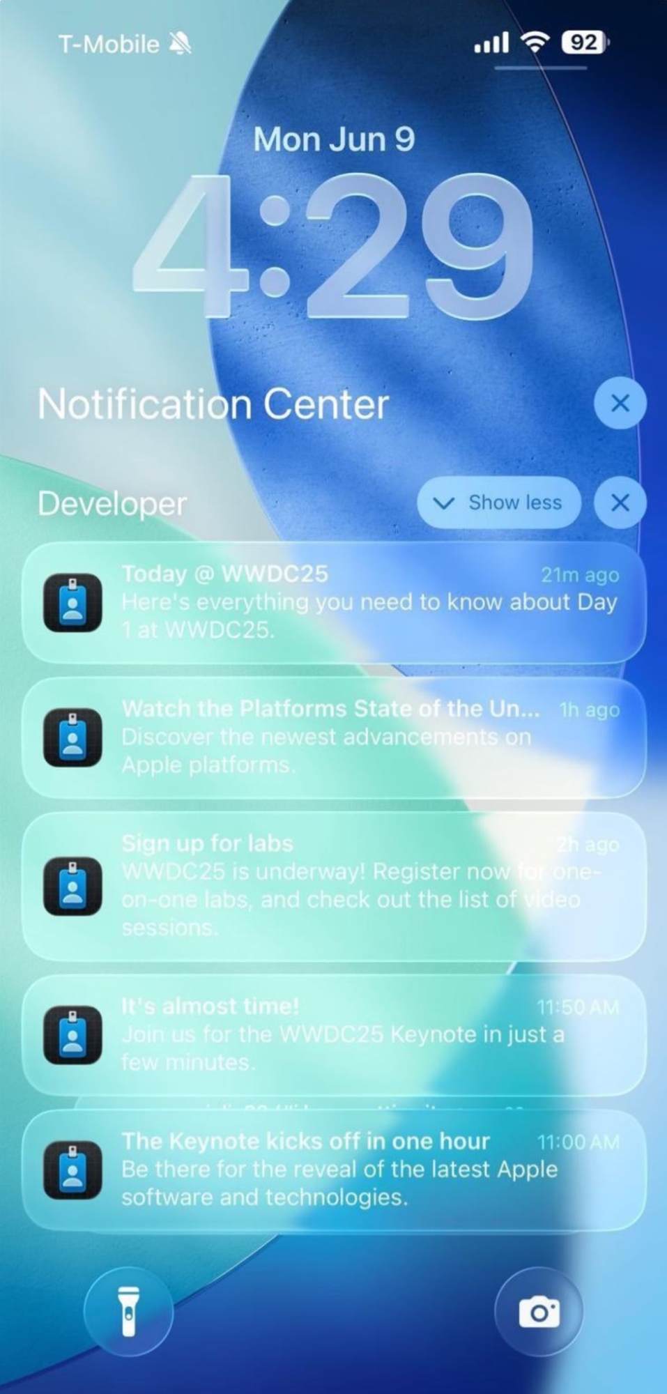
Missing in Dev Beta 1
-lower refraction of text
- button legibility on variable backgrounds
- No Color Bleeding in final design
- Button label changes color based on background
I feel bad for the presenter in this video. He posted something on Twitter after WWDC about how proud he was of the work his team did on this and the post had nearly 1,000 comments last time I checked and so many were negative.you can see it in this video after 6 minute mark: https://developer.apple.com/videos/play/wwdc2025/219
develop focused video giving developers overview of final design
Missing in Dev Beta 1
-lower refraction of text
- button legibility on variable backgrounds
- No Color Bleeding in final design
- Button label changes color based on background
I agree. I am sure the team did the best they could and I am also sure their vision isn't flawed, just the implementation as of DB 1. I am really looking forward to seeing this new design language done right.I feel bad for the presenter in this video. He posted something on Twitter after WWDC about how proud he was of the work his team did on this and the post had nearly 1,000 comments last time I checked and so many were negative.
Watching the developer session shared above you get the sense a lot of thought went into this. I’ve got to believe legibility issues will be fixed in future betas. I mean there’s no way the people at Apple who worked on this would say this is legible and should ship in the fall.I agree. I am sure the team did the best they could and I am also sure their vision isn't flawed, just the implementation as of DB 1. I am really looking forward to seeing this new design language done right.

do you have the link? what do people complain about ?I feel bad for the presenter in this video. He posted something on Twitter after WWDC about how proud he was of the work his team did on this and the post had nearly 1,000 comments last time I checked and so many were negative.
Why do people always attribute so much to Tim Cook? I think he has more important things to worry about than liquifying a transparent solid, especially since the current US administration and their policies and "promises" were on the horizon again.Before he died, Steve Jobs spent a lot of time with Tim Cook sharing his vision for the future. Looks like Tim finished the checklist a couple of years ago and has no ideas about what to do.
OK it actually has over 2K comments now. I guess I noticed it because I don’t remember tweets from Apple employees receiving that many comments before.do you have the link? what do people complain about ?
thanks. that's good. the more people who complain, the more chances they'll actually improve it. i still think glass is a terrible idea . if it were only in the menus and corners, maybe . but everywhere, including the background where the text is written? that's terrible. i wonder if there are engineers for ergonomics and this kind of stuff at apple, because their products are beautiful but getting terribly harder to useOK it actually has over 2K comments now. I guess I noticed it because I don’t remember tweets from Apple employees receiving that many comments before.
Another one from a co-worker that has over 950 comments.
And another that has over 500 comments.
And I can only hope that until September they've figured out how to fix this abomination.

These images kind of remind me of when the GPU is acting up and glitches outWatching the developer session shared above you get the sense a lot of thought went into this. I’ve got to believe legibility issues will be fixed in future betas. I mean there’s no way the people at Apple who worked on this would say this is legible and should ship in the fall.
I don’t mind it overall but they absolutely need to fix the legibility issues. If that means reducing transparency in some cases, going to frosted glass or making the text black, whatever it needs to be they can’t ship something in September that causes people to get eye strain, headaches or nausea.thanks. that's good. the more people who complain, the more chances they'll actually improve it. i still think glass is a terrible idea . if it were only in the menus and corners, maybe . but everywhere, including the background where the text is written? that's terrible. i wonder if there are engineers for ergonomics and this kind of stuff at apple, because their products are beautiful but getting terribly harder to use
frosted glass would be a good idea ! but i'm not sure they're gonna do this sadly...I don’t mind it overall but they absolutely need to fix the legibility issues. If that means reducing transparency in some cases, going to frosted glass or making the text black, whatever it needs to be they can’t ship something in September that causes people to get eye strain, headaches or nausea.
I don’t mind it overall but they absolutely need to fix the legibility issues. If that means reducing transparency in some cases, going to frosted glass or making the text black, whatever it needs to be they can’t ship something in September that causes people to get eye strain, headaches or nausea.
Before he died, Steve Jobs spent a lot of time with Tim Cook sharing his vision for the future. Looks like Tim finished the checklist a couple of years ago and has no ideas about what to do.
