Because we want them to do better. If you are happy, why come to this forum to just get all this negativity? Go outside. Touch some grass. Ignorance is bliss.I don't know why you and others bother to come into macrumors, or buy apple products, when you seem to have nothing but negativity towards them, and the company that makes them.
Got a tip for us?
Let us know
Become a MacRumors Supporter for $50/year with no ads, ability to filter front page stories, and private forums.
„Just some beta bashing“
- Thread starter Parowdy
- Start date
-
- Tags
- downgrade ios 26 ugly ugly
- Sort by reaction score
You are using an out of date browser. It may not display this or other websites correctly.
You should upgrade or use an alternative browser.
You should upgrade or use an alternative browser.
You don’t get it either, do you? My main complaint is that this design seems good enough for Apple to showcase to the world, despite it having obvious drawbacks that were even present in their own keynote.You don't get it do you? It's not that I'm not listening to those that don't like it, because those on here, who state a dislike, have admitted, in the main, that they are not developers. As far as I am concerned, their opinions are not worth listening to, Yet!
How long do you think Apple worked on this?
How reluctant do you think they are going to be to pedal back or dramatically change some, if not most, of those design decisions within the next 3 (or 2) months.
The past has shown that Apple is willing to listen to some feedback, but they haven’t been criticized about this many things in a long time. They took a whole year to slightly revert their controversial Photos changes. They had all the time and resources they needed to learn from their mistakes AND deliver on first try.
Admittedly, a complete redesign is a massive undertaking that is bound to create at least some pushback. But even Apple is probably surprised how much there is.
They shouldn’t need to wait for third party developer feedback on their system UI, it should be a mostly done deal right out of the gate so said developers can work out how their apps look, not the systems they run on…
Also, devs are only devs, doesn’t matter if they are first of third party. How usable a system or an app is only really becomes obvious when the public gets their hands on it.
If it was up to you, Apple would spent a month listening to devs that apparently are supposed to do the work their own devs should have done, before starting to listen to the public who is the actual important demographic.
Where does any of this make sense?
i dunno, i think i've seen worse wallpapers 🤔
Well said! Bravo!You don’t get it either, do you? My main complaint is that this design seems good enough for Apple to showcase to the world, despite it having obvious drawbacks that were even present in their own keynote.
How long do you think Apple worked on this?
How reluctant do you think they are going to be to pedal back or dramatically change some, if not most, of those design decisions within the next 3 (or 2) months.
The past has shown that Apple is willing to listen to some feedback, but they haven’t been criticized about this many things in a long time. They took a whole year to slightly revert their controversial Photos changes. They had all the time and resources they needed to learn from their mistakes AND deliver on first try.
Admittedly, a complete redesign is a massive undertaking that is bound to create at least some pushback. But even Apple is probably surprised how much there is.
They shouldn’t need to wait for third party developer feedback on their system UI, it should be a mostly done deal right out of the gate so said developers can work out how their apps look, not the systems they run on…
Also, devs are only devs, doesn’t matter if they are first of third party. How usable a system or an app is only really becomes obvious when the public gets their hands on it.
If it was up to you, Apple would spent a month listening to devs that apparently are supposed to do the work their own devs should have done, before starting to listen to the public who is the actual important demographic.
Where does any of this make sense?
Yeah I couldn’t figure out if that was sarcasm or not either, that’s one of the better examples I’ve seen. Still not what I’d like, but tolerable at least.What is it?
They are not, as said so many times, this is a developer beta.seems good enough for Apple to showcase to the world
Developers first, why? Because they have the ability/knowledge/education to assist Apple. Public after that, because you like to look at pretty things!
I mean, to be fair Apple's software quality has taken a nosedive in the past five or so years, so they don't have a strong reputation in this area. BUT, this happens every time there's a major UI/UX change – Apple goes too far, and then reels it back to something more reasonable over the course of the beta.
Outside of the usual QA issues, this is classic Apple. They often push hard into new territory, and often blunder their way around until things settle. Jobs was infamous for this.
The iOS 7 beta was no different. Some of the first dev seed releases looked _horrible_, and I would argue it took Apple the course of the iOS 7 lifespan to figure things out. I don't think this design is any different than that iOS 7 release – the jump from skeuomorphism and rich textures to flat monochromatic was extreme.
I get the passion people have for Apple's products and complaining because they want them to be good, but context matters. If this was truly meant for public consumption, it would have been called a Public Beta. So you would hope people would approach it with that level of understanding. I guess not.
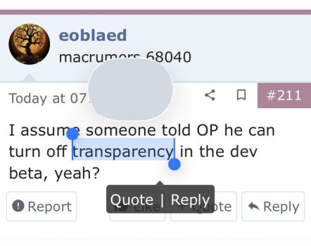
I know I can turn off transparency even in previous non betasI assume someone told OP he can turn off transparency in the dev beta, yeah?
What’s the point in using an accessibility setting to „turn off“ the new design while making other things unnecessary ugly or not work correctly AND make the whole thing look worse than the 12 years before?
Last edited:
If Apple didn’t want to „showcase to the world“, they wouldn’t have started streaming their opening WWDC keynote on YouTube…They are not, as said so many times, this is a developer beta.
Developers first, why? Because they have the ability/knowledge/education to assist Apple. Public after that, because you like to look at pretty things!
You honestly believe Apple wants third party developers to „assist“ with their design this much?
The lead designer himself said he has „an army“ of a team. What exactly is that for then?
You really do want Apple to have even less time until release to listen to the public, you know, the people that have to use whatever ships in September.
You continue to deny the nature of things, the intend MAY be different, but that’s doesn’t change anything about how this reveal played out.
And if you watched the WWDC keynote, and the Liquid Glass videos, you'd have noticed that what has been released in the first dev beta is missing features and details that would enhance cohesion and legibility. One look at the dev beta after watching WWDC content would tell you that, as released, it is unfinished. Certainly, point out things you don't like, point out errors and mistakes, heck, hate on the design if you don't like it, but just keep in mind what we're playing with is unfinished.
No point discussing this with you, as you have not once demonstrated an understanding of the processes of bring software to market.If Apple didn’t want to „showcase to the world“, they wouldn’t have started streaming their opening WWDC keynote on YouTube…
You honestly believe Apple wants third party developers to „assist“ with their design this much?
The lead designer himself said he has „an army“ of a team. What exactly is that for then?
You really do want Apple to have even less time until release to listen to the public, you know, the people that have to use whatever ships in September.
You continue to deny the nature of things, the intend MAY be different, but that’s doesn’t change anything about how this reveal played out.
This would imply then that the slicker demos during the livestream were in fact smoke and mirrors all over again, CG renderings of what it will eventually (hopefully) become.And if you watched the WWDC keynote, and the Liquid Glass videos, you'd have noticed that what has been released in the first dev beta is missing features and details that would enhance cohesion and legibility. One look at the dev beta after watching WWDC content would tell you that, as released, it is unfinished. Certainly, point out things you don't like, point out errors and mistakes, heck, hate on the design if you don't like it, but just keep in mind what we're playing with is unfinished.
A Beta 1 for devs will be full of bugs. The whole point of a mass test is to collect feedback and iron them out. But back when they used to do these things live on stage, the version running on the test iPhone had to be the same one available later that day.
If the cake is still runny in the middle, you don't ask people to taste it; you leave it in the oven.
What is it?
Referring to the legibility of elements.
Sorry, I thought it was clear in the photo. 🙏
The icons are so meh! lack definition and detail. Hate the bevels around the widgets.
But oh boy, this is straight from android and not in a good way. It's a yuck interface... why not just showing the files, without the cheesy Preview text and that badly designed header

But oh boy, this is straight from android and not in a good way. It's a yuck interface... why not just showing the files, without the cheesy Preview text and that badly designed header
The Preview app is utterly pointless. You're still better off using Books to manage a PDF library.The icons are so meh! lack definition and detail. Hate the bevels around the widgets.
But oh boy, this is straight from android and not in a good way. It's a yuck interface... why not just showing the files, without the cheesy Preview text and that badly designed header
View attachment 2521108
No I mean like what app is it? Safari? 3rd party?Referring to the legibility of elements.
Sorry, I thought it was clear in the photo. 🙏
No I mean like what app is it? Safari? 3rd party?
Oh! Shoot -- sorry, that flew right over my head.
I cropped the photo w/o taking note of which App, as I should have.
Sorry
And if you watched the WWDC keynote, and the Liquid Glass videos, you'd have noticed that what has been released in the first dev beta is missing features and details that would enhance cohesion and legibility. One look at the dev beta after watching WWDC content would tell you that, as released, it is unfinished. Certainly, point out things you don't like, point out errors and mistakes, heck, hate on the design if you don't like it, but just keep in mind what we're playing with is unfinished.
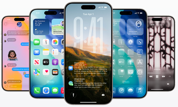
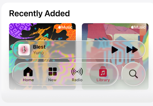
While I think what ships this fall will be tweaked, to be fair, these images are on Apple’s website previewing iOS 26. Those Lock Screen notifications are difficult to read. And that Apple Music screenshot definitely needs more background blur or reduced transparency.


No problem. It’s more proof tweaks need to happen.Oh! Shoot -- sorry, that flew right over my head.
I cropped the photo w/o taking note of which App, as I should have.
Sorry
It does still need tweaking as you’re right, contrast isn’t always as good as it could be, but I am really enjoying using it. I find that screenshots don’t really do it justice. In my experience, the complaints are over exaggerated. Many of them aren’t wrong, but it isn’t the worst thing since ever!!!While I think what ships this fall will be tweaked, to be fair, these images are on Apple’s website previewing iOS 26. Those Lock Screen notifications are difficult to read. And that Apple Music screenshot definitely needs more background blur or reduced transparency.
View attachment 2521117
View attachment 2521119
Register on MacRumors! This sidebar will go away, and you'll see fewer ads.


