Simplify the tree (it doesn't need to look cartoonishly "realistic") and change the color of the text (both the name and the tag line). Blue and red don't contrast enough with green to be legible.
Got a tip for us?
Let us know
Become a MacRumors Supporter for $50/year with no ads, ability to filter front page stories, and private forums.
logo critique #99999999
- Thread starter liptonlover
- Start date
- Sort by reaction score
You are using an out of date browser. It may not display this or other websites correctly.
You should upgrade or use an alternative browser.
You should upgrade or use an alternative browser.
but am I on the right track?
I'll try other colors... does anyone have particular color ideas?
Thanks loads for your help guys")
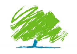
oh yeah... finding a different tree might be hard. This was one of the few I could find that explicitly said people have permission to use it. I don't want legal trouble and I can't draw one myself.
I'll try other colors... does anyone have particular color ideas?
Thanks loads for your help guys
oh yeah... finding a different tree might be hard. This was one of the few I could find that explicitly said people have permission to use it. I don't want legal trouble and I can't draw one myself.
finding a different tree might be hard. This was one of the few I could find that explicitly said people have permission to use it. I don't want legal trouble and I can't draw one myself.
Just use 3 triangles. Something that was suggestive of the shape of a pine tree would look a lot better than some clip art you got off the Internet, anyway.
As for color, find a single color you like, then experiment with others until you find one more that goes well with it. Then, if you must, do the same with a third color. You probably only need two, though.
I think the quote needs a different color from the title if it's going to be there. Do you think it needs to be there though?

I love how you just put together something better than all my efforts. The only problem is the tree isn't an evergreen.
I love how you just put together something better than all my efforts. The only problem is the tree isn't an evergreen.
Thanks, but I do this everyday for a living. This was an idea, just to show how layout and simplicity can work. Look at Smashing it's a great resource for design.
The best advise I can give is keep it simple.
Find one or two colours.
Find a nice font.
Then work from their.
And good logos are developed overtime, it does take time and effort to get the perfect concept.
for color ideas...
http://kuler.adobe.com/ is a great reference tool...it offers color palates that designers have already used (or you can play and make your own)... there are cmyk values for print & rgb values for web...HSB (which I dont use), LAB, and HEX values.
It's a GREAT tool. Have fun.
http://kuler.adobe.com/ is a great reference tool...it offers color palates that designers have already used (or you can play and make your own)... there are cmyk values for print & rgb values for web...HSB (which I dont use), LAB, and HEX values.
It's a GREAT tool. Have fun.
I love how you just put together something better than all my efforts. The only problem is the tree isn't an evergreen.
It really isn't that hard to simply change the tree. Besides, I think ezekielrage_99 was just trying to provide an example. Anyway, I figured I'd just change the tree anyway (hope you don't mind me playing with it, ezekiel) and made it an evergreen. I got the tree shape from a Creative Commons search for commerical works.
Attachments

It really isn't that hard to simply change the tree. Besides, I think ezekielrage_99 was just trying to provide an example. Anyway, I figured I'd just change the tree anyway (hope you don't mind me playing with it, ezekiel) and made it an evergreen. I got the tree shape from a Creative Commons search for commerical works.
I don't mind, the tree I used was an unused icon from a green eco report (for some reason the client didn't think it looked like a tree).
Anyway my concept was an example of what I know works from brand development POV.
take two.

I have the basic 3 colors of light, an eversoft tree, readable text, and my corny company quote.
Oh yeah.... and NO swastika.
edit: Sorry I didn't mean to call myself a DESIGNER. I know how to use the tools.
Dramatically better. Of course, the first round was in the toilet, but this is much improved. Not done though.
Often times for logos you need to consider the media for which it will be reproduced. Is this a company that will eventually have print advertising, letterhead, or other print needs? If so the logo generally needs to look good in black and white. You need to simplify further if this is a future need.
I would also consider a simpler tree (no gradients) that can be used in place of one of the letters. I bet you can do a nice stylized tree in the place of the "f" or the "t".
Just my 2cents...Also, I'm not a designer, but I like design.
take two.
I have the basic 3 colors of light, an eversoft tree, readable text, and my corny company quote.
Oh yeah.... and NO swastika.
edit: Sorry I didn't mean to call myself a DESIGNER. I know how to use the tools.
I would not qualify that as 'readable text' - it's still very tough to pick up over the tree.
Why not have the tree away from the logotype. See this logo for an example:
Tree Logo
here's the next version.

I originally wanted to make it a banner, 720 pixels wide so that it'd fit my website perfectly. But only the first one worked for that. I think I'm going to try a side by side next. Image on the left, then the text. Would it look ok if I put another tree on the other side, or should I find another image?
I originally wanted to make it a banner, 720 pixels wide so that it'd fit my website perfectly. But only the first one worked for that. I think I'm going to try a side by side next. Image on the left, then the text. Would it look ok if I put another tree on the other side, or should I find another image?
... and here's a banner.

All I ned left is to add an object on the right... it looks too blank otherwise. Any suggestions?
Thanks for all this help... if I hadn't thought to ask for critique I would have ended up with a swastika on my website rofl
All I ned left is to add an object on the right... it looks too blank otherwise. Any suggestions?
Thanks for all this help... if I hadn't thought to ask for critique I would have ended up with a swastika on my website rofl
Your tree is more like a picture than an icon. If it can be simplified do it!
Attached is a quick example of how simple it could go. One thing with this example though is it does not really identify what Eversoft does (apart from the descriptor) so maybe look at incorporating the 'digital' aspect of that by making one of the trees (or possibly all of them) out of squares to represent pixels. This will of course make the logo more complicated but it is also communicating more. Its a fine balance of simplicity and communication. With Eversoft I dont think you will get away with just showing a tree. There needs to be more to it. If Eversoft produce just iPhone apps you could incorporate the rounded square shape that is synonymous with iPhone apps like has been in earlier examples in this thread. If you hit a 'brick wall' start from scratch with a different idea. Trees may not be the way to go.
Logo design is a long process, don't be deterred and keep going. I think you can already see that what you are producing now is much better than when you started.
Attachments

definitely. I wish I could think of this stuff myself though lol.
I think I need the tree... it's my most solid "symbol". But I do need another one...
I may only do iphone apps sometime in the future, but right now I don't do them at all yet, though that is my goal.
I think what I want on the right side is something that represents quality... but I don't know what represents that. I'm racking my brain... but nothing comes to mind. Actually... softpedia gave me a bugfree certificate for all of my apps... could I put that there?
definitely. I wish I could think of this stuff myself though lol.
I think I need the tree... it's my most solid "symbol". But I do need another one...
I may only do iphone apps sometime in the future, but right now I don't do them at all yet, though that is my goal.
I think what I want on the right side is something that represents quality... but I don't know what represents that. I'm racking my brain... but nothing comes to mind. Actually... softpedia gave me a bugfree certificate for all of my apps... could I put that there?
No use the certificate on your website etc. Don't include it as part of the logo.
Also dont add anything to the right side. Try and think of something that visually represents apps and incorporate that into your tree (if you are keeping the tree). Like I said if you 'digitise' the tree - its quite a cliché however and I use it as just an example - then the symbol will communicate that you work in a digital environment (apps) and the tree as a whole can represent strength, growth, fresh ideas, freedom etc.

I don't mean to thwart your efforts, because your getting there... But are you hell bent on doing this yourself?
I mean its all well and good asking peoples advice and its a great way to learn (if you want to) - but have you considered getting a designer to work with you on this properly?
Feel free to ignore me though, it's coming along nicely and the help everyone on this forum offers is always top notch
I mean its all well and good asking peoples advice and its a great way to learn (if you want to) - but have you considered getting a designer to work with you on this properly?
Feel free to ignore me though, it's coming along nicely and the help everyone on this forum offers is always top notch
stop... you're making me wish I only do iphone apps now
not sure if this is what you were picturing...

What represents software? I suppose I could use the generic app icon, but do I just layer it over the tree like the apple?
not sure if this is what you were picturing...
What represents software? I suppose I could use the generic app icon, but do I just layer it over the tree like the apple?
I want to do it myself because I enjoy it, and because I can't afford to pay someone. Trying to get an ipod touch right now
Also doing this is a good learning experience. I love anything creative, and anything along those lines helps. But it's fine, I see where you're coming from
Also doing this is a good learning experience. I love anything creative, and anything along those lines helps. But it's fine, I see where you're coming from
I want to do it myself because I enjoy it, and because I can't afford to pay someone. Trying to get an ipod touch right now
Also doing this is a good learning experience. I love anything creative, and anything along those lines helps. But it's fine, I see where you're coming from
Take the Apple off. Apple Inc. will sue your ass and hand it back to you (in pieces through the mail slot). When I said incorporate I didnt mean literally put something in your tree I meant do something clever that will represent a tree as well as applications.
This example represents trees and art.
Attachments
*slaps head* didn't think of that. <_< thanks
So is using the generic icon instead a good idea? Or is that suable as well?
So is using the generic icon instead a good idea? Or is that suable as well?
*slaps head* didn't think of that. <_< thanks
So is using the generic icon instead a good idea? Or is that suable as well?
No because Apple (if its the OSX one you refer to) owns it and retains copyright privileges.
<_< sometimes copyrights get sooo annoying...
So I need something either I draw myself, or something not copyrighted. It needs to reflect software/software development, and possibly apple.
So I need something either I draw myself, or something not copyrighted. It needs to reflect software/software development, and possibly apple.
Register on MacRumors! This sidebar will go away, and you'll see fewer ads.