Become a MacRumors Supporter for $50/year with no ads, ability to filter front page stories, and private forums.
Status
The first post of this thread is a WikiPost and can be edited by anyone with the appropiate permissions. Your edits will be public.

Q5jgP22Ym0EC

macrumors newbie
Sep 25, 2018
2
3
Wow, now this is just super cool!
I1lHBfC.png
I've always wanted to be warned every single time I want to open more 25 or more files, forever.
 
  • Like
Reactions: mikzn and tkermit

tkermit

macrumors 68040
Feb 20, 2004
3,586
2,921
Wow, now this is just super cool!
I1lHBfC.png
I've always wanted to be warned every single time I want to open more 25 or more files, forever.
Sounds like you're being sarcastic, but I'm actually thankful for the warning. MacOS made it far too easy to accidentally open a huge number of files (of possibly different types) especially if you were using shortcuts (e.g. ⌘A/⌘↓ with the wrong window in the foreground). It's not a pretty picture when your Mac suddenly launches dozens of apps, each attempting to open hundreds of files, which can easily happen.
 

Q5jgP22Ym0EC

macrumors newbie
Sep 25, 2018
2
3
Sounds like you're being sarcastic, but I'm actually thankful for the warning. MacOS made it far too easy to accidentally open a huge number of files (of possibly different types) especially if you were using shortcuts (e.g. ⌘A/⌘↓ with the wrong window in the foreground). It's not a pretty picture when your Mac suddenly launches dozens of apps, each attempting to open hundreds of files, which can easily happen.
Sure, but it's not like there aren't a lot of reasons for opening 25+ files at once. They should give you an option to disable the warning.

If anyone knows how to go into the terminal and disable this I would be very grateful.
 
  • Like
Reactions: tkermit

afir93

macrumors 6502a
Jan 5, 2018
730
910
Is this just me, or is the Mojave more...colorful?

I do not know why does it look so to me...
There are a number of little changes that might not immediately be visible but contribute to such an effect. For example, if you're using dark mode, the window shades actually aren't fixed colors but they instead subtly change depending on the chosen background and its' vibrancy, to make the interface feel less "cold" in dark mode. There are also favicons in Safari which might make it look a lot more colorful, and more accent colors to choose from in System Preferences, but both need to be changed/activated by the user. Maybe there's more like that.
 
  • Like
Reactions: StellarVixen

Noongun

macrumors newbie
Sep 11, 2018
7
8
Wondering what happened to three finger drop and drag feature for easily moving open windows and files around. This clicking thing is not working for me might as well be using a windows PC then, sooo bloody irritating for 4 years I have been able to use my track pad without force or clicking now my hand is in spasm as I used the feature a lot, and the sound is irritating click, click, click, click, click!!!!!
 
  • Like
Reactions: DaveF

afir93

macrumors 6502a
Jan 5, 2018
730
910
Wondering what happened to three finger drop and drag feature for easily moving open windows and files around. This clicking thing is not working for me might as well be using a windows PC then, sooo bloody irritating for 4 years I have been able to use my track pad without force or clicking now my hand is in spasm as I used the feature a lot, and the sound is irritating click, click, click, click, click!!!!!
Can't test it right now but are you sure it's not just deactivated in the System Preferences? In HS and earlier, I believe the three-finger-drag it would only be active when you don't have any of the other gesture actions set to three fingers (Mission Control, App Expose, etc.), because otherwise the three-finger-drags would be overtaken by that. If the three-finger-drag is gone completely, that would be a bit peculiar; not sure why Apple would remove that.
 

Noongun

macrumors newbie
Sep 11, 2018
7
8
Can't test it right now but are you sure it's not just deactivated in the System Preferences? In HS and earlier, I believe the three-finger-drag it would only be active when you don't have any of the other gesture actions set to three fingers (Mission Control, App Expose, etc.), because otherwise the three-finger-drags would be overtaken by that. If the three-finger-drag is gone completely, that would be a bit peculiar; not sure why Apple would remove that.

Yeah dont know, think it has been replaced with the new three finger gesture for mission control but there is no alternative gesture I can assign to it or revert it back to the old one. The problem is that when I need to work quickly on my macbook the speed is much better to drag and drop than click and drag with one finger having to press down hard as not to lose the click action, its absolutely terrible. I actually had to restore from backup and go back to High Sierra just to be able to work. Oh and I touch type a lot so the drop and drag was so useful for quick highlighting text for copy and paste short cuts, again now it has to be clicked and then clumsely highlighted with one finger. Installed Mojave on a hard drive the second time to double check and still nothing. I am devastatingly dissapointed this is a serious deal breaker for me.
 

AZhappyjack

Suspended
Jul 3, 2011
10,184
23,659
Happy Jack, AZ
Wondering what happened to three finger drop and drag feature for easily moving open windows and files around. This clicking thing is not working for me might as well be using a windows PC then, sooo bloody irritating for 4 years I have been able to use my track pad without force or clicking now my hand is in spasm as I used the feature a lot, and the sound is irritating click, click, click, click, click!!!!!

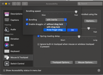
Allow me to play the role of Captain Obvious for a moment ... you are aware that they moved that setting into the Accessibility widget in System Preferences, right? It's still there for me, though it was disabled upon upgrading to Mojave. (Not sure why Apple does that...)

System Preferences > Accessibility > Mouse & Trackpad > Trackpad ...

Screen Shot 2018-09-27 at 6.14.56 AM.png
 

Noongun

macrumors newbie
Sep 11, 2018
7
8
Allow me to play the role of Captain Obvious for a moment ... you are aware that they moved that setting into the Accessibility widget in System Preferences, right? It's still there for me, though it was disabled upon upgrading to Mojave. (Not sure why Apple does that...)

System Preferences > Accessibility > Mouse & Trackpad > Trackpad ...

View attachment 789553

Thanks a million! Geeez it's always something so obvious, but cant see it, and getting worked up and irritated just makes me more blind and stupid. I googled it 5 times and found nothing this morning... but anyways thanks now I can go on again :)
 

Weaselboy

Moderator
Staff member
Jan 23, 2005
34,463
16,160
California
Is this just me, or is the Mojave more...colorful?

I do not know why does it look so to me...
It does to me also, and I don't have dark mode on. I'm using the LG 5K monitor and I think text looks a little more crisp and colors are more vibrant. I really notice it with the colored icons in the Dock.
 

afir93

macrumors 6502a
Jan 5, 2018
730
910
Is there any way to enable News app in unsupported region? Tried opening it from terminal and no result :/
Just switch the region of your Mac under "language and region" in System Preferences to one of the supported countries (like US) and maybe restart your Mac. Works on iOS devices aswell. You might need to re-set your date format afterwards, but apart from that it should work fine.

Only oddity for me as someone who has been doing that for a few days is that for some reason, my News-app settings and liked/saved stories won't sync between devices. Checkmark is set on every device under iCloud settings (also tried to dis- and re-enable it). Now to be clear I'm not sure if this is related to the regions somehow, but since I couldn't find much infos about this issue on the web, my only guess is that maybe it won't work because my Apple ID is from a different country than the region I have set my devices to, seeing as how the News app content is highly region-specific? But again, it's just speculation, it might also be a completely unrelated issue. If anyone has any suggestions on how this might be fixed, I'm all ears.
 

Apple Knowledge Navigator

macrumors 68040
Mar 28, 2010
3,676
12,835
I thought I would get used to this by now, but I'm still not used to the way the safari tab bar looks. I can't remember how it used to look, but I know something about it is different.
It's because they (Apple) have removed the transparency from the U.I. So now it is a solid grey, rather than altering contrast/hue based on the webpage and its position.
 

drlunanerd

macrumors 68000
Feb 14, 2004
1,698
178
It's because they (Apple) have removed the transparency from the U.I. So now it is a solid grey, rather than altering contrast/hue based on the webpage and its position.

Nope, transparency in Safari 12 is still there. The tab bar is not solid grey. They may have altered the level of transparency though from High Sierra.
 

DanielDD

macrumors 6502a
Apr 5, 2013
524
4,447
Portugal
Is there any way to enable News app in unsupported region? Tried opening it from terminal and no result :/

Open terminal and type “open -a News”.
You can also go to your applications folder and press cmd + shift + . to show hidden files. The News app should be there.

Bear in mind some features and channels may still be unavailable in your region. If you want to use the News app to its fullest, you need to change your region in System Preferences.
 

StellarVixen

macrumors 68040
Mar 1, 2018
3,253
5,779
Somewhere between 0 and 1
It does to me also, and I don't have dark mode on. I'm using the LG 5K monitor and I think text looks a little more crisp and colors are more vibrant. I really notice it with the colored icons in the Dock.

I know, I mean I am not crazy. “Aurora” wallpaper looks more colorful than ever, I do not remember it ever being that vibrant.

I mean I like when it is colorful, it is not that I am complain. The thing is just that I want to know if this is for real, or just an illusion.
 
  • Like
Reactions: Weaselboy

Sweeper29

macrumors newbie
Aug 31, 2009
8
1
Taking my time to get use to the visible changes and am hunting down personal OS tweaks that may have been eradicated in the update - Updated my trashcan MAC to Mojave, but am leaving my tweaked 4,1 pro on HS till NVIDIA get the Drivers right (use this machine for bigtime 3D rendering). Dark Mode is cool as it aligns with some of my application software that already adopted the same scheme - but with Firefox the bookmark line takes some getting use to as the light print seems to be enveloped by the 'darkness' making it appear to blur. I got use to working with the Finder in Cover Flow exclusively as I do a lot of Folder/file management between computers - Gallery View is cool for picture and PDF collections but little else IMHO. However, the List View comes with a side preview panel just like Gallery View so perhaps this is my 'go to' file manager screen (vertical instead of horizontal preview) - a 'poor mans' Cover Flow alternative. Right now I'm on a mission to re-establish OS personal tweaks where I can (trash can behaviour, those little folder expansion triangles) - always feel like a noob when I forget how I did it the last time. The Ars Technica review was quite helpful so far....
 

afir93

macrumors 6502a
Jan 5, 2018
730
910
I got use to working with the Finder in Cover Flow exclusively as I do a lot of Folder/file management between computers - Gallery View is cool for picture and PDF collections but little else IMHO. However, the List View comes with a side preview panel just like Gallery View so perhaps this is my 'go to' file manager screen (vertical instead of horizontal preview) - a 'poor mans' Cover Flow alternative.
I kind of agree – I like the new Gallery View, but I wish they would have added it in addition to CoverFlow instead of making it the replacement for it. In my opinion, Gallery View and CoverFlow View serve slightly different functions – CoverFlow is better for quickly scrolling through large amounts of pictures or media and for casually browsing through them, whereas Gallery View puts the emphasis more on the individual file you have selected and doesn't allow you to scroll that nicely between many files. Scolling in Gallery View only scrolls through the tiny bottom bar instead of shuffling through the actual selected file like CoverFlow did.

It's not a big loss, and I know most people weren't really using CoverFlow anyway, but I found it nice that it stuck around till High Sierra and I don't think it needed to be dropped entirely. Those who don't see any use in it can just not use it; I don't think it would have required much development effort to keep it around for the few people who do find it useful or nice-to-have. But apart from that I'm really happy with the new Finder additions in Mojave, including Gallery View.
 

boodle

macrumors regular
Jun 12, 2004
145
113
Dictionary definitions not appearing in Word of the Day screensaver fixed in Beta 4. It has a new colour scheme and font (changed from Serif to a Bold Rounded!) in Mojave.
I've been trying to figure out how to change the font back to Baskerville but all of the quartz files have been moved around. Looks like it might be compiled into the binary now. Boo.
 
Last edited:

BigxMac

macrumors member
Mar 15, 2015
35
13
Anyone notice a subtle line/bar on the top of windows in 3rd party apps? In the screenshots below you can notice them in Spotify, Slack, and Word. Not present in Apple apps like Safari, Pages, and Xcode.
 

Attachments

  • Screen Shot 2018-09-29 at 18.14.46.png
    Screen Shot 2018-09-29 at 18.14.46.png
    24.8 KB · Views: 270
  • Screen Shot 2018-09-29 at 18.16.32.png
    Screen Shot 2018-09-29 at 18.16.32.png
    184.2 KB · Views: 298
  • Screen Shot 2018-09-29 at 18.16.48.png
    Screen Shot 2018-09-29 at 18.16.48.png
    71.5 KB · Views: 262
  • Screen Shot 2018-09-29 at 18.17.01.png
    Screen Shot 2018-09-29 at 18.17.01.png
    96.9 KB · Views: 286
  • Screen Shot 2018-09-29 at 18.17.12.png
    Screen Shot 2018-09-29 at 18.17.12.png
    63.4 KB · Views: 265
  • Screen Shot 2018-09-29 at 18.17.52.png
    Screen Shot 2018-09-29 at 18.17.52.png
    39.8 KB · Views: 270
  • Like
Reactions: randolorian
Register on MacRumors! This sidebar will go away, and you'll see fewer ads.