Okay, so I was able to get it installed and up/running. I was most curious about the new System Settings app (System Preferences' replacement), and while initially I wanted to be positive and give it a chance, unfortunately, I am not impressed. It's basically iOS now, and the submenus are
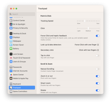
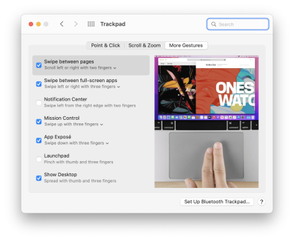
awful and hard on the eyes. The great visual trackpad pane is now all text; no "demonstration". It's pitiful, honestly.

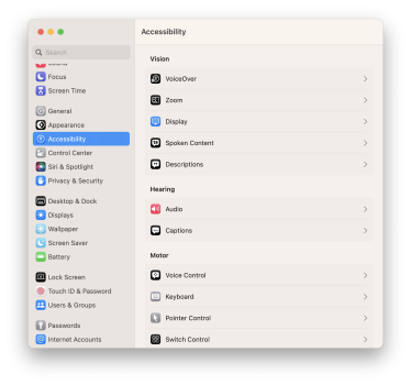
^ This is Accessibility — not too bad upon first sight, BUT...

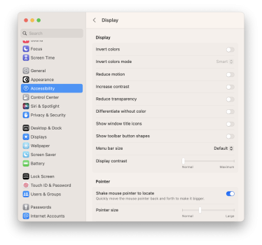
^ This is the display submenu of Accessibility. It's horrid. Hard on the eyes, too "wordy" without visual indicators, meh.
Also, there does not seem to be a way to rotate between desktop wallpapers anymore.
Edit: Nevermind, you can still do that. You do have to 'select' a folder, or cluster, then click the "i" button, then it'll allow you to rotate, etc. It just isn't clear upfront.
Specifically in regards to System Settings, ugh. I really don't like how they went with the lowest common denominator, especially there was nothing wrong with the previous configuration. It might have been a bit dated, but it was much easier on the eyes and more "tight".
Edit: Added a screenshot of trackpad settings to show what I mean when I mentioned trackpad settings and no more demonstrations.

^ This is Ventura. Now, compare and contrast...

^ In Monterey, here's what it looks like - very user-friendly and easy on the eyes, right?
Hopefully this is just beta and they'll tweak SP to make it more... I don't know, maybe less iOS-like? Especially with the submenus.


