Become a MacRumors Supporter for $50/year with no ads, ability to filter front page stories, and private forums.
Status
The first post of this thread is a WikiPost and can be edited by anyone with the appropiate permissions. Your edits will be public.
GG still doesn't obey the default browser setting when you use a contextual menu.

For example, if I am in Mail, and I highlight something, right-click, and select "Search with Google", it will always open Safari, despite the default browser being set to something else (in my case Vivaldi).

Tahoe also did this, and there doesn't seem to be any other setting that controls the default browser - unless I'm looking in the wrong place?
 
Yeah it's curious, in some ways the Liquid Glass concept is grounded in a kind of physical reality (trying not to say skewmorphism here!), and yet a lot of the modern UI is still in the flat design, like the Dock.

An angled glass dock, like we used to have in OS X, would actually work rather well in the revised Golden Gate version of Liquid Glass - which would then suit icons that are not limited to the squircle design.
I honestly don’t get why things like progress bars, checkboxes confirmation buttons, etc. don’t have a Liquid Glass effect.
 
Apple built OS X to have photo realistic icons only to reduce it all to squircles and one texture (glass) decades later. Distinguishing between applications and identifying functions was so much easier and faster when different shapes were used.

I remember this well but not initially knowing it at the time when branching on to mac at Snow Leopard time, just being in awe of the gorgeously rendered icons, it was an "of course and why not" moment!

I've written it before but I think Jobs time at Pixar influenced and enriched his visual expectations, enhancing them during this period for all our benefit, you only have to watch Toy Story 4 to see how iteratively incredible the rendering and mastery of the art was in that movie, we need to see that back.

Another thing I've written before, was that I had a sneaking suspicion Ai was involved in Tahoe design (for those that really couldn't or thought it was the bees knees) or crept in somehow someway even if a little (figma???), and maybe I'll never know for sure but defo UI like everything else is being affected by Ai, no spirit in the output.

While I'm somewhat biased having trained and worked in Animation, it allows me to know what it is, it really requires all the art and design talents inputs and outputs to culminate to produce such films as the like of Pixar who relaly became the Apple of 3D Movie biz and changed the industry (Renderman) again, couldn't have been done without Jobs input,

Animation, of that level, it's an experientially informed pursuit, it does not come out of nothing, and right now I can't think of a better metaphor but we need more Toy Story quality, craftsmanship and artisty infused back or as welcome companion if even just macOS X, the past bridged via Jobs but welcome some or the rich culture and spirit back under the hood and cleanse our eyes, and the chances of even a fraction of that prospect are looking good with Godeln gate, but let's not get ahead of ourselves yet!

Can you tell I'm looking forward to Toy Story 5 😀

As part of your open visual training course here at MR, it is recommended you take a field trip with your inner child and any outer children within your care this summer.
😉

At least that's Apple's tradition. macOS: Fischer Price OS since 2001.
I had that reaction in the early days of Aqua but not being a mac user, as you can read from above when it came to Snow Leopard for me it was wow this is the computing I've been missing!

Having elements of icons reach outside the squircle area, refracting their surroundings, would kinda fit in with the Liquid Glass ideology. The Dock background in itself isn't much to refract, but the idea of layers in icons would get visually stronger when breaking the boundary.

Icons as works of Art, this isn't hard, Apple nailed it under jobs, no-one else did and or has since afaict, this is a cultural pursuit, anything less becomes inhuman.

 
I honestly don’t get why things like progress bars, checkboxes confirmation buttons, etc. don’t have a Liquid Glass effect.
'Cause the people leading it were clearly total bluffers, of the fake it till you make it variety, the kind where the ego takes hold and won't let go until you go too far and then... well in the end they didn't make it anything but awful!
 
Last edited:
I had that reaction in the early days of Aqua but not being a mac user, as you can read from above when it came to Snow Leopard for me it was wow this is the computing I've been missing!
Yeah, I came to OS X from XP. It took me a minute to get used to OS X, but once I did, XP looked so cheesy in comparison!

I just enjoy pointing out the rich history of accusing OS X/macOS of being a Fisher Price OS. One day I'll find the link to the OS X 10.0 beta discussion where that epithet was first hurled at Apple. They were absolutely livid that OS X didn't look like Mac OS 9!
 
  • Like
Reactions: TimothyR734
I like this:


Screenshot-2026-06-09-at-8.48.22-AM.png


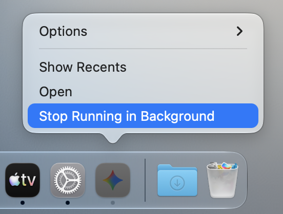
I also love how GG now lets you know an app is still running in the background despite having closed it.


Screenshot-2026-06-09-at-8.48.36-AM.png


I wonder if that “Stop running in background” button is an equivalent to “Force stop” app from the menu bar, or “kill” command…
 
It really seems apparent that Cook pushed visionOS as the base UX/UI across all Apple products (most likely he wants to leave an indelible mark with his departure as the Vision Pro wasn’t the success he anticipated). You cannot force a user interface for an AR/VR headset onto 2D systems without compromises. The shimmering 3D effects on Tahoe and iOS just don’t work. I’m glad Apple is toning it down but at this point throw in the towel. It’s turning into a mess with mixed elements of past OS X/macOS systems.

I honestly miss OS X so much. I hate the iOS elements especially with System Settings. Apple needs a serious product and UX overhaul as everything is fragmented and rushed out. I’d rather have a solid desktop update every 2-3 years than a rushed free one every year.
 
Apologies if this has been discussed before

When writing in a forum like this one, is there the ability to highlight, right-click, and use AI to rephrase your paragraph?

Am I correct that the option is missing in Golden Gate?
 
  • Like
Reactions: TimothyR734
I honestly miss OS X so much. I hate the iOS elements especially with System Settings. Apple needs a serious product and UX overhaul as everything is fragmented and rushed out
Then, what do you propose? Removing the “iOS” vibe from macOS leaving a fragmented UX across the different devices? Or not having a fragmented experience, hence, using iOS design language on macOS?

The only thing I don’t see viable is using the old aqua OSX interface in both macOS and iOS. Mobile devices need a slim and non intrusive interface.

Like it or not, it’s been more than a decade that the fate of the Apple operating systems is to converge, both visually and functionally. That doesn’t mean running iOS on Macs or macOS on iPads, but you get the general idea.
 
  • Like
Reactions: TimothyR734
Apologies if this has been discussed before

When writing in a forum like this one, is there the ability to highlight, right-click, and use AI to rephrase your paragraph?

Am I correct that the option is missing in Golden Gate?
What you’re looking for is, probably, the writing tools, that now have a different name. But it should be on the developer beta 2
 
  • Like
Reactions: TimothyR734
Then, what do you propose? Removing the “iOS” vibe from macOS leaving a fragmented UX across the different devices? Or not having a fragmented experience, hence, using iOS design language on macOS?

The only thing I don’t see viable is using the old aqua OSX interface in both macOS and iOS. Mobile devices need a slim and non intrusive interface.

Like it or not, it’s been more than a decade that the fate of the Apple operating systems is to converge, both visually and functionally. That doesn’t mean running iOS on Macs or macOS on iPads, but you get the general idea.
Let macOS be macOS. iOS and macOS haven’t meaningfully converged. Better yet, disable SwiftUI as an option in macOS.
 
Can someone tell me if this is new? When I fill my screen with a window by dragging it to the top of the screen (or double clicking the title bar of a window), the wallpaper becomes darker.

I am unsure if it's new or I just never noticed it before.

It also happens if you tile multiple windows, as long as they fill the screen.
That’s really interesting! Maybe a sign that they are rethinking the whole Full Screen logic and Fill is becoming the new intended “Full Screen”? (In that case why doesn’t Apple just hide the window borders when a window “Fill”s…… I feel this would be a more elegant way to resolve the whole corner situation)
 
  • Like
Reactions: TimothyR734
Then, what do you propose? Removing the “iOS” vibe from macOS leaving a fragmented UX across the different devices? Or not having a fragmented experience, hence, using iOS design language on macOS?

The only thing I don’t see viable is using the old aqua OSX interface in both macOS and iOS. Mobile devices need a slim and non intrusive interface.

Like it or not, it’s been more than a decade that the fate of the Apple operating systems is to converge, both visually and functionally. That doesn’t mean running iOS on Macs or macOS on iPads, but you get the general idea.
Nothing is inevitable. We had Mac’s and iDevices running separately for years with just the right balance of integration. Each device has its own form and function and the OS should reflect that. Changes to the OS for each should be dependent on the specific needs for that device - use cases - not change for change sake.

It’s akin to using visionOS across Apple devices as the base UX/UI. An AR/VR OS doesn’t work well on 2D devices. Integrate cross features when beneficial but ensure the GUI for each device meets those devices specified needs. Changing the system settings on OS X to iOS, developed primarily for a vertical display, makes little sense. Mac’s have more screen real estate that was used well until Apple threw out their own design guides and began mixing random design elements across platforms. I don’t want my Mac looking like a larger iPad, it’s a desktop computer and the UX/UI should reflect that. If you are going to force design elements across products, make it consistent or simply do not do it.

It’s been a mess for years and liquid glass - errr, visionOS - worsened it. These are allllll the little things that have impacted Apple’s core products. 😉

Eta personally, OS X 10.9 Mavericks or 10.14 Mojave are better than anything Apple has recently released and that was years ago. Incorporating iDevice features doesn’t mean overhauling the entire desktop OS to take on an iPhone or iPad GUI. Apple’s changes to design seem more financially motivated by cutting design teams and combining them which is exactly what has happened. Less people working on product UX/UI designs while pushing out free annual releases with more features to market rather than fixing bugs and making a solid OS.

“Keep it simple stupid”, an old tongue in cheek term Apple has forgotten. The best OS does the job with the right tools - minimalism is always best. I don’t need my desktop OS looking like a “glass” iPad.
 
Last edited:
Nothing is inevitable. We had Mac’s and iDevices running separately for years with just the right balance of integration. Each device has its own form and function and the OS should reflect that. Changes to the OS for each should be dependent on the specific needs for that device - use cases - not change for change sake.

It’s akin to using visionOS across Apple devices as the base UX/UI. An AR/VR OS doesn’t work well on 2D devices. Integrate cross features when beneficial but ensure the GUI for each device meets those devices specified needs. Changing the system settings on OS X to iOS, developed primarily for a vertical display, makes little sense. Mac’s have more screen real estate that was used well until Apple threw out their own design guides and began mixing random design elements across platforms. I don’t want my Mac looking like a larger iPad, it’s a desktop computer and the UX/UI should reflect that. If you are going to force design elements across products, make it consistent or simply do not do it.

It’s been a mess for years and liquid glass - errr, visionOS - worsened it. These are allllll the little things that have impacted Apple’s core products. 😉

Eta personally, OS X 10.9 Mavericks or 10.14 Mojave are better than anything Apple has recently released and that was years ago. Incorporating iDevice features doesn’t mean overhauling the entire desktop OS to take on an iPhone or iPad GUI. Apple’s changes to design seem more financially motivated by cutting design teams and combining them which is exactly what has happened. Less people working on product UX/UI designs while pushing out free annual releases with more features to market rather than fixing bugs and making a solid OS.

“Keep it simple stupid”, an old tongue in cheek term Apple has forgotten. The best OS does the job with the right tools - minimalism is always best. I don’t need my desktop OS looking like a “glass” iPad.
and then there are other people, with other opinions. but i agree with this: "The best OS does the job with the right tools - minimalism is always best", and for me, we're in that place right now 👍
 
and then there are other people, with other opinions. but i agree with this: "The best OS does the job with the right tools - minimalism is always best", and for me, we're in that place right now 👍
How is any of this “minimal”? In any way, how?

Narrator: it’s not.

One key example

IMG_1269.jpeg


New and Old. A visual interface works better when everything is quick and easy to see/find. Jobs was adamant about simplicity; now everything takes more steps to accomplish the same tasks. This has been a universal objective complaint by consumers and professionals for the past few years.

IMG_1270.webp
 
Last edited:
Ok then it's not just me!
It really seems apparent that Cook pushed visionOS as the base UX/UI across all Apple products (most likely he wants to leave an indelible mark with his departure as the Vision Pro wasn’t the success he anticipated). You cannot force a user interface for an AR/VR headset onto 2D systems without compromises. The shimmering 3D effects on Tahoe and iOS just don’t work. I’m glad Apple is toning it down but at this point throw in the towel. It’s turning into a mess with mixed elements of past OS X/macOS systems.

I honestly miss OS X so much. I hate the iOS elements especially with System Settings. Apple needs a serious product and UX overhaul as everything is fragmented and rushed out. I’d rather have a solid desktop update every 2-3 years than a rushed free one every year.
On the Cook point, I don't think Cook would have had the Vision to spread Vision OS across the entire range independently, as opposed to it being pitched to him, and the going with that idea, with some dev-cost X cheaper over Y time to sell it to him, but often a one size fits all approach does not work metaphorically speaking, in this case one UI skin fits all, nope.

I prefer one great design time fits all.

Apple needs to add the option to change the default icons of preinstalled apps, and I don't mean the silly dark mode or glass options. Let me drag and drop or paste something into Get Info like I was able to do from the 1990s up to Big Sur. My workarounds to change the icons of preinstalled apps no longer work, although I suspect running Golden Gate off an external drive may be the cause of this problem for me.

One of the little things.. gone! I didn't realise. 😥

How is any of this “minimal”? In any way, how?

Narrator: it’s not.

One key example

View attachment 2641863

New and Old. A visual interface works better when everything is quick and easy to see/find. Jobs was adamant about simplicity; now everything takes more steps to accomplish the same tasks. This has been a universal objective complaint by consumers and professionals for the past few years.

View attachment 2641864
I'm having deep déja-vu right now and so I have to be very careful what I post 😂 but you're spot on.

I was looking up images of iOS 6 Vs post iOS6 to post in another forum topic, but I'll post here some of it, as it kinda applies a little, what I like about the distance and not great photo but acts as a more real world control than a sterile bitmap on a screen, and demonstrates how one is far more legible and definition is superior perfectly.

Up to iOS 6 things were richer and has more character and personality with visual punch.

Calendar and iTunes icons are superior design wise, and this demonstrates it, you can see them from miles away, to iOS7+ version calendar is almost not even there!

I'm not blaming every iOS6 icons is perfecto but as a set in front of you they look "pressable" i.e. the lick-able

I've never liked the new photos prismatic sunflower, but I also never had anything other than a iOS 7+ iPhone so I can't say I have a bias, I just don't like it for the job it's been asked to do, but the new fixed rendering for Golden gate is at the same time a lovely job from a point of pure artistry.

1782754219152.png


Icons as works of art, you develop a relationship with beautiful things, industrial designers are not nesscairly the people who should be allowed near the interface per se, they have spent so much time trying to make it disappear being the equivalent of making the iPhone too thin, the UI is too thin! 🤣😂😅
 
Last edited:
Consider this my shouting into the void… 😉 but if moderators are going to delete “off topic” posts in this thread, what about the +35% of posts that have nothing to do with “little things” in GG per OP guidelines or the last couple pages which are more of a UI philosophical discussion? There are even posts in this thread that self-select as off topic by starting with “I know this is off topic but…” lol

I’m all for pruning off topic posts, but I just find moderation to be wildly inconsistent (I do concede they have a challenging job monitoring such a large forum). Hopefully a few kindred souls will read this post before it’s also deleted. 🙂
 
Consider this my shouting into the void… 😉 but if moderators are going to delete “off topic” posts in this thread, what about the +35% of posts that have nothing to do with “little things” in GG per OP guidelines or the last couple pages which are more of a UI philosophical discussion? There are even posts in this thread that self-select as off topic by starting with “I know this is off topic but…” lol

I’m all for pruning off topic posts, but I just find moderation to be wildly inconsistent (I do concede they have a challenging job monitoring such a large forum). Hopefully a few kindred souls will read this post before it’s also deleted. 🙂
Design
  • New Liquid Glass appearance.
Seems most are on topic. 🤷‍♂️

But moving on as it’s been discussed enough for me.
 
  • Like
Reactions: tenjikuronin
Changing the system settings on OS X to iOS, developed primarily for a vertical display, makes little sense.
Yeah, I agree with that. I was talking about the design language (fonts, glyphs, materials…) rather than copying other system’s parts. But I get your idea, and yes, Liquid Glass (which I like, btw) seems an attempt to expand visionOS “spirit” across all the other platforms.
 
  • Like
Reactions: CDPlayer
Consider this my shouting into the void… 😉 but if moderators are going to delete “off topic” posts in this thread, what about the +35% of posts that have nothing to do with “little things” in GG per OP guidelines or the last couple pages which are more of a UI philosophical discussion? There are even posts in this thread that self-select as off topic by starting with “I know this is off topic but…” lol

I’m all for pruning off topic posts, but I just find moderation to be wildly inconsistent (I do concede they have a challenging job monitoring such a large forum). Hopefully a few kindred souls will read this post before it’s also deleted. 🙂
You’re absolutely right. I leave my offtopic regarding Liquid Glass and the macOS UI evolution right here
 
Register on MacRumors! This sidebar will go away, and you'll see fewer ads.