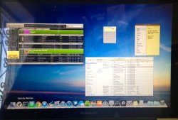
I can see both working together nicely if they'd just change some things:OP is totally right, there was NO point in combining spaces with expose,
Step 1: Get rid of this "full-screen-apps-need-a-dedicated-space" nonsense. It makes no sense why an app with no menu/title bar is so special it warrants its own corner of the universe. Let full screen apps mingle with other apps on the same space/desktop. FS Apps screw up dual monitors.
Step 2: If only using a single desktop, get rid of that redundant icon at the top. I'd rather use that wasted screen real estate for expose'.
I don't mind having both Spaces AND expose on one screen with just a swipe. Couldn't do that with Snow Leopard.
Mountain Line now lets you "unstack" all windows now as an option. i.e., the old Expose' in SL is back.Stacking windows from the same app together? You surely have lost the plot Apple. I don't understand how such a stupid flaw can come into fruition.
----------
Look at the top of MC when you have no other spaces defined. There's a useless and silly-assed "space" right there showing you a miniature thumbnail of what you're already looking at below.No one used Spaces but Geeks.
Welcome to Geekdom.


