Become a MacRumors Supporter for $50/year with no ads, ability to filter front page stories, and private forums.
They have introduced new bugs in this version.
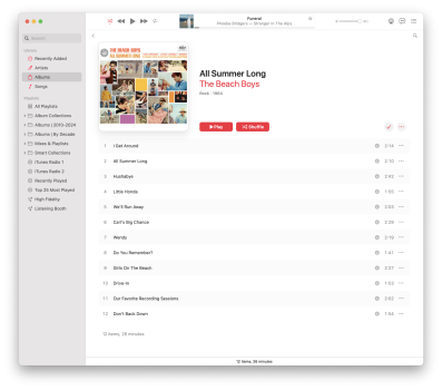
I edit metadata for an album in the recently added window (edit: not limited to recently added)
If you select the first track using Get Info, edit it and move on to the next, you might be at some other track or even a track in a different album

I've had that same issue in the last few weeks, sometimes it acts like it did before, other times it seems to go alphabetically. Of course, when I go back to try and update some tags this bug appears, at least I figured it out ahead of time although it was more time consuming. I notice that scrolling seems to be better during the UI but yeah fix one thing break another it seems.
 
Please add the fact that they've removed the automatic creation of a tiled artwork for each playlist based on its contents and replaced it with a disgusting 1990s gradient square.

Screenshot 2024-10-09 at 2.44.52 pm.png
Screenshot 2024-10-09 at 2.48.12 pm.png


Playlists used to create a 2x2 grid of the album art from tracks in the playlist, and now that's not the case. You can choose your own file, or pick from a list of gross MS Word 97 gradients.

As someone with an extensive library, who relies on Playlists heavily, this is a hideous change.
 
Ever since the move from iTunes to Music I have just assumed they have had no-one working on it.
It just seems to limp along with a ton of bugs that they don't fix.

It is incredibly depressing to find out that they HAVE been working on it but have just made things worse.
 
Occasionally, after playing for a long time, Music loses sound. Silence. The song continues to play, but there is no sound.
 
  • Like
Reactions: ufukty
New feature? New Bug is probably more like it.

I routinely have a Spreadsheet (or two) open on the Right Side. Left Side is a Text File. I switch back and forth when one of them isn't Temporarily minimized to access a different Text or Spreadsheet file. In the background there is/are browsers with five and more Tabs ready for access. (One has an even dozen Tabs). Nice way to track UPS/USPS/FedEx-whatever packages.
Then without warning whatever I'm switching to opens up to Full Screen. Hey, except for things like videos I have to watch (Zoom meets, etc.) I NEVER have something filling The Entire Screen. Top half This Spreadsheet, Bottom half That Spreadsheet. What goes into Bottom needs to be copied into Top spreadsheet. I Do Not Want Either Spreadsheet Filling The Entire Screen.
Tracking UPS code and I'm about to enter a new set of numbers. I'm about to copy a Long set of Alphanumeric characters and the browser page suddenly fills the screen. Chances are I haven't copied the numbers yet. ☠️

How do I disable that new "Feature"?? No More Full Screen Unless I Activate It.
 
Ever since the move from iTunes to Music I have just assumed they have had no-one working on it.
It just seems to limp along with a ton of bugs that they don't fix.

It is incredibly depressing to find out that they HAVE been working on it but have just made things worse.
Unless I have to listen to something important or I'm busy away from my Desk, I am Continuously listening to music. I have over 11,500 pieces of music in either my Mac mini or my iPad. That's nearly a solid month of uninterrupted music.
Last year when I transferred music from my Mac mini to my iPad I found that they went In Synch. 😐😐😐😐. I Don't WANT them Synched; I got literally thousands of duplicates on the iPad. A year later I am still finding Duplicates.

There are pieces of music that sound very well at home on the Speakers, but their softness is Not Good on iPad. I have hundreds more songs that are ready to be sent to my iPad. But I will NOT Synch them with my Mini.
 
Please add the fact that they've removed the automatic creation of a tiled artwork for each playlist based on its contents and replaced it with a disgusting 1990s gradient square.

View attachment 2435162View attachment 2435163

Playlists used to create a 2x2 grid of the album art from tracks in the playlist, and now that's not the case. You can choose your own file, or pick from a list of gross MS Word 97 gradients.

As someone with an extensive library, who relies on Playlists heavily, this is a hideous change.
Download the app Denim. Creates beautiful playlist images.
 
Music does not support spreadsheets or text files my dude.
I'm talking about nearly Everything opening to Full Page without me telling it to.
OOPS! 😊 Should have gone to a different Topic. Sorry.

Please re-read the Previous post of mine where my iPad got Synched with my Mini and literally thousands of duplicate music files added to the iPad.
 
The covers sync back to the Mac app of course.
Yeah I've no doubt about that, but any time you edit a playlist on iPhone and sync it back to your Mac, you just end up creating a new +1 playlist, duplicating it in the MacOS Music App. I would much rather Apple just reverse the stupid change.
 
  • Like
Reactions: Slix
I just upgraded to Sequoia yesterday on macOS - I'm not going crazy, album/playlist artwork is no longer square right? It looks awful.
 
I just upgraded to Sequoia yesterday on macOS - I'm not going crazy, album/playlist artwork is no longer square right? It looks awful.

Oh God, why did they do that?

In song view and when viewing a particular album or using the MiniPlayer, the artwork is square, as it should be.

But in the album view grid, they've cropped off the sides of the artwork to make it taller! What?!

See, look at The Beach Boys' All Summer Long on grid view vs. viewing the album. Notice the teeny bit of white border on the sides when it's square, as it should be.

The cropping to make artwork taller than it is wide is slight enough that many people may not even notice it, but now that I've seen it, I can't unsee it. I just don't understand why they would do this.

Hope it's just a bug that will be fixed in the next update.
 

Attachments

  • music2.png
    music2.png
    702.8 KB · Views: 79
  • music1.png
    music1.png
    2.6 MB · Views: 84
Last edited:
Oh God, why did they do that?

In song view and when viewing a particular album or using the MiniPlayer, the artwork is square, as it should be.

But in the album view grid, they've cropped off the sides of the artwork to make it taller! What?!

See, look at The Beach Boys' All Summer Long on grid view vs. viewing the album. Notice the teeny bit of white border on the sides when it's square, as it should be.

The cropping to make artwork taller than it is wide is slight enough that many people may not even notice it, but now that I've seen it, I can't unsee it. I just don't understand why they would do this.

Hope it's just a bug that will be fixed in the next update.
Well, I submitted feedback to Apple for whatever good that may or may not do.
 
Are there people who want an alternative to the stock app for non-streaming purposes?

Because the stock music app is going in a particular direction that I’m not a fan of, since iTunes 11, and because Retroactive doesn’t work all that great, and because there are seemingly few alternatives - I’m writing the app that I wish they would make, in the vein of iTunes 10. It ties into the local music library, and so my phone still syncs with it, but it still has the ability to edit metadata for local files. I’ve made it just for me, but if I’m not the only one who just wants iTunes back, then I might release it at some point.
 
Since Sequoia, music video icon is missing on Albums view:

screenshot_1.png


But visible under Artists view:

screenshot_2.png


Edit: Fixed with Sequoia 15.2.
 
Last edited:
Since upgrading to Sequoia, I can no longer use my return key on my keyboard to start playing a selected song in Apple Music when in "View as Playlist" mode. The return key still works in "View as Songs" mode, so I assume it is a bug.

Does anybody else have this issue?

1731907224910.png
 
  • Wow
  • Haha
Reactions: tomtad and gank41
Are there people who want an alternative to the stock app for non-streaming purposes?

Because the stock music app is going in a particular direction that I’m not a fan of, since iTunes 11, and because Retroactive doesn’t work all that great, and because there are seemingly few alternatives - I’m writing the app that I wish they would make, in the vein of iTunes 10. It ties into the local music library, and so my phone still syncs with it, but it still has the ability to edit metadata for local files. I’ve made it just for me, but if I’m not the only one who just wants iTunes back, then I might release it at some point.
I'm one of those people and I would be very glad to try your app. I'm now using Swinsian beta 3 version 18 which is good as gold and I recommend it with all my heart to anyone who has issues with Apple's horrible music app.
So please let me know what I need to do to get your app.
 
Please add the fact that they've removed the automatic creation of a tiled artwork for each playlist based on its contents and replaced it with a disgusting 1990s gradient square.

View attachment 2435162View attachment 2435163

Playlists used to create a 2x2 grid of the album art from tracks in the playlist, and now that's not the case. You can choose your own file, or pick from a list of gross MS Word 97 gradients.

As someone with an extensive library, who relies on Playlists heavily, this is a hideous change.
I tried adding a custom image from my Mac and it doesn’t even show up in the playlist view of the music app so that whole cover art portion of the app and playlist view which would automatically generate in prior MacOS’s is completely broken in Seqoia it seems
 
Last edited:
For those wanting to leave Apple Music and to something that is more just about playing your own music, I would suggest running Plex with your own music and using Plexamp as a music player.
 
It's a gross mobile app running on desktop that doesn't even have AirPlay support. What am I missing here?

View attachment 2460211

I’m pretty sure Plexamp on macOS supports AirPlay. It does on every other device. It even works with speaker systems casting. You can handoff what you’re listening to to other Plexamp players or control them from your phone. A feature people have been wishing for on Apple Music for years. While I agree the program is not the prettiest thing, it was made like that on purpose. It’s supposed to be a lightweight and fast player for your music, not a giant bloated music player and music management program. They will be redesigning the UI soon. They just redesigned the main Plex app.
 
Since 99% of my songs in Music for the Mac are ones I ripped with dBpoweramp Music Converter, I have no problem switching to another music player, except I don't know how another music app would handle my Playlists of which I probably have 100+. Redoing those by hand would be a nightmare.
 
Register on MacRumors! This sidebar will go away, and you'll see fewer ads.