The current dock on Mavericks is fine. The new transparent dock is a step backwards and reminds me of the early Aqua days.
Got a tip for us?
Let us know
Become a MacRumors Supporter for $50/year with no ads, ability to filter front page stories, and private forums.
New dock is a step backwards!
- Thread starter MattMJB0188
- Start date
- Sort by reaction score
You are using an out of date browser. It may not display this or other websites correctly.
You should upgrade or use an alternative browser.
You should upgrade or use an alternative browser.
You'll get over it. I personally welcome the new design. It's a good harmony between iOS and OS X. But my main excitement stems from the new feature set (Continuity!)
The current dock on Mavericks is fine. The new transparent dock is a step backwards and reminds me of the early Aqua days.
100% disagree. Once 10.5's 3-D Dock came, I hated it - it was all visual eye-candy that demanded unnecessary resources to render the 'mirror-like' reflections.
I'm glad Apple went back to more minimalism but still keep a nice touch on design.
I guess it's down to individual opinion. I think the new UI is GORGEOUS! I can't wait to get involved with the public beta! Hopefully they'll announce a date as to when that will begin. All they said in the keynote was "throughout the summer." We're in June, isn't June a summer month?
100% disagree. Once 10.5's 3-D Dock came, I hated it - it was all visual eye-candy that demanded unnecessary resources to render the 'mirror-like' reflections.
I'm glad Apple went back to more minimalism but still keep a nice touch on design.
Why not give the user the choice to change docks? Oh wait...
Why not give the user the choice to change docks? Oh wait...
Not sure why you quoted me - I never said anything about not giving options. I'm all for 'options' but with the whole scheme of 'flat UI', it would be a bizarre option to make the Dock 3-D. They at least gave us a light/dark option.
Same, but I'm sure it will grow with the more apps you place in the dock and the dark theme is a welcome change, at least we have the option now.I like it. I just wish they went all the way and made the icons flat.
I just don't have a ton of apps in my dock so it will just be this little rectangle at the bottom center of my screen.
I'm going in.. wish me luck.
Attachments
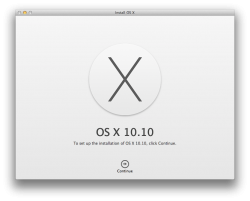
Take a picture of the installer when it's installing! Me curious.
Same, but I'm sure it will grow with the more apps you place in the dock and the dark theme is a welcome change, at least we have the option now.
I just don't have a ton of apps in my dock so it will just be this little rectangle at the bottom center of my screen.
I'm going in.. wish me luck.
In my opinion having no backdrop for the dock is the best looking most useful thing you can do. Hopefully the 3rd party software for 10.10 will be ready when it launches
Take a picture of the installer when it's installing! Me curious.
I am, currently looks very similar to Mavs with different fonts.
Installing as upgrade on the '13 MBA 1st, test, then a clean install, test, then '13 iMac and '12 Mini with Server....later on of course. After everything has been backed up ...twice.
")
4 mins remaining
Totally ! Except for that .. It's awesome!!!! I mean come on! The icons are good.. The old trash can was better, Craig said they used a lot if time designing it, we'll not worth ... Did any one notice if the magnifying feature is still there. ???? I didn't see it... The old dock is the heart of Mac.. It's one thing it was famous for!!! It's bad!!! Even though it's translucent and all! But bad...
Attachments
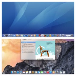
Totally ! Except for that .. It's awesome!!!! I mean come on! The icons are good.. The old trash can was better, Craig said they used a lot if time designing it, we'll not worth ... Did any one notice if the magnifying feature is still there. ???? I didn't see it... The old dock is the heart of Mac.. It's one thing it was famous for!!! It's bad!!! Even though it's translucent and all! But bad...
I dont like the new 10x bigger spotlight search bs... Everything in 10.10 is like in ios7, takes up so much space in every direction
I'm curious as to see how it works with magnification as you move your cursor over the dock icons. If Yosemite will still carry that feature that is...
I'm curious as to see how it works with magnification as you move your cursor over the dock icons. If Yosemite will still carry that feature that is...
Does
----------
You can also disable transparency if that is a deal breaker for some.
Still trying to find the "developer" black mode.
Does
----------
You can also disable transparency if that is a deal breaker for some.
Still trying to find the "developer" black mode.
Is it possible to remove the **** behind the icons?
Register on MacRumors! This sidebar will go away, and you'll see fewer ads.