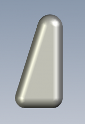
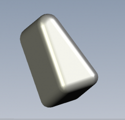
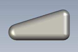
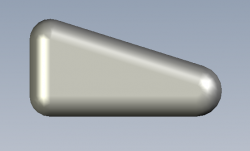
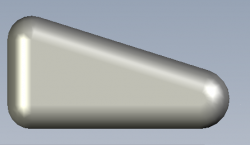
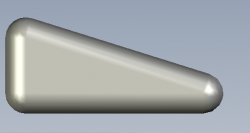
I posted my old design here but I updated it into something much better that I'd like to share with the MacRumors community. By the way--thanks for your feedback. I admit that my old version did look pretty ugly and I made it look at least somewhat better with these following pictures--thank you guys for giving me your honest perspectives. 
I added the same poll to this thread that I put on the other one so that I can see if the MacRumors community thinks that this design is an improvement from what I posted before in the other thread.
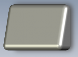
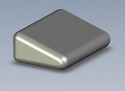
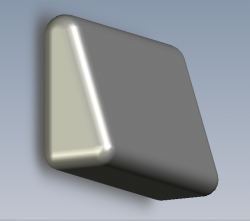
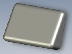
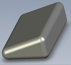
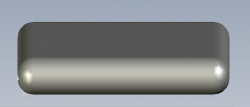
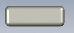
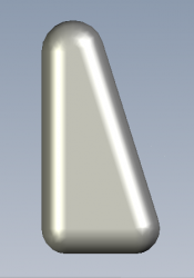
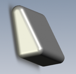
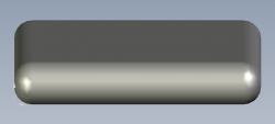
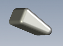
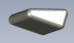
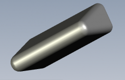
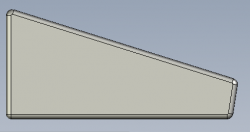
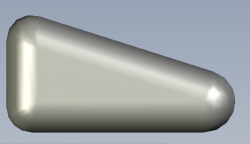
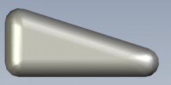
To save on the loading speed I am only using thumbnails. The order of the images is as follows:
1. Upright Position (Option 1) - Table Top View
2. Easy Touch Position (Option 2) - Isometric View:
3. Upright Position - Isometric View (Front 1):
4. Upright Position - Isometric View (Front 2):
5. Easy Touch Position - Isometric (Back):
Feel free once again to give me honest feedback.


