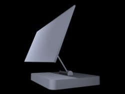
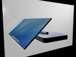
Thanks. I like the supportiveness of MacRumors. Some people are willing to bluntly tell me the truth and others are encouraging me to do better--a perfect combination for improvement.Btw, I admire you for having a go at least, but I really think your ideas lack detail. Good luck with it anyway!
Got a tip for us?
Let us know
Become a MacRumors Supporter for $50/year with no ads, ability to filter front page stories, and private forums.
New iMac Multi-Touch Design Speculation (Pictures Included)
- Thread starter GodBless
- Start date
- Sort by reaction score
You are using an out of date browser. It may not display this or other websites correctly.
You should upgrade or use an alternative browser.
You should upgrade or use an alternative browser.
Edit: The only thing is that my design allows the iMac to have standard sized parts that can be easily updated and replaced. This is something that the iMac needs but is lacking.
So it definitely ins't going to happen.
What I like about your wegde concept is that it allows for the two angles, what I dislike is that it ONLY allows for two angles. I spend enough time adjusting the angle on my iMac to know that the ability to adjust it is good.
I agree with Erasmus that a flat design like the iMac or iPhone with leg(s) is far more likely to give the same function, though I'd imagine a single leg with ratcheting positions and maybe a brace that would allow for a multitude of angles both upright and what you call the multi-touch position.
B
It's still ugly. 
Very ugly.
Horrendous and Hideous.
So, ugliness aside, it has no flexibility. The screen can't tilt, it's stationary. It takes up too much estate on a desk.
To be honest, the design is quite average. It's something Gateway or Dell or Compaq would have thought up. Not innovative, you are taking a wedge and giving it different sizes...there's absolutely nothing special about it.
And I agree with another who said it looked like a pillow. You just added another functionality with your revision - pillow. So now you have door stopper, foot rest, pillow, and cheese wedge for home decor. And maybe a computer, just barely.
People are being harsh not just to get a kick out of it...have you ever thought of that? Maybe it IS crappy.
At least that one's got a screen. What OS is that, btw?
Its 10.5 of course, you'll need it to support all the fancy touch screen features no doubt.
At least that one's got a screen. What OS is that, btw? Is it Leopard?
The thing near the middle of the screen looks like it's one of Leopard's top-secret features. Shall we speculate?
Oh man, I'm glad I didn't miss this thread. When I first started reading, i thought the OP was serious!
Very nice.
Very nice.
because he kind of had to. He uses big fixed desk thingies because his displays are that big, relying on projection. The Apple stuff uses a whole different technology, they won't have a need for that bulk.Jeff Han used an angled touch screen
This is the single greatest thing I have ever seen on the internet.
This is the single greatest thing I have ever seen on the internet.
Then you clearly haven't seen Nickdance...
I have been trying to learn some basic 3D modeling skills, and here is a little something I started, no materials or textures on it but you'll get the point I think. I made a little movie of it in action but can't post the mov.
Attachments
Nice, but really a square-ish version of the beautiful iLamp...The iMac G4 would IMO be a great design to have as a touch screen...I have been trying to learn some basic 3D modeling skills, and here is a little something I started, no materials or textures on it but you'll get the point I think. I made a little movie of it in action but can't post the mov.
How else would Apple design the best multi-touch computer unless the screen was at a comfortable angle like I have shown with my design? Jeff Han used an angled touch screen which can be seen in this video.
The problem is that the screen would not be adjustable. That's why I can't see Apple designing it that way.
I have been trying to learn some basic 3D modeling skills, and here is a little something I started, no materials or textures on it but you'll get the point I think. I made a little movie of it in action but can't post the mov.
I'm sorry, but I don't like the lamp. It looks flimsy. I don't think Apple will go back to screen + box.
I do like the new iMac designs.
And all this talk about religion is way off topic, as are the comments about rectum probing. They are also somewhat in bad taste.
I'm sticking with my flat, chinless multitouchscreen Mac (probably not an iMac, I think they would change the name), in black like the iPhone, just like with a 50" screen.
You're right, it is a total ripoff of the g4. I have about 1 week experience in modeling so I really can't portray the look I envision, I'd leave that to Ives.Nice, but really a square-ish version of the beautiful iLamp...The iMac G4 would IMO be a great design to have as a touch screen...
I guess this is just what makes sense to me, house as much as possible in the base to make the screen as light and easy to position as possible.
No progess - STILL nothing like apple
There is no progress whatsoever with this product. It's still a piece of scrap metal to me (which is worth a lot these days =D). I have made a harsh comment with your last design and I'm going to do it yet again. I don't find the angle of the product is a problem, I find the design the problem.
1) First, hey you added the curves. High five for that. But no you did the wrong kind of curves. Apple has curves and sharp angles. EVERY APPLE PRODUCT HAS THIS. In my last post, I didn't post any pictures to give you any examples. Well, here it is to explain myself:

Notice the red circles. The curve on one side while a white edge without a curve in the same corners.
2) Where's iSight? I might see where you will put, the top of the monitor slant area I guess? But I can't see users finding that good. They must always lean their necks to get their faces into a camera. And I can't see apple using a external iSight, although I actually liked the external one... =( Apple is beginning to develop all in one products, please keep that in mind.
3) As I said before, apple is innovative but they do a lot of research before they launch a product. Apple has developed their touch screen product, the iPhone with research of over eight years. In response to your iPod defense, Apple didn't do a lot of research before entering the music market. But until when did the iPod revolution came. Sales only started to improve in 2005 Q1. And from their starting research in 2001, improving the iPod ever since, that's a total of 4 years. See what I mean by research. There has to be a lot of demand for Apple to release a product.
Go back to the drawing board and add more to this. I'm seeing it slowly improving. Make it more of an Apple product. If you make the style of the product more like an angled Monitor, I'm sure you will have better comments. But for now, this one, although I see what you are trying to get to, I don't see it any better than a piece of scrap metal on a desk.
These designs prove you aren't an employee of Apple design group. I just remembered you can do this stuff simply on AutoCad.
There is no progress whatsoever with this product. It's still a piece of scrap metal to me (which is worth a lot these days =D). I have made a harsh comment with your last design and I'm going to do it yet again. I don't find the angle of the product is a problem, I find the design the problem.
1) First, hey you added the curves. High five for that. But no you did the wrong kind of curves. Apple has curves and sharp angles. EVERY APPLE PRODUCT HAS THIS. In my last post, I didn't post any pictures to give you any examples. Well, here it is to explain myself:

Notice the red circles. The curve on one side while a white edge without a curve in the same corners.
2) Where's iSight? I might see where you will put, the top of the monitor slant area I guess? But I can't see users finding that good. They must always lean their necks to get their faces into a camera. And I can't see apple using a external iSight, although I actually liked the external one... =( Apple is beginning to develop all in one products, please keep that in mind.
3) As I said before, apple is innovative but they do a lot of research before they launch a product. Apple has developed their touch screen product, the iPhone with research of over eight years. In response to your iPod defense, Apple didn't do a lot of research before entering the music market. But until when did the iPod revolution came. Sales only started to improve in 2005 Q1. And from their starting research in 2001, improving the iPod ever since, that's a total of 4 years. See what I mean by research. There has to be a lot of demand for Apple to release a product.
Go back to the drawing board and add more to this. I'm seeing it slowly improving. Make it more of an Apple product. If you make the style of the product more like an angled Monitor, I'm sure you will have better comments. But for now, this one, although I see what you are trying to get to, I don't see it any better than a piece of scrap metal on a desk.
These designs prove you aren't an employee of Apple design group. I just remembered you can do this stuff simply on AutoCad.
FWIW, after reading your comment I looked at my 22 inch Apple Cinema Display looking for the curves and sharp angles and discovered that it has no exposed sharp angles on the display itself. The stand does, but the display does not.1) First, hey you added the curves. High five for that. But no you did the wrong kind of curves. Apple has curves and sharp angles. EVERY APPLE PRODUCT HAS THIS. In my last post, I didn't post any pictures to give you any examples. Well, here it is to explain myself:

Notice the red circles. The curve on one side while a white edge without a curve in the same corners.
I wonder if this change was deliberate from when they went from the G4 PowerMacs to the G5 PowerMacs?
How else would Apple design the best multi-touch computer unless the screen was at a comfortable angle like I have shown with my design? Jeff Han used an angled touch screen which can be seen in this video.
Who the hell ever said that Apple was going to make a touchscreen/multitouch iMac? It is completely Illogical — first of all, the iMac is a consumer desktop, there is no need to be able to touch the screen. Second of all, it is a desktop, not a device that you will put in your lap for taking notes or using like a tablet (it also has a power cable!) I could maybe see a Cinema Display with multitouch for Photoshop users and artists who use the pen tool a lot and draw or paint using a tablet - but not the average customer.
This is also very ugly!
-Brad
Register on MacRumors! This sidebar will go away, and you'll see fewer ads.


