Honestly don't mind the look of it. I'm digging the soft-touch back, and (what appears to be) aluminum sides. I really hope they surprise us with a bigger battery than the 2300mah that's in the rumors, otherwise I'm holding off on it and sticking with the S4
Got a tip for us?
Let us know
Become a MacRumors Supporter for $50/year with no ads, ability to filter front page stories, and private forums.
Nexus 5
- Thread starter Explicitic
- Start date
- Sort by reaction score
You are using an out of date browser. It may not display this or other websites correctly.
You should upgrade or use an alternative browser.
You should upgrade or use an alternative browser.
Honestly don't mind the look of it. I'm digging the soft-touch back, and (what appears to be) aluminum sides. I really hope they surprise us with a bigger battery than the 2300mah that's in the rumors, otherwise I'm holding off on it and sticking with the S4
the 2300mah is confirmed specs via FCC. i'd still get the nexus 5 over the s4 because it will have updated SoC, (modified snapdragon 800 processor), and you also get direct updates from google. fast timely updates compared to dealing with samsung.
rehosted. photo taken from weespeed.
really excited to get this in my hands soon. i think Nexus 5 announcement date is set for 10/14
Image
Well I personally very much like the style--seems very complementary to the Nexus 7 which I find very understated, with clean design that feels great in hand. Even the huge Nexus logo seems subtle unless the light hits the glossy finish inside the letters just right.
My only personal concern is I'll be getting more of exactly the same that already have with the Nexus 7--same design, similar performance and exact same features. It's nice to have my devices function in sync, but it's also a bit boring. Hmmm, decisions, decisions...
Updates aren't a problem for me. I can flash Google Edition Roms on my S4 so I'll always have the latest software. The updated SoC is nice, but I think I'll just wait until the new HTC or S5 come out because both will have better processors than the S800.the 2300mah is confirmed specs via FCC. i'd still get the nexus 5 over the s4 because it will have updated SoC, (modified snapdragon 800 processor), and you also get direct updates from google. fast timely updates compared to dealing with samsung.
Updates aren't a problem for me. I can flash Google Edition Roms on my S4 so I'll always have the latest software. The updated SoC is nice, but I think I'll just wait until the new HTC or S5 come out because both will have better processors than the S800.
I'm thinking an updated HTC One would be pretty enticing for some. I guess my loyalty resides mainly with Google and their ability to sell a phone at a reasonable price range for many. If the battery life for the N5 does become an issue most likely I will pick up a Note 3 on contract.
I'm thinking an updated HTC One would be pretty enticing for some. I guess my loyalty resides mainly with Google and their ability to sell a phone at a reasonable price range for many. If the battery life for the N5 does become an issue most likely I will pick up a Note 3 on contract.
Yea I don't blame you the Note 3 looks pretty sweet, just too big. I think I'm gonna go HTC for 2014, I'm getting tired of plastic and amoled.
Well I personally very much like the style--seems very complementary to the Nexus 7 which I find very understated, with clean design that feels great in hand. Even the huge Nexus logo seems subtle unless the light hits the glossy finish inside the letters just right.
My only personal concern is I'll be getting more of exactly the same that already have with the Nexus 7--same design, similar performance and exact same features. It's nice to have my devices function in sync, but it's also a bit boring. Hmmm, decisions, decisions...
This is why I haven't bought the Nexus 7. Once I have the Nexus 5 it seems like the 7 would be redundant -- especially since there aren't many tablet versions of apps.
This is why I haven't bought the Nexus 7. Once I have the Nexus 5 it seems like the 7 would be redundant -- especially since there aren't many tablet versions of apps.
Agreed, though I feel there are far more phones that meet my needs (or at least come close) vs. the dearth of good Android tablets, especially at the 7-8" mark. However, if I'm going to use iOS at all, it'll only in the form of an iPad Mini.
Oh, I want to many gadgets---far more than I need or could possibly make good use of. #firstworldproblems
Updates aren't a problem for me. I can flash Google Edition Roms on my S4 so I'll always have the latest software. The updated SoC is nice, but I think I'll just wait until the new HTC or S5 come out because both will have better processors than the S800.
Yeah but it's still an S 4. Ugh. Horrible.
Yea I don't blame you the Note 3 looks pretty sweet, just too big. I think I'm gonna go HTC for 2014, I'm getting tired of plastic and amoled.
Yep. I'm tired of plastic too. That's why I haven't even considered the LG G2, even if it's the next smartphone available now. I'm tired of the plastic of my SGS3.
I hope next year is the year where manufacturers step up and release their top smartphones with better materials.
It's all I envy of the iPhone 5. I want an SGS4 or so with the iPhone 5 materials. I know you guys will say the HTC One is that phone, but the terrible camera plus only 4.1 (when 4.2 had been released a couple of months before) on release made me forget about it.
Agreed, though I feel there are far more phones that meet my needs (or at least come close) vs. the dearth of good Android tablets, especially at the 7-8" mark. However, if I'm going to use iOS at all, it'll only in the form of an iPad Mini.
Oh, I want to many gadgets---far more than I need or could possibly make good use of. #firstworldproblems
Haha, I'm the same way! I often buy new devices before realizing I don't really have a use for it. Thankfully Best Buy has a good return policy.
I personally love the new back. It's looking like it'll be similar or same material as the Nexus 7, which is great. It feels good in the hand, gives you some grip, gives you a sense of durability, looks subtle, and feels/looks better than both glossy plastic and glass, IMO.
I'm all for this material. What is it exactly, anyway?
----------
Yeah, I really wish iOS brought more to the table. I'd love to go back to a Nexus 5 and iPad Mini Retina combo. Best of both worlds. I've always thought iOS was far more forgiving to use on a tablet because I just don't have to do as much on it -- it's mostly for media, browsing, some reading, and gaming. In those instances, I don't need the keyboard to be killer good. It's not like I'm drumming out long important emails.
Yet still, many frustrations switching between an Android device to an iOS device -- loss of back button, loss of dedicated menu button, loss of swiping for the few times you do need to type, loss of widgets, etc. It's like driving an automatic then going back to a manual car.
Oh well. It'll either be my HTC One and Nexus 7 combo for the foreseeable future, or a Nexus 5 and Nexus 7 combo. We'll see what happens with iOS 8...
I personally love the new back. It's looking like it'll be similar or same material as the Nexus 7, which is great. It feels good in the hand, gives you some grip, gives you a sense of durability, looks subtle, and feels/looks better than both glossy plastic and glass, IMO.
I'm all for this material. What is it exactly, anyway?
----------
Yeah, I really wish iOS brought more to the table. I'd love to go back to a Nexus 5 and iPad Mini Retina combo. Best of both worlds. I've always thought iOS was far more forgiving to use on a tablet because I just don't have to do as much on it -- it's mostly for media, browsing, some reading, and gaming. In those instances, I don't need the keyboard to be killer good. It's not like I'm drumming out long important emails.
Yet still, many frustrations switching between an Android device to an iOS device -- loss of back button, loss of dedicated menu button, loss of swiping for the few times you do need to type, loss of widgets, etc. It's like driving an automatic then going back to a manual car.
Oh well. It'll either be my HTC One and Nexus 7 combo for the foreseeable future, or a Nexus 5 and Nexus 7 combo. We'll see what happens with iOS 8...
IOS is never going to have a back or menu button, you would have a better chance of Apple releasing an android device. I don't see what the big deal of those buttons are anyway the back button is always on the top left.
IOS is never going to have a back or menu button, you would have a better chance of Apple releasing an android device. I don't see what the big deal of those buttons are anyway the back button is always on the top left.
top left is too far to the top and left
And iOS is moving away from top left as well in iOS7 (just swipe) in order to prepare for a larger screen iPhone IMO.
This is an EXCELLENT point.
IOS is never going to have a back or menu button, you would have a better chance of Apple releasing an android device. I don't see what the big deal of those buttons are anyway the back button is always on the top left.
Not true, unfortunately. Usually it's top left, but sometimes it's top right, or sometimes it's a center "cancel" button, and then in Safari it's lower left. I always felt like I had to actively "look" for it depending on the app and situation.
Sometimes the only way to go back is the upper right:

Other times, it's a cancel button bottom of the screen (you cannot tap elsewhere on the screen to get out of this):
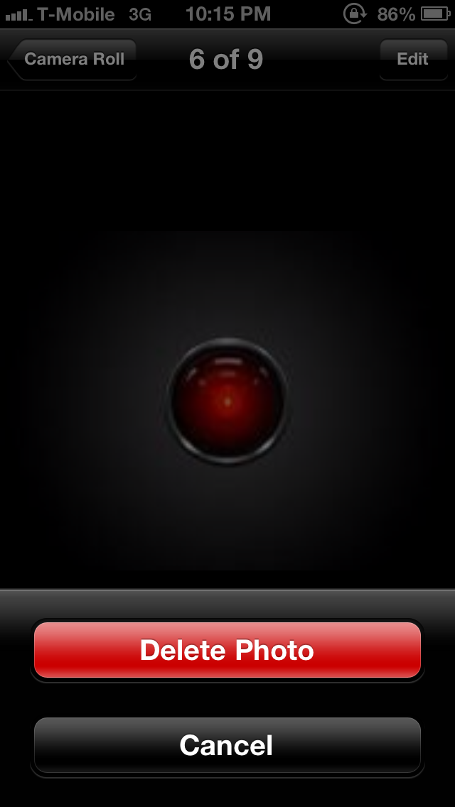
And in Safari, it's lower left to go back a page:
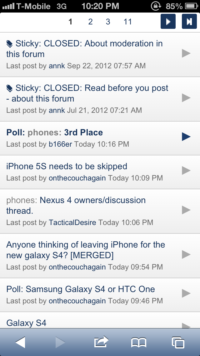
----------
And iOS is moving away from top left as well in iOS7 (just swipe) in order to prepare for a larger screen iPhone IMO.
I made a recent post hoping for this too in iOS 8 and the future larger iPhone. I think gestures are definitely the way to go.
What is it on an Android phone?Not true, unfortunately. Usually it's top left, but sometimes it's top right, or sometimes it's a center "cancel" button, and then in Safari it's lower left. I always felt like I had to actively "look" for it depending on the app and situation.
Sometimes the only way to go back is the upper right:
Other times, it's a cancel button bottom of the screen (you cannot tap elsewhere on the screen to get out of this):
And in Safari, it's lower left to go back a page:
What is it on an Android phone?
What is the method to go back you mean? The back button?
I see... thanks. Sorry, I'm not an Android user. Just curious about it since I'm tired of waiting for Apple to release a wider iPhone.What is the method to go back you mean? The back button?
Not true, unfortunately. Usually it's top left, but sometimes it's top right, or sometimes it's a center "cancel" button, and then in Safari it's lower left. I always felt like I had to actively "look" for it depending on the app and situation.
Sometimes the only way to go back is the upper right:

Other times, it's a cancel button bottom of the screen (you cannot tap elsewhere on the screen to get out of this):

And in Safari, it's lower left to go back a page:

----------
I made a recent post hoping for this too in iOS 8 and the future larger iPhone. I think gestures are definitely the way to go.
In all fairness those are all different operations. To bring down the keyboard, the close button is always in the top right. To cancel an operation like deleting a photo is always in the bottom center like that. And going back in Safari in terms of web pages is always in that corner. Sure, when you say it it seems more complicated. But it's really just a matter of what you are used to. iPhone users get used to it. And when I first got my Nexus 4, it took me a couple of days to get used to one back button.
And the back button isn't always consistent. If I am in tapatalk and hit the multitasking button and then hit messaging, it will take me back to the home screen. Wtf, that makes no sense. It should take me back to tapatalk. Other times doing this same thing will take me backwards inside of tapatalk even though I just entered the app. And of course there are other examples as well.
Ultimately neither one is perfect. It's just a matter of getting used to whichever platform you are on.
Last edited:
In all fairness those are all different operations. To bring down the keyboard, the close button is always in the top right. To cancel an operation like deleting a photo is always in the bottom center like that. And going back in Safari in terms of web pages is always in that corner. Sure, when you say it it seems more complicated. But it's really just a matter of what you are used to. iPhone users get used to it. And when I first got my Nexus 4, it took me a couple of days to get used to one back button.
And the back button isn't always consistent. If I am in tapatalk and hit the multitasking button and then hit messaging, it will take me back to the home screen. Wtf, that makes no sense. It should take me back to tapatalk. Other times doing this same thing will take me backwards inside of tapatalk even though I just entered the app. And of course there are other examples as well.
Ultimately neither one is perfect. It's just a matter of getting used to whichever platform you are on.
Don't disagree.
The back button is there for the developers to make consistent.
If I am in tapatalk and hit the multitasking button and then hit messaging, it will take me back to the home screen.
I actually don't understand this reference as I don't use tapatalk. Did you mean the "back" button and not the messaging button?
The problem is that if you leave it up to different people to make it consistent, it won't be just because it is left up to different people.Don't disagree.
The back button is there for the developers to make consistent.
Its not just tapatalk. Let's say I'm Chrome, hit the multitasking button, and then hit the messaging app. Once I get in the messaging app I immediately hit the back button. It *should* take me back to Chrome, but instead it takes me to the home screen. Other times it will take me back within the app. At no point will the back button actually take me back to where I was.I actually don't understand this reference as I don't use tapatalk. Did you mean the "back" button and not the messaging button?
Its not just tapatalk. Let's say I'm Chrome, hit the multitasking button, and then hit the messaging app. Once I get in the messaging app I immediately hit the back button. It *should* take me back to Chrome, but instead it takes me to the home screen. Other times it will take me back within the app. At no point will the back button actually take me back to where I was.
That's because you're supposed to use the multitasking button to get back to where you were. To use your example, you're in Chrome...you hit the multitasking button, then hit the messaging app. You do your thing in the messaging app...then, if you want to go back to Chrome, you simply tap the multitasking button and tap Chrome. Bam...you're back where you were.
I can't believe I'm saying this, but to paraphrase Steve Jobs...you're using it wrong. It's as simple as that. I get where some people are confused by why the back button works one way in some apps and another way in other apps, but in your example, you're simply doing it wrong.
The problem is that if you leave it up to different people to make it consistent, it won't be just because it is left up to different people.
Its not just tapatalk. Let's say I'm Chrome, hit the multitasking button, and then hit the messaging app. Once I get in the messaging app I immediately hit the back button. It *should* take me back to Chrome, but instead it takes me to the home screen. Other times it will take me back within the app. At no point will the back button actually take me back to where I was.
Disagree with that last bit. Hitting back from messages makes perfect sense to take you home and or back within the app. The back button is not an app switcher.
EDIT: I had to post a quick response earlier, but let me now elaborate...
It's a good thing the back button doesn't operate the way you want it to. That would be frustrating if it switches back to the previous app. Think about it: How would you go back within the app, then, if it did that? Say you're in Chrome, then use App Switcher to change to Messages, and say the last screen of Messages was a chat... how do you then go back to the contact list in Messages? If the Back button takes you back to Chrome, there's no way to go back unless there's an on-screen back button (ala iOS). That would, in many ways, defeat the purpose of the Back button and be downright frustrating.
An even better example? Reverse your scenario. Say you're in Messages, hit App Switcher to change to Chrome, should the back button now take you back to Messages? The answer should be a resounding, no. How else would you go "back" to the previous page in Chrome, then? Would you have to go forward in Chrome just to let the back button go back to being a back button? Would that point where you made the app switch always be a point of returning to the previous app, meaning you can't ever go back with the back button past that point? (Do you get what I'm asking?)
The Back button takes you back within the app you're in -- that's its purpose. It doesn't and arguably shouldn't take you back to the previous app you were in. That would cause way too much confusion. And as already said, that's what the App Switcher button itself is for.
There are some apps where if you hit Back enough times and there's nothing else within that app to go back to, it'll take you home. That, to me, makes sense too. You're basically "backing" or "exiting" the app since there's nothing left to go back to. In this case, too, it should still not switch you back to a previous app. Again, App Switcher is there to accomplish this.
----------
That's because you're supposed to use the multitasking button to get back to where you were. To use your example, you're in Chrome...you hit the multitasking button, then hit the messaging app. You do your thing in the messaging app...then, if you want to go back to Chrome, you simply tap the multitasking button and tap Chrome. Bam...you're back where you were.
I can't believe I'm saying this, but to paraphrase Steve Jobs...you're using it wrong. It's as simple as that. I get where some people are confused by why the back button works one way in some apps and another way in other apps, but in your example, you're simply doing it wrong.
Yes.
Last edited:
Register on MacRumors! This sidebar will go away, and you'll see fewer ads.

