Become a MacRumors Supporter for $50/year with no ads, ability to filter front page stories, and private forums.

Elit3

macrumors regular
Sep 17, 2012
177
0
if that truly is it, count me disappointed as it looks huge.

5.2"

----------

Honestly don't mind the look of it. I'm digging the soft-touch back, and (what appears to be) aluminum sides. I really hope they surprise us with a bigger battery than the 2300mah that's in the rumors, otherwise I'm holding off on it and sticking with the S4

I don't believe the rumours. The Moto X was said to have a 1600mAh, that has a 2100 mAh. Plus the Nexus 5 is an LG G2 sister phone, the G2 has a larger battery than 2300mAh.

Though the HTC ONE only has mAh, with the same specs, apart from the CPU.
 

theNEOone

macrumors 6502
Jun 28, 2007
250
0
NYC
5.2"

----------


I don't believe the rumours. The Moto X was said to have a 1600mAh, that has a 2100 mAh. Plus the Nexus 5 is an LG G2 sister phone, the G2 has a larger battery than 2300mAh.

Though the HTC ONE only has mAh, with the same specs, apart from the CPU.

I'm torn on this one. While I do feel that the battery in the G2 and N5 will be the same (just as the Optimus and N4 had the same battery size) it's hard not to believe the FCC filings.... I mean, they're pretty clear. If we're going to selectively believe that the battery specs are incorrect, then we might as well throw all the other specs out the window...

The G2 has a 5.2" screen, the N5 has a 5" screen. Smaller dimensions, smaller screen --> point to smaller battery. I think as much as we might want a bigger battery than 2300mah, it's probably not going to happen.


=|
 

Faux Carnival

macrumors 6502a
Aug 1, 2010
697
2
Not true, unfortunately. Usually it's top left, but sometimes it's top right, or sometimes it's a center "cancel" button, and then in Safari it's lower left. I always felt like I had to actively "look" for it depending on the app and situation.


Sometimes the only way to go back is the upper right:

srCknzg.png


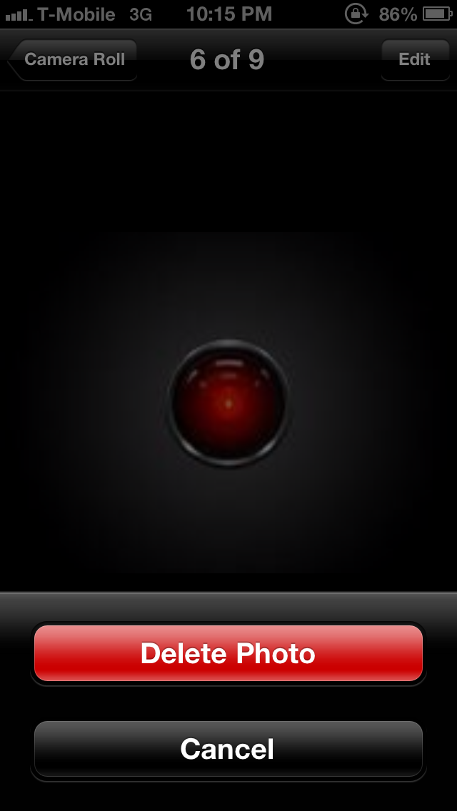
Other times, it's a cancel button bottom of the screen (you cannot tap elsewhere on the screen to get out of this):

uYbjJch.png


And in Safari, it's lower left to go back a page:

Cvm222I.png


----------


I made a recent post hoping for this too in iOS 8 and the future larger iPhone. I think gestures are definitely the way to go.
Wow. Good point actually. I have been an iPhone user since 2007 but I have to admit that although Apple makes excellent hardware, their software is still a mess and pretty limited.
 

strausd

macrumors 68030
Jul 11, 2008
2,998
1
Texas
That's because you're supposed to use the multitasking button to get back to where you were. To use your example, you're in Chrome...you hit the multitasking button, then hit the messaging app. You do your thing in the messaging app...then, if you want to go back to Chrome, you simply tap the multitasking button and tap Chrome. Bam...you're back where you were.

I can't believe I'm saying this, but to paraphrase Steve Jobs...you're using it wrong. It's as simple as that. I get where some people are confused by why the back button works one way in some apps and another way in other apps, but in your example, you're simply doing it wrong.


Disagree with that last bit. Hitting back from messages makes perfect sense to take you home and or back within the app. The back button is not an app switcher.

EDIT: I had to post a quick response earlier, but let me now elaborate...

It's a good thing the back button doesn't operate the way you want it to. That would be frustrating if it switches back to the previous app. Think about it: How would you go back within the app, then, if it did that? Say you're in Chrome, then use App Switcher to change to Messages, and say the last screen of Messages was a chat... how do you then go back to the contact list in Messages? If the Back button takes you back to Chrome, there's no way to go back unless there's an on-screen back button (ala iOS). That would, in many ways, defeat the purpose of the Back button and be downright frustrating.

An even better example? Reverse your scenario. Say you're in Messages, hit App Switcher to change to Chrome, should the back button now take you back to Messages? The answer should be a resounding, no. How else would you go "back" to the previous page in Chrome, then? Would you have to go forward in Chrome just to let the back button go back to being a back button? Would that point where you made the app switch always be a point of returning to the previous app, meaning you can't ever go back with the back button past that point? (Do you get what I'm asking?)

The Back button takes you back within the app you're in -- that's its purpose. It doesn't and arguably shouldn't take you back to the previous app you were in. That would cause way too much confusion. And as already said, that's what the App Switcher button itself is for.

There are some apps where if you hit Back enough times and there's nothing else within that app to go back to, it'll take you home. That, to me, makes sense too. You're basically "backing" or "exiting" the app since there's nothing left to go back to. In this case, too, it should still not switch you back to a previous app. Again, App Switcher is there to accomplish this.


----------


Yes.

You guys are missing the point. The biggest issue here isn't what it *should* do, it's that it is inconsistent. Sometimes it takes me home, sometimes it takes me back within the app. It should only do one of those every time. Not randomly switch between them.

And really taking me back to my previous app makes more sense than going home, which is what it does most of the time. It rarely goes back within the app like couch mentioned. If I go from one app directly to the other app and hit back, why the heck should it take me to the home screen where I never even was? I never used the home screen to go to another app, so why take me to it? At no point does that make sense. What does make sense is it taking me back to where I was.

If I'm in Chrome and switch to messaging and *immediately* hit the BACK button, it should go to where I just was, which was the previous app. Going back within the app wasn't the last thing I did, so the back button did something I didn't just do, thus by definition not a back button. It would at that point only be an app-specific back button. But in reality it isn't that either.

If I am in messaging and hit a link that takes me to chrome and immediately hit the back button, it *actually* takes me back to where I was! Hey that's awesome, the back button actually does what it sounds like it does, takes you back to where you were. The problem is that this only happens with links and isn't 100% consistent and will sometimes take me back within the app.

Yes, it bothers me that the back button doesn't always do what it sounds like it will do. But ultimately the issue is its consistency. If it is consistent, it at least makes it easier to get used to it working the wrong way.
 

onthecouchagain

macrumors 604
Mar 29, 2011
7,382
2
You guys are missing the point. The biggest issue here isn't what it *should* do, it's that it is inconsistent. Sometimes it takes me home, sometimes it takes me back within the app. It should only do one of those every time. Not randomly switch between them.

And really taking me back to my previous app makes more sense than going home, which is what it does most of the time. It rarely goes back within the app like couch mentioned. If I go from one app directly to the other app and hit back, why the heck should it take me to the home screen where I never even was? I never used the home screen to go to another app, so why take me to it? At no point does that make sense. What does make sense is it taking me back to where I was.

If I'm in Chrome and switch to messaging and *immediately* hit the BACK button, it should go to where I just was, which was the previous app. Going back within the app wasn't the last thing I did, so the back button did something I didn't just do, thus by definition not a back button. It would at that point only be an app-specific back button. But in reality it isn't that either.

If I am in messaging and hit a link that takes me to chrome and immediately hit the back button, it *actually* takes me back to where I was! Hey that's awesome, the back button actually does what it sounds like it does, takes you back to where you were. The problem is that this only happens with links and isn't 100% consistent and will sometimes take me back within the app.

Yes, it bothers me that the back button doesn't always do what it sounds like it will do. But ultimately the issue is its consistency. If it is consistent, it at least makes it easier to get used to it working the wrong way.

Sure the back button can be more consistent in general. What it shouldn't do is switch between apps.

Again, why are you not using the app switcher? The button that actually does what you're asking (albeit requiring two steps as any app switcher does).

When I switch between apps, hitting the back button takes me back within the app. I ask again how would you go back within the app then after a switch in your scenario.

You're taking the back button too literally. And at the same time ignoring the button that would do what you want.

Sorry the back button doesn't work for you but thankfully its not the way you want it to be. It'd be frustrating and redundant.

EDIT:


If I am in messaging and hit a link that takes me to chrome and immediately hit the back button, it *actually* takes me back to where I was! Hey that's awesome, the back button actually does what it sounds like it does, takes you back to where you were. The problem is that this only happens with links and isn't 100% consistent and will sometimes take me back within the app.

And I want to address this specifically.

What you're describing is intentional. You are not actually switching to a different app in your example. Tapatalk is not alone in doing what you're describing. Hangouts (and I believe Whatsapp) does this also. This is by design.

You are launching the browser from said app (in your example, Tapatalk), so you're technically still reading the link via the original app. It's just using Chrome to do it.

The example you keep giving, however (going from Chrome, hitting the App Switcher, then going to Tapatalk) is different. Here, you've actually used the App Switcher to get to a different app. The back button should have no relation to the previous app that you switched away from anymore (again, that's why the app switcher button is there in the first place -- to switch apps. That's the button you'd use to switch back to Chrome if you so desire). Once you've made that conscious decision and action to switch apps (using the app switcher) it makes perfect sense for the OS to believe you want to be in the new app and want to be using the new app. Thus, the back button acts as a back button within the app or until it reaches the furthest "back" it can go within that app, in which case, it'll take you back to the home screen.

This makes perfect sense.

Whereas, if you click a link from Tapatalk or Hangouts, you're just visiting said link (because it's a link. That's what you do). The OS still considers you tied to the app from where the link came from. This, also, makes sense. Thusly, the back button in this case does precisely what it's supposed to do, take you back "within" that app (Tapatalk/Hangouts). Remember, you're still tied to the original app. The back button never acts as an app switcher. Technically, you haven't switched apps. You're just reading a link.

I hope that made sense. The back button is actually doing exactly what it's supposed to be doing in the examples you keep giving. Try it elsewhere; it's not only Tapatalk. It's not a coincidence this only happens with links. It's not like it's a conspiracy where once you hit a link, then the back button does what you're wishing it'll do. It's by design.
 
Last edited:

JH-

macrumors 6502
Feb 25, 2009
392
2
Sure the back button can be more consistent in general. What it shouldn't do is switch between apps.

Again, why are you not using the app switcher? The button that actually does what you're asking (albeit requiring two steps as any app switcher does).

When I switch between apps, hitting the back button takes me back within the app. I ask again how would you go back within the app then after a switch in your scenario.

You're taking the back button too literally. And at the same time ignoring the button that would do what you want.

Sorry the back button doesn't work for you but thankfully its not the way you want it to be. It'd be frustrating and redundant.

But couch I thought the point of android was choice? Isn't that what you're always saying? ;-)
 

onthecouchagain

macrumors 604
Mar 29, 2011
7,382
2
But couch I thought the point of android was choice? Isn't that what you're always saying? ;-)

Non sequitur.

But if he's suggesting a setting toggle where one can choose the action of the back button then sure. Why would I be against that? Except that's not what he's asking for. Not sure why that setting would be needed though since there is an app switcher button already.

Nice try, though.
 
Last edited:

JH-

macrumors 6502
Feb 25, 2009
392
2
Non sequitur.

But if he's suggesting a setting toggle where one can choose the action of the back button then sure. Why would I be against that? Except that's not what he's asking for. Not sure why that setting would be needed though since there is an app switcher button already.

Nice try, though.

Just messing around.
 

Vegastouch

macrumors 603
Jul 12, 2008
6,185
992
Las Vegas, NV
Not true, unfortunately. Usually it's top left, but sometimes it's top right, or sometimes it's a center "cancel" button, and then in Safari it's lower left. I always felt like I had to actively "look" for it depending on the app and situation.


Sometimes the only way to go back is the upper right:

srCknzg.png


Other times, it's a cancel button bottom of the screen (you cannot tap elsewhere on the screen to get out of this):

uYbjJch.png


And in Safari, it's lower left to go back a page:

Cvm222I.png

.


So true. It is all over the place on iOS. No dedicated back button and when i use iOS on the mini(which i really dont use it anymore) im always trying to go to that back button.
 
Last edited:

onthecouchagain

macrumors 604
Mar 29, 2011
7,382
2
Re. the questions about the Nexus 5 camera, hasn't it been all but established that it's going to be pretty kick ass?

http://www.gottabemobile.com/2013/09/13/nexus-5-3-key-details-emerge/

The new leak shows that it might be an 8MP camera, whereas the FCC filing (right?) said it would be 13MP.

I think that's what people are worried about.

We still don't know for sure what it's MP count will actually be.

----------

If I am in messaging and hit a link that takes me to chrome and immediately hit the back button, it *actually* takes me back to where I was! Hey that's awesome, the back button actually does what it sounds like it does, takes you back to where you were. The problem is that this only happens with links and isn't 100% consistent and will sometimes take me back within the app.

And I want to address this specifically.

What you're describing is intentional. You are not actually switching to a different app in your example. Tapatalk is not alone in doing what you're describing. Hangouts (and I believe Whatsapp) does this also. This is by design.

You are launching the browser from said app (in your example, Tapatalk), so you're technically still reading the link via the original app. It's just using Chrome to do it.

The example you keep giving, however (going from Chrome, hitting the App Switcher, then going to Tapatalk) is different. Here, you've actually used the App Switcher to get to a different app. The back button should have no relation to the previous app that you switched away from anymore (again, that's why the app switcher button is there in the first place -- to switch apps. That's the button you'd use to switch back to Chrome if you so desire). Once you've made that conscious decision and action to switch apps (using the app switcher) it makes perfect sense for the OS to believe you want to be in the new app and want to be using the new app. Thus, the back button acts as a back button within the app or until it reaches the furthest "back" it can go within that app, in which case, it'll take you back to the home screen.

This makes perfect sense.

Whereas, if you click a link from Tapatalk or Hangouts, you're just visiting said link (because it's a link. That's what you do). The OS still considers you tied to the app from where the link came from. This, also, makes sense. Thusly, the back button in this case does precisely what it's supposed to do, take you back "within" that app (Tapatalk/Hangouts). Remember, you're still tied to the original app. The back button never acts as an app switcher. Technically, you haven't switched apps. You're just reading a link.

I hope that made sense. The back button is actually doing exactly what it's supposed to be doing in the examples you keep giving. Try it elsewhere; it's not only Tapatalk. It's not a coincidence this only happens with links. It's not like it's a conspiracy where once you hit a link, then the back button does what you're wishing it'll do. It's by design.
 
Last edited:

strausd

macrumors 68030
Jul 11, 2008
2,998
1
Texas
What it shouldn't do is switch between apps.

Maybe you missed in my last post where I said in a specific case it does?

Again, why are you not using the app switcher? The button that actually does what you're asking (albeit requiring two steps as any app switcher does).

I do use the app switcher and I have said that multiple times. But after using the app switcher if I immediately want to go back, using the back button doesn't actually take me back. Seems illogical considering the name is literally called the "back" button.

You're taking the back button too literally. And at the same time ignoring the button that would do what you want.

I'm taking the back button at face value. If it does anything other than take someone back to where they were, then it is inconsistent. I'm not ignoring any button, you are just ignoring previously written words.

Sorry the back button doesn't work for you but thankfully its not the way you want it to be. It'd be frustrating and redundant.

Yet randomly inconsistent is better than predictable? I don't think so.
 

strausd

macrumors 68030
Jul 11, 2008
2,998
1
Texas
Back on topic, in terms of battery, I think the HTC One GPE edition will be a good comparison device. Only difference is the Nexus 5 has a larger screen area to light up, but it has a more energy efficient CPU.
 

onthecouchagain

macrumors 604
Mar 29, 2011
7,382
2
Maybe you missed in my last post where I said in a specific case it does?


I do use the app switcher and I have said that multiple times. But after using the app switcher if I immediately want to go back, using the back button doesn't actually take me back. Seems illogical considering the name is literally called the "back" button.


I'm taking the back button at face value. If it does anything other than take someone back to where they were, then it is inconsistent. I'm not ignoring any button, you are just ignoring previously written words.


Yet randomly inconsistent is better than predictable? I don't think so.

I'm sorry Straus, you're just expecting something that the Back button was never intended to do.

The back button is never an app switcher. It's always been a way to go back within the app. Notice on the home screen, if you click Back, it doesn't jump back to the previous app you were just in. It's not supposed to. Nothing happens on the home screen because there's no more "back" to go back to on the home screen.

It's always been like that. But if you do want to go back to an app, you can launch it again and/or use the app switcher -- that's what it's there for.

I don't know how else to make this point clearer. The back button, in all your examples, is doing precisely what it's supposed to be doing.

And unless I'm mistaken, you still haven't addressed this vital question:

How would you go back within the app, then, if it did that? Say you're in Chrome, then use App Switcher to change to Messages, and say the last screen of Messages was a chat... how do you then go back to the contact list in Messages? If the Back button takes you back to Chrome, there's no way to go back unless there's an on-screen back button (ala iOS). That would, in many ways, defeat the purpose of the Back button and be downright frustrating.

Reverse your scenario. Say you're in Messages, hit App Switcher to change to Chrome, should the back button now take you back to Messages? The answer should be a resounding, no. How else would you go "back" to the previous page in Chrome, then? Would you have to go forward in Chrome just to let the back button go back to being a back button? Would that point where you made the app switch always be a point of returning to the previous app, meaning you can't ever go back with the back button past that point? (Do you get what I'm asking?)


PS. Please read my earlier post. Due to the timing of my edit, you might have missed it. https://forums.macrumors.com/posts/18059187/
 

DeathChill

macrumors 68000
Jul 15, 2005
1,663
90
I'm sorry Straus, you're just expecting something that the Back button was never intended to do.

The back button is never an app switcher. It's always been a way to go back within the app. Notice on the home screen, if you click Back, it doesn't jump back to the previous app you were just in. It's not supposed to. Nothing happens on the home screen because there's no more "back" to go back to on the home screen.

It's always been like that. But if you do want to go back to an app, you can launch it again and/or use the app switcher -- that's what it's there for.

I don't know how else to make this point clearer. The back button, in all your examples, is doing precisely what it's supposed to be doing.
Google seems to disagree with you (from the Nexus 4 user manual) :

OivVbzz.png
 

onthecouchagain

macrumors 604
Mar 29, 2011
7,382
2
Google seems to disagree with you (from the Nexus 4 user manual) :

Image

I'm sorry, you're translating that wrong. That line "even if it's a different app" is in reference to links. That's why only links do that -- after you hit a link, it makes sense to be able to hit the Back button to go back to the app you were in from where the link originated from. That's what that line is referring to.

The back button is not an app switcher. Even Google's own apps don't do that. Try opening Gmail, then hitting App Switcher to say, the Play Store. Then try hitting Back. Where does it go? It takes you either to the previous screen in the Play Store or back to Home if there's nothing else to go 'back' to. It has to. Or else -- I asked Straus this important question, too -- how else can you go back after you've switched to the Play Store? You can't if the Back button suddenly takes you back to Gmail. You'd be stuck forever in whatever Play Store screen first came up, unless you exited the App entirely and then went back into it from Home. That makes zero sense to have to do.

Why would Google not follow it's own rule? YOu're interpreting it wrong. The Back button has never gone back to an app after using the App Switcher.

----------

Here:

The back button can perform any of the following actions:

-Go back to previous screen (activity)
-Dismiss a popup
-Terminate a long running process
-Close on-screen keyboard
-Go to previous page on browser
-Exit the running app when on the last activity
-Return to previous app when on the last activity and the app was launched through intent from another app

That last one is the example Straus keeps using about links. And what I described in this post: https://forums.macrumors.com/posts/18059187/
 

DeathChill

macrumors 68000
Jul 15, 2005
1,663
90
I'm sorry, you're translating that wrong. That line "even if it's a different app" is in reference to links. That's why only links do that -- after you hit a link, it makes sense to be able to hit the Back button to go back to the app you were in from where the link originated from. That's what that line is referring to.

The back button is not an app switcher. Even Google's own apps don't do that. Try opening Gmail, then hitting App Switcher to say, the Play Store. Then try hitting Back. Where does it go? It takes you either to the previous screen in the Play Store or back to Home if there's nothing else to go 'back' to. It has to. Or else -- I asked Straus this important question, too -- how else can you go back after you've switched to the Play Store? You can't if the Back button suddenly takes you back to Gmail. You'd be stuck forever in whatever Play Store screen first came up, unless you exited the App entirely and then went back into it from Home. That makes zero sense to have to do.

Why would Google not follow it's own rule? YOu're interpreting it wrong. The Back button has never gone back to an app after using the App Switcher.
That may be but their description is pretty awful.
 

onthecouchagain

macrumors 604
Mar 29, 2011
7,382
2
I also want to add that I agree the back button is sometimes inconsistent (like sometimes it'll take me back home even when I know there's more "back" to go in an app). It, however, should do none of the things Straus is asking for. There's already a button for that -- the Back button is not, and was never, an App Switcher. I don't know how else I can articulate that point further.

----------

That may be but their description is pretty
awful.

Sure, I guess. But here:

The back button can perform any of the following actions:

-Go back to previous screen (activity)
-Dismiss a popup
-Terminate a long running process
-Close on-screen keyboard
-Go to previous page on browser
-Exit the running app when on the last activity
-Return to previous app when on the last activity and the app was launched through intent from another app

That last one is the example Straus keeps using about links. And what I described in this post: https://forums.macrumors.com/showpost...&postcount=463
 

onthecouchagain

macrumors 604
Mar 29, 2011
7,382
2
If you really want to improve the Back button (and I've made this suggestion before), make the Back button more dynamic.

Imagine if you can hold the Back button to bring up a small "history" list of things you can go back to (including apps, too, if you so insist, Straus, though again, now it's behaving like an App Switcher and I foresee users complaining about redundancy). So imagine in Chrome, hitting Back once takes you to the previous page, and holding Back brings up a small history of recently visited pages (in descending order, of course). That would be neat.

Likewise, in a Messaging app, say you're messaging with multiple contacts, hitting back once will take you Back to contact list, as usual, but holding Back can bring up a "history" list of the recent convos (again, descending order of most recent) for you to jump directly to that chat within that app.

I'm sure there are more examples. Now that would be improving the Back button; by actually adding features to it. I made this suggestion a long time ago in a thread about wild new ideas for Android.
 

ReanimationN

macrumors 6502a
Sep 7, 2011
724
0
Australia
Not true, unfortunately. Usually it's top left, but sometimes it's top right, or sometimes it's a center "cancel" button, and then in Safari it's lower left. I always felt like I had to actively "look" for it depending on the app and situation.


Sometimes the only way to go back is the upper right:

srCknzg.png


Other times, it's a cancel button bottom of the screen (you cannot tap elsewhere on the screen to get out of this):

uYbjJch.png


And in Safari, it's lower left to go back a page:

Cvm222I.png


----------


I made a recent post hoping for this too in iOS 8 and the future larger iPhone. I think gestures are definitely the way to go.

The back button is in the top-left in effectively all situations, bar the completion/cancellation of a form, the pop-up prompts like in the photos app and in Safari.

It's pretty damn consistent, unlike the behaviour of the back button in Android. When I had the N7 last year, the differing behaviour of the back button used to confuse me. The Commonwealth Netbank app used to throw you straight back to the home screen, the gmail widget used to take you back to the inbox instead of back to the home screen, a news app I used would take you back to the last screen you were on in the app, then would switch you to the last app you were in if you pressed back again, other apps wouldn't do that and would take you home.

And since the button doesn't have a label on it, it feels like far more of a lottery than the buttons on iOS. Most buttons on iOS are labelled with their function, the back button on Android is always the back symbol, iOS feels far less cryptic with what you'll get when you push that button.
 

onthecouchagain

macrumors 604
Mar 29, 2011
7,382
2
The back button is in the top-left in effectively all situations, bar the completion/cancellation of a form, the pop-up prompts like in the photos app and in Safari.

It's pretty damn consistent, unlike the behaviour of the back button in Android. When I had the N7 last year, the differing behaviour of the back button used to confuse me. The Commonwealth Netbank app used to throw you straight back to the home screen, the gmail widget used to take you back to the inbox instead of back to the home screen, a news app I used would take you back to the last screen you were on in the app, then would switch you to the last app you were in if you pressed back again, other apps wouldn't do that and would take you home.

And since the button doesn't have a label on it, it feels like far more of a lottery than the buttons on iOS. Most buttons on iOS are labelled with their function, the back button on Android is always the back symbol, iOS feels far less cryptic with what you'll get when you push that button.

Fair enough. As I said before I'm all for making it more consistent. That's on the developers.

I still love having a dedicated back button than not. And this inconsistency is a little overblown. It works the same way in most apps most of the time. I honestly never even thought about it that much until it got brought up here.

I love that its always in the same place. It's a small detail but it's nice to have that muscle memory.
 

onthecouchagain

macrumors 604
Mar 29, 2011
7,382
2
The back button is in the top-left in effectively all situations, bar the completion/cancellation of a form, the pop-up prompts like in the photos app and in Safari.

It's pretty damn consistent, unlike the behaviour of the back button in Android. When I had the N7 last year, the differing behaviour of the back button used to confuse me. The Commonwealth Netbank app used to throw you straight back to the home screen, the gmail widget used to take you back to the inbox instead of back to the home screen, a news app I used would take you back to the last screen you were on in the app, then would switch you to the last app you were in if you pressed back again, other apps wouldn't do that and would take you home.

And since the button doesn't have a label on it, it feels like far more of a lottery than the buttons on iOS. Most buttons on iOS are labelled with their function, the back button on Android is always the back symbol, iOS feels far less cryptic with what you'll get when you push that button.

BTW when's the last time you posted about the inconsistencies of the settings options in iOS? How come sometimes it's in the app itself and other times it's in the os settings? How come sometimes it's in both places?

Serious question. I'm genuinely curious.
 

ReanimationN

macrumors 6502a
Sep 7, 2011
724
0
Australia
BTW when's the last time you posted about the inconsistencies of the settings options in iOS? How come sometimes it's in the app itself and other times it's in the os settings? How come sometimes it's in both places?

Serious question. I'm genuinely curious.

Yeah it's pretty silly, and can be quite annoying too. Thankfully the worst offender, Safari's private mode, has moved inside the app. Still though, it can be a mess at times.

I don't really see what that has to do with back buttons though. ;)
 
Register on MacRumors! This sidebar will go away, and you'll see fewer ads.