Become a MacRumors Supporter for $50/year with no ads, ability to filter front page stories, and private forums.
Status
The first post of this thread is a WikiPost and can be edited by anyone with the appropiate permissions. Your edits will be public.
iMessage in yosemite question.

I have been trying to get a answer to this every where and there seem to be no one that know. in maverick i could change the size and fonts for incoming and outgoing messages,.that was cool cause i could read what i was typing...now that i have upgraded to Yosemite in iMessage the fonts are so small i can barely read them...you can make the text larger but not by much..anyone have any idea how to change this...


mac mini
ipad air
iphone
 
not sure if its on here, but now that the maximize is gone, double tapping along any unoccupied space on the top bar of safari will maximize/ minimize it.

Option + fullscreen button will maximize.

Another irritating thing about Safari UI is that there actually isn't a lot of space along the top where you can grab the window and move it.
 
Option + fullscreen button will maximize.

Another irritating thing about Safari UI is that there actually isn't a lot of space along the top where you can grab the window and move it.
I have more than enough space beween the toolbar buttons and adress bar on both sides. :confused:
 
App Store icons have been updated today:

0_11b264_a6e457d7_orig
 
Last edited:
After using it for a week on a second partition next to Mavericks, yesterday I decided to install Yosemite as the primary system on my MBA mid-2011. Not that I ever had speed problems with any version of OS X (mainly due to the MBA's speedy SSD, I guess), but I still realized that Yosemite performed slightly better at any task than Mavericks. The only exception is the quicklook window when I'm going through some pictures in Finder, the opening animation is sort of choppy. But overall Yosemite runs fine on my 3 years old Air, and I guess it will only get better with the incremental updates. I love the UI, and besides the obvious things there are so many tiny thoughtful alterations they did to the system you might not realize at first look. :cool:
 
Yosemite upgrade flawless

The upgrade to OS X 10.10 was flawless for me. I backed up to Time Machine and did a Carbon Copy Clone, but they weren't needed. In the course of one evening I updated:
  1. Parallels to v10
  2. 1Password to v5
  3. Carbon Copy Cloner to Yosemite-friendly
  4. all three iWork apps on my Mac
  5. MS Office 2011 security upgrade to latest
  6. iPhone 5S to iOS8.1
  7. all three iWork apps on my iPhone
  8. OS X from 10.9 to 10.10 on my 2011 MBP 17" with a Crucial 512Gb SSD drive

I'm up and running today, at work, in a Windoze corporate offie using my Mac for everything like I usually do.
Kudos to the whole Apple team - this was SO painless.
 
Yosemite, sorry for the broad reference; I meant specifically as a Spotlight function.

-------

Also, paths in the info page for a file now use little triangles "▸" instead of a path like a computer directory (e.g. "Macintosh HD/Users", etc)

Do you know if you can change the triangles back to slashes? It makes copying my files' directories into R super annoying.
 
Looks like they reverted the icons back to normal. I saw the new icons in the App Store on my Mac yesterday, but it's now showing the previous set of icons. Is anyone else also noticing this?

Yes, you are right. I see the old icons now. "Back to normal"? I don't agree. The icons become blurred again.
 
Do you know if you can change the triangles back to slashes? …

If that part of Apple's design can be worked around, I doubt that the work will be easy. Maybe someone can produce something that's intended to patch a binary – something within Finder, maybe – but then, will the end result be treated as an unsigned app? And so on; I should not recommend modifying any Apple-installed part of /System

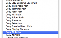
In the absence of the more useful interface I should suggest seeking third party software that will allow you to copy a path.

Re: the attached screenshot, from my Mac, as far as I recall: all the services are provided by or with one product, but I can't recall the name of the product.

Neither can I guess whether such things will work with Yosemite; I haven't touched it since pre-release. Sticking with Mavericks here.

Good luck
 

Attachments

  • services.png
    services.png
    40.4 KB · Views: 166
Quick power menu now works with ctr+power button.... on mavericks you had only to click power button for a while.... why they changed it again?
 
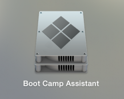
To anyone who needs a Boot Camp Assistant icon, check out my DeviantArt at atopsy.deviantart.com :D

I'm also trying to make icons for System Information, Grab & DVD Player to make Yosemite not feel inconsistent like it does right now. Hope Apple adds in the remaining design overhauls still needed.. :p

Here is a preview of it:
 

Attachments

  • Screen Shot 2014-10-26 at 18.03.47.png
    Screen Shot 2014-10-26 at 18.03.47.png
    77.7 KB · Views: 157
I agree. It's too obtrusive. Oftentimes when I want to drag something to an Open dialog, or want to refer to the numbers when doing a calculation, Spotlight blocks everything behind. I switched to Alfred and couldn't be happier now.

So that's a yes, it's still obnoxious.

When in a list view in Finder, does the Name column still take up the entire window, even after you've resized it? See: Column Widths
 
Re: the attached screenshot, from my Mac, as far as I recall: all the services are provided by or with one product, but I can't recall the name of the product.

Ooo, that looks handy. If the name of the product comes to mind, please post back here.
 
The biggest problem with Yosemite IMHO is that Apple has failed to recognize the difference between an OS used by an iPhone and that of a computer user.

The visible surface area of an iPhone is small. The applications typically eat up nearly 100% of the viewable area. The same is not true with a computer user.

IMHO the acceptance of iOS7 wasn't particularly good. One poster on here pointed out that a CNET did a user poll, NOT a CNET review, but a poll of "what do you think of iOS7" for end users, and it got a low score, like 1.5 out of 5, whereas iOS6 had a score on the order of 4.5 out of 5. Another posted the fact that iPad sales dropped after the release of iOS7. Is there correlation here? I don't know, but I think it would be worth looking into. Another posted that the "back off" rate for iOS7 (those that "un-did" the installation of iOS7 and went back to iOS6) was high, like 30%.

The trouble with an iPhone is that it's tied to a contract, and the contract and its costs may dictate how well it sells, not whether or not it's a great OS. High sales may not acknowledge acceptance of the OS, but rather the willingness of people to tolerate the OS because of low prices.

This, IMHO, is where Apple made its mistake. Where have you ever seen such rebuttal of an OS? Sure, I'm sure there were some, if not a lot, when MacOS transitioned to Aqua around 2000, but entire core of the OS was changing to a Unix based system, and let's be real - the company was going down the tubes.

It was OS X based Aqua and iOS using the, now apparently "idiotic" use of skeuomorphic designs of Jobs and company that pulled the company from a graveyard destination. This OS is not a major, system overhaul of the underpinnings, it's a supposed "facelift" along with some enhancements that could have been achieved with or without an interface change, and it's based on a change that suggests Apple failed, reasonably failed, to recognize was not an improvement.

I really have to wonder if this isn't Wall Street driven. It surely wouldn't be the first time they've taken a sound company and driven it into the ground with their bean counter based "reasoning."

Just my opinions.
 
Register on MacRumors! This sidebar will go away, and you'll see fewer ads.