Alrighty then... ready for criticism. Location is in Powell's Bookstore, Portland OR.
Model: NIKON D50
Exposure: 1/40 sec
Aperture: f/5.0
Focal Length: 18mm
fett: I guess I already critiqued your "valentines" photo in the daily pic thread, and I agree with the vertical crop idea if you want to make a card out of it... otherwise, I kind of like the whole thing as it is for a large print.
I like this photo because it is something that I can critique much further than I thought once I looked at it for a while. I give it a 2.5-3/5. The image attempts for symmetry but it's not quite there with the ladder and the off center angle. It's got some great color in the wood of the bookshelves, a tad bit on the yellow side but that's what you get with the mixed lighting and the wood.
The part that is the big let down is the guy on the end. I don't mean to be harsh, he just isn't interesting and the blown highlights are really making his boredom pop out.
- Lower angle, get on your knees.
- It's okay to move things if you aren't shooting journalistically so get that ladder out of the way next time
- Get closer to your subject, the guy I assume, and put more of those elements like his book bag, the papers, and his books into the scene to really give that "I am studying feel"
- Expose for the highlights. That guy may have to have been silhouetted and the bookshelves under exposed to get the guy as the center of focus. Then you could have gotten the shelves back in post which is perfectly fine both artistically and journalistically.
Good photo though, those are the images that you grow from and that show that the photog has an eye that is dying to be trained.
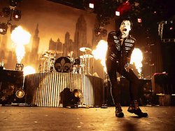
Concert photo taken w/
Nikon d80
Nikkor 50mm f/1.4D
f/1.4
Shutter: 1/20
ISO: 800
Concert photography is going to evoke more emotion that most others. People go to concerts to hear the music they love, and that music makes them feel a certain way, or gives them an idea, or feeling that another genre can't give. That's what has to be captured in concert photography. The image is good, but the first thing that someone may ask is, "What type of music is he singing?" and a lot of times photos of the concerts don't portray that or give mixed messages.
The best concert photography passes that on to the viewer almost immediately without hesitation.
Look at the attachment below. You can tell what genre this band is in even if you have never seen them or heard of them. The flames, the crazy face, and the lighting lead you right into what emotions or feelings people may get from the music, or what makes the band unique.
In defense of the photographer, most concerts don't have as much invested in lighting as mainstream or high end indie music, and some bands don't try their best to give that band culture/feel to the public.
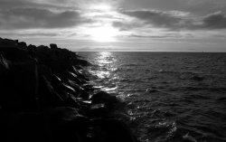
. I know that whenever I look at this photo, something never really seems to "click" like it does with some of my others. Hopefully a crop will help change this. As for the lighting, I think that I will try to bracket my exposures and merge them in photoshop (like you do) when I re-take this. The only difficulty will be the fact that the water around here is very dynamic, and could generate some serious 'ghosting' in a combined image. (Unless I manage to subtly mask in the lightened rocks while leaving the water at normal exposure...