Become a MacRumors Supporter for $50/year with no ads, ability to filter front page stories, and private forums.

pdxflint

macrumors 68020
Aug 25, 2006
2,407
14
Oregon coast
more feedback...

Critique please :D

Just a picture of some birds while backpacking through the Strathcona Provincial Park. Taken with a Sony Cybershot.

DSC01020.jpg

I liked this one a lot when I first saw it several months ago in a pic of the day thread. I love the symmetry of the two birds, how they definitely appear linked, maybe they're mates. I can almost see them twitching. Only thing better would have been if the lower bird wasn't cut off, but it's a sweet shot anyway. 3.75

here's one i took this summer one early morning in utah. it was an awesome experience. probably 30 hummingbirds going after this one feeder, diving in for a fleeting sip. i got in within a foot and they couldn't care less. their buzz was so loud it sounded like a car engine.

Nikon D50
RAW
ISO 200
55mm
f5.6
1/1000 sec

Amazing hummingbird shot. Since very few shots would rate a 5 in my book (like a 10 in olympic gymnastics... have to have room for perfection...;) ) I'll call it a 4.25. It came together well, and you were prepared to meet the opportunity.

Sorry I don't have anytime today to do an critique's but I'm going to put a landscape in. Interested to hear what everyone things.


I like this a lot. I can see it as a fine art selenium toned print. It looks like black/white film with a orange/red filter. Only criticism is I'd slightly (very, very slightly) bring up the shadow detail. Otherwise, nice composition, nice exposure, good sharpness and detail.
 

pdxflint

macrumors 68020
Aug 25, 2006
2,407
14
Oregon coast
Mazatlan, Mexico

Another one offered up for critique. I was on foot for a day in Mazatlan, Mexico, with only a tiny 35mm film fixed lens (35mm f/2.8) AF P/S (Konica Big Mini.) I didn't want to draw attention to myself, and this is a quiet little camera. The boats are small pangas, (fishing boats) which are launched off the beach near the old town. Most fishermen had come in for the day, as it was late.

fishingboats.jpg


Fuji Super G 400 film
no other exif
 

fett

macrumors 6502
Original poster
Nov 5, 2007
278
0
Calgary, AB
To be fair:

Nikon D2hs
f/2.8
ISO400
34 mm
1/160

Background: NABJ shootout contest. Theme: African American influence on Las Vegas.

Caption: (if you want to be a journalist, this is the most important part of your image, I learned the hard way while I was in school.) Phil Ellis is an air brush artist that originally hails from Tampa Bay Florida, but left a managerial position and moved to Las Vegas four months ago to open his own air brushing business. Ellis expresses his love for Las Vegas in his artwork and says that the cities nice friends, nice work, and nice customers keep him going throughout his workday. He also says that the driving force behind his business, titled Fresh Made Inc., is his strong faith in God and his self taught abilities.

DS: 4/5 - I like this photo and think it is a great example of photojournalism. I like that the lines created from the artwork and doorway all point to the artist. The light from his work lamp also work to further bring the focus to the artist as I find my eye is pulled towards the brighter parts of the image. With that I come to my only negative, I find that light coming in from the door also fights for my attention. I know with photojournalism you don't really get the chance to setup the shot but I think if this was taken later a night it would have been even better.

Another one offered up for critique. I was on foot for a day in Mazatlan, Mexico, with only a tiny 35mm film fixed lens (35mm f/2.8) AF P/S (Konica Big Mini.) I didn't want to draw attention to myself, and this is a quiet little camera. The boats are small pangas, (fishing boats) which are launched off the beach near the old town. Most fishermen had come in for the day, as it was late.

fishingboats.jpg


Fuji Super G 400 film
no other exif

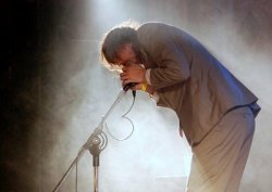
Pdxflint: I really like the crop you did on the concert shot.

3.5/5 - I'm having a hard time with this picture. At first glance it looks like it should be really interesting. It seems to me that something is off but I can't put my finger on it. I like the boats and the curve of the beach, maybe that's what it is, my eyes seem to follow the curve and it leads me out of the photo. Maybe a different position closer to the beach would've improve it or it could just be me. I would be interested in what others get from it.
 

Digital Skunk

macrumors G3
Dec 23, 2006
8,100
930
In my imagination
Thanks for the critique everyone. I do consider this one of my favorite pieces because it was a seat of your pants kind of shoot. Never been to Las Vegas and had to grab this shot from some neighborhood I had never been in.

Yes. It was part of a story so there are other images in the bunch that show him with his brush and shirts etc.

You hit it right on the nose PDXFLINT. The judges said the same exact thing. The image is pretty much useless without the caption, and even with the caption it didn't add much of anything to the story, so they scraped it and moved on. Of the other 4 images they liked about two of them, but they weren't enough to hold the story together.

I learned a very important lesson about photos stories during that comp. It's not the best images that make a good story, it's how good those images are and how they tell the story... how they flow together and through what is being conveyed.

Gotta love journalism!
 

fett

macrumors 6502
Original poster
Nov 5, 2007
278
0
Calgary, AB
How is everyone liking the thread so far? Personally I like it, I'm learning a lot.

I did this one for my photo a day project. I wanted to go with something that tells a story more than my usually photos.

HEADACHE.
 

OCBC

macrumors newbie
Dec 12, 2007
14
0
I find this photo very interesting. You have quite an eye for composition. I love the fact that even at 1/1000 of a second the birds wings are still blurry! They are so fast! You've got a nice eye... I like the way the other birds that are out of focus break up the big chunk of sky!! I give it a 5/5!!! YAY!!

Thank you so much qtpie, and everyone else who offered comments on my photo. This really was a case of being there at the right time. As someone who is fairly new to photography and thinking desperately in my final term of undergraduate what I might do to make a career out of it, your encouragement means alot.
 

OCBC

macrumors newbie
Dec 12, 2007
14
0
Another one offered up for critique. I was on foot for a day in Mazatlan, Mexico, with only a tiny 35mm film fixed lens (35mm f/2.8) AF P/S (Konica Big Mini.) I didn't want to draw attention to myself, and this is a quiet little camera. The boats are small pangas, (fishing boats) which are launched off the beach near the old town. Most fishermen had come in for the day, as it was late.

fishingboats.jpg


Fuji Super G 400 film
no other exif

pdxflint, I really like this shot. The lighting, colors, and contrast are all wonderful. The curve of the beach and wall is a really interesting and strong line, and the staggered arrangement of the boats leads the eye back in an interesting way. the only sticking point that I find with this photo is that my eye keeps drawing back to the brightly lit building near the center of the frame, (i'm assuming it's not your intended subject) mostly likely because the yellow of the building contrasts with the blue of the sky and the cooler cast on the boats and beach.

overall though, a very nice shot. 3.75/5
 

pdxflint

macrumors 68020
Aug 25, 2006
2,407
14
Oregon coast
I thought I'd add one of mine! I like looking at everyone's and seeing what people have to say, I'd appreciate feedback as well!! Thanks Guys!

2247132498_c56fcab601_b.jpg


Nikon D40
Shutter 1/80
F/9
ISO 200
48mm

This has been a hard one, (I noticed nobody else has tackled it yet...) because even though it's a photograph of what appears to be the inside of a children's playground apparatus (tunnel, thingamajig... ;)) it represents itself to me more as piece of abstract art, with the swirly, lines and bold color spectrum. So... what I like - the composition, shapes, spiral lines suggest movement, and colors. What I don't like - the lines lead the eye to a bright, overexposed bright dead-end.... a non-descript view through some pale bars - a virtual "white hole." That's a letdown, and actually takes away from the wonderful potential of the interior of this structure. 2.5 (with potential)

Maybe try this again at a different time of day, with some golden light entering the tunnel from late afternoon sun, or after sunset with light still in the sky. Try it with and without kids.. just experiment some more... :)
 

pdxflint

macrumors 68020
Aug 25, 2006
2,407
14
Oregon coast
pdxflint, I really like this shot. The lighting, colors, and contrast are all wonderful. The curve of the beach and wall is a really interesting and strong line, and the staggered arrangement of the boats leads the eye back in an interesting way. the only sticking point that I find with this photo is that my eye keeps drawing back to the brightly lit building near the center of the frame, (i'm assuming it's not your intended subject) mostly likely because the yellow of the building contrasts with the blue of the sky and the cooler cast on the boats and beach.

overall though, a very nice shot. 3.75/5

Thanks OCBC. I really liked the curve of the beach/wall too, and the colors that time of day, especially. No, the building in the center wasn't my subject, it was just part of the scene. It was not only yellowish in color, it was lit up by the last rays of the sun, but I'm not sure it really hurts the shot. At least that's what was there...

Now, another contribution for critique: This one I saw as I shot it, but I don't think I really did it justice since I had to react quickly, and it made for a hasty exposure. I saw a possibility of an optical illusion, like this kid was walking across a sand bridge. What do you all think?

DSC_5389.JPG


Model: NIKON D50
Exposure: 1/500 sec
Aperture: f/9.0
Focal Length: 40mm
 

teleromeo

macrumors 65816
Dec 2, 2006
1,285
34
kidnapped by aliens
Later: As a follow up, I did a quick crop, and minor color tweak. I don't know if it improved it or not, but I like this crop... hope you don't mind. :) Another way would have been to keep the spotlight by going more vertical...

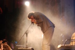
I prefer the original photo over the crop you made ...
All the 'rubbish' that surrounds the musician gives it a dramatic effect. I can hear the music and the ambiance of the public.
 

Digital Skunk

macrumors G3
Dec 23, 2006
8,100
930
In my imagination
I prefer the original photo over the crop you made ...
All the 'rubbish' that surrounds the musician gives it a dramatic effect. I can hear the music and the ambiance of the public.

I would always say that a major part of a good photos is the details of what your capturing, and it's true for just about every photo that is taken. What is a flower without the grass, or the leaves surrounding it? What is a photo of the human body without the details of the body that make that particular one beautiful? Many images get cut out during the editing process or many photo contests because of the details, even mine (the one of the airbrusher had four images taken out because of a few missing KEY features, namely, where his shop was)

The image of the rocker is a good one, but as i said before you need the feeling of the music the guy is singing. The shot with the audience:

2246137390_c97ccd3dc3_o.jpg

Is not too distracting, but that chair in the back is VERY unnecessary. The audience is welcome but the chair has to go. If the photog wanted a square image that would work, but with keeping the aspect ratio the same he would have to loose much of the audience and the chair itself, shaving off the singer's legs as well.

This image:

2246137390_c97ccd3dc3_o-1.jpg

Is a better edit, not because of the missing chair, but because it puts your concentration on the singer and nothing else. The mood and environment are still there, and still a bit obscure, but it's definitely not cluttered with chairs, background images, audience members staring off into the distance, etc.

The tone is welcomed improvement as well. The only thing missing the genre of music.
 

appie57

macrumors 6502
Oct 27, 2006
375
0
Netherlands
Another one offered up for critique. I was on foot for a day in Mazatlan, Mexico, with only a tiny 35mm film fixed lens (35mm f/2.8) AF P/S (Konica Big Mini.) I didn't want to draw attention to myself, and this is a quiet little camera. The boats are small pangas, (fishing boats) which are launched off the beach near the old town. Most fishermen had come in for the day, as it was late.

fishingboats.jpg


Fuji Super G 400 film
no other exif

Nice pic pdxflint! I like the light, the late afternoon atmosphere along the beach is well conveyed in this image. I would have preferred some more human activity in the front, but that wasn't there apparently.
 

pdxflint

macrumors 68020
Aug 25, 2006
2,407
14
Oregon coast
I prefer the original photo over the crop you made ...
All the 'rubbish' that surrounds the musician gives it a dramatic effect. I can hear the music and the ambiance of the public.

This image: <edit: cropped version>

Is a better edit, not because of the missing chair, but because it puts your concentration on the singer and nothing else. The mood and environment are still there, and still a bit obscure, but it's definitely not cluttered with chairs, background images, audience members staring off into the distance, etc.

The tone is welcomed improvement as well. The only thing missing the genre of music.

Even though this thread isn't as active as the daily pic thread, it's certainly as educational. Thanks guys for your comments on an interesting subject - photo editing. I know a lot of folks here want to (and do with great regularity, I should add..) make images that appeal to others in some way. But, another twist on this endeavor is, what is the intended market, publication or client? What is the purpose of the photograph. Is it telling a story (news, sports, documentary, advertising?) Is it a piece of beautiful art for display? Is it for sale, or done on commission? Is it personal? These are things that are worth discussing for anyone who might be thinking of a career in photography. Digital Skunk's photojournalism approach, for example, with his eye and keen ability to explain his thinking in the editing process is something any budding news or sports photographer should eat up. There are other voices, also with their areas of expertise in terms of creating their style of art. This thread, hopefully, will be a good, and safe place to be exposed to the kind of constructive criticism a teacher, or photo editor might hand out. If it can build enough momentum, it could be worth it's weight in free photo classes! :)

Nice pic pdxflint! I like the light, the late afternoon atmosphere along the beach is well conveyed in this image. I would have preferred some more human activity in the front, but that wasn't there apparently.

I agree with you on this. If I had gotten there just a bit earlier I might have seen more activity right there. Another thing I could have done was get down on the beach and wander around a bit more looking for people finishing up their daily fishing activities, but I chose to move on. I think I saw the composition of the boats, the color and light, and just reacted in the moment. That's why I'm still not sure if it succeeds on its own. I do like it, though, which in the end justifies it for me. I appreciate your feedback.
 

Digital Skunk

macrumors G3
Dec 23, 2006
8,100
930
In my imagination
Even though this thread isn't as active as the daily pic thread, it's certainly as educational. Thanks guys for your comments on an interesting subject - photo editing. I know a lot of folks here want to (and do with great regularity, I should add..) make images that appeal to others in some way. But, another twist on this endeavor is, what is the intended market, publication or client? What is the purpose of the photograph. Is it telling a story (news, sports, documentary, advertising?) Is it a piece of beautiful art for display? Is it for sale, or done on commission? Is it personal? These are things that are worth discussing for anyone who might be thinking of a career in photography. Digital Skunk's photojournalism approach, for example, with his eye and keen ability to explain his thinking in the editing process is something any budding news or sports photographer should eat up. There are other voices, also with their areas of expertise in terms of creating their style of art. This thread, hopefully, will be a good, and safe place to be exposed to the kind of constructive criticism a teacher, or photo editor might hand out. If it can build enough momentum, it could be worth it's weight in free photo classes! :)

Amen, enough said. I hope that this does catch on and that people share their opinions and their theories on how to edit a photo. It can be a great tool for learning for anyone that sets goals for their photography.
 

fett

macrumors 6502
Original poster
Nov 5, 2007
278
0
Calgary, AB
Well said pdxflint!

I'm interested to hear what people think of this one. So far people seem to like it but it doesn't really grab me the same. To me it's just an average photo with HDR processing. If you like it (it's ok if you don't and you can say why) what is it that you like. Is it the HDR processing that makes it different, the mood created by the lighting or something else.


pdxflint

macrumors 68020
Aug 25, 2006
2,407
14
Oregon coast
Well said pdxflint!

I'm interested to hear what people think of this one. So far people seem to like it but it doesn't really grab me the same. To me it's just an average photo with HDR processing. If you like it (it's ok if you don't and you can say why) what is it that you like. Is it the HDR processing that makes it different, the mood created by the lighting or something else.


It's not that easy to critique, since I don't know what your intent was, but I'll give it a go... I think it's a very pleasing shot to the eye, by that I mean it looks exposed well, the colors are interesting and it's composed well. Technically, I can't really fault it. Subjectwise, it looks like something I'd expect to see in some real estate related publication, or a magazine article about neighborhoods or real estate. If you had a Christmas tree in the foreground, or ornamental lights in the front yards or on the houses, it could be a Christmas card shot. All in all, it's a well-executed photograph, but seems to lack any purpose or soul without some kind of explanation or "caption." Where is it? Why do these ordinary houses matter, so that I should look at them for more than just a passing moment? I don't have anything to connect with it, with what you've given us. For example, most people (other than on this forum) wouldn't even know it was HDR post-processed, and even if they did, it wouldn't mean anything to them. But, if you're demonstrating HDR to a narrowly focused audience, the shot would have much more meaning just for the processing procedures. In that case, I'd be more inclined to judge the photo accordingly. So... in the end it all depends on what you're trying to accomplish in order to determine how well you've pulled it off. So, I'll arbitrarily "rate" it twice: HDR technique - 4.5 ; general interest - 2.5. I think you hit it on the head with your own assessment. :)
 

pdxflint

macrumors 68020
Aug 25, 2006
2,407
14
Oregon coast
Photojournalism edit exercise: which would you pick?

Maybe we can start a discussion with this one. These two shots were taken a number of years ago in Portland, OR when leaders of the Pacific Rim countries were attending an economic conference at Portland State. As the conference wound down, President Clinton emerged and addressed a large crowd that had been waiting for several hours in the South Park Blocks on campus. Lots of speech shots were taken, but one of the president's favorite things to do after these kinds of events was to walk the rope line pressing the flesh with the crowd. That's obviously the activity in both of these pictures, which were shot from the exact spot on the podium where minutes earlier Clinton had delivered his speech. These photos were both under consideration for the front page of the university daily paper, and ultimately it became my job to decide which to use. Think about which one you'd choose, and why? Have fun! ;)

Note: both are scans from old work prints...

No. 1

clinton%2C%20boy%20scouts_1.jpg


No. 2

clinton%2C%20psu%20crowd_1.jpg
 

Doylem

macrumors 68040
Dec 30, 2006
3,858
3,642
Wherever I hang my hat...
Now, another contribution for critique: This one I saw as I shot it, but I don't think I really did it justice since I had to react quickly, and it made for a hasty exposure. I saw a possibility of an optical illusion, like this kid was walking across a sand bridge. What do you all think?

DSC_5389.JPG

Nothing wrong with the idea; the 'possibility' was there. But, well, it didn't come off this time. The kid looks like he's been shot in the back of the head by a rather chunky arrow, making him slump forward... and the light is dull and unrevealing.
 

pdxflint

macrumors 68020
Aug 25, 2006
2,407
14
Oregon coast
Nothing wrong with the idea; the 'possibility' was there. But, well, it didn't come off this time. The kid looks like he's been shot in the back of the head by a rather chunky arrow, making him slump forward... and the light is dull and unrevealing.

Well, Doylem, you don't miss a thing, mate! Your comment made me laugh out loud, so at least the picture was worth something before meeting it's digital demise... :D As they say in photography and fishing, you should have seen the one that got away...!
 

Digital Skunk

macrumors G3
Dec 23, 2006
8,100
930
In my imagination

Now I hope that the paper took this shot mainly because you can see who is at the event.


This shot is decent as a jump photo, but I wouldn't put this on the front page of the paper. The main thing this says to me is the guy that is focused in the shot is some hotshot guy, and the back of that guy's head is in the way.

I would have gone with the first shot for the front page, and probably picked a different shot to go with the jump.
 

Doylem

macrumors 68040
Dec 30, 2006
3,858
3,642
Wherever I hang my hat...
Well, Doylem, you don't miss a thing, mate! Your comment made me laugh out loud, so at least the picture was worth something before meeting it's digital demise... :D As they say in photography and fishing, you should have seen the one that got away...!

Glad to bring a little laughter into this gloomy world. When we ask ourselves "Does this picture work... or doesn't it?", we generally know the answer already (hint: it's not "yes" ;))...

This is a shot I like (partly 'cos it's one of the first shots I took when I 'went digital'). But... there's a rock behind the horse. Now, I know it's a rock, but somehow all I ever think is "pile of horse crap"... so I think I'm going to have to use my (negligable) skills with PhotoShop to get rid of it. Once you see a pic in a certain way, it can be hard to see it any other way. :)

horseonbeach1lb8.jpg
 

fett

macrumors 6502
Original poster
Nov 5, 2007
278
0
Calgary, AB
pdxflint - I think your ratings are right on the money. The purpose was to capture the clouds because I thought they would be perfect for HDR. I framed the lights to give the photo an interest point for the viewers to start at. If it wasn't for the hdr processing I did this photo probably would have ended up in my archives never to be seen again. That's why I posted it here because on flickr it is one of my most popular photos and I wanted to see if I was missing something. Although I do think I'm going to try and sell it to the home builder as it might work good in a brochure for the community.

For your two Clinton photos I would have gone with #1 for the same reasons as DS and I like the kid giving the thumbs up. You put this photo beside the story and I would know exactly what is going one in it without a caption.


Doylem I'm glad you decided to participate in the critique thread. It was your straight to the point critiques that gave me the idea.

Now I'll give your photo a try. I can see why you like this photo. I really like the silhouette of the horse and man. It's simple and yet a powerful image. As you already pointed out the rocks behind the horse do kind of look like horse crap and I also find the rocks in the foreground don't add to the image. If it was me I would probably have cropped them out bringing the horse/man down lower in the image.
 

Doylem

macrumors 68040
Dec 30, 2006
3,858
3,642
Wherever I hang my hat...
Doylem I'm glad you decided to participate in the critique thread. It was your straight to the point critiques that gave me the idea.

Now I'll give your photo a try. I can see why you like this photo. I really like the silhouette of the horse and man. It's simple and yet a powerful image. As you already pointed out the rocks behind the horse do kind of look like horse crap and I also find the rocks in the foreground don't add to the image. If it was me I would probably have cropped them out bringing the horse/man down lower in the image.

Erm... my "straight to the point critiques" haven't won me a lot of friends lately... but they're only ever opinions... only ever a point of view...

That day was amazing, about a year ago. I was enjoying the weather, the light and my brand new D200 camera. The woman was exercising her horse on the beach, so I got a few shots. This was the one that got all the legs 'in synch': small woman, big horse, in perfect harmony. It was a special moment.

But, of course, you have to divorce the memories of the moment from the picture itself. You can try to sort out the faults in a pic... or just accept that that's how it was...

This is a possible crop (though the crap's still there)... :)

horseandwoman1vb3.jpg
 
Register on MacRumors! This sidebar will go away, and you'll see fewer ads.