December 2011
June 2013
January 2015
Present
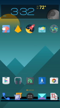
^ Smart Launcher, Flare Theme Wallpaper, 7null Icons Pack. 7null doesn't have all icons for your apps, so need to get creative and use other alternative ones that matches its description. Note I have two camera apps because the Moto E default one takes the photos too quickly without focus. Still there for selfies but also using camera app by Google for the rear since it auto focuses longer before the shot.
I used the original iPhone homescreen as my template for the last nine years. How my apps were arranged in the og iPhone 2G marketing photos before it was released and added an iTunes app is almost exactly how I arrange it for my Android phones. Never a fourth line of apps especially when I had pages of apps so when I swiped to the right, my finger had room to swipe.
Only differences now -
- Where Stock is replaced by Gmail. Where Weather is replaced by QuickPic. Where Gallery (Photos) app is replaced by Photo Editor. Where Email in the dock is replaced by Contacts.
- One page homescreen thanks to swipe or tap shortcuts and drawer. Which is why I use Nova Prime and now Smart Launcher.
I hate now with the bigger screen iPhones, I can't adjust the size of the grid to 4x4 or their icon sizes. For months, I even used a black wallpaper using the Nexus Live Wallpaper Revamped with all the animations and particles turned off for some of my phones as homage to the original iPhone.
I experimented with alot of homescreen looks before. Even made my og iPod touch look like Windows Vista using invisible blank apps or an app called Poof! I have 09 Launcher HD in my weakest phone which I barely use and even tried Windows 8 launchers. I also tried Arrow and ZenUI but very picky so I stick to Nova Prime and Smart for the shortcuts.
Need double tap to Greenify Hibernate and swipe up to Screen Off & Lock. A natural habit I don't want to lose to turn off the screen. Weakness on Microsoft's Arrow is it kinda lags although it looks clean and simple. ASUS ZenUI doesn't have shortcuts. OS9 HD might be one of the better iOS-like launchers but sometimes my apps disappear from the homescreen during a crash or reboot.
As long I can open my apps with shortcuts and it looks clean with a decent wallpaper which matches the icons, I'm content.
I hate an uneven look where a missing app isn't present in the last line. Even my drawer is evened out exactly to a certain number of apps. Exactly 40 icons will show in my 5x4 drawer or 60 if hidden apps are shown. It is funny how Apple promotes simplicity and minimalism when it is only Android that caters to that to me when it comes to a homescreen.


