Why are some Lion screenshots different than other ones?
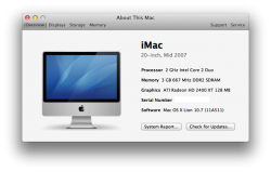
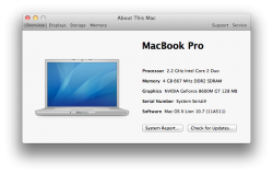
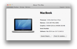
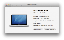
Like cambookpro- Has Lion, but it looks like a regular OS X About This Mac screen. But then zildjansg has the new Lion screen?
Because the regular panel that appears when you click on "
 > about this mac " is pretty much the same as the old one, than if you click on the "more info..." button, it shows you the new style panel


