Got a tip for us?
Let us know
Become a MacRumors Supporter for $50/year with no ads, ability to filter front page stories, and private forums.
Post Your Desktop: June 2014
- Thread starter cambookpro
- Start date
- Sort by reaction score
You are using an out of date browser. It may not display this or other websites correctly.
You should upgrade or use an alternative browser.
You should upgrade or use an alternative browser.
For whatever reason I have gotten used to my dock being purple and haven't changed it in months.


For whatever reason I have gotten used to my dock being purple and haven't changed it in months.
Image
How do you like Stache?
How do you like Stache?
To be honest, not worth it. Although I bought both versions and so am stuck using it. One of my big complaints I wrote in my blog review of it was the tagging, which now auto-completes in the latest update, but I would have rather continue on with my complex Evernote setup over it.
It boils down to it being flat out ugly, which is why I can't recommend it. Ads and whatever inline popups appear when you first load the page are visible in the screenshots, so for example, Fast Company and TIME articles with really nice layouts get butchered for that reason.
And there's very little separation between said screenshots and the accompanying title. This is most noticeable in sites with a white background.
It depends too much on the internet being beautiful, and that's not the case at all.
And this is totally off-topic.
Last edited:
To be honest, not worth it. Although I bought both versions and so am stuck using it. One of my big complaints I wrote in my blog review of it was the tagging, which now auto-completes in the latest update, but I would have rather continue on with my complex Evernote setup over it.
It boils down to it being flat out ugly, which is why I can't recommend it. Ads and whatever inline popups appear when you first load the page are visible in the screenshots, so for example, Fast Company and TIME articles with really nice layouts get butchered for that reason.
And there's very little separation between said screenshots and the accompanying title. This is most noticeable in sites with a white background.
It depends too much on the internet being beautiful, and that's not the case at all.
And this is totally off-topic..
Thanks for the review, you saved me $7 lol.
Last edited:
Post Your Desktop: June 2014
http://www.idownloadblog.com/2014/06/02/download-ios-8-os-x-yosemite-wallpapers/
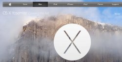
Does anyone know where I can get a large (larger the better - ideal would be 3840 x 1080 - dual monitors) size of the Yosemite pic below minus the text and the "X"?
http://www.idownloadblog.com/2014/06/02/download-ios-8-os-x-yosemite-wallpapers/
Things are a little sparse because of Alfred; I use it to launch/find/open 99% of the things I need.


Been there...they have the "other" Yosemite pic, I don't see the one I asked about - except at the top of the page and it's got the text and "X" on it
Added a bunch of Geeklets and moved them to the left and then found high res pictures of my favorite Hyundai Sonata


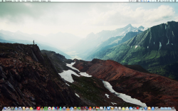
Love the wallpaper, would you mind sharing?
That wallpaper can be found via this new app. http://appshopper.com/mac/lifestyle/wallpaper-by-behance
Thats what happens when you trim the bushes. It makes the dock bigger.
I get it...
Love the wallpaper, would you mind sharing?
Or without having to install an app, get it here:
https://dl.dropboxusercontent.com/u/870242/mountains.png
Register on MacRumors! This sidebar will go away, and you'll see fewer ads.


