Become a MacRumors Supporter for $50/year with no ads, ability to filter front page stories, and private forums.

AngerDanger

Graphics
Original poster
Staff member
Dec 9, 2008
5,452
29,006
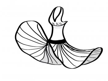
A bit corpsey…

corpse.jpeg


With the exception of the left foot, I dig the top figure. Really impressed with the eschewing of references too.
 

needfx

Suspended
Aug 10, 2010
3,931
4,249
macrumors apparently
A bit corpsey…

Image


With the exception of the left foot, I dig the top figure. Really impressed with the eschewing of references too.

you're quite efficient in bringing body figures to life. they do seem alive, however corpsey you might think that last one is; maybe more rapedate :D, kidding..! however, do tell what you mean with that nose reference.
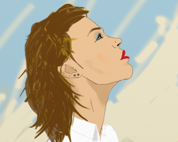
I was about to edit my post earlier that I like the way you take on hair. that's one tough attribute. after seeing your work, I thought I would have a go at a close up of a head, at least from behind, so I neglected editing the post. still ways to go to achieve any kind of realism, perspective, physiology. I might have written this stuff before, but hey, a reminder to myself to try harder.

regarding lack of references, it is my way of finding what looks right without any assistance of visual cues which can be distracting and frustrating to imitate (for me). I'm kinda strange when it comes to learning to express myself on any new medium. I just do it my way mostly.

regarding that foot, a failed attempt at a ballerina on pointe.

Cheers for the input.

https://flic.kr/p/rper5Qhttps://www.flickr.com/people/107651264@N04/

--edit
you also bring easily bodily volumes with very few charcoal strokes, maybe I'll have a go at that too!
 
Last edited:

AngerDanger

Graphics
Original poster
Staff member
Dec 9, 2008
5,452
29,006
you're quite efficient in bringing body figures to life. they do seem alive, however corpsey you might think that last one is; maybe more rapedate :D, kidding..! however, do tell what you mean with that nose reference.
I was about to edit my post earlier that I like the way you take on hair. that's one tough attribute. after seeing your work, I thought I would have a go at a close up of a head, at least from behind, so I neglected editing the post. still ways to go to achieve any kind of realism, perspective, physiology. I might have written this stuff before, but hey, a reminder to myself to try harder.

regarding lack of references, it is my way of finding what looks right without any assistance of visual cues which can be distracting and frustrating to imitate (for me). I'm kinda strange when it comes to learning to express myself on any new medium. I just do it my way mostly.

regarding that foot, a failed attempt at a ballerina on pointe.

Cheers for the input.

[url=https://farm8.staticflickr.com/7656/16671819444_fcf595b3c2_c.jpg]Image[/url]https://flic.kr/p/rper5Qhttps://www.flickr.com/people/107651264@N04/

--edit
you also bring easily bodily volumes with very few charcoal strokes, maybe I'll have a go at that too!

Oh, God, it is the slightest bit daterapey… :eek::p I couldn't figure out the perspective of her nose, which looked upturned (or cut off) each time I drew it, so I gave up and wrote "What did I do to the nose?". As for the hair, I tend to apply heavy lines, smudge them for shading, and use an eraser to add in highlights. It's quite fun if accuracy isn't preferred. Charcoal is definitely worth a try.

You've achieved realism and intuitive perspective in your figure drawings, so fleshing out details is only going to help. That's an impressive close up; the hair seems to be going in directions that imply it's actually growing from the head. The scene is also depicted at an interesting angle, which I imagine could be quite difficult but was well done.

The fact that it was en pointe was conveyed well; the foot was just a bit too twisted. :)
 
Last edited:

AngerDanger

Graphics
Original poster
Staff member
Dec 9, 2008
5,452
29,006
Long time, no post. I've been watching "It's Always Sunny in Philadelphia" and wanted to develop hand-eye-Wacom coordination, so I drew the show runner, Rob McElhenney:

macanimation.png


Then I overlaid the drawing above the reference photo for comparison purposes. The original Flash file allows the mask to follow the user's cursor, but this works well in GIF form:

match.gif


Still scared to take a page out of @needfx's book and work without a reference photo.
 
  • Like
Reactions: needfx

needfx

Suspended
Aug 10, 2010
3,931
4,249
macrumors apparently
Long time, no post. I've been watching "It's Always Sunny in Philadelphia" and wanted to develop hand-eye-Wacom coordination, so I drew the show runner, Rob McElhenney:

View attachment 612474

Then I overlaid the drawing above the reference photo for comparison purposes. The original Flash file allows the mask to follow the user's cursor, but this works well in GIF form:

View attachment 612475

Still scared to take a page out of @needfx's book and work without a reference photo.


oh c'mon @ my pages comment

neat attempt with Rob!
 
Register on MacRumors! This sidebar will go away, and you'll see fewer ads.