Got a tip for us?
Let us know
Become a MacRumors Supporter for $50/year with no ads, ability to filter front page stories, and private forums.
Post your drawings/sketches/doodles
- Thread starter AngerDanger
- Start date
- Sort by reaction score
You are using an out of date browser. It may not display this or other websites correctly.
You should upgrade or use an alternative browser.
You should upgrade or use an alternative browser.
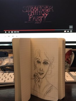
A goofy-eyed Mackenzie Davis:
View attachment 619090
I've also made a little HTML5 thing for comparing the sketch to the reference photo.
always loving the the comparisons!!
Wow, I dig the hair.
always loving the the comparisons!!
Thanks! It's actually really helpful for identifying features I tend to distort. When I first started using it (I originally programmed it in Flash because my digital drawings were all in one file anyway), I noticed that I made eyes huge relative to faces and made hair really small. So while I'm getting better about not exaggerating features, I've also picked up on my tendency to make tilted things straight. If somebody is leaning or has their face at an angle, I draw them sitting/standing straight and their face looking more towards the viewer.
It's especially apparent along the edges of the face in this portrait of Lee Pace.
</rant>
I've started teaching myself to draw...again. I'm rather proud of the progress I've made. I've gotten to the point where I can hold the pencil and make it do stuff. Sorta.
Here are some of my most recent doodles...


Here are some of my most recent doodles...
Comic sans-computer:

Uh, this thread isn't really about bragging, man, so maybe tone it down a bit.I've gotten to the point where I can hold the pencil and make it do stuff. Sorta.
Uh, this thread isn't really about bragging, man, so maybe tone it down a bit.
The talent of my hands demands accolades.
"F*ck, - I should have brushed my teeth before sleep, back in 1775..."


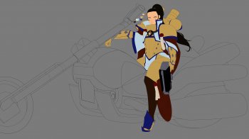
Working on some Warhammer 40K ideas with my best friend. We created an Order of Adeptas Sororitas that use motorcycles, called the Shining Steeds.

As usual, a comparison to the reference photo can be found here.

I seem to flatten glasses that are at an angle make the sides of tilted faces thinner.
I seem to flatten glasses that are at an angle make the sides of tilted faces thinner.
Is that an original composition or was there a reference?
Haha, well, that makes me feel less inadequate about my (in)ability to generate original figures.
If you're ever interested, I turned that image comparison thing I did into its own site. It works best on desktop Safari, but feel free to check it out: drawwhatyousee.xyz
Haha, well, that makes me feel less inadequate about my (in)ability to generate original figures.
If you're ever interested, I turned that image comparison thing I did into its own site. It works best on desktop Safari, but feel free to check it out: drawwhatyousee.xyz
oh wow!! cool beans!
Will give a go once I scan/pic the sketch!
Wow!!
Wow!!
I totally agree with your amazement!
It certainly does!View attachment 687228 View attachment 687229 Apparently these... I hope that doodles also includes things such as these!?
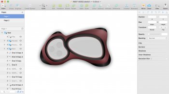
Some various Simplify player skins that did not quite make it because programming wise I have nothing... Even by copy pasting from other default Simplify skins fails because I do not understand the coding language. I am very much a fan of the work David Parise and the work he did with some Audion skins.
There's one skin from Audion that I very much want to recreate, it is tall and looks like an older Apple TV remote. But then I thought that not many uses skins for players on their desktop other than text based information so these are in all actuality older than they might appear given the date of the entry here.
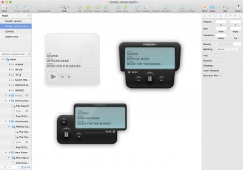
The one David Parise look-a-like that I did release on dA didn't appeal to many. So there's that.
David Parise on Behance
https://www.behance.net/dparise
There's one skin from Audion that I very much want to recreate, it is tall and looks like an older Apple TV remote. But then I thought that not many uses skins for players on their desktop other than text based information so these are in all actuality older than they might appear given the date of the entry here.

The one David Parise look-a-like that I did release on dA didn't appeal to many. So there's that.
David Parise on Behance
https://www.behance.net/dparise
If you don't focus on the hair, clothes, or sketch, it's not too bad.
Good thing I was focusing on another thread!
Register on MacRumors! This sidebar will go away, and you'll see fewer ads.


