Post 5623 Credits to the famous Lex for the modding
thx snakeeater you ar the man
Post 5623 Credits to the famous Lex for the modding
thx snakeeater you ar the man
What are your guys' favorite icon sets? I'm yet to find one that I really like. I'm currently using Noki and I didn't like VIP or Zorsha that much.
Any ideas? I thought Genesis was pretty good though.
That's really such a subjective thing for most people. Did you not see icons you liked while combing through this thread?
I personally swap between the following:
Glasklart HD (MacThemes or Cydia, free, has a TON of icons)
Upojenie HD (MacThemes download, free, some great icons but not enough people making them as they're pretty complicated)
Redline (Frameless) (Cydia, paid theme, and I only use the icons--hundreds of icons over on ModMyI)
ElitePro HD (Cydia, paid, use the icons and just some small bits from the UI, also hundreds on ModMyI)
Round3 (MacThemes, free)
Avid HD (Cydia, paid, only a few icons as this one's just been released)
And an Eclectic set I put together myself, with icons cherry-picked from half a dozen themes on MacThemes, plus quite a few I made myself
Not one of these sets is wholly stock, either. They've all got icons in them that I did myself when I couldn't find what I wanted. Redline & Elite are terrific for that, since they're more photographic image based than graphic design based, and included the necessary PSD's for creating your own icons in Photoshop.
Zooropalg had themed the SB music controls for the VIP theme, I really like it.
Nice blinded. Can you post the clock and iPod icons? It's hard to keep up with the VIP thread at modMyi.
Too many beautiful LS themes to choose from, here is LS Dream Bottle from dBar :

Have these icons worked for anyone? I cant seem to get them to work/set. they are saving as JPEG as opposed to PNG?..... :-(
Schnedi, any chance of removing the line under the status bar in the overlay please?
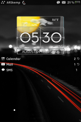
So after two days of playing around, I've ended up with something like this
http://cl.ly/2H1P190D0X060t2N1518
It's not amazing, but I like it so far. I only have a few grievances...
Is there any way to make the icons smaller? Or can someone possible upload a plist where they are more spread apart? they're just too squished together, I don't like it right now. And possibly a back overlay with black/wooden shelves to go along with it? I really think that would make all the difference in the world.
I handpicked the icons myself so I like them so far, trying to switch around to make them match a little more.
Also the dock looks really lame. I've seen home screens where it literally looks like the icons are just sitting on the ground. Can anyone help me with that?
If I can spread the apps out a little bit or make the icons smaller and have a more realistic looking dock, I'll really start to like what I've done.
I'm up to page 78, but damn that thing exploded, I just can't keep up.
Thank you very much, appreciate this
What do you want removed? There is no line under the statusbar in the png you posted.
Yes please my friend?