B S Magnet, wow, that was a very beautiful but at the same time very sad story. I would certainly have felt the same way.I thought the thank-you letter would be the end of it, but they sent back the picture with some sort of direct-marketing printed sheet of paper! It sort of hurt my feelings — not because it was probably one of the thousands of generic/amateur pictures which other kids probably sent them each year, but because it felt like they rejected my appreciation of them helping out with that warped piece.
Got a tip for us?
Let us know
Become a MacRumors Supporter for $50/year with no ads, ability to filter front page stories, and private forums.
Pre and Post iMac G3 uses of Translucent Plastics
- Thread starter mectojic
- WikiPost WikiPost
- Start date
- Sort by reaction score
You are using an out of date browser. It may not display this or other websites correctly.
You should upgrade or use an alternative browser.
You should upgrade or use an alternative browser.
- Status
- The first post of this thread is a WikiPost and can be edited by anyone with the appropiate permissions. Your edits will be public.
Let's talk about prototypes!
Apple received a lot of criticism for their undersized iMac G3 keyboard and the puck mouse. According to Ken Segall's book "Insanely Simple", in 1999 he confronted Steve about all the negative press regarding the mouse, and Steve privately admitted that they were already working on something new.
Completing that story are some rare prototypes of the M7803 Pro Keyboard. As we know, the M7803 was released in one colour, a clear acrylic with graphite logo, alongside the Summer 2000 Mac lineup. But there is evidence that may have been plans to release the keyboard earlier, in the original fruit colours.
Here is a Japanese prototype Lime M7803, dated to June 2000, its date confirmed by the serial number too (and a month before the July 2000 event):
View attachment 2140105View attachment 2140106View attachment 2140107
Beautiful? Not sure. But interesting, definitely. This photo was grabbed from an old 2016 eBay listing; apparently the seller was also selling a prototype Pro Mouse M5769 – for reference, that mouse was apparently just clear, no colour. So we don't have a confirmed example of the M5769 being made in colours. But I do wonder, how would it be coloured? Would they make the shell colourful, or perhaps, even cooler, the internal part?
When I followed the story of this keyboards, I actually stumbled upon a now-deleted Macrumors collectors thread from 2016. The buyer of this exact keyboard was a user here called PowerMac G4 MDD – anyone remember this person? On the archived thread, they posted a video of the keyboard (username maccollectorZ), but sadly the video is now listed as private.
Here's another translucent prototype M7803, an earlier blueberry DVT from March 2000 (also sold on Ebay years back):
View attachment 2140109View attachment 2140110
View attachment 2140114
I don't know much about prototyping, but I assume that all new designs must go through a DVT, to confirm that they can be made on a production line? From the photos, you get the impression that they were seriously testing whether these colours could be produced en masse. Perhaps, they used the then-current fruit colours for their DUT prototypes, to hide the secret of their upcoming new design language and "jewel" iMacs. I do sense a bit of aesthetic clash between the pure-blue apple logo and back frame, and the newer design-language sticker label.
Only now seeing these… wow.
I don’t know why, but the green above reminds me more of the Sage from the “summer 2000” series iMac (the boreal bias really showed with Apple’s series names at the time). That series premiered with this extended keyboard (the blue above, though, definitely looks like Blueberry).
It could have been Lime, but it would have been helpful for that prototype to have been leaned against either the Lime or Sage iMac (to account for lighting/colour-grading variations). Plus, the timing of when that prototype was assembled is right in line with when the factory production for the post-fruit iMacs was underway.

Contrast with the yellower and more saturated green of Lime:
I guess either the costs involved to break out production lines into discrete hues once again; the ability to source enough of dyes for the polycarbonate/ABS for the several assembly factories making these; and/or a reluctance to run into production shortages for model variant hues being exceptionally popular, is what ultimately led them to go with a generic clear shell. It’s a shame, really, and one I lamented ever since the day these were announced to replace the “fruit five” — as Ruby, Sage, and Indigo, along with Snow and Graphite extended keyboards, would have been magnificent to see and use. It, and the clear mouse replacement with black (and later, white) insert, never really hit home for me, even as I’d come to buy one of the black extended keyboards to replace the graphite keyboard on my Yikes! G4.
We may speculate forever about the reasons why such decisions were made. I can't imagine it was cost or shortage of supply, since probably 90% of the dye was used for the bulbous iMac, rather than the keyboard/mouse, but perhaps it would cost a lot to ramp up the colours for the mice/keyboard production lines too. I'm no expert.I guess either the costs involved to break out production lines into discrete hues once again; the ability to source enough of dyes for the polycarbonate/ABS for the several assembly factories making these; and/or a reluctance to run into production shortages for model variant hues being exceptionally popular, is what ultimately led them to go with a generic clear shell.
I think the most likely reason was the urgent need to shift tastes. When Apple announced the fruit iMacs in Jan '99, it was a revolutionary design choice for personal computers. But by 2000, it had been copied so much that it had become kitsch. Besides, as we previously discussed, the first Graphite iMac SE sold really, really well, and Apple used that as market research that people wanted more subdued colours. Were they right? Well actually, probably not – Apple suffered its first revenue loss at the end of 2000 – we can blame the G4 Cube or the lackluster Gigabit Ethernet G4s, or the lack of CD-RWs in the Mac lineup – so perhaps we'll never know if the subtler colours were more appealing or not. Would've been nice if colour had stuck around in the consumer market permanently, just like the iPods started to do.
Also, by 2000 Apple was promoting their products as having revolutionary technologies within, even in their consumer Macs. In 1998-99, the iMac marketing was mostly about ease of use and internet access. By late 99-2000, the emphasis was on awesome features: DVD-Rom, firewire, harmon/kardon speakers, Airport. And of course, the 'Pro' Mouse doesn't sound like same company that made the kid-friendly tray-load iMacs. It was revolutionary too, optical – so even in jewel tones, it doesn't really make sense to ship it in colour anymore - it's too 'pro' for that. And naturally, the keyboard has to do the same.
I suppose it's really about minimalism, too, which was always Apple's aesthetic. The first iMacs were the exception to the rule. Perhaps Jony Ive was craving to focus on the exploration of fine materials, rather than kitschy plastics and colours. ABS->Polycarbonate->Acrylic->Titanium->Aluminium. You can't go back.
Me too. Really was a watershed moment. There's a brilliant article written at the time of the Summer 2000 event on Ars Technica, which seems to perfectly analyse what those colour changes would mean for the future. It's a long read but well worth it. Here's a bit:It’s a shame, really, and one I lamented ever since the day these were announced to replace the “fruit five” — as Ruby, Sage, and Indigo, along with Snow and Graphite extended keyboards, would have been magnificent to see and use.
"The new iMacs are still multi-colored, however, even if their keyboards and mice aren't. The colors are too important from a branding perspective for Apple to give them up. But the days of the garish, candy-colored iMacs seem to be over. The new colors are more muted and mature. This seemingly trivial fact highlights a major facet of Apple's strategy.
Many people dismiss Apple's recent hardware as a silly reaction against boring beige: "They're bland and we're garish, hip, and exciting!" But that's not what Apple is doing. Their innovation is the championing of the very concept of style and fashion in the computer industry. Style changes. Apple's strategy is not tied to "bright colors" or "shiny objects" any more than a fashion designer's strategy is tied to wide lapels, skinny ties, or platform shoes."
Same. There's something a little, idk, impersonal about the acrylic mouse and keyboard? They do look like they're meant to sit behind glass in a modern art museum.It, and the clear mouse replacement with black (and later, white) insert, never really hit home for me, even as I’d come to buy one of the black extended keyboards to replace the graphite keyboard on my Yikes! G4.
My need for more expressive, colourful accessories is what's driven me to collect 3rd party stuff. As far as I can tell, no one ever made a keyboard to match Apple's jewel tones, but Macally did make optical mice in those colours. I've got one in Indigo. It's much nicer.
Just posting another set of translucent console stuff, some 1st party and some 3rd party. With these examples, I can't get a precise date on them to know whether they predate or post-date the iMac; probably a mixture of both. For instance, I don't know whether there were translucent Playstation memory cards and controllers between 1994-98.
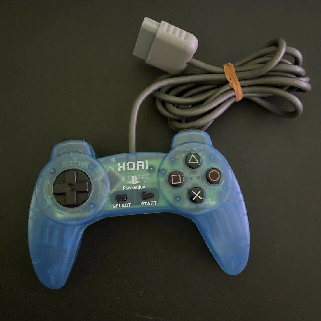
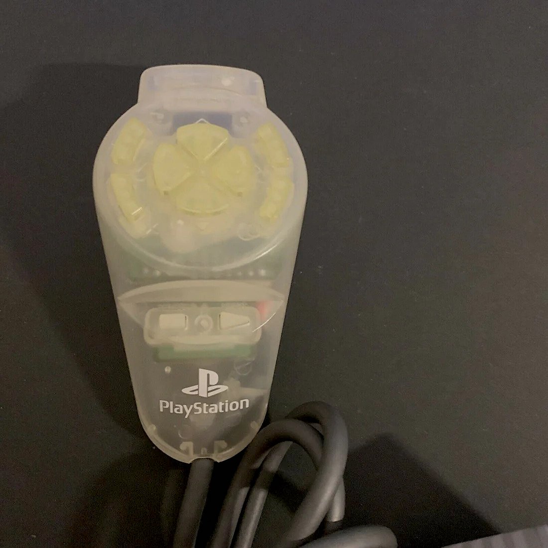
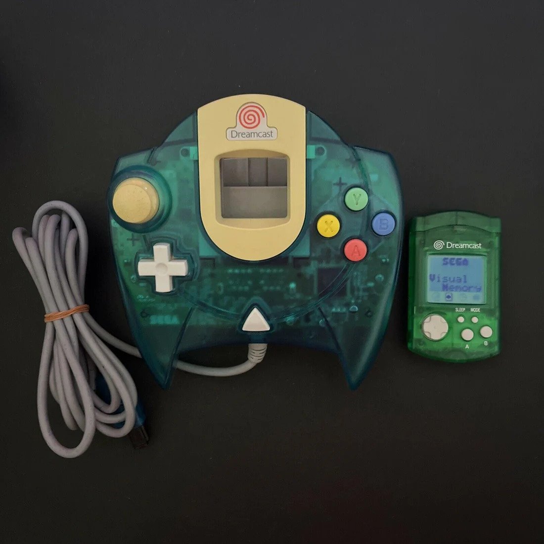
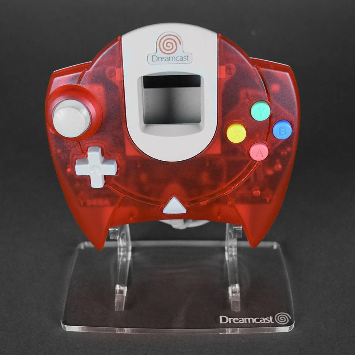
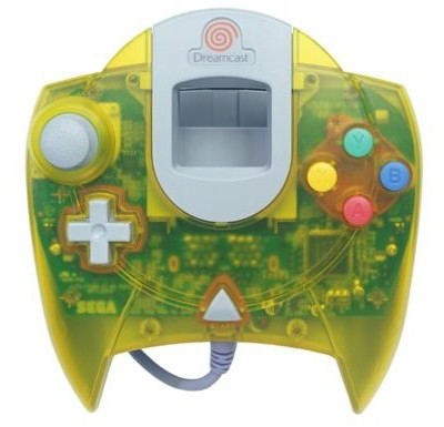
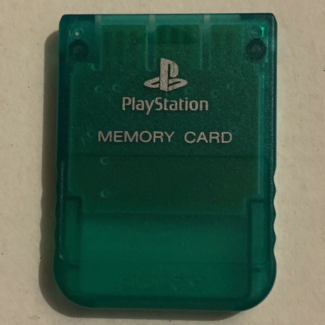
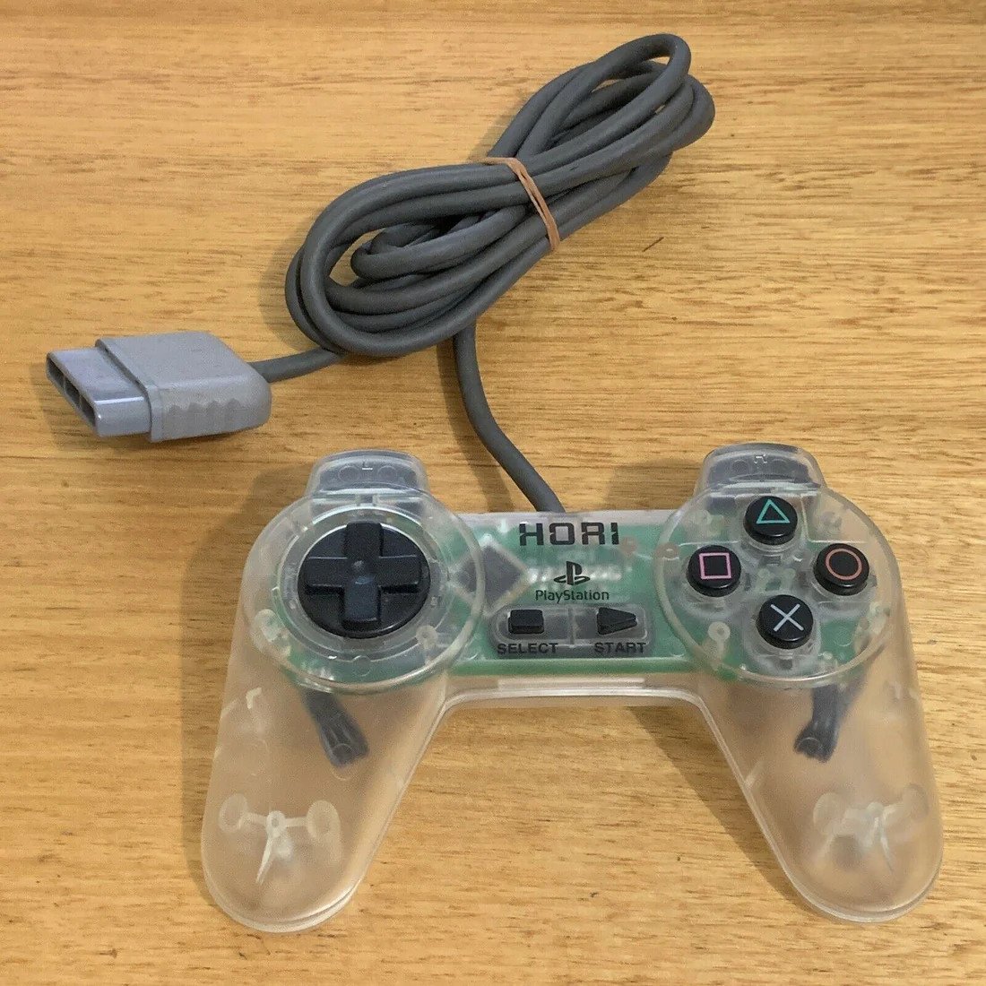
I don't think this one was mentioned here for its use of colored translucent plastics yet but the Game Boy Camera had a Clear Purple variant in Japan released alongside the other models in Feb. 1998:


Yes, I have it, along with the matching clear purple Gameboy Pocket (also a Japanese exclusive). I love the gentle frosted coloration that dates it before the iMac G3 – more iMac-imitation plastics are much more vibrant.I don't think this one was mentioned here for its use of colored translucent plastics yet but the Game Boy Camera had a Clear Purple variant in Japan released alongside the other models in Feb. 1998:

Came across a very unusual clear mouse from Logitech.
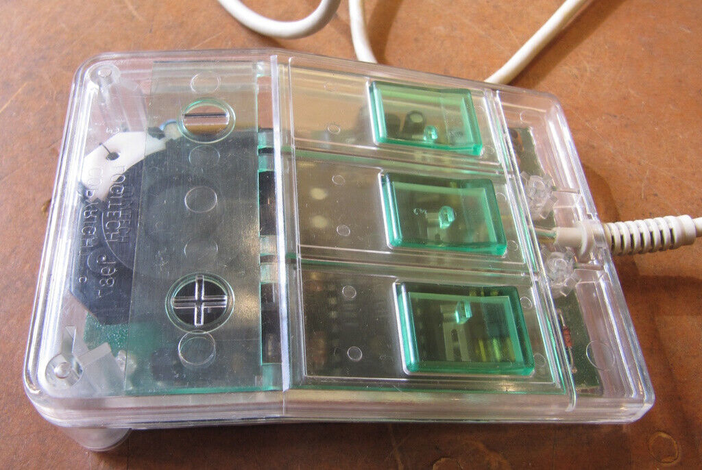
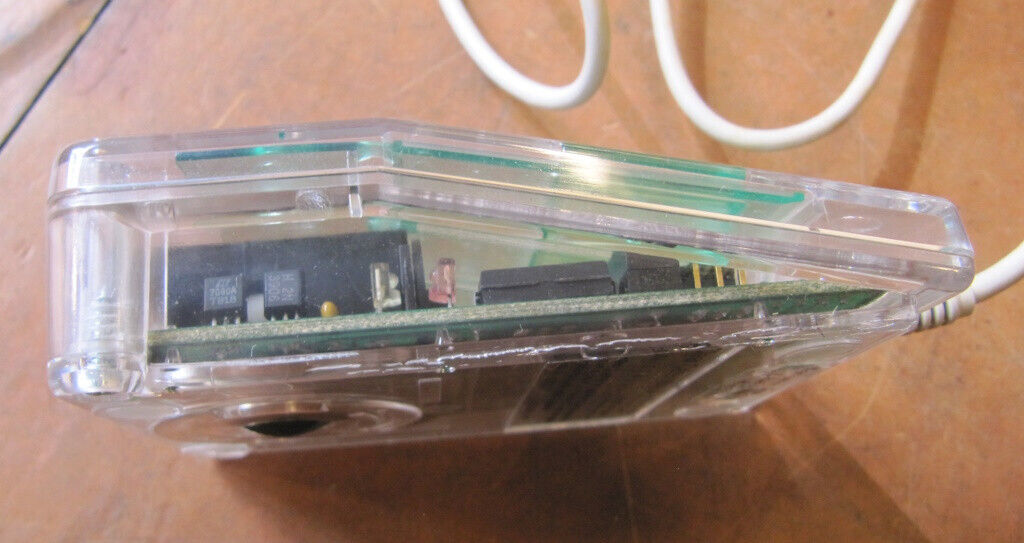
The weird part? It's from 1988 – a whole 10 years before the translucent craze, and even a few years before the clear craze. Very interesting. It's quite pretty too; too bad it uses a serial interface.
The weird part? It's from 1988 – a whole 10 years before the translucent craze, and even a few years before the clear craze. Very interesting. It's quite pretty too; too bad it uses a serial interface.
Quick search in the old parts bins came up with these old relics:
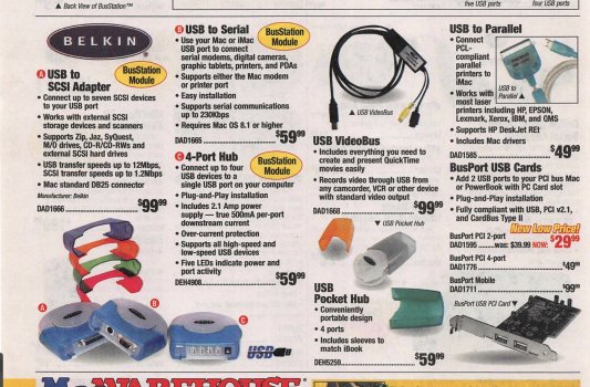
The Belkin 7-port USB BusStation and USB Serial Adaptor Module ...
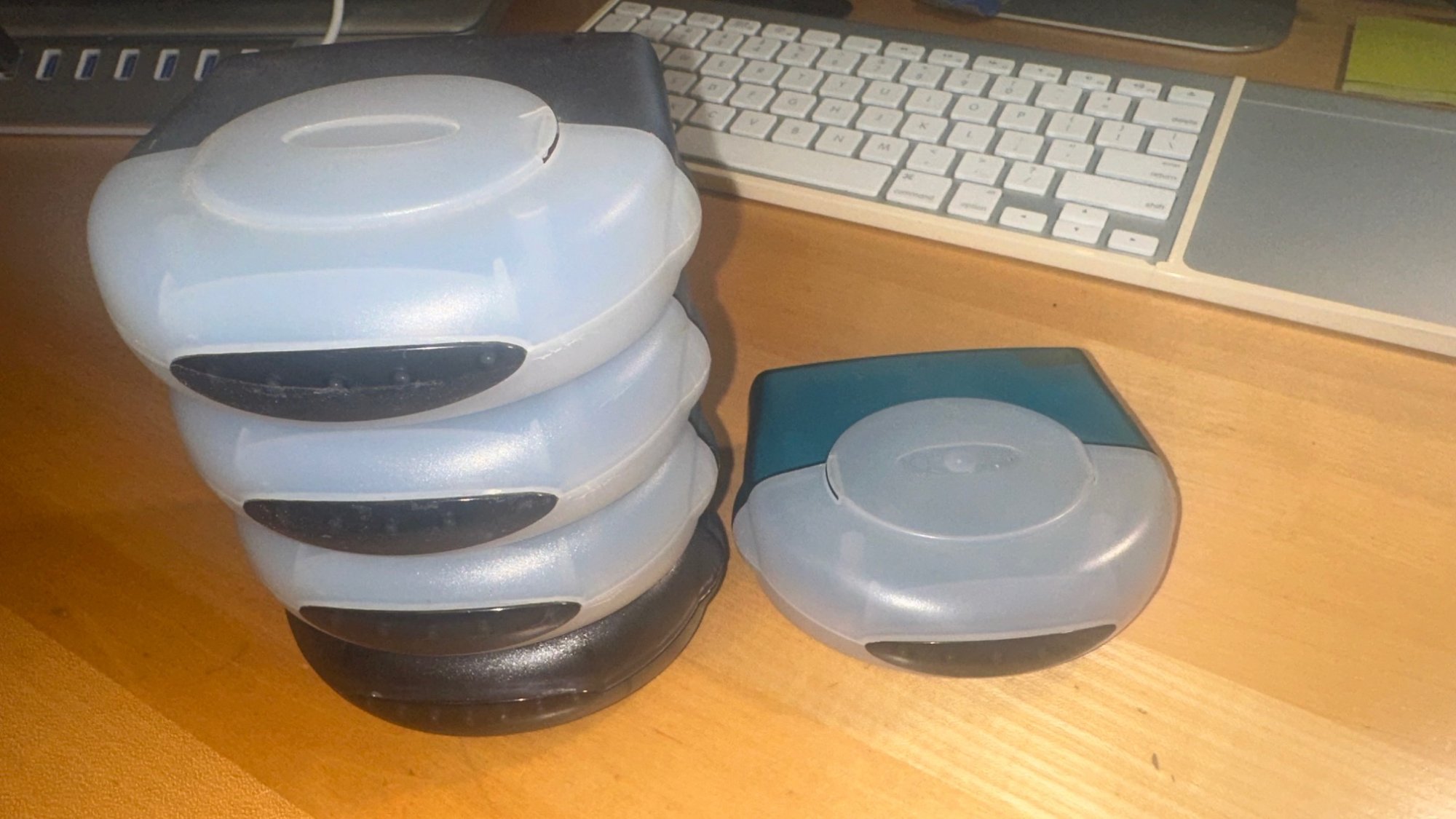
... and couple of old FireWire Drives
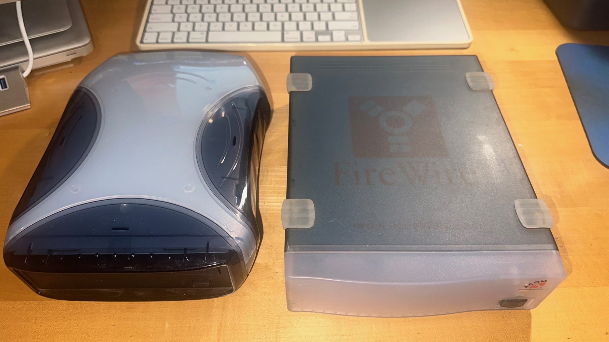
The Belkin 7-port USB BusStation and USB Serial Adaptor Module ...
... and couple of old FireWire Drives
Yes, those are quite nice! I have the blue and grey Que Drives, though neither work. That Belkin hub was unique in the way it stacked. You could get different modules, some were USB hubs, others were SCSI.Quick search in the old parts bins came up with these old relics:
The Belkin 7-port USB BusStation and USB Serial Adaptor Module ...
View attachment 2308456
... and couple of old FireWire Drives
View attachment 2308457
Here's a good photo of it, with the colour options:
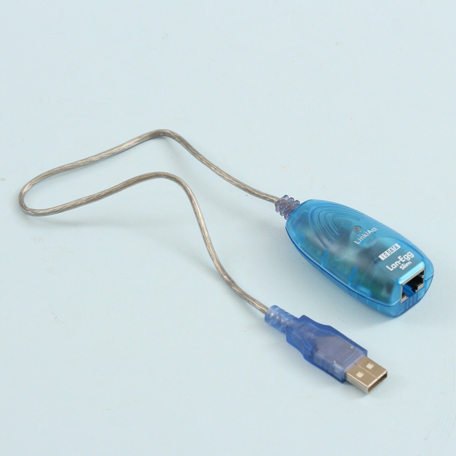
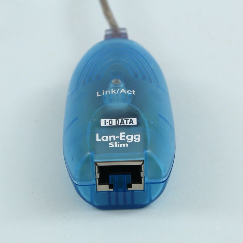
Lan-Egg USB Ethernet adapter (presumably USB 1.1). Not a very clear reason why these existed, since all Macs had built-in ethernet, and there was only a small niche of computers around 1999-2001 that had USB but no ethernet; still, they did exist (my Compaq Presario 5000 is one example).
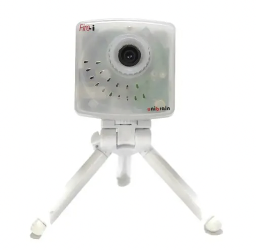
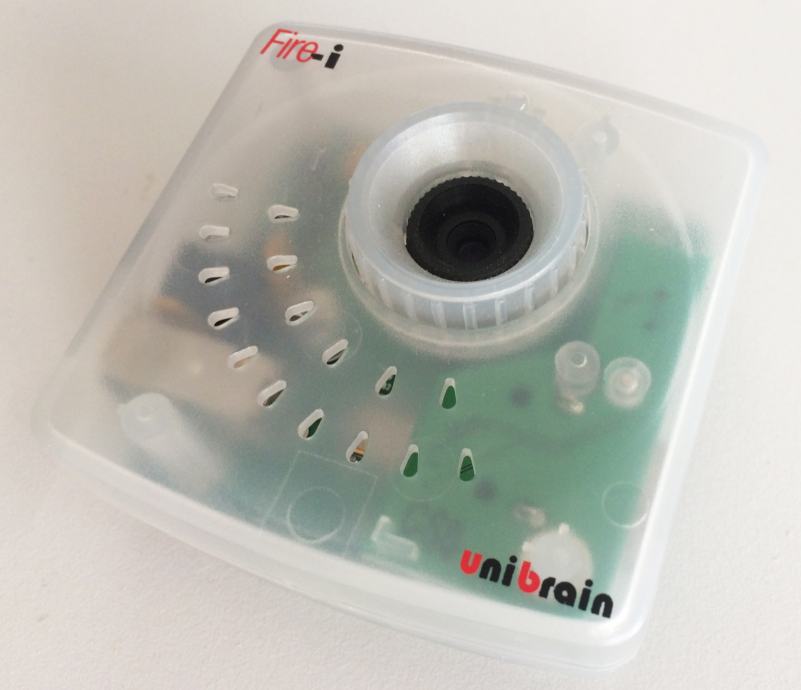
Here's an early Firewire camera, Fire-I by Unibrain:
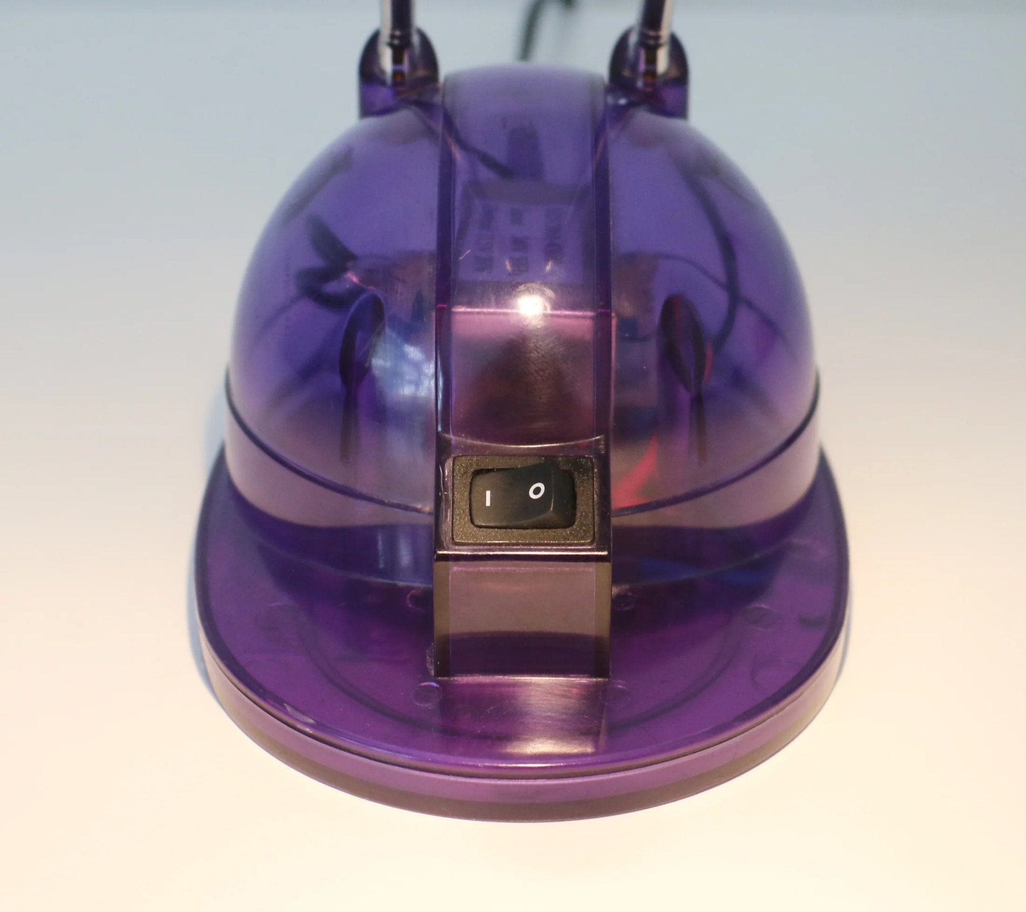
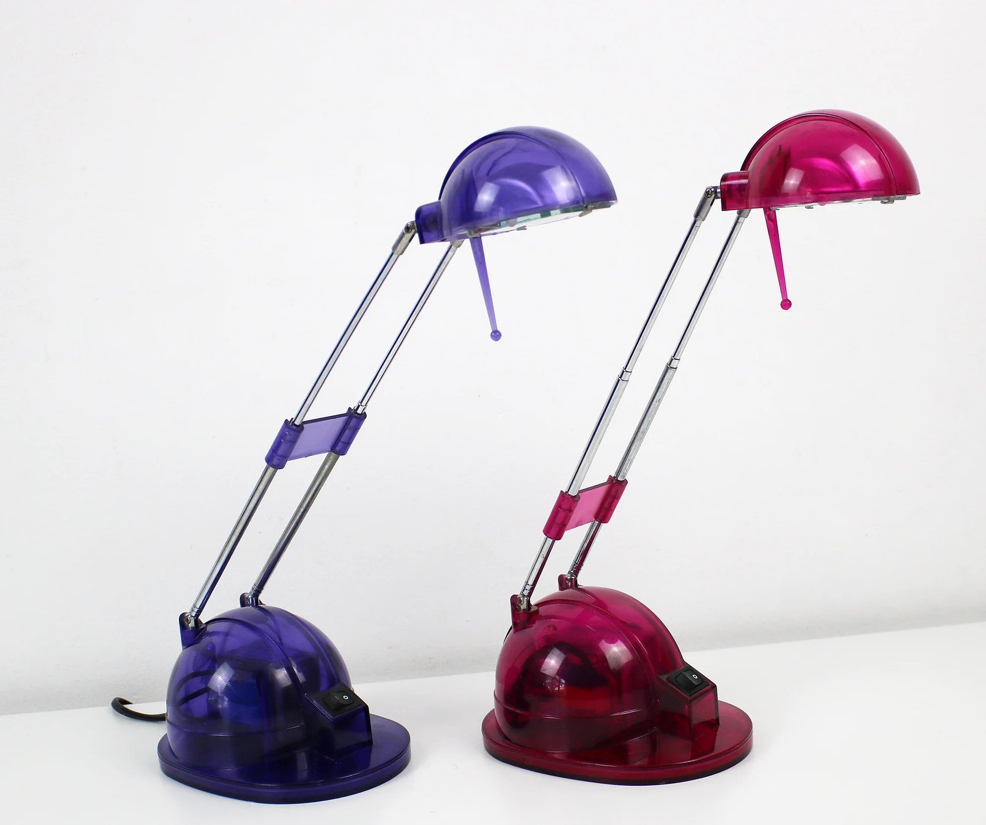
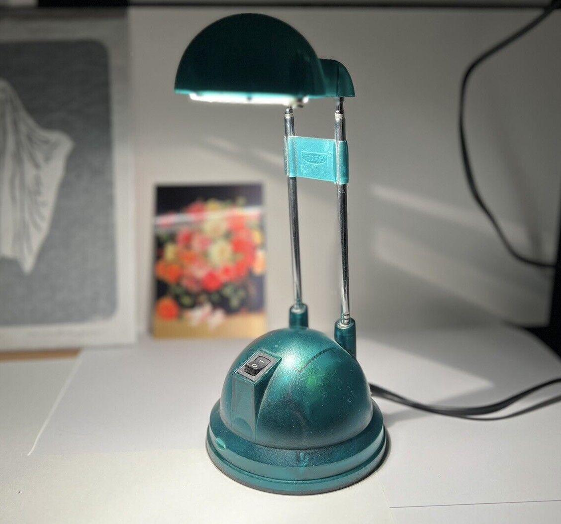
And here are some translucent iMac-matching lamps. Evidently they were mass produced, unbranded. Some of them use the frosted plastic look, others use the glossy look of the later iMacs.
Here's an early Firewire camera, Fire-I by Unibrain:
And here are some translucent iMac-matching lamps. Evidently they were mass produced, unbranded. Some of them use the frosted plastic look, others use the glossy look of the later iMacs.
The Compaq Presario 5000 and 7000 series were one of most bold PC responses to the iMac, while playing it safe and mitigating risks of selling multiple colours.
The vast majority (like 90%+) of these were sold in the stock colour, a rather boring purple-grey. You could then pay a little extra to 'personalise' your one by changing the translucent front panels to a different colour.
I tried to get some photos below, including my own one (1st picture).
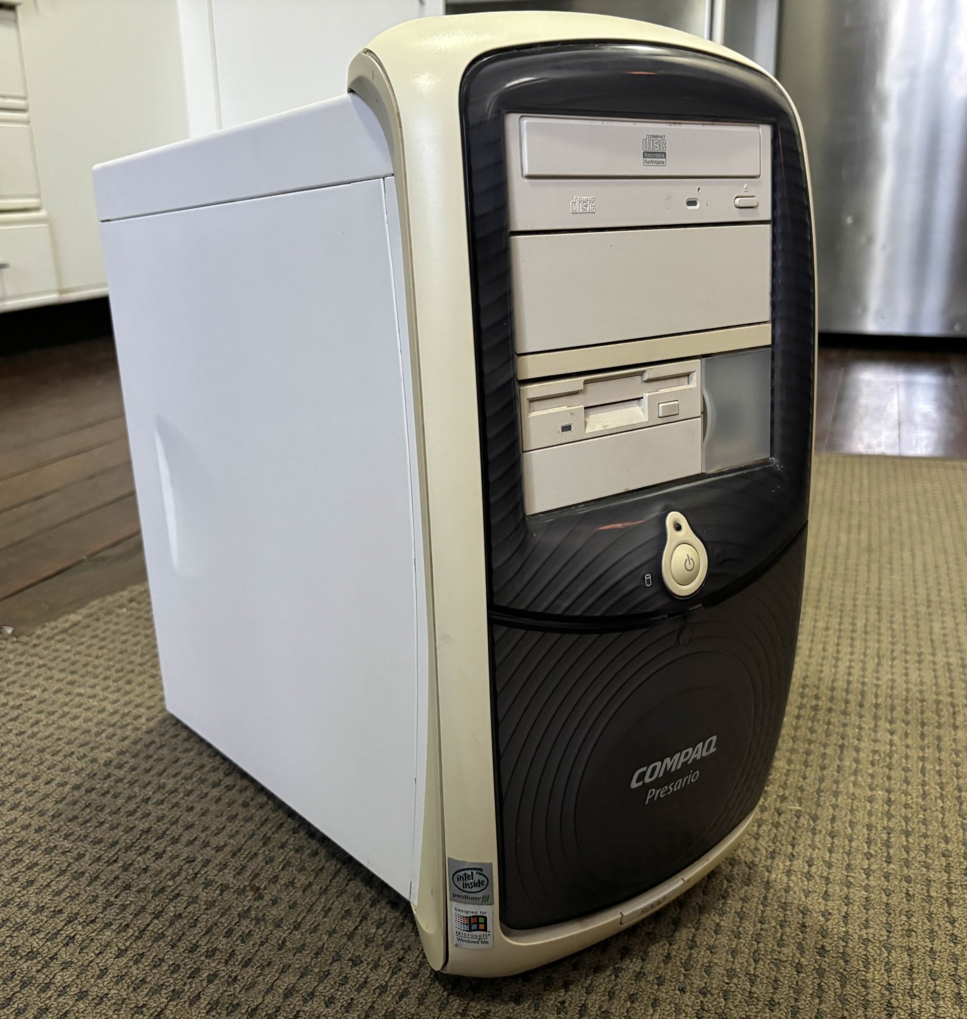
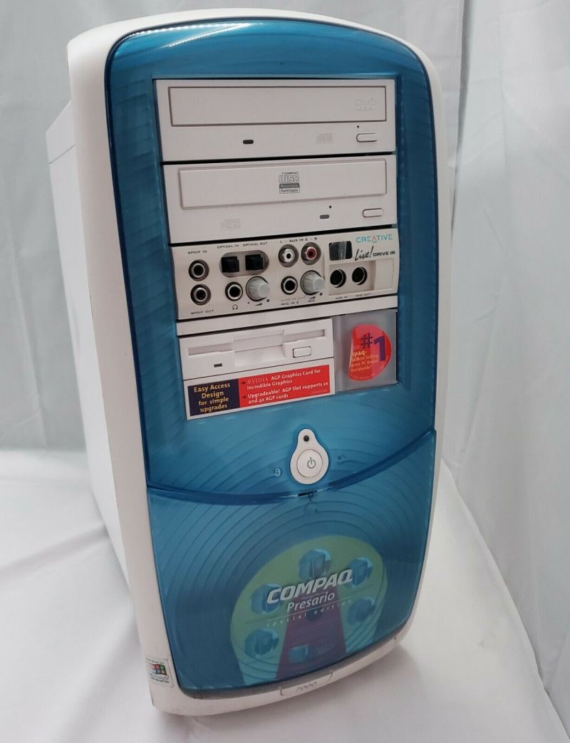

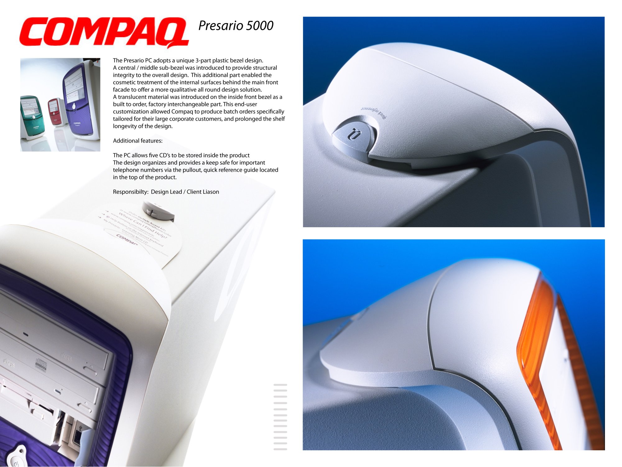
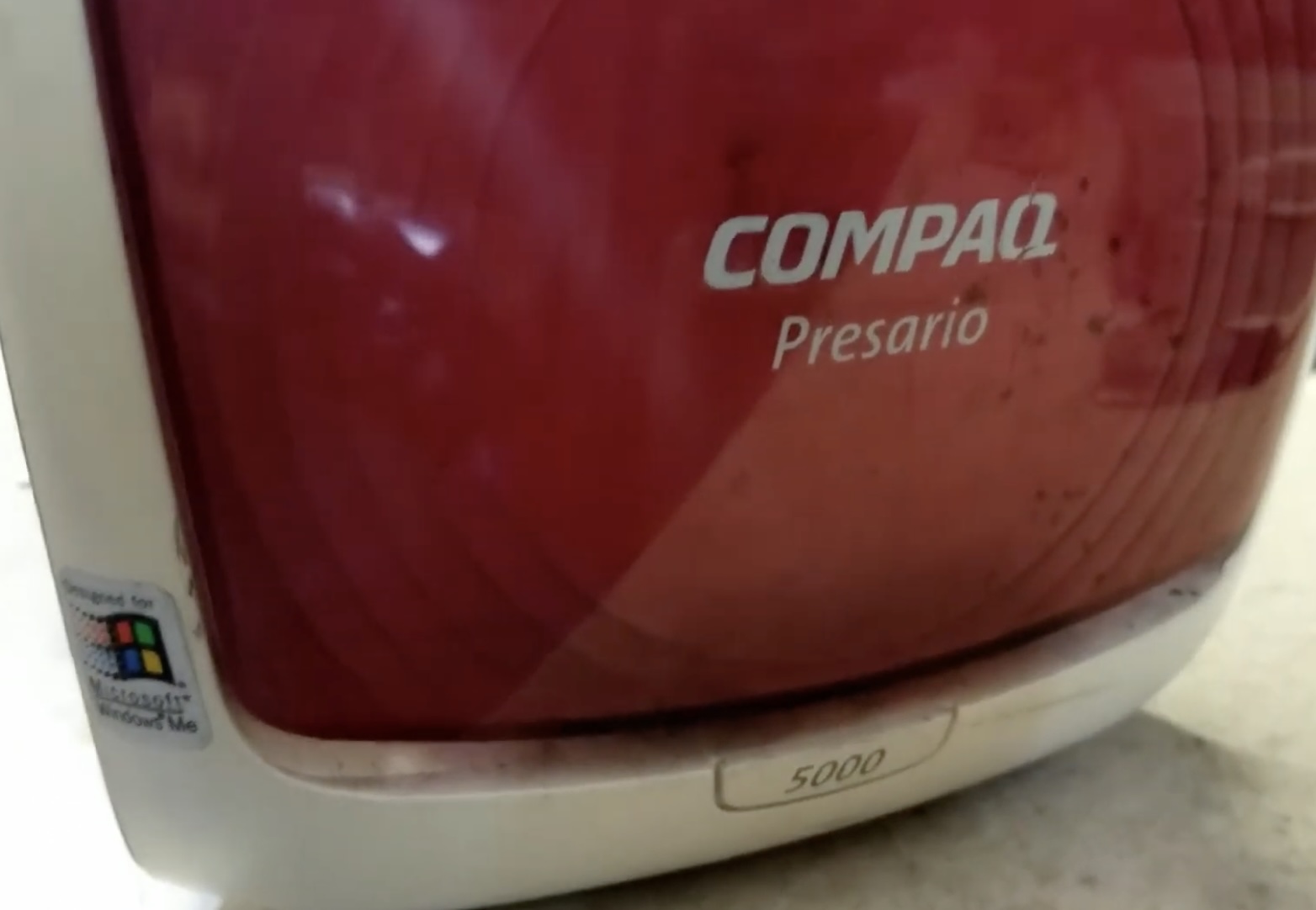
The vast majority (like 90%+) of these were sold in the stock colour, a rather boring purple-grey. You could then pay a little extra to 'personalise' your one by changing the translucent front panels to a different colour.
I tried to get some photos below, including my own one (1st picture).
A look at some ATX cases made from the late 90s. I rather like the pink one!
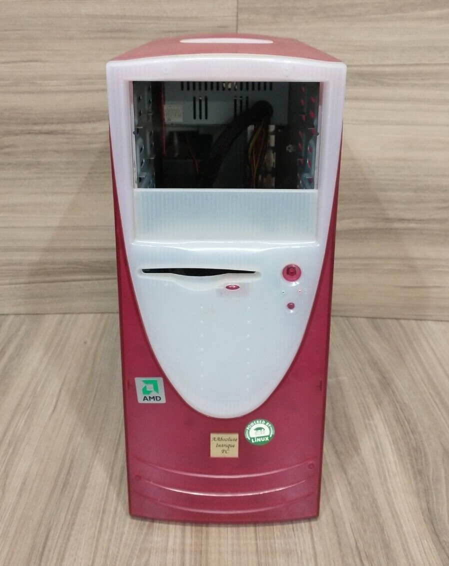
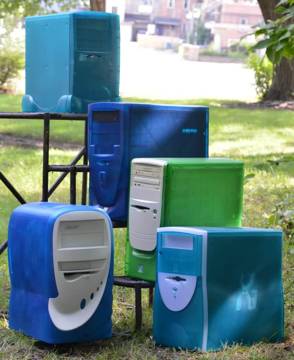
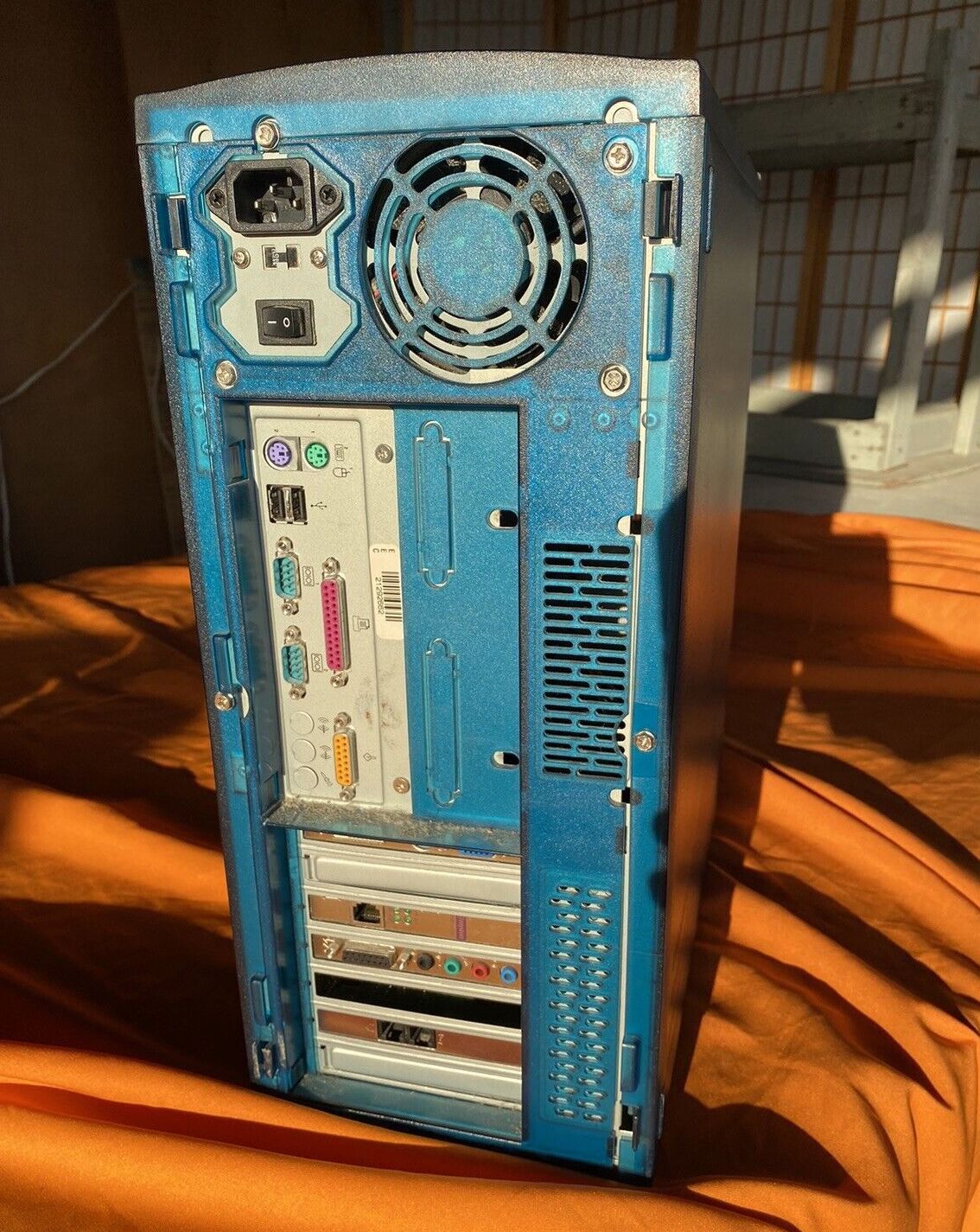
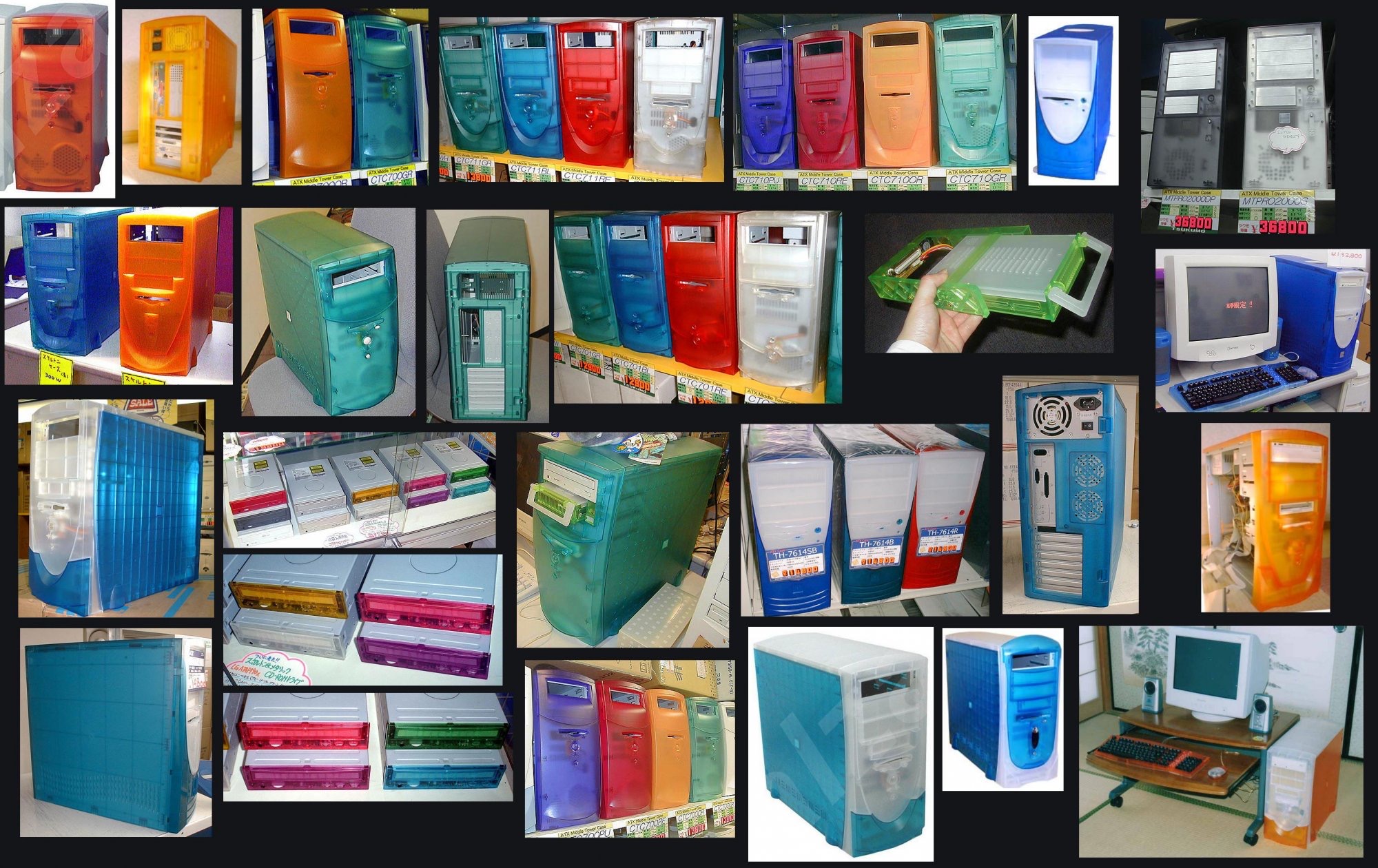
That case was sold on US Ebay last year, so maybe it was that exact one!I went to a local retro computer gathering last year and there was a P2 built up in the pink and white case that is top-left. Neat computer that I played a few rounds of UT99 on.
A look at some ATX cases made from the late 90s. I rather like the pink one!
View attachment 2344261View attachment 2344262View attachment 2344263
View attachment 2344260
Honestly, when I see this:
I think this:
Surge protectors were also made in Bondi Blue 
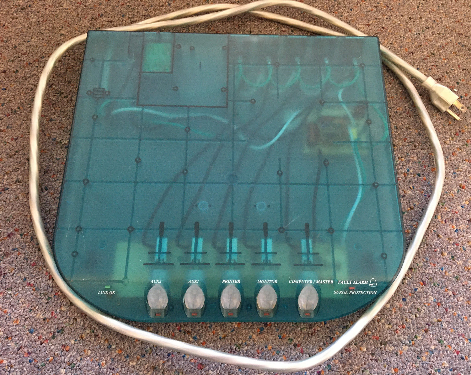
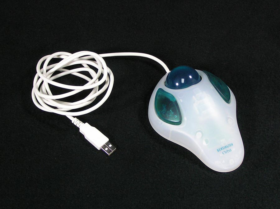
Also the Kensington Orbit trackball:
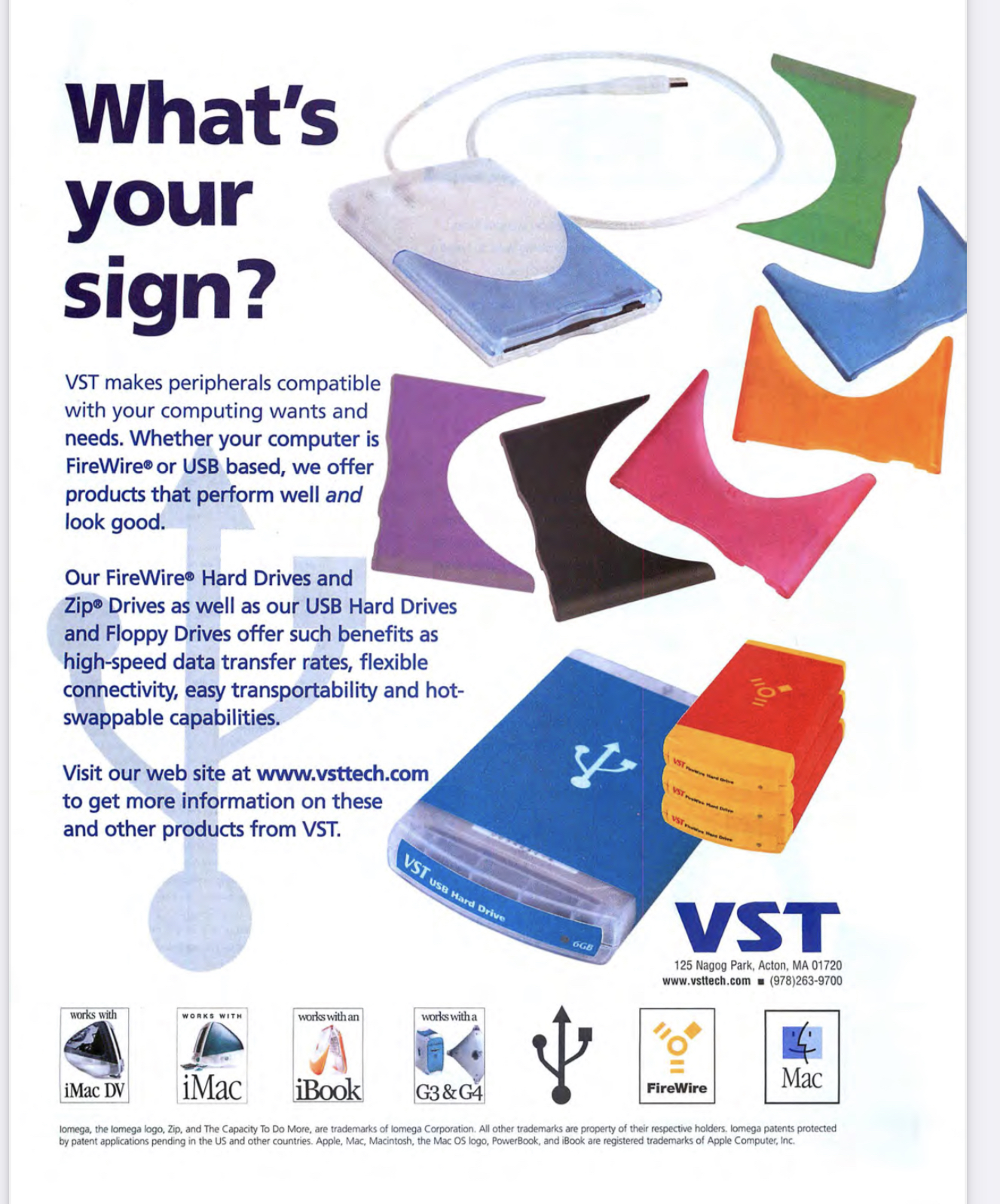
And VST made swappable sleeves for its immensely popular USB floppy drive:
Also the Kensington Orbit trackball:
And VST made swappable sleeves for its immensely popular USB floppy drive:
Corega 5-port Ethernet Hub, and a Lan-Egg USB (1.1?)-Ethernet adapter, for "Fast Internet".


Drippy CREUBB USB Mouse.

Some Elecom Gamepads


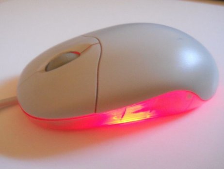
And finally, a seemingly-beige Logitech mouse. But flip it on its belly, and you reveal a taste of the future. I love these ones especially, the bridge between old and new! I haven't used this one personally, but I assume the optical sensor lights up and you get the lovely red glow underneath the mouse.


Drippy CREUBB USB Mouse.
Some Elecom Gamepads
And finally, a seemingly-beige Logitech mouse. But flip it on its belly, and you reveal a taste of the future. I love these ones especially, the bridge between old and new! I haven't used this one personally, but I assume the optical sensor lights up and you get the lovely red glow underneath the mouse.
True. The optical sensor had red glow, like on the bottom photo.And finally, a seemingly-beige Logitech mouse. But flip it on its belly, and you reveal a taste of the future. I love these ones especially, the bridge between old and new! I haven't used this one personally, but I assume the optical sensor lights up and you get the lovely red glow underneath the mouse.
I used one of these Logitech Pilot mouses with translucent belly, but that one had black plastic top.
Attachments
Some cameras!
Largan Lmini 350
Handpring Visor PDA with Eye Module
Agfa CL18
Fujifilm DS-10s
Kodak DC240i
Ansco Digipix

My own Kodak DC240i set and Vivitar. The DC240i was sold limited edition in the 5 iMac colours. They're very accurate to the colours of the iMacs.

Largan Lmini 350
Handpring Visor PDA with Eye Module
Agfa CL18
Fujifilm DS-10s
Kodak DC240i
Ansco Digipix
My own Kodak DC240i set and Vivitar. The DC240i was sold limited edition in the 5 iMac colours. They're very accurate to the colours of the iMacs.
It was a fun time for photography too - half-decent digital cameras were just entering the consumer market, and old trusty 35mm cameras also very common. You can get translucent versions of bothOh boy I have a soft spot for cameras. Those translucent specimens look so good on a display shelf
The Kodak DC240 is 1.2 megapixel
I still use a Belkin Surgemaster that I use and have been using since my PowerMac G3. It's probably 26 years old. You can see it here (time stamped in youtube video). I've never been able to give it up as I just like the damn thing too much.
Attachments
Register on MacRumors! This sidebar will go away, and you'll see fewer ads.


