Ah right. Thank you.I think Ries already said it. The only thing we see is checksum errors in some icc files.
Worth noting is that mmjrk icc files are not the standard color profiles for the MBP which should be in
/Library/ColorSync/Profiles
He seems to have some Adobe specific profiles for video installed, and that is what he is showing.
You should first check what profile you actually using by looking in Settings > Displays > Color.
Got a tip for us?
Let us know
Become a MacRumors Supporter for $50/year with no ads, ability to filter front page stories, and private forums.
Screen on 16'' duller an yellowish compared to 15'' (photos)
- Thread starter mmjrk
- Start date
- Sort by reaction score
You are using an out of date browser. It may not display this or other websites correctly.
You should upgrade or use an alternative browser.
You should upgrade or use an alternative browser.
Could be an issue being a new 16" panel (haven't seen it used in any other device) as well as the variable refresh capability. Anecdotally, the first manufacturing runs of any new device have more issues than later batches.Why would Apple need to refine the manufacturing process? Shouldn't it be "refined" already after years of making LCDs for their various laptops?
Before making any judgment, you should go through the Color Calibration process carefully.
https://support.apple.com/en-mt/guide/mac-help/mchlp1109/mac
https://support.apple.com/en-mt/guide/mac-help/mchlp1109/mac
I am planning to do the same - wait and exchange it later with the hopes that the newer batches dont have such issues. Sigh.My 16" is like this too - compared to a base model 2019 13" which was way brighter/whiter.
Since I have a return date of January 8th I may wait a few weeks and do an exchange in hopes they have refined the manufacturing process.
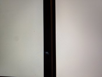
While I can’t comment on the «duller» bit, as I didn’t see this at all, I have to agree on «yellow»: the 13“ I happened to see in a shop next to the 16“ quite clearly had a colder white.

I‘m not sure I would be bothered much if I had a 16“ with such a lightly yellowish touch.
(sorry about the image, I‘ve no idea why it is upside down and am too lazy to correct it)
I‘m not sure I would be bothered much if I had a 16“ with such a lightly yellowish touch.
(sorry about the image, I‘ve no idea why it is upside down and am too lazy to correct it)
While I can’t comment on the «duller» bit, as I didn’t see this at all, I have to agree on «yellow»: the 13“ I happened to see in a shop next to the 16“ quite clearly had a colder white.
View attachment 879650
I‘m not sure I would be bothered much if I had a 16“ with such a lightly yellowish touch.
(sorry about the image, I‘ve no idea why it is upside down and am too lazy to correct it)
Thanks! Did u check if TrueTone was ON perhaps on the 16"? That adds a distinct yellow tint in most circumstances and is the default option.
That was my thought as well, but AFAIK TrueTone was off (not 100% certain, because I always find those french OS settings slightly impenetrable).Thanks! Did u check if TrueTone was ON perhaps on the 16"?
Yellow screen is a new unannounced Apple feature, same as the iPhone 11 Pro -
https://forums.macrumors.com/threads/any-yellow-tint-on-iphone-11-pro-max.2199500/
I also noticed my 16" is warmer/yellower than my 2018 15" Macbook Pro.
https://forums.macrumors.com/threads/any-yellow-tint-on-iphone-11-pro-max.2199500/
I also noticed my 16" is warmer/yellower than my 2018 15" Macbook Pro.
Of course, the question now is: does it bother you? Or do you think it may even grow on you, as many of the things Apple does tend to do?I also noticed my 16" is warmer/yellower than my 2018 15" Macbook Pro.
I called Apple support today and I was offered exchange for different unit. If new unit's the same I will probably return it and wait for next year's model. There were these rumours about OLED / MicroLED... 
Maybe I would get used to it over time but the new screen was just not enjoyable for me and I repeatedly ended up reaching for my 15" from 2016. I'm having a hard time justifying 3000€+ purchase when I find the screen not to be up to par with technology from 2016.
[automerge]1574975736[/automerge]
Maybe someone will find this useful... while comparing the screens I found out that option "Automatically adjust brightness" also reduces color saturation when enabled, even when the brightness slider doesn't move!
Last edited:
I received my replacement unit today (manufacture date 2019-11-25). Display is the same as before. It also has a terrible coil while, worse than the original unit (manufacture date 2019-11-21).
Returning it and waiting for next year's model.
Just so you know according to the most credible rumors next year will be neither OLED nor MicroLED but MiniLED, which is still LCD.
Still, that's a very obvious difference between your two photos, it really seems like this year the screen is a lottery...
I have yellow /warmer tint as well - especially with True Tone. Comparing to iPad Pro. It is bothering me a little as I want to see my photos similar on both devices. Was playing with white point calibration but did't like the outcome.
Few observation:
1. When I disable True Tone on both iPad and MBP they look nearly identical with MBP being still slightly warmer. I have read on Anandtech that iPad is nearly perfect with slight blueish tint - potentially helping with battery on iPad. if MPB is lightly warmer - maybe it is the right spot.
2. I have find out that I really like working with this new screen on factory presets - even with True Tone on. When I switch to 2016 MacBook it really looks off - don't like it (MacBook). The only time I have doubts is when do side by side comparison to iPad.
3. In the past I did calibration with spyder and was always surprised how much warmer, less contrasty screen looked. Maybe we are all wrong - it is not yellowish - other screens are not correct?
4. Catalina is still very buggy - I have noticed during boot that Catalina default picture is very intense/contrasty/dark and it is changing after login - probably after icc profile is being loaded.
5. There is something wrong with True Tone - too yellow imo, but this could be corrected in software.
Not sure what to do - everything else is perfect. No light bleeding, uniform display, machine is silent and cool with light work, extremely performant with heavy load. I'm afraid I will exchange for something not as good.
I will probably stay with it - if I find it disturbing I'll calibrate it in in the future.
Does anyone realize they can calibrate the white point?
This isn't an iPhone.
Thanks for the advice, Genius. Of course I tried calibration, I mentioned that on the first page of this thread. Doesn't help. True Tone, Night Shift, auto brightness and dimming on battery all turned off.
[automerge]1575923718[/automerge]
I have yellow /warmer tint as well - especially with True Tone. Comparing to iPad Pro. It is bothering me a little as I want to see my photos similar on both devices. Was playing with white point calibration but did't like the outcome.
Few observation:
1. When I disable True Tone on both iPad and MBP they look nearly identical with MBP being still slightly warmer. I have read on Anandtech that iPad is nearly perfect with slight blueish tint - potentially helping with battery on iPad. if MPB is lightly warmer - maybe it is the right spot.
2. I have find out that I really like working with this new screen on factory presets - even with True Tone on. When I switch to 2016 MacBook it really looks off - don't like it (MacBook). The only time I have doubts is when do side by side comparison to iPad.
3. In the past I did calibration with spyder and was always surprised how much warmer, less contrasty screen looked. Maybe we are all wrong - it is not yellowish - other screens are not correct?
4. Catalina is still very buggy - I have noticed during boot that Catalina default picture is very intense/contrasty/dark and it is changing after login - probably after icc profile is being loaded.
5. There is something wrong with True Tone - too yellow imo, but this could be corrected in software.
Not sure what to do - everything else is perfect. No light bleeding, uniform display, machine is silent and cool with light work, extremely performant with heavy load. I'm afraid I will exchange for something not as good.
I will probably stay with it - if I find it disturbing I'll calibrate it in in the future.
I also think that there are some bugs related to True Tone and color calibration (after applying calibrated profile the screen turns too dark and saturated, someone already mentioned this in a different thread), but even without True Tone the display looks off to me. But I guess it's hard to spot when people don't have 2016-2019 models on hand for comparison. Reviewers could at least acknowledge that the display is warmer indeed so people wouldn't think it's a defect. Seems weird to me that people don't talk about this more.
It may not be seen as much of an issue. Notebook Check acknowledges what may be this issue, but in terms most people might not follow:Reviewers could at least acknowledge that the display is warmer indeed so people wouldn't think it's a defect. Seems weird to me that people don't talk about this more.
the panel in our MacBook Pro 16 review unit is not as accurate as the display in the MacBook Pro 15 that we tested, which had only minor DeltaE deviations. While the MacBook Pro 16 has impressively low greyscale deviations, its brown and orange deviations are higher than what we would have expected.
Additional calibration helped minimise deviations, with all metrics being better than the ideal value of three. You can find our calibrated ICC file in the box above our comparison table should you wish to use it."
After calibration, the error was less than can be perceived, which is probably why more isn't made of it. Many reviewers calibrate their screens as a matter of course, so the initial tint isn't of great concern to them.
(I haven't looked into this, but I wonder if tastes for screen tint have changed as a result of fears about blue light. That wouldn't affect what an accurate color would be, but it might affect what people prefer.)
I purchased a 2.3/16/1TB stock model with a great screen but decided to return it for the upgraded in-store model 2.4/32/2TB and that unit had a dim and yellow screen, it was really really bad and of course, it was returned immediately. Have not yet bought another replacement as my 15 inch is fine (for now) and not being passed on to another employee just yet so I have sometime to play the screen lottery.
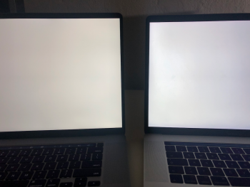
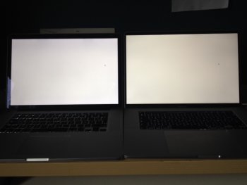
I received my MacBookPro 16 inch last week as an upgrade coming from the initial MBPr 15 inch (mid-2012). Coming from this early model I thought the display would at least be on par but I immediately noticed the colours were less expressive on the 16 inch MacBook, also there seems to be a yellowish hue compared to the older MacBook (see attachment, both MBPs are set on 75% brightness, automatic brightness and True Tone disabled). I ran through the calibration tool to adjust the colour temperature, but to no avail. To improve the contrast, I ran the calibration tool in expert mode which certainly improves the contrast and colours, however the yellow/greenish hue still remains. I can only compare with an older model which I found to have a slight reddish hue but this seems to pop the whites, which I miss on the new MBPr. Does anyone have the same experience or is this related to the particular panel used in the 16 inch model. I checked and it seems I have an LG panel inside. On the older MBP I had a Samsung panel, this might explain the difference. I am just wondering, is this normal (on the left MBPr 2012, on the right MBPr 2019) for the new models or is there something wrong with the screen. Can someone send in a picture of a 'correct' panel (or at least what you objectively see as how a normal panel should display white)?
Attachments
I have the same and models in Apple store are identical - I have spend 1 hour comparing with mine.
I‘m afraid this is new norm we should get adjusted.
Maybe previous calibration on older models was not correct?
I did comparison with 2019 13” in store as well. The difference is not that dramatic as with older ones (like yours 2012) but new MBP 16 is still on the warmer side.
I‘m afraid this is new norm we should get adjusted.
Maybe previous calibration on older models was not correct?
I did comparison with 2019 13” in store as well. The difference is not that dramatic as with older ones (like yours 2012) but new MBP 16 is still on the warmer side.
Last edited:
@intrepidcase any chance you can check which type of panel you're using as it seems that your MBP 16" has a more reddish glow (which is also the case for my 2012 MBPr)?
- My 2012 MBPr: slight reddish hue, Samsung
- My 2019 MBP 16: yellow/green hue, LG
Your situation (at least colorwise) seems to be the other way around (ie. 2014 MBPr - yellow/green, 2019 MBP 16 - red). If your screen is a Samsung I would happily go for another Samsung display as I was quite happy with it on my 2012 MBP.
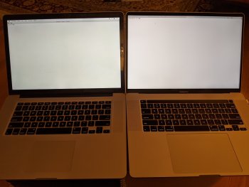
yours doesn't seem to have a yellow-ish hue compared to your old computer.datapoint - pics of my late 2013 15" MBP vs 16" MBP ... (I used terminal but 100% brightness, no true-tone, 100% white, etc).
my 16" does seem slightly warmer compared to my previous 2017 15" but i'm starting to think maybe those monitors were a little too cool. either way, i actually prefer the cooler displays but this isn't something I notice with day to day use; only if i take out my previous 15" and compare them side by side do i notice a difference
Register on MacRumors! This sidebar will go away, and you'll see fewer ads.


