You would have lost your bet. I have an LG panel according to 3utools.Do you have a 15PM with you now? How much are you betting that you have a Samsung panel?
If you can’t accesso to 3utools I write you the procedure to identify the producer without any tools
Got a tip for us?
Let us know
Become a MacRumors Supporter for $50/year with no ads, ability to filter front page stories, and private forums.
iPhone 15 Pro Max Screen uniformity and cast
- Thread starter iamdman
- Start date
- Sort by reaction score
You are using an out of date browser. It may not display this or other websites correctly.
You should upgrade or use an alternative browser.
You should upgrade or use an alternative browser.
You’re right. I think I remember reading BOE are in 15 plus and regular 15.G9Q also Samsung. I doubt there are any BOE in 15 Pro series this year.
I still don’t get it. I don’t see GXX anywhere.samsung-g9n,g9p
after 334-first number year then 34 week
lg-gh/gvh
Is there uniformity issues with your panel when viewing it from the normal usage angles? They all tend to tint at some angle. I'd myself appreciate more uniform panel and rather live with some even tint across the screen. These tend to be calibrated pretty warm so that it good to keep in mind when judging the panel.You would have lost your bet. I have an LG panel according to 3utools.
Not sure what you mean but looking at the picture about your panel serial you posted earlier, yours is LG panel. The string would start with G9xxxx if it was Samsung.I still don’t get it. I don’t see GXX anywhere.
Where can I get the white background image to take a look. My issue is that it’s too yellow (true tone night shift off) also looks a little pink when looking at an angle.Is there uniformity issues with your panel when viewing it from the normal usage angles? They all tend to tint at some angle. I'd myself appreciate more uniform panel and rather live with some even tint across the screen. These tend to be calibrated pretty warm so that it good to keep in mind when judging the panel.
Can you post some photos? with 10% brightness! and everything is active!Where can I get the white background image to take a look. My issue is that it’s too yellow (true tone night shift off) also looks a little pink when looking at an angle.
Preferably use something from Safari so that you can have all TT and NS used in their normal strength without additional image enhancements what it does when using photos app.Where can I get the white background image to take a look. My issue is that it’s too yellow (true tone night shift off) also looks a little pink when looking at an angle.
Simply start with page like google.com and turn your phone sideways and zoom the white filling the whole screen. There is your 100% white test pattern. Also google for Walvision test patterns, you can find several different, just zoom them to fill the whole screen.
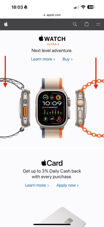
As for the uniformity check, I also use some real web sites, simply like going to apple.com and check different gray "boxes" with product images on the front page. I find Apple Watch Ultra 2 box very nice test when moving it up and down and see how gray changes, just look at the gray inside the watch strap loop on either side, very simple but effective way to "reset" your eyes to see actual difference if there is any. It allows you to see better if like left and right side have different tint because I find myself that whole screen one color test patterns tend to cause "snow blindess" type effect, it is much harder to see with bare eyes difference in those (unless it is very bad screen) while if you take a photo of your screen with such test pattern it will immediately reveal how bad uniformity is (which is why you often hear people saying their panel shows issues when take take a photo of the screen but it looks fine viewing bare eyes. Surely camera makes issues more visible better but still).
Last edited:
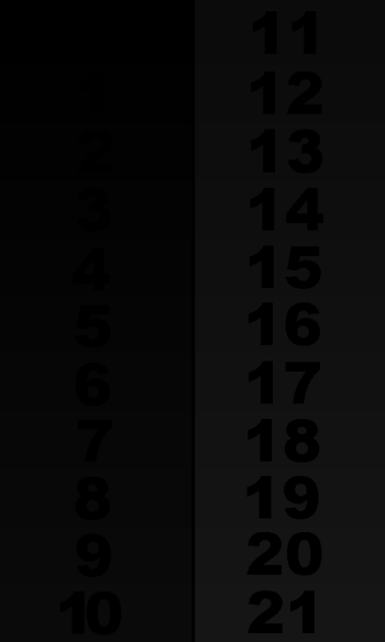
You should see up to 1 because 0 is supposed to be completely black and if 0 can be differ from black, then your panel it not right either. Anyway what you describe (seeing up to 2) is simple black crush and it is pretty usual issue especially OLED is not that good at lower gray levels even its black level is prefect. If I recall even some MacBooks LCD's tend to do that.This image is a better test of how good your screen is. You should be able to see all the way to at least 1 if you have a good panel. Even 0 I believe. I can only see up to 2 on a completely dark room.
You’re right. It’s been a while since I had to test this. My last iPhone was an XS Max and I upgraded to 15PM now.You should see up to 1 because 0 is supposed to be completely black and if 0 can be differ from black, then your panel it not right either. Anyway what you describe (seeing up to 2) is simple black crush and it is pretty usual issue especially OLED is not that good at lower gray levels even its black level is prefect. If I recall even some MacBooks LCD's tend to do that.
Do you refer to the apple ultra watch box in home page?Preferably use something from Safari so that you can have all TT and NS used in their normal strength without additional image enhancements what it does when using photos app.
Simply start with page like google.com and turn your phone sideways and zoom the white filling the whole screen. There is your 100% white test pattern. Also google for Walvision test patterns, you can find several different, just zoom them to fill the whole screen.
As for the uniformity check, I also use some real web sites, simply like going to apple.com and check different gray "boxes" with product images on the front page. I find Apple Watch Ultra 2 box very nice test when moving it up and down and see how gray changes, just look at the gray inside the watch strap loop on either side, very simple but effective way to "reset" your eyes to see actual difference if there is any. It allows you to see better if like left and right side have different tint because I find myself that whole screen one color test patterns tend to cause "snow blindess" type effect, it is much harder to see with bare eyes difference in those (unless it is very bad screen) while if you take a photo of your screen with such test pattern it will immediately reveal how bad uniformity is (which is why you often hear people saying their panel shows issues when take take a photo of the screen but it looks fine viewing bare eyes. Surely camera makes issues more visible better but still).
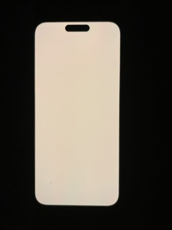
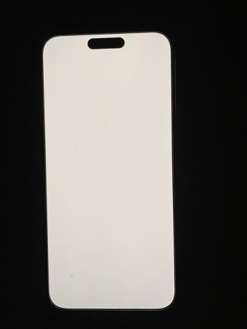
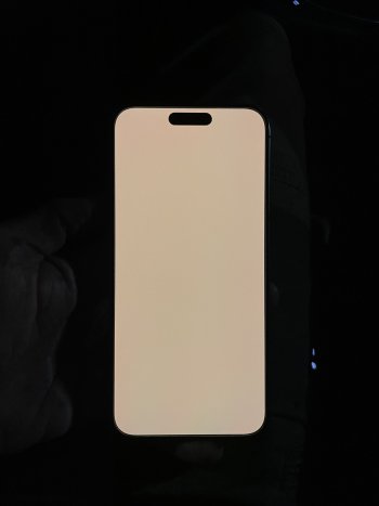
I tried to get some picture using the google page and zooming the white, there some slight differences.
Hard to post a pic, with the prtective glass it looks like rainbow in soem area. 1pics and 3rd with NS at full strength and TT, zooming google white background, the 2nd without NS.
It’s ok anyway, without the 100% NS it looks great to my eyes
Attachments
Last edited:
My experience with the LG or GVC panel that they tend to be more yellow. I got an G9N, absolutely love it.
First one was a perfect G9N too, but unfortunaly it had a death pixel in the camera app. 2nd GVC, too yellow for me. 3rd another reseller a charm. Lucky and perfecto for me. No more headace and it's an keeper for years to come!
First one was a perfect G9N too, but unfortunaly it had a death pixel in the camera app. 2nd GVC, too yellow for me. 3rd another reseller a charm. Lucky and perfecto for me. No more headace and it's an keeper for years to come!
My main issue is when it’s too warm. I don’t like it. I can live with some tint at extreme angles since I don’t ever look at the screen at those extreme angles.Is there uniformity issues with your panel when viewing it from the normal usage angles? They all tend to tint at some angle. I'd myself appreciate more uniform panel and rather live with some even tint across the screen. These tend to be calibrated pretty warm so that it good to keep in mind when judging the panel.
Last edited:
I mean 6th product from the top on the apple.com front page. Basically all product images with different level gray background on that page is good starting point to evaluate displays. Product photo in the middle allow you to "reset" you eyes to see difference in gray between left and right side.Do you refer to the apple ultra watch box in home page?
Not bad, looks like average G9N. Not too much tint difference between left and right, just top part it pinkish.I tried to get some picture using the google page and zooming the white, there some slight differences.
Hard to post a pic, with the prtective glass it looks like rainbow in soem area. 1pics and 3rd with NS at full strength and TT, zooming google white background, the 2nd without NS.
It’s ok anyway, without the 100% NS it looks great to my eyes
My G9P is similar but also some pink tint on the right side but from what I tested demo G9P's they all had the same issue. We had bad luck with our G9N (we have got 2 x 15 PM's here) since it has pink tint on the left too besides typical pink tint upper half of the screen but in some situations it still might have edge over mine, not quite sure even after my long tests. Anyway my G9P was better in landscape mode where left and right side did not look too different unlike our G9N where difference was very noticeable in that case. I did not bother jumping to exchange roulette but if I had, I would have aimed for decent G9N myself too, not sure G9P reach the same level
Last edited:
I see. I would myself happily take too warm but even panel instead of cooler but non uniform. My G9P has cooler white than our G9N which is nice and warm. It is hard to describe but my G9P has somewhat bluish undertone with red "tinge", probably panel is cool by nature but adjusted warmer by pushing red to meet desired white balance.My main issue is when it’s too warm. I don’t like it. I can live with some tint at extreme angles since I don’t ever look aat the screen at thhose extreme angles.
Yes, it is very pleasing warm. Probably that panel is naturally closer to desired white balance.Yes I agree. My G9N is minimal warmer than my previous G9P. 😀
I wondering if that is the best type after all. Seems very common in this model.
Yes my G9N is very good.
The only issue is, the brightness on the right side from middle to top is a little bit lower than on the right side. But there is no color tint or something only minimal brightness difference.
With the G9P it was the same but there I had a tint from top to bottom when night shift was 50-100%. With this G9N there is no tint even with 100% NS.
Really happy with it 😄
I have found that often this brightness difference can cause tint issues in real use. Have you checked pages like Apple.com comparing left and right side with product images which have light gray background when using NS at 100% + TT?Yes my G9N is very good.
The only issue is, the brightness on the right side from middle to top is a little bit lower than on the right side. But there is no color tint or something only minimal brightness difference.
Anyway, sounds more like you might have found good panel.With the G9P it was the same but there I had a tint from top to bottom when night shift was 50-100%. With this G9N there is no tint even with 100% NS.
Really happy with it 😄
Yes I have tested apple.com
The only issues is the brightness issue you can see. For example the picture with the watch I can see it a little bit. The right side is a little minimal bit darker than the left side. But I have to concentrat to see it. In real life you cannot see it 😃
It is also the first panel with no top to bottom tint like the other 4x G9P & G9N I have tested. They all had this even harder with NS at 100%. With this panel there is no difference with NS at 100%.
Attachments
I found out something strange.
Hold the phone in landscape mode but disable the RotateFunction and test the following:
Open a 100% white test picture with 10% brightness NightShift 100% / TrueTone On the display is complete uniform.
If I change immediately to settings the bottom of the screen becomes blueish/greenish and the top reddish.
What the f*** 😳
View attachment 2316135
Is this a software bug because if the panel will be bad the 100% white picture also has to be uneven?! 😳
UPDATE: If I disable the HDR function in settings under photos the 100% white picture also becomes uneven. The brightness is on both tests unchanged with 20%.
What is that 😳
You can test it with this tutorial 😀
My main issue is when it’s too warm. I don’t like it. I can live with some tint at extreme angles since I don’t ever look at the screen at hose extreme angles.
Wouldn't it be cooler, if it's closer to desired white balance ~6500K? if the color temp is higher(warmer) it's farther from the desired white balance. Am I missing something?Yes, it is very pleasing warm. Probably that panel is naturally closer to desired white balance.
I wondering if that is the best type after all. Seems very common in this model.
Man, you don't want an BOE display if you have a regular 15 https://www.macrumors.com/2023/12/05/iphone-15-oled-supplier-problems-persist/
Register on MacRumors! This sidebar will go away, and you'll see fewer ads.


