Got a tip for us?
Let us know
Become a MacRumors Supporter for $50/year with no ads, ability to filter front page stories, and private forums.
Show Off Your iOS 18 Homescreen!
- Thread starter PilotTiny
- WikiPost WikiPost
- Start date
- Sort by reaction score
You are using an out of date browser. It may not display this or other websites correctly.
You should upgrade or use an alternative browser.
You should upgrade or use an alternative browser.
- Status
- The first post of this thread is a WikiPost and can be edited by anyone with the appropiate permissions. Your edits will be public.

very simple but for now, black icon is the only color I like. Other seems like a bad filter on the screen.
I like the option without labels but I hate the fact labels are also removed from app gallery, not sure to Keep that option.
Also , color is not Linked to focus profile so actually it’s a dead on arrival feature because of that for me.
I like the option without labels but I hate the fact labels are also removed from app gallery, not sure to Keep that option.
Also , color is not Linked to focus profile so actually it’s a dead on arrival feature because of that for me.
Attachments
Some great looking home screens on here, giving me some inspiration lol
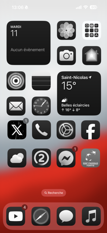
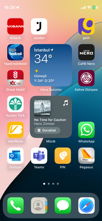
Updating my current set up…I’m like the tinting option
Attachments
Last edited:
I've gotten so used to having a locked grid and made adjustments with Widgy that I'm struggling to use the new feature.
You don't. Those are large icons. It automatically removes them when you go big. No user preference or anything. I would have liked to have a denser five column layout with smaller icons and no labels, but we aren't going there this year.How did you remove labels on small icons?
Dock icons are custom icons right? not the default ones only with tinting.Updating my current set up…I’m like the tinting option
Why are the gaps between the icons all different and some icons are even misaligned.very simple but for now, black icon is the only color I like. Other seems like a bad filter on the screen.
I like the option without labels but I hate the fact labels are also removed from app gallery, not sure to Keep that option.
Also , color is not Linked to focus profile so actually it’s a dead on arrival feature because of that for me.
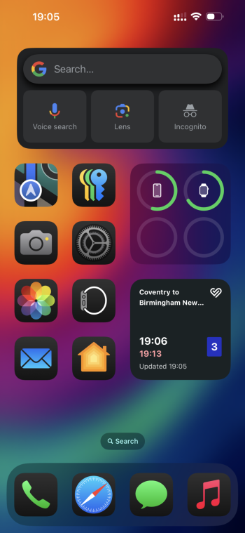
I can’t seem to get my widgets in the middle like that.iOS 18 is very nice.
I just tried it out - there has to be an icon on either side of the widget for it to stay in the middle. Otherwise it slides to the left or right.I can’t seem to get my widgets in the middle like that.
You don't. Those are large icons. It automatically removes them when you go big. No user preference or anything. I would have liked to have a denser five column layout with smaller icons and no labels, but we aren't going there this year.
I knew the label went away with the large icons. Yours don’t look large in the pic here.
How did you get the widgets in the middle?iOS 18 is very nice.
this dark mode is just ugly with the stock icons dark and the rest in color. Looks terrible IMONoting much! Swapped the camera button to "Scan code" on lockscreen.
Apple stock wallpaper.
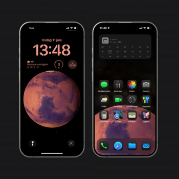
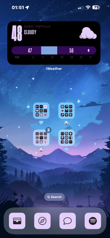
Homescreen with a Widgy on top.
YUCK! If you like that then just go grab a cheap flip phone. WOW that's bad!View attachment 2387543
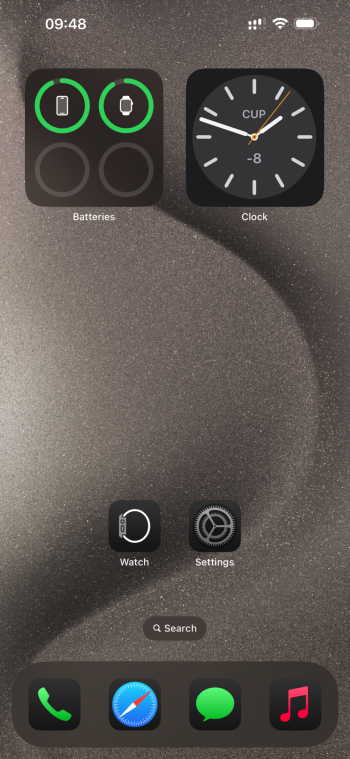
Living that monochromatic life!
You are correct, however this is just the same from when we were transitioning from iOS 6 to iOS 7. New system icons with old designed third party ones. Once iOS18 gets released to the public most third party icons will get updated pretty quickly.this dark mode is just ugly with the stock icons dark and the rest in color. Looks terrible IMO
Register on MacRumors! This sidebar will go away, and you'll see fewer ads.