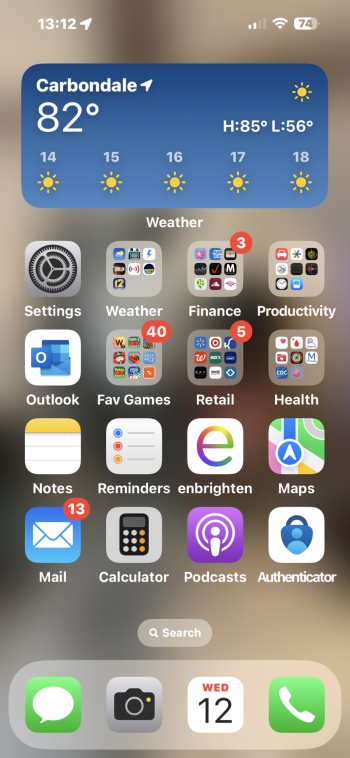
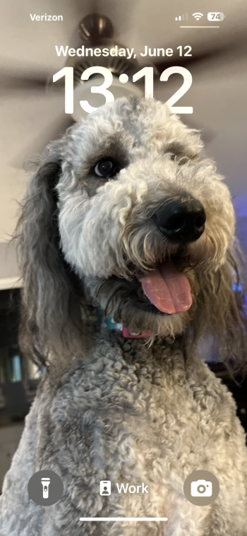
IndeedAlmost feels like it's a first beta and not everything is ready!
Got a tip for us?
Let us know
Become a MacRumors Supporter for $50/year with no ads, ability to filter front page stories, and private forums.
Show Off Your iOS 18 Homescreen!
- Thread starter PilotTiny
- WikiPost WikiPost
- Start date
- Sort by reaction score
You are using an out of date browser. It may not display this or other websites correctly.
You should upgrade or use an alternative browser.
You should upgrade or use an alternative browser.
- Status
- The first post of this thread is a WikiPost and can be edited by anyone with the appropiate permissions. Your edits will be public.
I tried and gave up 😂It's tricky. You can't really move icons and widgets wherever you want. Whenever you move something the other icons shift so you have to play with it to get a widget in the middle.
Can you share this wallpaper if you don’t mind? It’s so cool in my eyes!
Nothing is impossible. Keep trying.I tried and gave up 😂
I get what you mean and it's bothering me too. I think my mind thinks that black background of app icons = inverted colors, but since the other colors stay the same it doesn't match what my mind expects there.There's something about these "new" icons that bothers me. Their implementation of color tint and dark mode just looks lazy. Maybe if we got completely new icons that had more depth, it would look better.
It's very noticeable with the Notes app icon.
Don’t hate it but I wish you could opt-out certain widgets like the Photo Widget obvi looks awful with the tint.

I agree with the Notes icon - it's easily the worst of the new dark icons. I think we'll see skilled third party developers show us how this should be done.I get what you mean and it's bothering me too. I think my mind thinks that black background of app icons = inverted colors, but since the other colors stay the same it doesn't match what my mind expects there.
It's very noticeable with the Notes app icon.
I think this looks really good, honestly. Do you have a link to the background wallpaper?Had another crack at it this evening. Really like this look. Especially with the dark icons
AppStore,Facebook, Instagram icons...using shorcuts, right? unfortunately they do not have a dark mode yet by default.
Here’s how I’m rolling, light and dark mode 😎
Loving the larger icons.
I tried to like them, but it just makes the Homescreen look so goofy lol... I really like the fact that it removes the app name though. Wish Apple gave us the option to do that on the regular size icons.
This looks just like an iOS 17 screen. Am I missing something?14PM
For the life of me I cannot get widgets in the middle like in your set-up.iOS 18 is very nice.
I do wish we could we could have an 6x5 or 6x6 icon grid.

mytuner Pro widget
weathergraph 48hr widget
The usual nonsense. Waiting until I can change the icon images on an individual basis, with differently chosen colours.
Tom
myTuner Pro picks up the only radio station in a town of 7,500 that is close to the village 50-90 people I live in. It warrants homescreen space b/c I live in the wastelands of 0-1 bar LTE service; only get 5G when I go in for dialysis. Widget holds a most recently played and 4 other stations.
Last edited:
It’s my home screen. It’s the way I like it.This looks just like an iOS 17 screen. Am I missing something?
Ok cool. was curious if there was an ios 18 feature that I wasn't seeing.It’s my home screen. It’s the way I like it.
Is there a toggle to keep the old icon behavior? I actually prefer the way it is now over how Android does it
Something about them all floating to the top keeps the home screen looking light, they’re like bubbles in a soda 🫧
Something about them all floating to the top keeps the home screen looking light, they’re like bubbles in a soda 🫧
Is there a toggle to keep the old icon behavior? I actually prefer the way it is now over how Android does it
Something about them all floating to the top keeps the home screen looking light, they’re like bubbles in a soda 🫧
The old behaviour is sort of still maintained, and when you drag around widgets for example, app icons around them will default to sorting from the top left. The difference is now is that if I drag an icon or widget to the bottom of the screen for example and there are non above it for example, it will stay there.
Pick up your S24U and you can 😂For the life of me I cannot get widgets in the middle like in your set-up.
I do wish we could we could have an 6x5 or 6x6 icon grid.
Would love a 6X5 grid but I'm loving the little changes tho in ios18. When RCS is a go most of my iOS complaints will be gone. May cure some of my phone hopping habit and save me some money 😂
I liked how yours looked and decided to give the space wallpapers a try and ahh! I love it so much actually! Especially with the dark mode icons.Noting much! Swapped the camera button to "Scan code" on lockscreen.
Apple stock wallpaper.
Homescreen with a Widgy on top.
I’ve been changing up some of my icons.
Like the old days of jailbreaking.

Like the old days of jailbreaking.

Last edited by a moderator:
Register on MacRumors! This sidebar will go away, and you'll see fewer ads.


