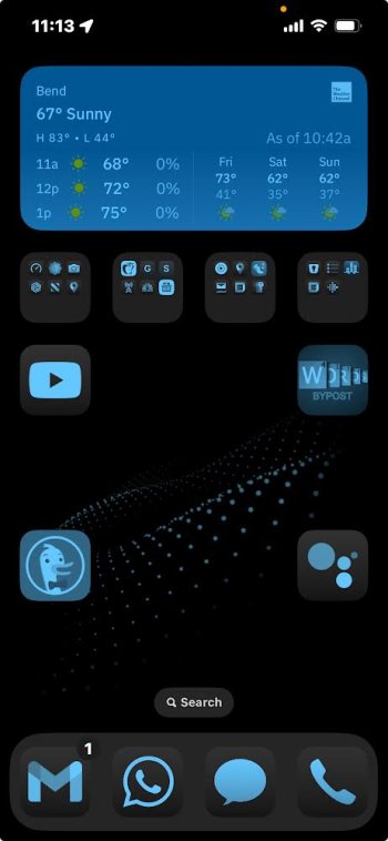
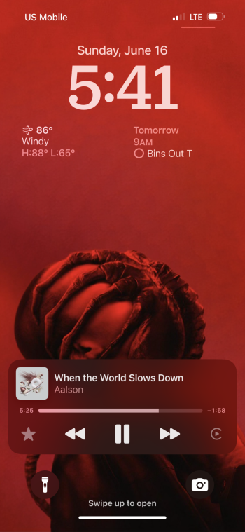
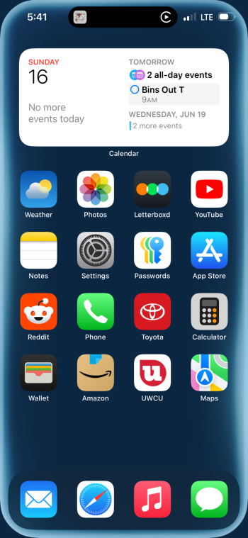
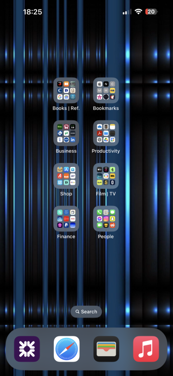
How did you get appstore/facebook/instagram icon in dark mode?
Got a tip for us?
Let us know
Become a MacRumors Supporter for $50/year with no ads, ability to filter front page stories, and private forums.
Show Off Your iOS 18 Homescreen!
- Thread starter PilotTiny
- WikiPost WikiPost
- Start date
- Sort by reaction score
You are using an out of date browser. It may not display this or other websites correctly.
You should upgrade or use an alternative browser.
You should upgrade or use an alternative browser.
- Status
- The first post of this thread is a WikiPost and can be edited by anyone with the appropiate permissions. Your edits will be public.
oh FFS! please stop using tapatalk people.[...]
Would you mind sharing your wallpaper please?
Please share wallpaper?
iOS 18 is very nice.
What is this witchcraft, tried several times to replicate, no go 🤨
Dark theme. Only want some useful widgets on Home Screen. Frequently used apps are in folders on the dock.

I can seem to move my widget to the middle. How’d you do that?View attachment 2387834Got my widget in the middle!
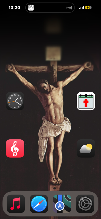
Yes stan miss CharliHere’s mine! I find that personally the tint only really looks good for black and white or dark colored wallpapers
View attachment 2387821
Agreed. Hopefully Apple or the app widget developers can have an option to not tint color photos or the font color. Some of the widget fonts I can't even read unless a turn on dark mode as well.Don’t hate it but I wish you could opt-out certain widgets like the Photo Widget obvi looks awful with the tint.
You think Apple also will add support to let us choose own icons?
Like: "Auto, Dark, Light, Tint or Import..." something like that.
Like: "Auto, Dark, Light, Tint or Import..." something like that.
You think Apple also will add support to let us choose own icons?
Like: "Auto, Dark, Light, Tint or Import..." something like that.
Don’t see that ever happening. The icons are intellectual property of the app owner. In most cases the icon is their logo. Allowing users to just swap it it because they want to will not be well accepted by the brand owners.
Last edited:
But they will be okey with people adding that aweful color tints? 🤣Don’t see that ever happening. The icons are intellectual property of the app owner. In most cases the icon is their logo. Allowing users to just swap it it because they want to will not be well accepted by the brand owners.
Agreed, for my part, the color tinting is a train wreck waiting to happen... but I see a big difference. The end users (us) aren't changing AN ICON, we're changing the entire color/tint of the Home Screen.But they will be okey with people adding that aweful color tints? 🤣
Takes trial and error. Have to arrange your icons on the left and right first, creating an empty space 2 icons wide in the middle. Then when you add your 2x2 widget, it'll put it there. But you can't make changes after that. Just moving 1 normal icon can shift the widget back to the side. Hope they fix this in a later release, and make the home screen fully customizable. I've needed to rearrange my icons a few times, and end up having to start that process all over again.I can seem to move my widget to the middle. How’d you do that?
Register on MacRumors! This sidebar will go away, and you'll see fewer ads.


