Got a tip for us?
Let us know
Become a MacRumors Supporter for $50/year with no ads, ability to filter front page stories, and private forums.
Show Off Your iOS 18 Homescreen!
- Thread starter PilotTiny
- WikiPost WikiPost
- Start date
- Sort by reaction score
You are using an out of date browser. It may not display this or other websites correctly.
You should upgrade or use an alternative browser.
You should upgrade or use an alternative browser.
- Status
- The first post of this thread is a WikiPost and can be edited by anyone with the appropiate permissions. Your edits will be public.
Can you share this wallpaper?The vertical spacing between X and Mail and weather lines are different and X is kicked over to the right compared to Mail by a few extra pixels. You don’t see any of that?
View attachment 2391311
Not gonna lie, this is the ugliest iOS update I’ve ever seen. Every time I come to this thread I’m just reminded how bad Apple dropped the ball here. Hideous. First iOS update ever that I’m not interested in updating to.
My phone is set up exactly as it was before the update. I’ve tried all sorts of new setups but classic is where it’s at.Not gonna lie, this is the ugliest iOS update I’ve ever seen. Every time I come to this thread I’m just reminded how bad Apple dropped the ball here. Hideous. First iOS update ever that I’m not interested in updating to.
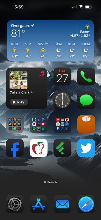
Masterchef and a bins-out reminder...... Are you a British ex-pat?! 😄My phone is set up exactly as it was before the update. I’ve tried all sorts of new setups but classic is where it’s at.
View attachment 2400698
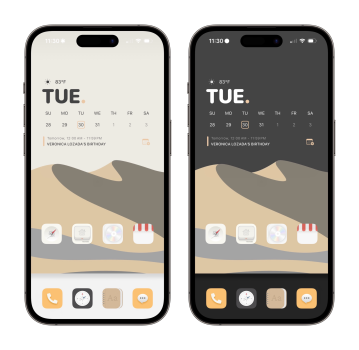
When you bring up the Customize options after long pressing on the screen, in the upper left corner of the options at the bottom there is a little icon that looks like a sun. Click on that and you can switch from a darker wallpaper to a lighter wallpaper.Is it just me, or does everybody’s wallpaper get darker in iOS 18?
Could you share this wallpaper?very simple but for now, black icon is the only color I like. Other seems like a bad filter on the screen.
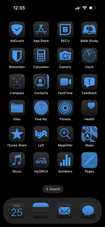
I like the option without labels but I hate the fact labels are also removed from app gallery, not sure to Keep that option.
Also , color is not Linked to focus profile so actually it’s a dead on arrival feature because of that for me.
I just wish the tinting would leave widget color alone.
I just wish the tinting would leave widget color alone.
And now they also ruined Widgy which is so damn petty, it’s always one step forward, two steps back with Apple. I just bought the paid version too, really hoping someone finds a workaround.
Register on MacRumors! This sidebar will go away, and you'll see fewer ads.


