Got a tip for us?
Let us know
Become a MacRumors Supporter for $50/year with no ads, ability to filter front page stories, and private forums.
Show Off Your iOS 18 Homescreen!
- Thread starter PilotTiny
- WikiPost WikiPost
- Start date
- Sort by reaction score
You are using an out of date browser. It may not display this or other websites correctly.
You should upgrade or use an alternative browser.
You should upgrade or use an alternative browser.
- Status
- The first post of this thread is a WikiPost and can be edited by anyone with the appropiate permissions. Your edits will be public.
Not sure what you mean. You can set the Home Screen for either light or dark mode. So a wallpaper will look different, depending on which you use. Not sure what you mean by a light wallpaper and dark wallpaper together?I have a question: Does Apple finally allow you to set a light theme wallpaper and a second different one for dark mode?
It was a shortcut that I had gor a while that would let you pick your home screen layout and apply the correct shadows to any wallpaper.Just gorgeous. I think this is one of those occasions where the tint feature looks really good. Congratulations on the composition.
That shadow effect looks really awesome! Did you apply them or they came with the wallpaper?
Something changed with Shortcuts last year and I lost the files and all of the links on the YouTube videos are now broken. Good thing I made a whole bunch of them.
What I mean is, setting a wallpaper A (for instance with yellow and coral colors) for the light mode, and a wallpaper B (for example one with dark blue and black colors) for the dark mode, so whenever the dark mode kicks in, the wallpaper changes from the yellow and coral one, to the black and blue one.Not sure what you mean. You can set the Home Screen for either light or dark mode. So a wallpaper will look different, depending on which you use. Not sure what you mean by a light wallpaper and dark wallpaper together?
Some stock wallpapers, at least in iOS 15, changed their colors dynamically when changing between light and dark mode. What I am asking is if you can select a wallpaper A for light mode and a wallpaper B (with different colors for instance) for dark mode.
If you still don’t understand, don’t bother, I don’t know how to explain it better.
So I did some digging and was able to find the shortcut but it’s failing because it requires Files access to get the templates and Files now requires Face ID. Anybody aware of a way to bypass this?
Edit: Also found a good link for the shortcut with updates for newer devices and OS up through 18.

Edit 2: Got it working again.
Edit 3: Seems the actual Home Screen layout has changed. Looks like they’ve shifted the icons upward to widen the already ridiculous gap between the bottom row and the dock so the lower shadows are set a little low.

Edit: Also found a good link for the shortcut with updates for newer devices and OS up through 18.

Edit 2: Got it working again.
Edit 3: Seems the actual Home Screen layout has changed. Looks like they’ve shifted the icons upward to widen the already ridiculous gap between the bottom row and the dock so the lower shadows are set a little low.
Last edited:
By slowly moving up the icons and making iPhones bigger, maybe by iOS 20 they’ll be able to cram one more row of icons lol (I’m joking, but… I don’t think it’s that crazy tbh).Edit 3: Seems the actual Home Screen layout has changed. Looks like they’ve shifted the icons upward to widen the already ridiculous gap between the bottom row and the dock so the lower shadows are set a little low.
By the way, thanks for looking it up.
Yes, the icons were raised. I've had to edit my home screen wallpapers, so my folder borders are raised up to fit. This started in 18 beta.So I did some digging and was able to find the shortcut but it’s failing because it requires Files access to get the templates and Files now requires Face ID. Anybody aware of a way to bypass this?
Edit: Also found a good link for the shortcut with updates for newer devices and OS up through 18.

Edit 2: Got it working again.
Edit 3: Seems the actual Home Screen layout has changed. Looks like they’ve shifted the icons upward to widen the already ridiculous gap between the bottom row and the dock so the lower shadows are set a little low.
View attachment 2404727
Yeah, they've come along nicely with the tinted icons. I noticed earlier that they tended to take on the color of the wallpaper in a much more subtle way. I almost like it now.My tinted icons suddenly changed to monochromatic on the dynamic wallpaper on the new beta 6. At first I didn’t like it, now I kinda got used to it so rocking them like that for a bit.
View attachment 2405538
I’m trying tinted icons for the first time. Nice touch that all of the white text in the widgets change to match the theme. 👍🏻
Thank youJust gorgeous. I think this is one of those occasions where the tint feature looks really good. Congratulations on the composition.
That shadow effect looks really awesome! Did you apply them or they came with the wallpaper?
Sean Parker Photography. Sshhh! Don't tell him! LOLI know the guy that took that photo!
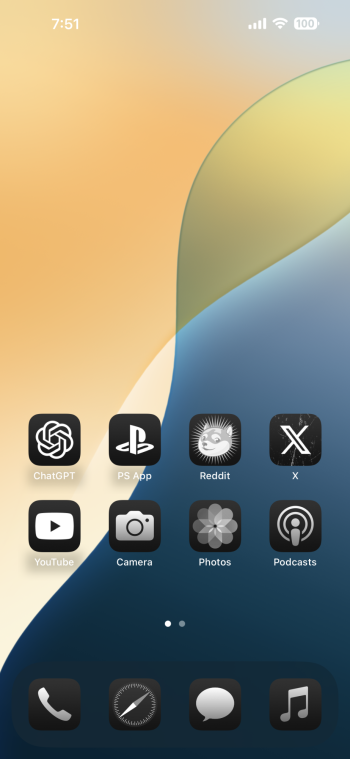
I’ve been messing around with the large icon setting and custom icons.

Custom icons… that still require shortcuts and show the confirmation each time you open an app, right? I thought maybe they were getting rid of that on iOS 18 and let us choose our icons freely.
Where did you get the top wallpaper. Looks great
Correct. Still has those drawbacks as of the current beta.Custom icons… that still require shortcuts and show the confirmation each time you open an app, right? I thought maybe they were getting rid of that on iOS 18 and let us choose our icons freely.
Pinterest.Where did you get the top wallpaper. Looks great
Register on MacRumors! This sidebar will go away, and you'll see fewer ads.


