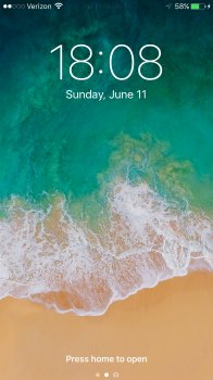
Should've stuck with bars. Dots are overused in the UI:
Ordinarily not a big deal, but imagine phone tech support asking a new user how many 'dots' they have.
- Multiple pages of icons were already represented by a line of dots.
- Updated apps already had blue dots beside them.
- Ellipsis buttons '...' are pretty common now.
I always thought the dots were just a bad design choice for that reason. Not a huge deal at the top left, but it was definitely the opposite of intuitive, when it first came out.


