Got a tip for us?
Let us know
Become a MacRumors Supporter for $50/year with no ads, ability to filter front page stories, and private forums.
Slate vs. Natural Titanium?
- Thread starter WatchBands
- Start date
- Sort by reaction score
You are using an out of date browser. It may not display this or other websites correctly.
You should upgrade or use an alternative browser.
You should upgrade or use an alternative browser.
Wow I am also going through the same Dilema! When I first saw the Jet Black, I was like wow that is beautiful but when they said it only came with Ion X glass, that was a dealbreaker for me. The Slate Titanium would be the closest match to the Jet Black with the benefit of the Sapphie glass, however will it go with alot of the styles of bands I already have had in the past for my Stainless Steel and Natural Titanium ultra models.
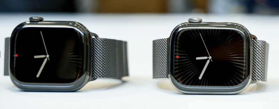
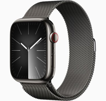
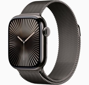
The Slate looks like the old graphite on the website, but seems much darker in person.
I agree, if Jet Black came with a sapphire display I would have been sold.
Your current thought process aligns with mine regarding which model would complement my watch band collection best. And I also agree that slate looks much better than the graphite.
Decisions decisions…..
Wow I am also going through the same Dilema! When I first saw the Jet Black, I was like wow that is beautiful but when they said it only came with Ion X glass, that was a dealbreaker for me. The Slate Titanium would be the closest match to the Jet Black with the benefit of the Sapphie glass, however will it go with alot of the styles of bands I already have had in the past for my Stainless Steel and Natural Titanium ultra models.
The Slate looks like the old graphite on the website, but seems much darker in person.
Slate looks even darker in person which I like, so I definitely made the right choice!
The natural looks a lot more polished than my S7 Titanium watch. I was hoping for the brushed titanium look.
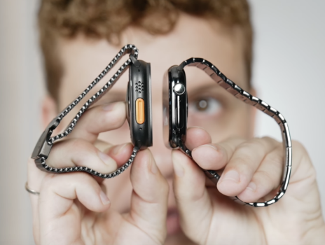
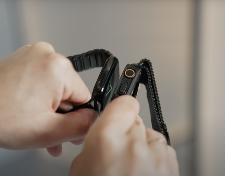
The first half of this video shows the colors pretty nicely. Compares the stainless steel color to the natural titanium, actually looks a hair darker. Then compares Jet Black Aluminum with the Slate Titanium.
Great video, thanks for sharing.The first half of this video shows the colors pretty nicely. Compares the stainless steel color to the natural titanium, actually looks a hair darker. Then compares Jet Black Aluminum with the Slate Titanium.
I feel like now I’m even more conflicted haha. While I do think Natural looks better, I’m leaning towards Slate for a more sleek look and also for a change as I’ve had SS for quite some time.
On a side note, I like how the red ring for cellular is now removed. The design looks a lot more clean.
Best Video Yet!

 youtube.com

âï¸ Titanium Apple Watch Series 10
59 seconds · Clipped by Frank Tricarico · Original video "Probando el Apple Watch series 10 - Primeras Impresiones" by Victor Abarca
Those new bezels are RIDICULOUS!!!
Sticking with my smaller bezel AW S7 Titanium with AC+ and my launch AW Ultra 2 both with O2 sensor. 10th anniversary AW is literally a step-back. Don't normally talk 💩 , but the fact that Apple's site compares the bezels to the 3/4/5/6 and not the 7/8/9 is a GD joke!

Apple's website:

Sticking with my smaller bezel AW S7 Titanium with AC+ and my launch AW Ultra 2 both with O2 sensor. 10th anniversary AW is literally a step-back. Don't normally talk 💩 , but the fact that Apple's site compares the bezels to the 3/4/5/6 and not the 7/8/9 is a GD joke!
Apple's website:
@adam1080 The bezels did get larger, but I have been wearing my Ultra for 2 years and it has the same size bezels. I really like the form factor of the standard watches, so sleak and the fact that its the same display size as the Ultra and like 40% thinner. That is what sold me.
Slate is much different then pictured on the website, it is close to Jet Black and looks darker than the satin black Ultra 2. It does look really good, so tempting.
Attachments
Yeah the slate is definitely the way to go this year. It should make the larger bezels less obvious as well.Slate is much different then pictured on the website, it is close to Jet Black and looks darker than the satin black Ultra 2. It does look really good, so tempting.
@adam1080 The bezels did get larger, but I have been wearing my Ultra for 2 years and it has the same size bezels. I really like the form factor of the standard watches, so sleak and the fact that its the same display size as the Ultra and like 40% thinner. That is what sold me.
I can’t tell much if any a difference an actual screen real-estate from the S7 to Ultra 2.
And I agree, after a year with the Ultra, putting on the S7 feels like I’m wearing nothing so I like to go sleek or wear the Ti S7 when dressing up.
However, with the same size bezels with Ultra 2 and S10, you get double the battery life, better brightness, better gps, O2 sensor and bombproof.
If I did not have the S7 Ti with 100% battery health and AC+, my tune might be different. But bigger than the Ultra and skinnier is not a selling point if you have a 7/8/9.
Those new bezels are RIDICULOUS!!!
Sticking with my smaller bezel AW S7 Titanium
More glass bezel, less metal bezel = same total bezel S7-9 vs. S10.
But yeah, I expected more as well.
Yeah, it was disappointing for “10th anniversary”More glass bezel, less metal bezel = same total bezel S7-9 vs. S10.
But yeah, I expected more as well.
That’s fair. I’d argue on a semi “luxury” material smartwatch, a black bezel is the least appealing portion. Give me more beautiful screen size and more beautiful metal and less ugly, black bezel. (Not less metal and more bezel)
Yeah, it was disappointing for “10th anniversary”
That’s fair. I’d argue on a semi “luxury” material smartwatch, a black bezel is the least appealing portion. Give me more beautiful screen size and more beautiful metal and less ugly, black bezel. (Not less metal and more bezel)
Having not seen the S10 IRL yet, I tend to agree. But I‘m open to change my mind in the Apple Store next week.
On the bright side, you do get more beautiful metal on the underside this time around. 😊
I would love to know what he is saying when he’s doing the comparison. It’s so hard to tell the difference. Slate looks very slightly lighter but it could just be the lighting. I think I’m going to have make my decision in the store.The first half of this video shows the colors pretty nicely. Compares the stainless steel color to the natural titanium, actually looks a hair darker. Then compares Jet Black Aluminum with the Slate Titanium.
Exactly. It's simply a different proportion of metal to bezel.More glass bezel, less metal bezel = same total bezel S7-9 vs. S10.
But yeah, I expected more as well.
Graphite and Slate look very similar in the images (click an image to expand, and then hop back and forth to compare).. I've got graphite S8, and I like the colour. I don't think I'd want it to be much darker..
Each to their own - I much preferred the Space Black stainless steel to the Graphite stainless steel. I'm hoping Slate returns towards the darker color.
I'll also note Apple's images just don't seem to reflect how Graphite really looks in person.
The rainforest braided loop looks fantastic with the graphite SSI usually wear a braided solo loop, in midnight or rainforest or similar, I feel like they would go better with natural but maybe that’s not true, I want the combination to look good both daily and in a work setting, I don’t know, I’m just guessing until they actually arrive!
Yeah, Apples images are often not great for colour. However, as the graphite looks darker in person compared to Apple images and as the slate appears to darker in videos compared to Apple images, and since the Apple images for both are very similar, I think graphite and slate will be similar in person. Will be interesting to check them out in store when I get a chanceEach to their own - I much preferred the Space Black stainless steel to the Graphite stainless steel. I'm hoping Slate returns towards the darker color.
I'll also note Apple's images just don't seem to reflect how Graphite really looks in person.
Yeah, Apples images are often not great for colour. However, as the graphite looks darker in person compared to Apple images and as the slate appears to darker in videos compared to Apple images, and since the Apple images for both are very similar, I think graphite and slate will be similar in person. Will be interesting to check them out in store when I get a chance
Speaking for myself, I find the graphite depends the lighting and I’ve found it can look much lighter than the images at times.
We shall see in a few days.
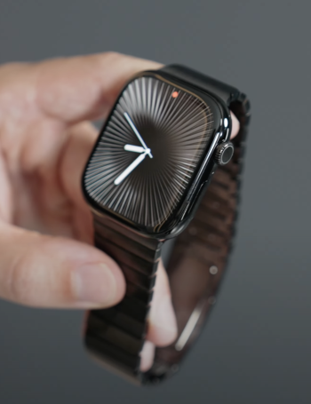
Another good video that shows how dark Slate is.
It seems the natural titanium has a nice darker warm tone to it, it’s a good inbetween of silver and slate.
It seems the natural titanium has a nice darker warm tone to it, it’s a good inbetween of silver and slate.
Register on MacRumors! This sidebar will go away, and you'll see fewer ads.


