Become a MacRumors Supporter for $50/year with no ads, ability to filter front page stories, and private forums.

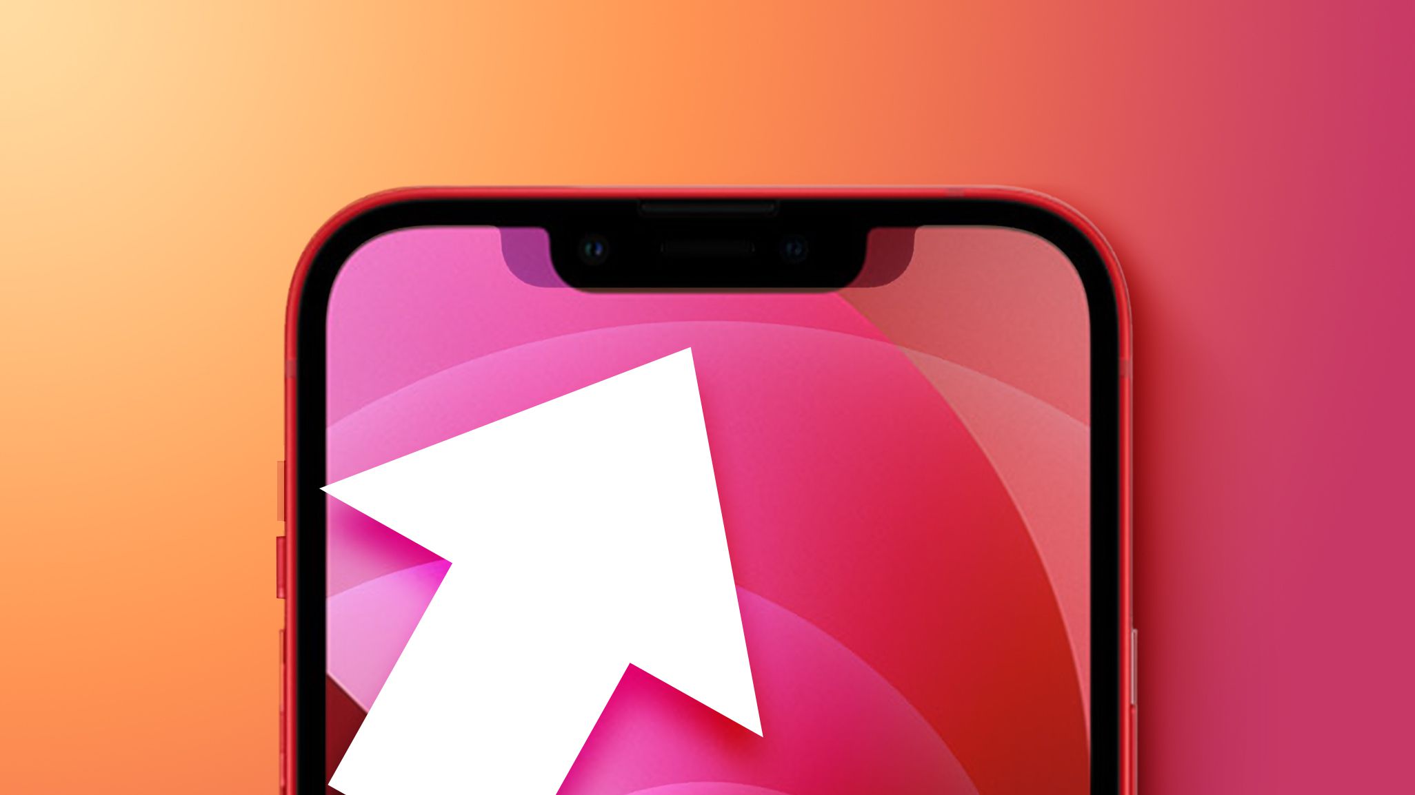
Does the smaller notch look worse than the original?

  • Yes

    Votes: 55 23.9%
  • No

    Votes: 96 41.7%
  • I don't care

    Votes: 79 34.3%

  • Total voters
    230
Are they? They didn’t really mention it much during the keynote, hardly touting it as a feature…
I'm pretty sure they mentioned it. Unless I'm imagining things.

Anyways, I agree they made it just slightly worse looking. Not dramatically worse, but it still begs the question why? Too bad there's no actual benefit to the narrower notch.

This should've just been something they played around with behind the scenes. We didn't need an official tweak of the design, unless it's to eliminate the notch entirely.

What bothers me with this (and no it doesn't keep me awake at night) is that we might have this same notch again next year, since they seem proud of its narrowing. Of course, it could be a case where the regular 14 and 14 Max get this same notch, while the 14 Pro and 14 Pro Max get the rumored hole punch design.
 
I don't really like either of them but I am used to the old one, so new one looks more jarring. I'm sure I'll get used to it the same over time though. But I do like how they made it smaller by moving components around to make the phone look more modern, I pay too much attention to details and the speaker in middle of the notch on my 12 Pro Max just looks super outdated and old fashioned waste of space.
 
You should see my 8 plus , the design compared to any of the notch models is abysmal , huge great black oblongs top and bottom doing nothing , talk about waste of space 🤦‍♂️

can’t wait to get my 13 pro max on Friday, the notch doesn’t bother me in the least
 
I don't really like either of them but I am used to the old one, so new one looks more jarring. I'm sure I'll get used to it the same over time though. But I do like how they made it smaller by moving components around to make the phone look more modern, I pay too much attention to details and the speaker in middle of the notch on my 12 Pro Max just looks super outdated and old fashioned waste of space.
Looks like the same height to me. Look at the text on how it lines with the bottom of the notch.
 
In mkbhd video Instagram now cuts into the notch the story text is now half hidden which means the notch is bigger, also some apps have text right at the top the screen under the notch now they was have text cut in
 
In mkbhd video Instagram now cuts into the notch the story text is now half hidden which means the notch is bigger, also some apps have text right at the top the screen under the notch now they was have text cut in
How is that if they are the same height? The notch looks way smaller, and most reviewers agree. Even saying it looks smaller than the 20 percent apple quoted.
 
How is that if they are the same height? The notch looks way smaller, and most reviewers agree. Even saying it looks smaller than the 20 percent apple quoted.
It’s taller so like I said text that normally sits at the top of the screen just under the notch gets cut into, it’s smaller yes width size but it’s slightly taller so now apps will have to update
 
4D260BA3-3067-4937-B41C-9282E66D9C87.jpeg

Look on mkbhd video now thanks to a taller notch the text on your story is now covered and sometimes it takes apps ages to update to new layouts, to me it’s a huge downgrade making it taller
 
It’s taller so like I said text that normally sits at the top of the screen just under the notch gets cut into, it’s smaller yes width size but it’s slightly taller so now apps will have to update.
Why? For half a mm? If at all? I dont think its taller at all, it looks taller since its less wide. I think that photo is not accurate. Its a app. Looks it would have been cut off under the old notch as well. Maybe the developer had it wrong to begin with?
 
Last edited:
Are they? They didn’t really mention it much during the keynote, hardly touting it as a feature…
They talked about the notch being 20% smaller at the event.


"Apple said on stage that the notch is now 20 percent less wide than the notch used in prior models, but comparisons between the iPhone 12 and ‌iPhone 13‌ confirm that the new notch design is just a tad bit taller."
 
Looks better to me while yes it’s there would rather have a smaller notch than what we had.
 
It definitely looks better, it's just that we got used to the wider notch looking at it every day for the past 4 years.
 
Notch never bothered me at all. The hate for it is blown way out of proportion. You literally forget about it days after you get an iPhone with it
 
i feel that after the initial paid reviews, we are gonna see lot of negative reviews for 13 series for its thickness and weight and of course the notch reduction and new features. wait for it
 
Looks like the same height to me. Look at the text on how it lines with the bottom of the notch.
I didn’t even mention the height though? But now that you say it, yes the icons are aligned with the bottom of the notch but on 13 the icons are larger and there’s still about the same amount of space between the icons and top side bezels meaning the 13 notch should be a tiny but taller? Not enough difference to make me care about it anyway.

View attachment 1839821
Look on mkbhd video now thanks to a taller notch the text on your story is now covered and sometimes it takes apps ages to update to new layouts, to me it’s a huge downgrade making it taller
On my 12 Pro Max Instagram stories have black bars on top and bottom, did iOS 15 change it? (I haven’t updated to it yet)

DE544677-5A59-4D6F-B80F-F3D7125FF51F.png
 
Needs to be a poll option for "Don't care". I never even notice the notch when I'm using the phone so neither of them bother me in the least. Any notch is better than the huge bezels the older iPhones had.

Same. The only time I ever think about the notch is when these threads pop up.
 
It's because there's no longer a speaker cutout in the middle of it. Cognitively, the notch was there for the speaker to be there. Without it, the notch no longer immediately & visibly houses anything, so your brain is wondering why it's there.
 
you aren’t the only one. It’s more unused wasted space on statusbar and taller

and bigger bunny ears. And I hate that the earpiece is at the top edge. They pretty much Just moved it to squeeze sensors closer together
Yep, New ears but no info. I was hoping that this change would give us at least the battery percentage back but seems like nothing has changed, I suspect most apps will just pad the space with nothing, thus making this a complete waste of screen. This is just a marketing maneuver.
 
  • Like
Reactions: timeconsumer
It's iterative to eventually remove. I guess it's nice that it's smaller, but I agree with folks wanting some more function from he top of the screen with more space.

I am interested to see how long until I get used to it. At first I think it might be a little distracting bc the wider not makes more of a parallel line with the top of the device and now it might be more "broken up"? hmmm we will see.
 
It's not a deal breaker, but as someone with a Pixel 3 XL which has the extreme version of this narrow but tall notch, I agree that the new notch is objectively a little worse than the older notch. If they were able to narrow the notch without increasing height and/or use the reduced width to provide battery percentage then this would be great. But as it is, the new notch is marginally worse than the old one.

Kind of disappointing. Hopefully, eventually there will be a software update to better use the notification area, but I doubt it.
 
  • Like
Reactions: timeconsumer
Register on MacRumors! This sidebar will go away, and you'll see fewer ads.