Windows 7:
- No expose and no spaces by default (I miss these a LOT from OSX)
- Control panel is a complete mess compared to OSX System Preferences
- Scrolling at the side of the trackpad is ghetto compared to OSX multitouch
Yup. Then again, Exposé and Spaces are symptoms as much as they are features. They are products of the inevitable desktop clutter on OS X. I prefer using apps full screen on PC and hide the desktop completely, whereas on Mac there is no multi-document interface in apps, all the parts are just floating around on the desktop -- I can't tell you how many times I've had Photoshop on top of Flash and accidentally tried to select tools from the wrong app... Exposé and Spaces were created to keep people from going insane, rather than addressing the root of the problem, i.e. that the Mac desktop paradigm is a clutter magnet.
OSX:
- Close and quit distinction is retarded. Windows close system is more elegant.
- Menu always on top is retarded. Ever use OSX on two 30 inch monitors? You have to move your mouse all the way across one monitor to the other just to use the menu if you can't remember the shortcut key or there isn't one for the option you want. The idea doesn't scale well to big multimonitors.
- Resizing only from the bottom right corner is dumb.
Word. These are some of my biggest reservations about OS X. I heard, many years ago, that Apple originally planned to ditch the menu-on-top concept for OS X and move the menus to where they're supposed to be, but then the OS 9 luddites went ballistic and threatened to kill themselves if someone took their precious menu bar away. It does perhaps save a little workspace, but on the other hand the menu bar takes up as much space as the Windows taskbar, with most of the menu bar empty (everything between the Help menu and the AirPort icons + clock), and then you have the Dock in addition to that.
I also can't stand that Apple notebook keyboards (and the wireless one I have) put the Fn key in the lower left corner. That's borderline retarded and designed for chimps.
I much prefer the PC mentality here of putting the CTRL key in the lower left and the Fn key to the right of it. But it seems only Dell really sticks to this. Some of the other PC vendors have taken the braindead Apple approach. The Apple keyboards also have the smallest arrow keys on the planet. I prefer the larger, offset arrow keys from the PC world. I also prefer having actual page up, down, home, end keys. On the Apple it requires two fingers (Fn+arrow) and that just slows me down when editing text at hyperspeeds.
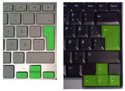
Totally. On the wireless alu keyboard I press the Fn key by accident all the time. I'm left handed and I never, ever use the CTRL+Shift+Alt keys on the right side, but I do use the cursor keys a lot, so it really bugs me that Apple made the cursor keys microscopic, and right above them is a gargantuan Shift key that's as big as all 4 cursor keys put together. Also, they shrunk the Return key which might be OK for a U.S. keyboard, but here in Scandinavia we have a vertically oriented return key (to make room for Å, Ä and Ö) and it ended up being crazy narrow on the new Mac layout. Not just on the mini-keyboards, but the full-sized one has the same anorexic Return key. Here's a comparison between the Return and cursor keys on a regular Scandinavian compact keyboard (Dell M65 15") and the munchkin keys on a wireless Apple keyboard or a MB/MBP/MBA:
On the other side of the fence I can't stand the redundant hardware on the PC side. Looking at my PC notebook keyboard I see 5 mouse buttons. That just takes up space and half of the buttons do the same thing as the other half. There's also a VGA port on this thing in the off chance I get teleported a decade into the past and need to hook it up to a legacy display.
Yeah, there's a lot of that going around on Dell and HP machines. I once asked why they're still putting all these 1990's crap on brand new machines, and apparently there's still a huge demand for it among PC professionals (only the pro machines like Precision and Latitude have it, the Inspiron and XPS machines aren't bogged down with legacy ports). For example, there are people who use these machines to interface with industrial robots that are programmed via 9-pin serial. And a new robot costs $3 million and they have 50 of them, so the old ones will serve for another 15 years or so, by which time the rest of us will be on USB 6.0 or whatever.
I wish Dell/HP would split their professional lines in two, one stone age line for users in the industrial sector and others who need legacy connectivity, and another for print/media/video/audio professionals who want sleek-looking machines with cutting edge connectivity, where they replace the VGA-, PS/2, 9-pin Serial and 25-pin Parallel with USB, DisplayPort, DVI and Firewire.


