Become a MacRumors Supporter for $50/year with no ads, ability to filter front page stories, and private forums.

Do these Pictures Accurately Represent What You Think the New iMac Will Look Like?

  • Totally

    Votes: 5 2.0%
  • Mostly

    Votes: 3 1.2%
  • Somewhat

    Votes: 6 2.4%
  • Not Really

    Votes: 21 8.5%
  • Not At All

    Votes: 211 85.8%

  • Total voters
    246
Status
Not open for further replies.

GodBless

macrumors 65816
Original poster
Jan 22, 2005
1,004
0
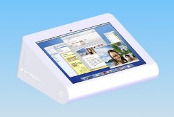
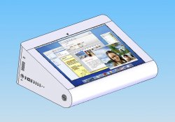
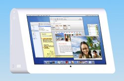
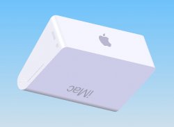
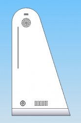
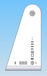
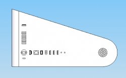
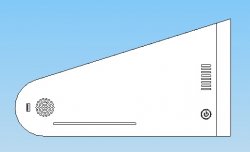
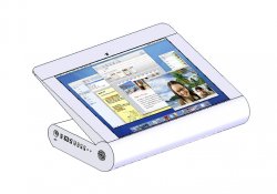
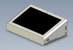
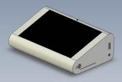
Here is a finalized design of what I speculate the touch screen iMac to look like (once Apple designs one). I still have one more design idea that I will be working on soon (and I will probably post pictures of it later) but I hope you guys like this one. (I've added the same poll as before in this thread and this other thread to see if your views have changed much.)

Easy Touch Isometric 1 (Left Side) <Without Port Outline>:
attachment.php


Easy Touch Isometric 1 (Left Side) <With Port Outline>:
attachment.php


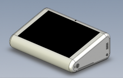
Upright Front 1 (Left Side) <Without Port Outline>:
attachment.php


Upright Front 1 (Left Side) <With Port Outline>:
attachment.php


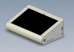
Easy Touch Isometric 2 (Back and Right Side) <Without Port Outline>:
attachment.php
 

Attachments

  • Front ISO 2 a.jpg
    Front ISO 2 a.jpg
    85 KB · Views: 12,662
  • Front ISO 2 b.jpg
    Front ISO 2 b.jpg
    102.5 KB · Views: 6,530
  • 2 Front Other 1 a.jpg
    2 Front Other 1 a.jpg
    181.5 KB · Views: 5,233
  • 2 Front Other 1 b.jpg
    2 Front Other 1 b.jpg
    88 KB · Views: 5,170
  • Back ISO 1 a.jpg
    Back ISO 1 a.jpg
    105.6 KB · Views: 6,414

72930

Retired
May 16, 2006
9,060
4
In pictures 2 and 3, how could the camera be used comfortably...

Looks too blockish for me...
 

Chaszmyr

macrumors 601
Aug 9, 2002
4,267
86
You were completely shot down the first time you made a thread about this design, adding textured pictures isn't going to help much. It's really just an incredibly bad design...
 

sushi

Moderator emeritus
Jul 19, 2002
15,639
3
キャンプスワ&#
I doubt we will ever see a thick iMac design after the sunflower and current iMac design. I don't see any advantages to your design and it gives me the feeling of going backwards technology wise.

My guess is that we will see thinner and lighter models along the lines of the current iMac design.
 

GodBless

macrumors 65816
Original poster
Jan 22, 2005
1,004
0
In pictures 2 and 3, how could the camera be used comfortably...
Well--I put a lot of thought into where the camera would go and I chose the spot where I put it (as you can see in the pictures) for multiple reasons (as follows):

1. Having the camera reversed wouldn't work for the "Easy Touch" position because your hand would rest on it often making smudges on the camera.
2. Also in the "Easy Touch" position your hands would get in the way of a video chat when you touch the screen while chatting.
3. You are closer to the screen when you have it in the "Easy Touch position so your face often wouldn't be in the right position for the camera and the camera would probably pickup your neck and chest (no this isn't better--unless it's your wife ;) ).
4. In the "Upright" position the computer would easily get your face when the camera is in the position that I have it.
5. Although it wouldn't be good for the background remember that Leopard lets you put artificial backgrounds behind your face in iChat.


Looks too blockish for me...
Maybe you will like my other design that I will be making soon.

Here are some more pictures (all with port outlines):

1. Easy Touch - Right
2. Easy Touch - Left
3. Upright - Right
4. Upright - Left
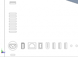
5. Easy Touch - Close up of Ports (Note: Are the ports easy enough to distinguish? Can anyone name them left to right?)
 

Attachments

  • 5 Left b-u.jpg
    5 Left b-u.jpg
    25.5 KB · Views: 121
  • 4 Right b-u.jpg
    4 Right b-u.jpg
    28.6 KB · Views: 113
  • 5 Left b.jpg
    5 Left b.jpg
    75.4 KB · Views: 121
  • 4 Right b.jpg
    4 Right b.jpg
    25.8 KB · Views: 120
  • Left Side (Back).png
    Left Side (Back).png
    9.4 KB · Views: 135

decksnap

macrumors 68040
Apr 11, 2003
3,075
84
The biggest flaw here is that to go from flat to standing you've got to flip and turn the entire system - dragging all your cords around in the process.

At the very least, just put a hinge in. Not that I like this design either.
 

Attachments

  • imac.jpg
    imac.jpg
    80.5 KB · Views: 132

GodBless

macrumors 65816
Original poster
Jan 22, 2005
1,004
0
Hey guys I took all of your suggestions. Perhaps you guys are interested in giving me more advice?

I can post screenshots of whatever side of my current design that you want me to and then feel free to give me feedback.

Here are my alternative designs:
1. All Sides Rounded
2. Curved Front and Curved Back Corners (Current Design)
3. Flat Front and Back
4. Flat Left and Right
 

Attachments

  • ^ISO 1-1.png
    ^ISO 1-1.png
    45.8 KB · Views: 135
  • ^ISO 1-2.png
    ^ISO 1-2.png
    35.9 KB · Views: 124
  • ^ISO 1-3.png
    ^ISO 1-3.png
    31 KB · Views: 127
  • ^ISO 1-4.png
    ^ISO 1-4.png
    37.1 KB · Views: 118

AppleMan101

macrumors regular
Jan 24, 2007
215
0
Well the most important design flaw i've seen with these designs is that they'v been designed for left-handers...eugh.


plus i would weep if apple ever considered any designs like this


ps - i dont want a touchscreen iMac
 

GodBless

macrumors 65816
Original poster
Jan 22, 2005
1,004
0
The biggest flaw here is that to go from flat to standing you've got to flip and turn the entire system - dragging all your cords around in the process.

At the very least, just put a hinge in. Not that I like this design either.
I considered a similar design, but I thought that since the screen would have to be locked in place in order to be used as an un-moving touch surface it would be better to design it without the screen not being able to be moved at all (i.e. with no hinge).

Most people will probably use it in one position or the other (i.e. Upright or Easy Touch) and won't switch it often.

By the way all the ports are on one side (there's just a USB port on the other side for easy thumb drive access while the "Easy Touch" position is used).
 

c.joe.go

macrumors regular
Apr 15, 2007
106
0
the nexus of the universe
wow.

let me give you an idea of how horrible your renderings are. i have spent years on this site, never registering because i have only been interested in other's discussions. your renderings are so terrible as to cause me to register and post this. i'm sorry, but there is nothing in your idea that would ever make it in practice. please. don't try again.
 

decksnap

macrumors 68040
Apr 11, 2003
3,075
84
I'm not quite getting it. Can I see more angles and closeups?

And do you have one in periwinkle?
 

GodBless

macrumors 65816
Original poster
Jan 22, 2005
1,004
0

j26

macrumors 68000
Mar 30, 2005
1,753
723
Paddyland
From a simple working point of view, that design would be unusable.

At the low angle you'd spend all your time looking downwards - how long before neckstrain gets you?
At the steep angle, you' have to contort your wrists to use it - how long before wrist cramps get you?

The thing is a health & safety nightmare.
 

dcv

macrumors G3
May 24, 2005
8,021
1
Most people will probably use it in one position or the other (i.e. Upright or Easy Touch) and won't switch it often.

^You're making a rather grand assumption that someone would actually buy such a product.


Honestly, it's ****ing terrible. Not only is it aesthetically displeasing but it also offers little in the way of ergonomics. How would I tilt the screen to best suit me or to avoid reflection from overhead lighting? Stand it on another wedge? How would I use the iSight if it's at the bottom of the screen? Am I supposed to sit hunched over it giving me neck ache?

The beauty of the current iMac is the super slim design and very small footprint. Who would want a monstrosity like this on their desk? And do I really want a bunch of cables hanging out of the side with no way of masking them?


Please, please, don't give up your day job... unless you work in product design...
 

GodBless

macrumors 65816
Original poster
Jan 22, 2005
1,004
0
The biggest flaw here is that to go from flat to standing you've got to flip and turn the entire system - dragging all your cords around in the process.

At the very least, just put a hinge in. Not that I like this design either.
By the way your design just inspired me to design something better. :) Thank you for your input.
 
Status
Not open for further replies.
Register on MacRumors! This sidebar will go away, and you'll see fewer ads.