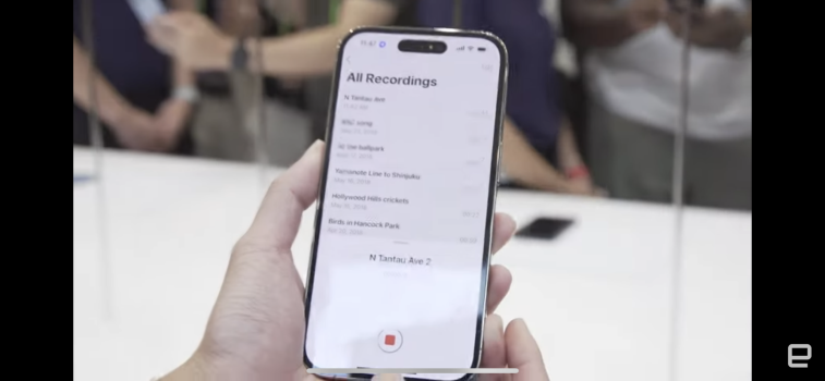
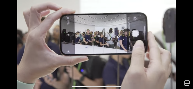
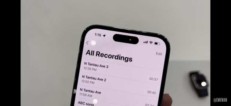
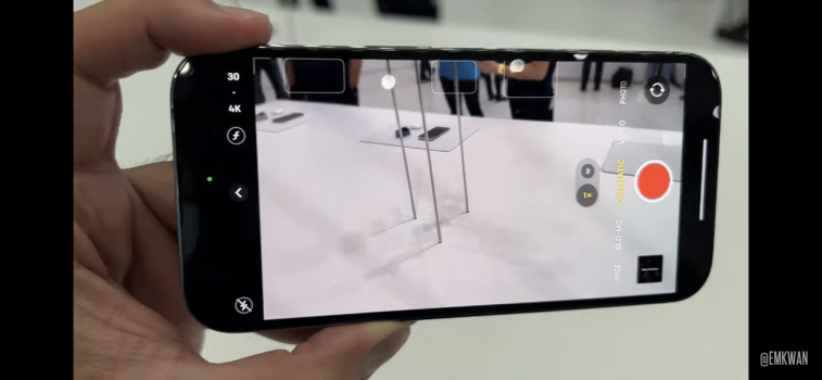
I really think this design is worse than other Android competitors, it’s better than the current notch because it’s smaller, but I think that if they made that cutout into a notch of that size it would have been soo much cleaner than this design, it would’ve made so much more sense.
Got a tip for us?
Let us know
Become a MacRumors Supporter for $50/year with no ads, ability to filter front page stories, and private forums.
Other The New Pill (Exclusive)
- Thread starter anonymous-A.S
- Start date
- Sort by reaction score
You are using an out of date browser. It may not display this or other websites correctly.
You should upgrade or use an alternative browser.
You should upgrade or use an alternative browser.
oh boy it isYou think that's uglier that the notch?
sure but android don't have to worry about Face ID sensors.I really think this design is worse than other Android competitors, it’s better than the current notch because it’s smaller, but I think that if they made that cutout into a notch of that size it would have been soo much cleaner than this design, it would’ve made so much more sense.
Oh no. You best leave and buy a Pixel 5G or somethingiPhone getting uglier day by day
Likely because the front facing camera module needs room to fit inside from the top of the phone and forces the pill/notch to be where it is.Why they didn’t move this pill to the top of the screen and make such tiny notch? It would look ten times better. The pill is so ugly.
I agree. The pill seems like it takes up more screen space. Have to wait and see on this one.I think it is. Keeping the notch at the edge masks it, while wrapping the display around this pill accentuates it.
Attachments
Last edited:
What about the classic battery percentage? Didn’t seem to be enabled by default. Is it possibly a toggle in settings?
Yes it’s always been disabled by defaultWhat about the classic battery percentage? Didn’t seem to be enabled by default. Is it possibly a toggle in settings?
Alright. So you’re confident it’s there in settings?Yes it’s always been disabled by default
YesAlright. So you’re confident it’s there in settings?
Well, a leaked unboxing came out and it shows the normal iOS 16 battery percentage icon… What do you think happened?
I hope they don’t use Samsung under the glass earpiece / speakers. Worst design ever.
Hang on. Samsungs have an under glass ear piece. How does that work?
Yea. They had it on the S20 ultra I believe. It didn’t turn out too well for them.Hang on. Samsungs have an under glass ear piece. How does that work?
Register on MacRumors! This sidebar will go away, and you'll see fewer ads.


