iMac 21.5, non-retina (late 2015)
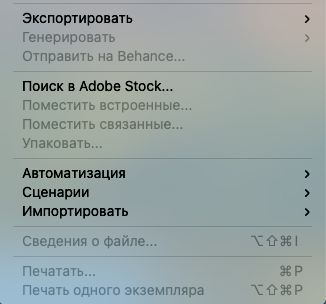
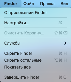
Updated from Catalina to Big Sur recently, system font looks much clearer now. Maybe they have somehow changed San Francisco font, because the difference is perceptible. It is also noticeable, that in non-updated apps system font is much uglier (which is how it used to look on Catalina everywhere). On the screenshots there are Catalina-like (1) and Big Sur system font (2) in menu bar lists (sorry, it's in Cyrillic, but the difference is clearly seen). Also, there were really ugly fonts in Dictionary.app, but now they are acceptable. All in all, Big Sur is better here for me
Updated from Catalina to Big Sur recently, system font looks much clearer now. Maybe they have somehow changed San Francisco font, because the difference is perceptible. It is also noticeable, that in non-updated apps system font is much uglier (which is how it used to look on Catalina everywhere). On the screenshots there are Catalina-like (1) and Big Sur system font (2) in menu bar lists (sorry, it's in Cyrillic, but the difference is clearly seen). Also, there were really ugly fonts in Dictionary.app, but now they are acceptable. All in all, Big Sur is better here for me


