Become a MacRumors Supporter for $50/year with no ads, ability to filter front page stories, and private forums.

pushqrdx

macrumors newbie
Oct 13, 2022
16
2
@tornado99 Where did I ever row back, my statements stand, you are incorrect about text being gamma corrected everywhere on Linux while both web browsers (and hence any electron-based app) and GTK still have no gamma correction. You are also incorrect assuming that the 5-tap custom filter hack is proper gamma correction because it lacks the alpha blending part which is essential.

Sorry but this is nonsense. With a little research into how to configure Freetype you get nothing like this. I have perfectly balanced text on 1080p, QHD, and 4K systems. I have this in my etc/profile.d/freetype2.sh for a QHD monitor.

Like for real, if you know anything about gamma, you wouldn't say that it's nonsense, you don't even have to take my word for it, in fact, if you did less than a minute of research and RTFM, you can find this page about stem-darkening on freetype's website... Just Ctrl+F "frail". It also goes into detail about everything i talked about and refers to alankila's page I linked earlier, which contains a test render so you can see the difference for yourself.

Moreover, lack of gamma correction on Linux is the exact reason stem darkening comes disabled OOB. As enabling it without gamma correction results in a huge mess, here is a direct quote from the freetype page I linked above: -

No library supports linear alpha blending and gamma correction out of the box on X11. Turning on stem darkening leads to heavy and fuzzy looking glyphs as in “Gamma 1.0, darkened” above, so it’s better to disable it.

Qt5 actually had gamma correction enabled for a short time while until someone complained that text was too light and unlike rendering in other toolkits, so the maintainers disabled it for the XCB-backend. Skia (Chrome) can do gamma-correction but turns it off for X11.


Anyway, I am sorry to burst your bubble, you seem to have been using chromium all this time thinking it is gamma corrected until I pointed it out, I can only imagine how awful your text must have looked with stem darkening without any gamma correction. But hey, just build chromium from source.
 
Last edited:

tornado99

macrumors 6502
Jul 28, 2013
454
445
@tornado99 Where did I ever row back, my statements stand, you are incorrect about text being gamma corrected everywhere on Linux while both web browsers (and hence any electron-based app) and GTK still have no gamma correction. You are also incorrect assuming that the 5-tap custom filter hack is proper gamma correction because it lacks the alpha blending part which is essential.


Like for real, if you know anything about gamma, you wouldn't say that it's nonsense, you don't even have to take my word for it, in fact, if you did less than a minute of research and RTFM, you can find this page about stem-darkening on freetype's website... Just Ctrl+F "frail". It also goes into detail about everything i talked about and refers to alankila's page I linked earlier, which contains a test render so you can see the difference for yourself.

Moreover, lack of gamma correction on Linux is the exact reason stem darkening comes disabled OOB. As enabling it without gamma correction results in a huge mess, here is a direct quote from the freetype page I linked above: -


Anyway, I am sorry to burst your bubble, you seem to have been using chromium all this time thinking it is gamma corrected until I pointed it out, I can only imagine how awful your text must have looked with stem darkening without any gamma correction. But hey, just build chromium from source.

You rowed back from claiming gamma correction wasn't available on Linux, to it not being available on web browsers and GTK apps. That's a significant difference.

" frail looking bright text on dark backgrounds and blotchy dark text on bright backgrounds"

This is your personal opinion, not a mathematical fact.

I have Freetype set up as described above on a 96dpi 1080p monitor and text is neither frail nor blotchy, in both light and dark themes. Enabling stem darkening doesn't result in a huge mess either.

I don't need test renders or "Ctrl+F Frail" on an article from 2015. I have a Linux desktop in front of me. The proof is in the pudding.
 

pushqrdx

macrumors newbie
Oct 13, 2022
16
2
@tornado99 It's not a personal opinion though, it is pure math, like this is literally a product of how the math works when converting from linear color space to sRGB and the difference between freetype's coverage data and what a monitor actually outputs in terms of luminance... So, the article still stands, at least until we fundamentally change how computer graphics work.

it's funny how I am the one pointing out facts and math while you're here using pudding and anecdotal experience as proof. To be honest you sound like a typical Linux enthusiast who's been talking about something they didn't understand for the past few years. And I am kinda surprised how you didn't learn all of that already by "browsing 10 years of freetype mailing lists".
 
Last edited:
  • Love
Reactions: Jassbag

tornado99

macrumors 6502
Jul 28, 2013
454
445
Whether text is frail looking or not is a personal opinion. On Windows a lot of people actually prefer FireFox's incorrect gamma to Chrome's correct gamma, because it's closer to the ink-bleed effect of printed type.

It is also dependent on the specific font, and monitor gamma curve. To give an example, Avenir (Frutiger) is challenging to render without looking overly thin on any platform. IBM Plex Sans looks great in most environments.

I don't see how actually using a desktop environment with certain Freetype settings is anecdotal. That's literally the point.

I very much doubt you understand anything on this topic. Your expertise seems to be spur-of-the-moment google quotes.
 
  • Haha
Reactions: Jassbag

chucker23n1

macrumors G3
Dec 7, 2014
9,090
12,112
To give an example, Avenir (Frutiger) is challenging to render without looking overly thin on any platform.

Is it though? Left: Wikipedia reference rendering. Right: rendering on an OS that doesn't suck at text rendering.

1665754952748.png
 

pushqrdx

macrumors newbie
Oct 13, 2022
16
2
@tornado99 Oh so now gamma correction isn't needed, alright, honestly going back and forth with someone who doesn't even understand the basics of whatever they're talking about is kinda degrading.

I very much doubt you understand anything on this topic. Your expertise seems to be spur-of-the-moment google quotes.

Quote one sentence I made that is quoted off of google. I literally pointed you both to source code and detailed explanation of all the stuff you don't understand but yet keep talking about anyways. The article i linked for your sake is written by the people who work on freetype. Moreover, it is not rocket science we're talking about, just absolute basic text rendering. If you know just the basics of putting text on a screen you should find it pretty hard to disagree with anything I said so far.

For the uninitiated, the whole thing is rather simple, freetype doesn't deal or care about colors, instead it spits out what they call "coverage data" which is basically a value saying how opaque a single pixel is, so for instance if it says 50% (or 128) opaque and you blindly take that value and tell your computer monitor hey this pixel is 50% bright, it will result in a pixel that is actually darker than 50% because computer monitors aren't linear. A 50% covered pixel should be gamma corrected to get it closer to actual 50% luminance on the screen... and as you might have already guessed, this is the reason why 1.0 gamma results in dim looking bright text on dark backgrounds... because it is literally dimmer than it should be..

Btw the "the ink-bleed effect of printed type." can be achieved with proper dilation like macOS with gamma correction
 
Last edited:

tornado99

macrumors 6502
Jul 28, 2013
454
445
Is it though? Left: Wikipedia reference rendering. Right: rendering on an OS that doesn't suck at text rendering.

View attachment 2094771

@chucker23n1 Interesting that you think the quality of subpixel antialiasing can be judged by viewing a screenshot on another monitor.
going back and forth with someone who doesn't even understand the basics of whatever they're talking about is kinda degrading.
Seeing as you didn't even spot the basic error above, your comment is rather apt.

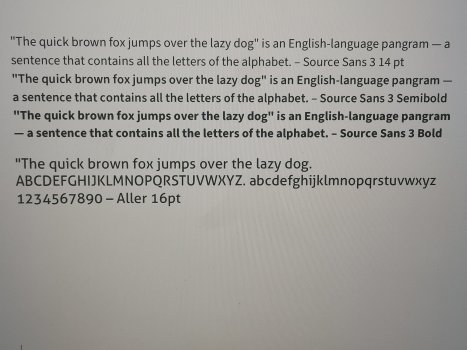
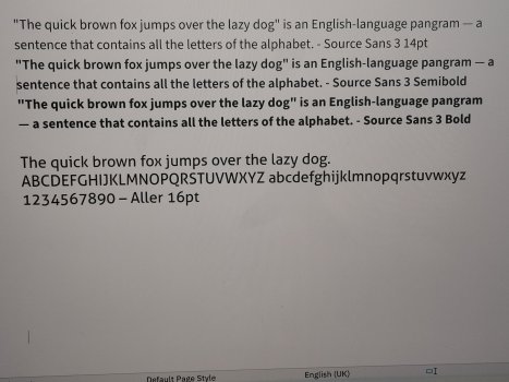
I did some tests today, and MacOS font rendering equals the quality of Linux under only one condition - No Hinting, No Subpixel AA, No dilation, Retina Screen with exact pixel doubling (see attached photos). As soon as you switch to "More Space" OS X fails as it has to do fractional downscaling of the entire screen buffer, whereas KDE renders fonts entirely separate to the rest of the desktop elements. As soon as you switch to a 1080p or QHD monitor OS X fails as there's no subpixel AA. And by the way dilation is a hack, as Steve Jobs was too proud to licence Cleartype from Microsoft, it has nothing to do with simulating ink bleed.

OS X is far better than Linux at many things. Font rendering is not one of them.
 

Attachments

  • Mac.jpg
    Mac.jpg
    473 KB · Views: 180
  • Linux.jpg
    Linux.jpg
    419.2 KB · Views: 193
Last edited:

chucker23n1

macrumors G3
Dec 7, 2014
9,090
12,112
@chucker23n1 Interesting that you think the quality of subpixel antialiasing can be judged by viewing a screenshot on another monitor.


It can. macOS doesn't use subpixel rendering, so a screenshot will contain all relevant information.

You said "Avenir (Frutiger) is challenging to render without looking overly thin on any platform", and it doesn't look overly thin.

I did some tests today, and MacOS font rendering equals the quality of Linux under only one condition - No Hinting, No Subpixel AA, No dilation, Retina Screen with exact pixel doubling (see attached photos).

That's correct: macOS does not use hinting, and does not use subpixel AA, and benefits from Retina.

As soon as you switch to "More Space" OS X fails as it has to do fractional downscaling of the entire screen buffer,

It does. I wouldn't quite go so far as to say it "fails".

Steve Jobs was too proud to licence Cleartype from Microsoft, it has nothing to do with simulating ink bleed.

ClearType is essentially deprecated, and macOS already had subpixel rendering before ClearType launched, so I'm not sure why Apple would've needed to license that. ClearType also optimizes for the pixel grid, whereas macOS optimizes for correctness. They follow different philosophies, so it has nothing to do with "pride".
 

tornado99

macrumors 6502
Jul 28, 2013
454
445
It can. macOS doesn't use subpixel rendering, so a screenshot will contain all relevant information.

But macOS renders identically to Linux when not using subpixel AA, with dilation turned off, and not performing fractional downscaling, so what is your point?

Furthermore, your screenshot is actually of the virtual screenbuffer, not the final downscaled frame that is sent to your monitor.

You said "Avenir (Frutiger) is challenging to render without looking overly thin on any platform", and it doesn't look overly thin.

That's a matter of opinion. It looks thin to me on any platform, partly because Adrian Frutiger didn't design it for screen. A lot of modern fonts are either designed for web, or have a special set for on-screen viewing.

That's correct: macOS does not use hinting, and does not use subpixel AA, and benefits from Retina.

Seems you are just swallowing marketing speak. Retina is an Apple term for a high pixel density display, it has nothing to do with the font rendering engine.

It does. I wouldn't quite go so far as to say it "fails".

OS X renders a font to a resolution of 7680 x 3960. The GPU then blindly downscales the entire desktop to your display. If you have "More Space" set this will lead to fractional scaling artifacts. A far better method is to treat desktop elements separately, and render fonts to your physical resolution.

ClearType is essentially deprecated, and macOS already had subpixel rendering before ClearType launched, so I'm not sure why Apple would've needed to license that. ClearType also optimizes for the pixel grid, whereas macOS optimizes for correctness.

ClearType is not deprecated, it is enabled by default in Windows 11. Both Apple and Linux couldn't use Cleartype until 2019 as it was patented. Their own alternatives (Quartz subpixelAA, and Harmony) were inferior workarounds*. Recently Linux switched to ClearType, and Apple did nothing. You have also (again) confused subpixel rendering with hinting. "optimizing for correctness" is just fluff - be precise with what you're trying to say.

* https://news.ycombinator.com/item?id=17477526 (worth a read)
 

pushqrdx

macrumors newbie
Oct 13, 2022
16
2
That's a matter of opinion. It looks thin to me

I wouldn't be surprised that you got desensitized to thickness after years of enabling stem darkening without gamma correction, pretty sure you're used to everything looking like a freaking molten cake.

it is enabled by default in Windows 11

It is enabled on Windows 11 but rarely used anymore in any of the modern UI elements, almost everywhere windows started to use grayscale AA, but unlike Linux, it is gamma corrected


You refuse to read an article written by the people who work on freetype discussing nothing but how the math works and why it works that way and yet link to some heated, full of opinions discussion on ycombinator?

Interesting that you think the quality of subpixel antialiasing can be judged by viewing a screenshot on another monitor.

Anyway, you keep saying random, incorrect and uneducated crap like that and when anyone points it out, you just default to "personal opinion", "looks good to me", or pudding. But, I mean, you thought that picture was using subpixel AA, how do you expect anyone to take your opinion seriously after that.
 

chucker23n1

macrumors G3
Dec 7, 2014
9,090
12,112
Furthermore, your screenshot is actually of the virtual screenbuffer, not the final downscaled frame that is sent to your monitor.

There is no downscaling on the device I took that screenshot on.

Seems you are just swallowing marketing speak. Retina is an Apple term for a high pixel density display, it has nothing to do with the font rendering engine.

It has everything to do with it. If Apple's displays were lower-density, they would make different font rendering tradeoffs.

ClearType is not deprecated, it is enabled by default in Windows 11.

UWP doesn't do ClearType. Neither does WinUI 3. Therefore, it has been essentially dead in the water since Windows 10. Yes, apps written in Win32, WinForms, WPF may still use it. Chromium still does, too. But Microsoft itself clearly doesn't consider it the future.

Subpixel rendering is on the way out because

1) it is far less relevant in higher-ppi displays, and
2) it relies on knowing the background underneath the text, and predicting that has become too hard with modern visual effects, which run on the GPU, not the CPU. Thus, you would have to move the entire font rendering pipeline to the GPU, which neither Apple nor Microsoft has bothered to do, which, because of 1 isn't worth it.

Both Apple and Linux couldn't use Cleartype until 2019 as it was patented.

Again, why would Apple want to license a third party's subpixel rendering when they already had one?

Their own alternatives (Quartz subpixelAA, and Harmony) were inferior workarounds*. Recently Linux switched to ClearType, and Apple did nothing. You have also (again) confused subpixel rendering with hinting. "optimizing for correctness" is just fluff - be precise with what you're trying to say.

* https://news.ycombinator.com/item?id=17477526 (worth a read)

You didn't understand the comment you're linking. Peter Ammon isn't saying that Apple was bad at implementing subpixel rendering.
 
  • Like
Reactions: pushqrdx

tornado99

macrumors 6502
Jul 28, 2013
454
445
There is no downscaling on the device I took that screenshot on.

The Screenshot utility always records the virtual framebuffer, so if that is 1:1 mapped to the screen, you were not using a HiDPI mode. Why?

It has everything to do with it. If Apple's displays were lower-density, they would make different font rendering tradeoffs.

But why does that make Apple's font rendering unique or superior? On a high-density display with 2x scaling Linux has identical quality font rendering. On a high-density display with 1.75x scaling, Linux is better.

Subpixel rendering is on the way out because

1) it is far less relevant in higher-ppi displays, and

The vast majority of monitors used right now are still low ppi. My workplace has several thousand hotdesked 96 dpi monitors. I can't even use my Macbook with them because font rendering is such an eyesore. I use Linux for text-related work as I have to operate in the world of today.

Again, why would Apple want to license a third party's subpixel rendering when they already had one?

Because Microsoft's patents, if correctly implemented, yield the result with least eyestrain on a low dpi monitor. There is a comparison with High Sierra here: https://pandasauce.org/post/linux-fonts/

You didn't understand the comment you're linking. Peter Ammon isn't saying that Apple was bad at implementing subpixel rendering.

It's funny that a lot of the technical problems described in that thread are solved in KDE Plasma. Apple made a series of decisions which locked them out of optimal font rendering on low-dpi and fractionally scaled desktops.
 
Last edited:

pushqrdx

macrumors newbie
Oct 13, 2022
16
2
The Screenshot utility always records the virtual framebuffer, so if that is 1:1 mapped to the screen, you were not using a HiDPI mode. Why?

MacOS doesn't do any rescaling when you're not doing fractional, so with the defaults the screenshot you're taking is what you get on the screen, I don't know why you're assuming that everybody on earth is using macOS with fractional scaling, in fact majority of people use macOS at default settings because they just work fine.

Linux has identical quality font rendering.

It cannot because Linux doesn't have gamma correction xD
 

tornado99

macrumors 6502
Jul 28, 2013
454
445
MacOS doesn't do any rescaling when you're not doing fractional
Wrong. Even in pixel doubled mode, Screenshot returns the virtual framebuffer, which is 7680x3960 pixels for a 4K monitor.
majority of people use macOS at default settings
Wrong again. Many Macbooks are sold with the default set at "More Space".

Also, why should I have to choose between best font quality, or a larger workspace. Linux gives me both, not just a sharper 1080p-equivalent.

It cannot because Linux doesn't have gamma correction xD

So presumably the photos I posted above from my dual-boot Macbook are fake? Rather than look at fonts in my real desktop environments, I just need to "Ctrl+F Frail".

Also, I find it amusing that your responses are peppered with ad hominems, and child-like emotional retorts. Is this normal in American discourse? xD
 

pushqrdx

macrumors newbie
Oct 13, 2022
16
2
which is 7680x3960 pixels for a 4K monitor.

You keep assuming stuff like this, who told you that screenshot was taken on an external monitor with fractional scaling and 4k resolution, and your idea about the virtual framebuffer is completely broken, I won't even attempt to correcting it.

Linux gives me both

The obvious tradeoff here is that anything non integer looks broken in most apps, it may look like a cheap shortcut, but it results in better consistency this way as it keeps UI proportions intact

So presumably the photos I posted above from my dual-boot Macbook are fake?

Again, with the assumptions, brother, you have an extreme stem darkening profile and you're using a retina display, you can't for heaven's sake see what the hell I was talking about on a HiDPI monitor with jacked up stem darkening. Of course, nothing will look frail with that... I am talking about LoDPI, this is where gamma correction + stem darkening has the most impact, because on LoDPI screens, no gamma correction results in frail looking text as the anti-aliased (smoothing) pixels don't get gamma corrected to look bright enough and hence you end up with stems that are 1~2px wide which look like crap on a low PPI monitor.

dual-boot

So, all this time you have been arguing about text rendering quality while using a retina display as your reference, wow... You can put freaking Windows 95 on a retina display and fonts will look beautiful

American discourse

goodness
 
Last edited:

chucker23n1

macrumors G3
Dec 7, 2014
9,090
12,112
You keep assuming stuff like this, who told you that screenshot was taken on an external monitor with fractional scaling and 4k resolution,

I’d were talking about my Avenir screenshot: that was on a 14-inch MBP, so the resolution would’ve been a physical 3024x1964, not that I see the relevance.

I presume the (non-subpixel) text antialiasing doesn’t quadruple the entire screen (and if it did, it certainly wouldn’t somehow end up at 8K‽), but rather renders individual pieces of text, offscreen, and as a consequence can use much smaller resolutions.
 

pushqrdx

macrumors newbie
Oct 13, 2022
16
2
I presume the (non-subpixel) text antialiasing doesn’t quadruple the entire screen

It doesn't, in fact neither subpixel or grayscale AA has anything to do with your screen resolution, nor the virtual framebuffer, or any of that, the only relevant piece of information here is whether the screenshot were taken with "fractional scaling" or what macOS calls "More Space" or not because in that case macOS renders at higher resolution than your monitor and then performs downscaling, which uses more resources and generally results in worse performance, so I've never seen it set by default on any MBP I used.
 

chucker23n1

macrumors G3
Dec 7, 2014
9,090
12,112
It doesn't, in fact neither subpixel or grayscale AA has anything to do with your screen resolution, nor the virtual framebuffer, or any of that, the only relevant piece of information here is whether the screenshot were taken with "fractional scaling" or what macOS calls "More Space" or not

My screenshot was regular scale, but it also doesn’t matter because you wouldn’t be able to tell from a screenshot. I would’ve had to make a photo.

I've never seen it set by default on any MBP I used.

I believe all 12-inch MacBooks and most(?) MBPs with a Touch Bar shipped with a default scaled resolution, which is kind of a bummer.
 

pushqrdx

macrumors newbie
Oct 13, 2022
16
2
doesn’t matter

Yes, it doesn't matter, he's just saying stuff, apparently an article written by freetype developers wasn't enough for him to understand the effect of gamma correction on LoDPI screens. So, I wonder if the actual source code of freetype itself does the trick? Starting from here it goes into detail on everything I talked about so far and why it's not a big deal or even noticeable on retina screens but essential on LoDPI.
 
Last edited:

tornado99

macrumors 6502
Jul 28, 2013
454
445
So, all this time you have been arguing about text rendering quality while using a retina display as your reference, wow... You can put freaking Windows 95 on a retina display and fonts will look beautiful

Odd then, that you were so enamoured with @chucker23n1 screenshots, taken on a...Retina display.

Again, with the assumptions, brother, you have an extreme stem darkening profile and you're using a retina display

I only turn on subpixel AA, stem darkening etc. on my other system, which is regularly connected to 96 dpi monitors. My Macbook in those photos is using default Freetype. So it's interesting that you are able to see "jacked up stem darkening". Gotcha.

I am talking about LoDPI, this is where gamma correction + stem darkening has the most impact

You seem to have forgotten that KDE does alpha blended gamma correction. Also, you are not taking into account that every individual has a different sensitivity to colour fringes. Text in Skia and GTK apps may not be technically correct, but it can be adjusted so that it is neither "blotchy" nor "frail".

I'm actually confused what your argument is here. Are you annoyed that Chromium doesn't enable gamma correction? That High Sierra or Monterey is better than KDE on a 96 dpi monitor? That Monterey is better than KDE on a 226 dpi monitor?
 

pushqrdx

macrumors newbie
Oct 13, 2022
16
2
Odd then, that you were so enamoured with @chucker23n1 screenshots, taken on a...Retina display.

Hmmm, what?

I'm actually confused what your argument is here.

@tornado99 You have been talking about how Linux text rendering is the literal incarnation of perfect for a few years, you have said some wildly inaccurate crap like "text on Linux is beautiful because it's gamma corrected", and so all I did was point out that most of the stuff you said are either inaccurate or plain misleading. Linux doesn't have gamma correction and hence text on Linux on anything other than HiDPI displays looks like crap. Now you may try to argue your way out by saying "actually QT has it if you use OTF fonts", but I say this still counts as doesn't have it because a) almost all major distros use TTF fonts by default and b) majority of Linux users don't know that doing something as bizarre is using OTF instead of TTF will enable gamma correction. Still, even if all distros started shipping OTF fonts by default, Chromium, and hence all chromium descendants (including Electron), and all GTK apps (most importantly gimp) do not gamma correct.

All in all, my point is, each system has a certain set of compromises, there's no perfect text rendering, on any system, period. in fact, the state of text rendering on all major platforms is pathetic at best, so saying that one is better than the other is just annoying and comes across as fanboyish. MacOS doesn't need to make the same set of compromises other systems do, mainly because they ship high pixel density screens along with all of their products. Windows is forced to look good on practically any monitor out there and so the only viable solution was their aggressive hinting and the use of stuff like ClearType. Linux is stuck with many legacy X11 toolkits, and so their compromise was to prioritize consistency and to look good enough on as many screens as possible and hence the use of gamma 1.0 and later adoption of ClearType
 
Last edited:

tornado99

macrumors 6502
Jul 28, 2013
454
445
Linux doesn't have gamma correction

It does on the entire KDE desktop, and any Qt 5 app. Why do you keep repeating this?

I think subpixel AA in KDE is the best incarnation of the original patents. Microsoft only implemented subsets of it in each version of Windows.

Oh, and by the way, on my 2560 x 1600 pixel Macbook I get the following resolutions in a Screenshot:
Default (1.77x scaling) : - 2880 x 1800 pixels
More Space (1.5x scaling) : - 3360 x 2100 pixels

So I am right that OS X fractionally scales by default, and Screenshot records a virtual buffer with more pixels than you actually have.
 
Register on MacRumors! This sidebar will go away, and you'll see fewer ads.