Become a MacRumors Supporter for $50/year with no ads, ability to filter front page stories, and private forums.

KohPhiPhi

macrumors 6502a
Feb 9, 2011
763
194
After having been using it for a week, I am afraid that I still dont see the point of the touch bar. Here is why:

Any actions/buttons I can configure into it is already available on the screen, right? The touch bar essentially duplicates options rather than creating new ones. Well, since our eye focus is on the screen 99% of the time, it is far more convenient to simply drag my cursor to the screen button than to lower my eye line onto the keyboard and physically reach out with my hand to the touch bar.

I have tried over and over again, and I always find it more convenient to interact with my software via the screen than via the touch bar. Therefore, and until I discover a new use for the touch bar, I am afraid that it is a gimmick for me.
 

BarracksSi

Suspended
Jul 14, 2015
3,902
2,664
Maybe it looks "pixelated" because of its slightly frosted finish. The glass isn't glossy-smooth like the display (or the Watch or iPhone displays). It's more like the trackpad and regular keys.
 
  • Like
Reactions: mahcus36

jeyf

macrumors 68020
Jan 20, 2009
2,173
1,044
marketing gimic
i have had my MBP for a week and have never looked at it. bet it worked well in the lab.
 

Komplement

macrumors newbie
Nov 14, 2016
6
10
Yes, it's a shame there isn't a 15" non-TB. I'm sure I'll get used to it, but I've had a lot of accidental presses on the TV. Never had any with the physical buttons. The rest of the machine is lovely, though.
 
  • Like
Reactions: pke

davidturner

macrumors member
Jun 10, 2015
60
12
Belfast, Northern Ireland
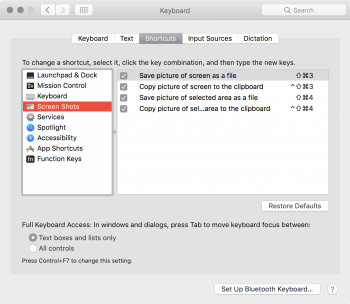
Is anyone else missing the options to screenshot their Touch Bar at all? One of the first things I did was a fresh install of the OS (I'm strange like that) and I've just noticed that I cannot screenshot the touch bar at all, and the shortcuts aren't listed, even after hitting the Restore Defaults button. Any ideas on how I can sort this at all?
 

Attachments

  • Screen Shot 2016-11-24 at 21.26.27.png
    Screen Shot 2016-11-24 at 21.26.27.png
    428.2 KB · Views: 166

mahcus36

macrumors regular
Sep 22, 2016
179
146
Maybe it looks "pixelated" because of its slightly frosted finish. The glass isn't glossy-smooth like the display (or the Watch or iPhone displays). It's more like the trackpad and regular keys.
Exactly, it's the matte finish that makes it look pixelated
 

Apple_Robert

Contributor
Sep 21, 2012
35,698
52,581
In a van down by the river
Is anyone else missing the options to screenshot their Touch Bar at all? One of the first things I did was a fresh install of the OS (I'm strange like that) and I've just noticed that I cannot screenshot the touch bar at all, and the shortcuts aren't listed, even after hitting the Restore Defaults button. Any ideas on how I can sort this at all?
For just the touch bar screen shot use ⇧⌘+6
 

judahde

macrumors member
Apr 14, 2015
92
88
Ha! I'm not sure I understand your confusion. When I'm looking at my phone and typing a message, my eyes are not focused on the keyboard of my phone but on the area where the text is being written. I could take my eyes completely away from my phone and still type accurately.

My point of this being is that it's still very possible to develop muscle memory even if there is no tactile buttons. Most users will probably be using the same applications over and over again on their new 2016" MBPs. It may take some time to get used to the Touch Bar shortcuts but I can see many users getting used to them very quickly.

I have the unique perspective of working on some of the first touchscreen interactive displays, while working on the LHX attach helicopter program. At first, having "buttons" appear based on context was a train wreck for the older pilots. I jumped in the simulator, and not knowing any better, took to it like a duck to water.

The same is true for the touchbar; within a couple of hours, i'm tapping away on the touchbar without even looking at it. I thought it was a gimmick (I owned a Surface Pro 3 & 4) but now I'm hooked. It's not distracting and works far better than a touch screen.
 
  • Like
Reactions: Capt T

The Martian

macrumors regular
Mar 21, 2016
201
155
Having a touchbar is 'great' from creating a new interactive display, but it creates additional stress and distractions for our brain. If Apple later on built in a multitouch screen into the large trackpad along with the touchbar, its great that you have 3 displays, and cool that the Macbook Pro has built in iPhone like functionality.. but consider the fact that now your brain and eyes have to constantly shift from the main screen, touchbar, to touch pad. You can't rely on your physical senses to know what you need to touch without stopping you from looking away.

Great on 'cool' factor, but not so hot on reducing distraction. If anything, it's just increasing the number of distractions and the amount of information your brain has to process. Versus just looking at what you want to do on one display, and touching one place directly.

As someone asked earlier. Have you used one? Until you have used one I put very little credence in your words as they are speculation and not based on actual experience. As someone that has a MacBook Pro I can tell you I enjoy using it and it has become very intuitive.
 
  • Like
Reactions: NAYo2002 and nstz

x600

macrumors newbie
May 28, 2015
17
5
One big problem with touch bar i came across is if ceiling lights is reflecting in it, you cannot see the keys on the touch bar. You have to change your position slightly to actually tap a required button.
 
  • Like
Reactions: Gnew

1083296

Suspended
Jun 11, 2010
61
4
Does anyone else notice the TouchBar flickering when changing between apps? Personally love touch bar so far but this is my one glitchy annoyance
 
  • Like
Reactions: mahcus36

IndigoDesign

macrumors regular
May 25, 2015
246
474
I've had the chance to try it out for hours at a friend's (who is returning his 13" TB for a 13" nonTB) and still my first "off-hand" impressions hold true. This does nothing to add to my productivity. It only adds to Apple's profit, entry-pricetag and to having "something" over the competition.

They should have ditched the TB alltogether and made the ginormous trackpad apple-pencil compatible. I even think it was on the cards at one point and THAT IS the actual reason for it being so big. That would've been a gamechanger. A true "creative's" laptop.

As for the port thing... they could have easily had 1x legacy USB port and 1x lightning port and NOT alienate most of their professional creative type of customer.

If you're gaining speed out of the TB, you were doing computing wrong all that years.
My opinion.
 
  • Like
Reactions: benz240

BarracksSi

Suspended
Jul 14, 2015
3,902
2,664
They should have ditched the TB alltogether and made the ginormous trackpad apple-pencil compatible. I even think it was on the cards at one point and THAT IS the actual reason for it being so big. That would've been a gamechanger. A true "creative's" laptop.
I really don't like the idea of using a pencil/stylus on a surface where I can't see what I'm drawing. It's great on a display -- when making selections or chicken-scratching my signature, I get instant visual feedback like I'm writing on paper -- but I'm just not sold on using them on plain surfaces.

I didn't like it with the original touch pads for the Apple II, and despite the [rather awesome] advances in resolution and response quality, the fundamental problem hasn't changed. IMO.
 

Macalway

macrumors 601
Aug 7, 2013
4,197
2,942
I still think it can be very useful. Standard apps don't need it, as it's a solution without a problem. But I can think of some productivity apps that might be improved with it. Multiple sliders for one. Ever try to adjust them with a mouse or trackpad? Just not fun. Single sliders don't need it, but if you have rows of them. Or the worst are the rotators. Absolute nightmare without any tool except a physical knob. I could see the touch bar for that.

Don' know though, as I don't have mine yet :D I'm really going to try not to 'find' uses, or like it just because I paid about $300 for it (which is certainly a reason to question it).
 

MacFeegle

macrumors newbie
Jul 27, 2011
5
4
Just got my MBP today, and so far I'm really liking it. I'm just laying around with the TouchBar - so far I'm liking it but I'll hold off a final determination until I've seen more apps that support it. That having been said, I've noticed an icon that appears on and off in the Control Strip, and I've no idea why it's there and what it does: a circle with four vertical lines. Does anybody else know what this icon does and why I see it? I can't find any mention of it in Apple's Human Interface Guidelines, it's not in the system icon list. When I press it I get a Safari icon (even when safari is not the active app) with a media player and a play button, and that's about it - it'll start playing a Youtube video in of of the inactive tabs. Why, though?
IMG_1314.jpg
 
  • Like
Reactions: mahcus36

JohnnyGo

macrumors 6502a
Sep 9, 2009
957
620
Just got my MBP today, and so far I'm really liking it. I'm just laying around with the TouchBar - so far I'm liking it but I'll hold off a final determination until I've seen more apps that support it. That having been said, I've noticed an icon that appears on and off in the Control Strip, and I've no idea why it's there and what it does: a circle with four vertical lines. Does anybody else know what this icon does and why I see it? I can't find any mention of it in Apple's Human Interface Guidelines, it's not in the system icon list. When I press it I get a Safari icon (even when safari is not the active app) with a media player and a play button, and that's about it - it'll start playing a Youtube video in of of the inactive tabs. Why, though?
View attachment 674709

"Now playing" icon. Maybe from some hidden video link / add on one of your safari tabs.
 
  • Like
Reactions: MacFeegle

benz240

macrumors regular
Dec 25, 2008
201
294
I really don't like the idea of using a pencil/stylus on a surface where I can't see what I'm drawing. It's great on a display -- when making selections or chicken-scratching my signature, I get instant visual feedback like I'm writing on paper -- but I'm just not sold on using them on plain surfaces.

I didn't like it with the original touch pads for the Apple II, and despite the [rather awesome] advances in resolution and response quality, the fundamental problem hasn't changed. IMO.

I guess you've never heard of the success of Wacom tablets? Huge industry based on using a pencil/stylus on a surface that you don't look at. If you try one you'll realize this works fine.
 

monkeydax

macrumors 6502
Nov 2, 2012
391
123
Just got my MBP today, and so far I'm really liking it. I'm just laying around with the TouchBar - so far I'm liking it but I'll hold off a final determination until I've seen more apps that support it. That having been said, I've noticed an icon that appears on and off in the Control Strip, and I've no idea why it's there and what it does: a circle with four vertical lines. Does anybody else know what this icon does and why I see it? I can't find any mention of it in Apple's Human Interface Guidelines, it's not in the system icon list. When I press it I get a Safari icon (even when safari is not the active app) with a media player and a play button, and that's about it - it'll start playing a Youtube video in of of the inactive tabs. Why, though?
View attachment 674709
Comes up when you're playing any kind of audio/video with a scrubber in iTunes, Safari. Let's you scrub through them with the shortcut, even while in other windows.
 

vinsalducci

macrumors regular
Nov 26, 2016
148
173
Have had my tbMBP for almost 2 weeks. Like most, I've been futsing around with the Touch Bar trying to find it's best uses. I've found it to be a cool augmentary tool for some things, and it does blend into the background when your not using it. Not really a distraction at all.

I'm waiting for the updates to Affinity Photo-that's no doubt where I'll use it most. Very useful in Photos now, no question.

One MUST download is Touchswitcher. Fantastic app switcher for the Touch Bar. Totally something Apple will Sherlock in future updates.
 
  • Like
Reactions: mahcus36

wherewuz

macrumors member
Mar 14, 2011
72
15
I'm liking my 15" MacBook Pro thus far, but I find the Touch Bar a bit buggy. For example, sometimes the "Now Playing" icon will still appear even when there's no media playing — except with an empty icon, and tapping the button doesn't do anything. It's happened twice in less than 24 hours and the only way I can make it go away is a restart.

Is there a Terminal command for killing/restarting the Touch Bar? I'm thinking something similar to

sudo killall Finder
Thanks!
 

BarracksSi

Suspended
Jul 14, 2015
3,902
2,664
I guess you've never heard of the success of Wacom tablets? Huge industry based on using a pencil/stylus on a surface that you don't look at. If you try one you'll realize this works fine.

I guess you think I never leave the house? I guess you missed where I mentioned the early trackpads made for the Apple II? I guess you conclude a statement with a question mark?

Wacom had big success -- in a very focused market. It never got very far outside visual design, though. Wacom only sells two models (or two variants of one model) of plain touchpads now anyway -- the rest of their lineup are "pen displays" and the super-niche pencil-and-paper smart notepads.
 

MDull

macrumors regular
Jun 22, 2011
101
36
I really don't like the idea of using a pencil/stylus on a surface where I can't see what I'm drawing. It's great on a display -- when making selections or chicken-scratching my signature, I get instant visual feedback like I'm writing on paper -- but I'm just not sold on using them on plain surfaces.

I didn't like it with the original touch pads for the Apple II, and despite the [rather awesome] advances in resolution and response quality, the fundamental problem hasn't changed. IMO.
Although using a stylus directly on the screen would be great, I have been using the trackpad and moving the cursor around for years with excellent results in photoshop so a stylus on the big trackpad would be even better.
 
Register on MacRumors! This sidebar will go away, and you'll see fewer ads.