Become a MacRumors Supporter for $50/year with no ads, ability to filter front page stories, and private forums.
This is the most likely explanation by far.

I’ve reported before that a Mac mini in AppleStore driving a 5K screen looked terrible compared to he iMac next to it. I haven’t been back yet to determine if it was an OS or font rendering/smoothing difference.

Regardless, to my eyes, on a no-retina display, the new mini is not quite as nice as the old 2011 mini. But this may be also be a Mojave/Sierra difference too.

Finally, @Ploki: it was my understanding that as soon as you hook up an external display to a MBPro the dGPU kicks in. Is this not the case on the 2018 model? It is on prior models (certainly on the 2011 MBPro).

I agree with this. I have a non-Retina 2k monitor (Dell U2518D). As it’s not a 4k monitor, I don’t have scaling options enabled and I run it at native resolution.

When I got my 2018 i5 which runs on Mojave, I noticed the font smoothness issue as well. My 2012 Mac Mini was running High Sierra and the overall text smoothness was much better. To validate my concern, I updated my 2012 Mini to Mojave, and the text smoothness dropped and became exactly the same as the 2018 Mini.

To somewhat remediate this, I ran the following command which helps in how fonts are rendered on Mojave

defaults write -g CGFontRenderingFontSmoothingDisabled -bool FALSE

The end result is much better (although I still prefer how text rendered on High Sierra)

I understand that this issue should be limited to HD or 2K monitors which don’t have high PPI. And I don’t understand why Apple would remove such a fundamental feature in Mojave.

OP - If possible, see if you can boot your MBP with Mojave. If the text rendering deteriorates with Mojave, then you’ll be able to convince yourself that iGPU and dGPU have absolutely no difference in something as basic as text rendering quality.
 
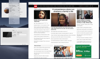
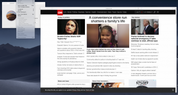
Here's the proof of what I am seeing..

The first 2 screenshots are "2018 Mini Render" vs the "2017 MBP with Radeon Render".
They show what I've been talking about. I will list what to look at in the pictures
while doing the side-by-side compare. Make sure to download and view both pictures at
"Actual Size".

MBP Render vs Mini Render:
1. Apple drop down selections are sharper/clearer on the MBP.
2. The "YAHOO!" logo is sharper/clearer on the MBP.
3. MBP's overall chrome page looks visually sharper devoid of the Mini's milky haze.
4. Look at "Single Mom of a 4-Year-Old Landed Her Dream" title in both pictures. MBP is razor sharp, Mini is not.
5. Look at "Government Shutdown Leaves..." title in both pictures. MBP is sharper.
6. "Single Mom of a 4-Year" picture is clearer on the MBP.
7. Purple "Politics" word above "Single Mom of a 4-Year" is sharper on the MBP.
8. "Man died in Yosemite" block text on MBP is sharper than the Mini's block text "CNN's Anderson Cooper"
9. About this mac "macOS Sierra" looks clearer and less fuzzy than the Mini's About this mac "Mojave".
10. Colors seem more vibrant and "pop" more on the MBP. White seems more pure on the MBP.
11. White on the Mini seems like a hazy/murky white.

Both have the same background picture.
Both are using chrome at latest version.
Both have OSX control panel set to "Generic RGB Profile".
Both are plugged into the same Samsung 27" curved monitor I bought from BestBuy for $300 a 17 months ago.

MBP Render2:
This was a crop I did early on today before I settled on how to frame the screen shot.
All of it's pictures seem to match the 'Mini Render" better and support my 1-11 comments.

My 2013 MBP with Nvidia discrete (Mavericks OS) also shows the same improvements over the Mini.

When I go to Best Buy, the Windows PCs using the Intel IGP always show the same murky haze
on the windows 10 desktop while the PCs that have dedicated Radeon or Nvidia cards look sharper
with purer whites. (I physically moved the same monitor between PCs to verify this)

You need to download the pictures and open them side-by-side at "Actual Size" to see the difference.
The MBP always looks sharper, clearer, with better colors and a purer white. It's more than just sharpness.
The murky haze, dull whites, and less vibrant colors are all apparent in my tests.

2017 MBP Render.png
2018 Mini Render.png
2017 MBP Render2.png
 
Last edited by a moderator:
Here's the proof of what I am seeing..

The first 2 screenshots are "2018 Mini Render" vs the "2017 MBP with Radeon Render".
They show what I've been talking about. I will list what to look at in the pictures
while doing the side-by-side compare. Make sure to download and view both pictures at
"Actual Size".

MBP Render vs Mini Render:
1. Apple drop down selections are sharper/clearer on the MBP.
2. The "YAHOO!" logo is sharper/clearer on the MBP.
3. MBP's overall chrome page looks visually sharper devoid of the Mini's milky haze.
4. Look at "Single Mom of a 4-Year-Old Landed Her Dream" title in both pictures. MBP is razor sharp, Mini is not.
5. Look at "Government Shutdown Leaves..." title in both pictures. MBP is sharper.
6. "Single Mom of a 4-Year" picture is clearer on the MBP.
7. Purple "Politics" word above "Single Mom of a 4-Year" is sharper on the MBP.
8. "Man died in Yosemite" block text on MBP is sharper than the Mini's block text "CNN's Anderson Cooper"
9. About this mac "macOS Sierra" looks clearer and less fuzzy than the Mini's About this mac "Mojave".
10. Colors seem more vibrant and "pop" more on the MBP. White seems more pure on the MBP.
11. White on the Mini seems like a hazy/murky white.

Both have the same background picture.
Both are using chrome at latest version.
Both have OSX control panel set to "Generic RGB Profile".
Both are plugged into the same Samsung 27" curved monitor I bought from BestBuy for $300 a 17 months ago.

MBP Render2:
This was a crop I did early on today before I settled on how to frame the screen shot.
All of it's pictures seem to match the 'Mini Render" better and support my 1-11 comments.

My 2013 MBP with Nvidia discrete (Mavericks OS) also shows the same improvements over the Mini.

When I go to Best Buy, the Windows PCs using the Intel IGP always show the same murky haze
on the windows 10 desktop while the PCs that have dedicated Radeon or Nvidia cards look sharper
with purer whites. (I physically moved the same monitor between PCs to verify this)

You need to download the pictures and open them side-by-side at "Actual Size" to see the difference.
The MBP always looks sharper, clearer, with better colors and a purer white. It's more than just sharpness.
The murky haze, dull whites, and less vibrant colors are all apparent in my tests.

View attachment 814297 View attachment 814298 View attachment 814299

I'm really confused. I just did the same thing you did - with both OSs on the same version (which you did not do, for the record).

If you're smart, you'll be able to figure out which one is the 2018 i5 Mac mini and which one is my 2014 5K Mac, both connected to a 27" 1440p monitor (Acer XB271HU), and then screen captured like you. There's no tangible difference between my 2018 i5 mini and my 2014 5K iMac Radeon outputting to that display only. My money is on software, OS differences, or something else.

I futzed with getting the text size the same back and forth. There's no difference at all in output. Color is the same (the reds etc), text is the same, About this Mac is the same, the dropdown menu is the same.
 

Attachments

  • Screen Shot 2019-01-05 at 8.54.16 PM.png
    Screen Shot 2019-01-05 at 8.54.16 PM.png
    2.2 MB · Views: 148
  • Screen Shot 2019-01-05 at 8.52.55 PM.png
    Screen Shot 2019-01-05 at 8.52.55 PM.png
    2.1 MB · Views: 174
Last edited by a moderator:
There must be something wrong here. Because when you use digital signal to drive a monitor such as via DVI-D, HDMI, or Display Port. Everything, apart from complex things like 3D rendering previews or 3D games, should look exactly the same on the monitor regardless of what GPU is used. I mean your desktop picture, web pages, OS's UI, images in Photoshop/Illustrator/InDesign, etc., should look the same if your settings are the same.

I've tested it myself by taking photographs (with a camera) of before and after switching the video cards and layered them in Photoshop in Difference blending mode. I did it to find out whether I needed to re-calibrate my monitor after changing the card. And the answer was I didn't need to.
 
I'm really confused. I just did the same thing you did - with both OSs on the same version (which you did not do, for the record).

If you're smart, you'll be able to figure out which one is the 2018 i5 Mac mini and which one is my 2014 5K Mac, both connected to a 27" 1440p monitor (Acer XB271HU), and then screen captured like you. There's no tangible difference between my 2018 i5 mini and my 2014 5K iMac Radeon outputting to that display only. My money is on software, OS differences, or something else.

I futzed with getting the text size the same back and forth. There's no difference at all in output. Color is the same (the reds etc), text is the same, About this Mac is the same, the dropdown menu is the same.


Your pictures do look the same when I downloaded them.
I see one is a 2014 5K Imac and one is the same 2018 Mini that I have.

Someone suggested in post #28 that Mojave does not render web pages and the MacOS GUI
on "non-retina monitors" as well as High Sierra does. And I am running Sierra on my MBP.

I am going to create a Mojave ext boot drive to boot my 2017 MBP into Mojave to see
if my display quality goes to crap. If it does I know it's Mojave and I will return the
Mini and keep my MBP running Sierra which always looks sharper with better colors.

I'm not convinced screen captures show all that is going on. While I can see differences
between my PNG files, In real life, switching the HDMI cable between the MBP/Sierra
and the Mini/Mojave shows more dramatic differences in overall visual appearance. I showed
someone yesterday and he said Stevie Wonder could see that the MBP plugged in looked better.

My $300 1080P 27" Samsung may not be the new $700 LG 4K monitor BUT it looks a lot
better when driven by my MBP/Sierra. I tried a Dell 2048×1556 a few years ago and many PC
games and programs did not display things correctly so I'm not sure I want to mess with
higher resolutions again since my 1080P works great on everything and it looks very good to me
using my MBP/Sierra OR MBP/Nvidia rigs. I also run a SFF work PC into the same 27" Samsung
(I switch the cable) during the work week for my job so there's another reason to stick with 1080P.
 
Last edited:
The first image quite clearly shows that subpixel antialiasing is turned ON. You can see this in the Apple menu pull down.
Subpixel antialiasing is NOT on in the second render. This is the main difference.

I personally prefer fonts with subpixel smoothing OFF. But it sounds like you prefer it ON.

You can toggle this off using the system preferences and also make an additional subtle difference using the terminal codes linked in a post above.

Here's the proof of what I am seeing..

The first 2 screenshots are "2018 Mini Render" vs the "2017 MBP with Radeon Render".
They show what I've been talking about. I will list what to look at in the pictures
while doing the side-by-side compare. Make sure to download and view both pictures at
"Actual Size".

MBP Render vs Mini Render:
1. Apple drop down selections are sharper/clearer on the MBP.
2. The "YAHOO!" logo is sharper/clearer on the MBP.
3. MBP's overall chrome page looks visually sharper devoid of the Mini's milky haze.
4. Look at "Single Mom of a 4-Year-Old Landed Her Dream" title in both pictures. MBP is razor sharp, Mini is not.
5. Look at "Government Shutdown Leaves..." title in both pictures. MBP is sharper.
6. "Single Mom of a 4-Year" picture is clearer on the MBP.
7. Purple "Politics" word above "Single Mom of a 4-Year" is sharper on the MBP.
8. "Man died in Yosemite" block text on MBP is sharper than the Mini's block text "CNN's Anderson Cooper"
9. About this mac "macOS Sierra" looks clearer and less fuzzy than the Mini's About this mac "Mojave".
10. Colors seem more vibrant and "pop" more on the MBP. White seems more pure on the MBP.
11. White on the Mini seems like a hazy/murky white.

Both have the same background picture.
Both are using chrome at latest version.
Both have OSX control panel set to "Generic RGB Profile".
Both are plugged into the same Samsung 27" curved monitor I bought from BestBuy for $300 a 17 months ago.

MBP Render2:
This was a crop I did early on today before I settled on how to frame the screen shot.
All of it's pictures seem to match the 'Mini Render" better and support my 1-11 comments.

My 2013 MBP with Nvidia discrete (Mavericks OS) also shows the same improvements over the Mini.

When I go to Best Buy, the Windows PCs using the Intel IGP always show the same murky haze
on the windows 10 desktop while the PCs that have dedicated Radeon or Nvidia cards look sharper
with purer whites. (I physically moved the same monitor between PCs to verify this)

You need to download the pictures and open them side-by-side at "Actual Size" to see the difference.
The MBP always looks sharper, clearer, with better colors and a purer white. It's more than just sharpness.
The murky haze, dull whites, and less vibrant colors are all apparent in my tests.

View attachment 814297 View attachment 814298 View attachment 814299
 
Last edited:
  • Like
Reactions: ElectronGuru
Images in your files "2017 MBP Render.png" and "2018 Mini Redner.png" look the same, even the Yahoo! logos (which is a raster image, not text) also look the same. The texts look different though, which is probably from font rendering between the two OS's.

I'm not convinced screen captures show all that is going on. While I can see differences
between my PNG files, In real life, switching the HDMI cable between the MBP/Sierra
and the Mini/Mojave shows more dramatic differences in overall visual appearance. I showed
someone yesterday and he said Stevie Wonder could see that the MBP plugged in looked better.

I think your problem is real but you can't rely on screen captures to present this kind of issue, a camera is the way to go. I suspect your problem is about Apple's bug on EDID which make the Mac send other color space other than RGB to the monitor.

In some case, it's very severe that you can tell it right away that it's wrong.
https://forums.macrumors.com/threads/mac-mini-2018-dual-monitor-woes.2153476/#post-26779461
https://michaelcivitillo.com/overriding-edid-on-osx-for-external-monitors/

But in some case, it's more subtle. Yours may be in this category.
https://spin.atomicobject.com/2018/08/24/macbook-pro-external-monitor-display-problem/
http://andsotomarket.blogspot.com/2...r-Override-Edid-Dell-U2713H-Dell-U2713HM.html
 
Both pictures merged, upper is Mac Mini 2018, lower is MacBook Pro 2017.

The main difference I see on my 4K monitor is the new font rendering in Mojave vs Sierra/High Sierra. No color differences. Some pictures on the Mini are a bit sharper rendered (look at the pic of the woman with child).

And no windows shadows on the Mini 2018 pictures.

Could it be that the monitor attached to the Mini is not 10 Bit?

comparizon 2.png
 
Last edited:
I was able to create a bootable Mojave thumb drive (painfully slow) and boot my 2017 MBP.
Mojave appears to be the problem. Graphics were poor on MBP/Mojave then returned to
excellent with sharp text with better colors once I booted the SSD with Sierra.

Both Sierra and Mojave had "Use LCD font smoothing when available" enabled in system preferences.
"defaults write -g CGFontRenderingFontSmoothingDisabled -bool FALSE" did not seem to help Mojave look better.

Since the 2018 Mini requires Mojave to run, I am stuck. Sierra clearly looks far better in my rig.
What steps should I try on the Mini before giving up, returning the mini and sticking with MBP/Sierra ?

I am glad someone spoke up that this is real. I was sick of the pot-shots.
If I need to stay with MBP/Sierra, I am fine with it.. And all this horsing around is getting old.
 
The Radeon renders sharper and cleaner text and images.
Pictures and Movies show more detail and look more 3D and seem
to produce more "depth".

On the default screen of MacBook Pro, yes?

The Mini's video seems flat and is not as sharp with less of that 3D like POP.
Playing with the monitor controls like sharpness, saturation, color temps
do not redeem the Mini. Text is not as sharp the web pages look dirty
in comparison to the Radeon 555.

On which display?

Please repeat the "tests" on the same display and then get back. Did not read anything beyond this, as herein lies the first nonsensical bias.

Playing with the monitor control panel will never redeem any graphic card chipset.
 
I was able to create a bootable Mojave thumb drive (painfully slow) and boot my 2017 MBP.
Mojave appears to be the problem. Graphics were poor on MBP/Mojave then returned to
excellent with sharp text with better colors once I booted the SSD with Sierra.

Both Sierra and Mojave had "Use LCD font smoothing when available" enabled in system preferences.
"defaults write -g CGFontRenderingFontSmoothingDisabled -bool FALSE" did not seem to help Mojave look better.

Since the 2018 Mini requires Mojave to run, I am stuck. Sierra clearly looks far better in my rig.
What steps should I try on the Mini before giving up, returning the mini and sticking with MBP/Sierra ?

I am glad someone spoke up that this is real. I was sick of the pot-shots.
If I need to stay with MBP/Sierra, I am fine with it.. And all this horsing around is getting old.
Did you also try "defaults write -g CGFontRenderingFontSmoothingDisabled -bool TRUE"
You need to log in/out for the difference to take.

I agree that font smoothing (and possibly something else) has changed between Sierra/High Sierra and Mojave.
On my same monitor(s), the fonts don't look quite as good from the 2018 Mojave mini as they do from the 2011 High Sierra mini. But it is very subtle.

Just to be clear, as far as I understand it, there are two levels to the font smoothing:

1. The terminal command toggles whether or not subpixel anti-aliasing is used as the specified type of font smoothing. (When NOT disabled, this creates the colour-fringed smoothing of text, and was the default form of smoothing up until Sierra I think).

2. In addition, the System Preference pane toggles whether or not additional font smoothing is applied at all. If this is ON, you get heavier and (potentially) smoother fonts. Depending on the Terminal setting, this extra smoothing will either use or not use subpixel antialiasing.

NOTE: Even with the system preference for smoothing turned OFF, fonts are still smoothed, but just to a lesser extent. I actually find that, to my eyes, on my monitors, that fonts actually look better/sharper with the System Pref smoothing turned OFF.

NOTE2: Weirdly, these options seem to affect the menu bar and also popup menus differently to Finder windows.

NOTE3: Finally, not all software observes these preferences. Preview never uses subpixel smoothing for example. Adobe Reader DC always does (I think).
 
I’ve read that Mojave fonts don’t look too good on non-retina screens.

I wish someone had posted this days ago. It would have saved me a whole lot of abuse from people saying that what I am seeing is impossible and that I was making it all up. Even the Macforum admin came on and said I was wrong. Sarpanch was the most help with post #26 as he experienced exactly what I am talking about and spoke up. Thanks Sarpanch !!!

Several people keep writing that my $300 monitor is crappy and that it is the problem. It is not the problem. This Samsung monitor looks great on Sierra and it allows me to play older games without resolution problems or performing interpolation on the pixels to make the 1080p frame bigger which always results in a non-native resolution image that looks less sharp. My 1080p also works great with my job related PC that runs windows.

This is a Mojave issue. I will try the command line suggestions to force certain settings to see if Mojave video out can be improved but it's looking like I will return the Mini and stay with my MBP with Sierra which looks excellent. Even my old 2013 MBP Mavericks rig that I keep as a backup computer looks excellent running 1080p into my 27" Samsung.

I think the reason why people were telling you that you were wrong is because you claimed it was down to the integrated GPU some how outputting a different picture to the dedicated gpu. Which I think we have now established isn’t the case.

You then went on to say:
When I go to Best Buy, the Windows PCs using the Intel IGP always show the same murky haze
on the windows 10 desktop while the PCs that have dedicated Radeon or Nvidia cards look sharper
with purer whites.

Which doesn’t make a whole lot of sense, but maybe that’s down to my lack of understanding in reguards to how GPU’s work? Like I said before if someone could link me to a paper or site that explains why a GPU would output a different picture assuming the same colour profile then I would love to take a read. However I do not believe that’s how they work.
 
Did you also try "defaults write -g CGFontRenderingFontSmoothingDisabled -bool TRUE"
You need to log in/out for the difference to take.

I agree that font smoothing (and possibly something else) has changed between Sierra/High Sierra and Mojave.
On my same monitor(s), the fonts don't look quite as good from the 2018 Mojave mini as they do from the 2011 High Sierra mini. But it is very subtle.

Just to be clear, as far as I understand it, there are two levels to the font smoothing:

1. The terminal command toggles whether or not subpixel anti-aliasing is used as the specified type of font smoothing. (When NOT disabled, this creates the colour-fringed smoothing of text, and was the default form of smoothing up until Sierra I think).

2. In addition, the System Preference pane toggles whether or not additional font smoothing is applied at all. If this is ON, you get heavier and (potentially) smoother fonts. Depending on the Terminal setting, this extra smoothing will either use or not use subpixel antialiasing.

NOTE: Even with the system preference for smoothing turned OFF, fonts are still smoothed, but just to a lesser extent. I actually find that, to my eyes, on my monitors, that fonts actually look better/sharper with the System Pref smoothing turned OFF.

NOTE2: Weirdly, these options seem to affect the menu bar and also popup menus differently to Finder windows.

NOTE3: Finally, not all software observes these preferences. Preview never uses subpixel smoothing for example. Adobe Reader DC always does (I think).


For number #2, This is what you mean or is it something else I need to set in System Preferences:

Screen Shot 2019-01-08 at 11.32.20 AM.png

Your Note2 supports my previous statements that the apple pull downs and other things in the GUI look less sharp on Mojave. It's not just a Chrome rendering issue. Thanks for that!

I will try "defaults write -g CGFontRenderingFontSmoothingDisabled -bool TRUE".
Does this persist after a reboot or does it need to be run every time I reboot ?

Anything else that I am missing to try on the 2018 Mini?

Thanks Spectrum..
 
For number #2, This is what you mean or is it something else I need to set in System Preferences:

View attachment 814844
Your Note2 supports my previous statements that the apple pull downs and other things in the GUI look less sharp on Mojave. It's not just a Chrome rendering issue. Thanks for that!

I will try "defaults write -g CGFontRenderingFontSmoothingDisabled -bool TRUE".
Does this persist after a reboot or does it need to be run every time I reboot ?

Anything else that I am missing to try on the 2018 Mini?

Thanks Spectrum..
Yes. That is the system preference I am talking about. Whatever setting you settle on (terminal and/or System Prefs) is persistent across reboots. You may not find a combination that you like however.

The difference you are seeing is potentially not just about the macOS per se either.

I wonder whether the Mojave mini versus your Sierra MBPro may have a different colour profile settings for the external monitor, and this is affecting contrast. I have actually made a new custom colour profile for one of my displays (Dell 2412 connected via HDMI to the mini) because it just didn't look nice - white point was off - too white/blue. You can do this is System Prefs>Displays>Color>Calibrate. It might help...
 
  • Like
Reactions: ElectronGuru
For what it's worth, here's my experience using a 4K display with my 2018 Mac mini:

- Connected via a USB-C/DP cable: everything is perfect. macOS automatically selects the correct display profile ("LG Ultra HD" in my case).
- Connected via an HDMI/HDMI cable: looks like crap. The colors are totally bonkers. Only two color profiles available, both only suitable for TVs, not for color-accurate monitors. The fonts also look subtly wrong.

I have had exactly the same experience connecting the same display to my MBP via DP (using the same USB-C/DP cable) and via HDMI (via Apple's own USB-C Multiport Adapter). It's a well known issue with macOS and HDMI monitors (basically, macOS seems to think that anything connected via HDMI is a TV and selects a wrong color space).

Given that the OP connects his monitor to his Mac mini via HDMI, I think this is the root of his problem. (I have no idea how he connects the display to his MBP.)
 
Yes. That is the system preference I am talking about. Whatever setting you settle on (terminal and/or System Prefs) is persistent across reboots. You may not find a combination that you like however.

The difference you are seeing is potentially not just about the macOS per se either.

I wonder whether the Mojave mini versus your Sierra MBPro may have a different colour profile settings for the external monitor, and this is affecting contrast. I have actually made a new custom colour profile for one of my displays (Dell 2412 connected via HDMI to the mini) because it just didn't look nice - white point was off - too white/blue. You can do this is System Prefs>Displays>Color>Calibrate. It might help...

For all 3 rigs:
2018 Mini Mojave
2017 MBP Sierra
2013 MBP Mavericks

I use "Generic RGB Profile" within System Preferences -> Displays

The Sierra and Mavericks rigs look identical for sharpness, a purer white, less haze,
and despite people doubting me the colors pop more as if color saturation is higher.
I've just tried the Generic RGB Profile and it doesn't match my screen well at all (Dell 2711). Far too much saturation and contrast for my taste. I use the default DELL U2711 profile. Is there a profile listed for your screen?
 
I've just tried the Generic RGB Profile and it doesn't match my screen well at all (Dell 2711). Far too much saturation and contrast for my taste. I use the default DELL U2711 profile. Is there a profile listed for your screen?

The default monitor profile (the one that contains your monitor model in it, or just "Color LCD" for internal display) is automatically generated from the monitor manufacturer's data in the EDID.

If nothing has changed since OS X 10.4, Generic RGB is the color profile OS X uses for objects that doesn't have a profile attached. Safari in Tiger didn't obey this rule though, but that's another story.

But what is important here is the color should look the same (good or bad) if the monitor profile in use is the same.
 
Last edited:
As @stratokaster has mentioned, your monitor may be mistaken for a tv on the Mac mini and it may be trying to use YCbCr rather than RGB which the dell monitors seem to support better. This may be the reason why you are experiencing colour differences (not a integrated gpu issue though). You can check in the system information to see if the Mac mini is outputting RGB or YCbCr. This blog post has some steps explaining how to force the display to use RGB if this is the case. https://www.mathewinkson.com/2013/0...ix-the-picture-quality-of-an-external-monitor

You can also try a usb-c to DisplayPort cable see @stratokaster ’s earlier message
 
Last edited:
I've just tried the Generic RGB Profile and it doesn't match my screen well at all (Dell 2711). Far too much saturation and contrast for my taste. I use the default DELL U2711 profile. Is there a profile listed for your screen?

When I open up display I see 14 color profiles to select from.
I tried every one for my 2013 and 2017 MBP using the GUI
and an open chrome session as content to find which one
looked the most pleasing.

I didn't use any scientific know how. For both MBP's, "Generic RGB Profile"
seemed the most pleasing so I have always used that profile. It may not
be cinematically correct but out of the preconfigured choices available to me,
this choice looks the best for both Sierra and Mavericks. I've been using
"Generic RGB Profile" since 2013.

Making a custom calibration file would be a disaster since I'm not
skilled at calibrating. When I select a white level that looks good to
my eyes, other colors go out of balance. All the shades selections
I am sure I would mess up as well.

The higher "saturation and contrast" of "Generic RGB Profile" is probably
what makes all the colors pop while giving me a sharp looking image.
This is probably not an accurate color profile, but it looks dazzling to me
and people still look like they have a normal skin tone.

Thanks for hanging in there with me Spectrum.
 
Last edited:
  • Like
Reactions: ElectronGuru
Register on MacRumors! This sidebar will go away, and you'll see fewer ads.