I love it. Only thing I don’t like is the icon inconsistencies and weirdness.
Got a tip for us?
Let us know
Become a MacRumors Supporter for $50/year with no ads, ability to filter front page stories, and private forums.
UI Redesign Thoughts?
- Thread starter retta283
- Start date
- Sort by reaction score
You are using an out of date browser. It may not display this or other websites correctly.
You should upgrade or use an alternative browser.
You should upgrade or use an alternative browser.
Agree to disagree. I want a real computer. Not a giant iPad. Apple/Google/MS keep ruining computers to chase after tweens (or something?).I've been crying for UI redesigns for years and they've finally done it. I always felt the degree of UI disparity b/w ios and macos was asynchronous and didn't like the fact that ios was always given the priority and macos a side quest. No longer!
I was slowly migrating towards W10 due to lack of apple's attention to the mac overshadowed by ios, ipados, watchos. Let's not forget the fiasco release of catalina. Catalina is certainly not the best macos I've ever used. I was losing hope in macos and found W10 more pleasant to use w/ its modern UI designs which I sometimes find better than macos. But if they sharpen this os and focus on more bug fixes by the public release date they might have re-gained my lost confidence in them.
The new design has issues, but it's not terrible.
Truth is, macOS third-party development seemed a bit stalled. Some of the apps ported to macOS (Catalyst or not, think thinly wrapped web apps too) by third parties lacked the "Mac feeling", being inconsistent with first party apps. And the reverse is also true. Adobe ported Photoshop to iPadOS and most of the pro features disappeared making the port a bit pointless (they promised "full Photoshop for iPad", and while it opens Photoshop files perfectly the ability to edit a lot of things just isn't there because it lacks the UI to do so).
In the long run, even if it'd be ideal to have developers tailoring unique, optimized experiences for both macOS and iPadOS, the reality was that most developers wouldn't bother. This now lowers the amount of effort required for developers to have both a good iPad and macOS app by making more parts directly portable (app icons, top bars, and general look and feel).
And even then, they kept the ability to "tweak" things to make them more Mac-like for those who want to. Rounded square icons are not enforced, and a few of Apple's own ones have elements that protrude outside the silhouette of the rounded square, making other rounded square icons feel at home but not making easy to adapt "old" Mac icons at the same time.
Some things are quite objectively worse (lack of contrast in some UI elements like the light menu bar), other things will change because they're clearly unpolished and won't ship into the release version (Keychain Access or QuickTime icons, battery UI in System Preferences...) and some things are better too (I've been using it and the UI looks much better in person).
I truly believe this will be a great move in the long run.
Agreed! I am getting sick of every app/website being 80% white space, or desktop websites/apps that are clearly just the mobile version, because developers can't be bothered anymore.The loss of information density is a tragedy.
It looks awful, and it's terrible to use. MacOS needed more information density, not less. Negative space is design cancer.
For me it's awesome and love it including new icons so it's a big overhaul and pretty fine ❤
I'm fully for and always like dark more UI
I'm fully for and always like dark more UI
Last edited:
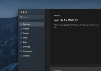
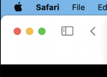
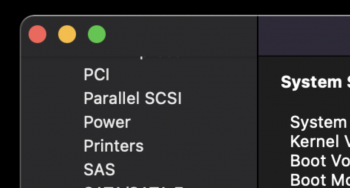
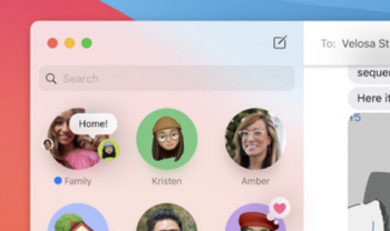
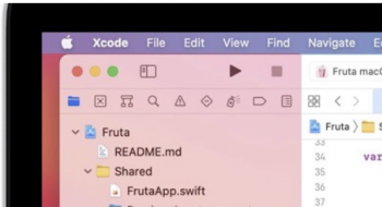
I really don't like the inconsistency of the upper left corner of the screen. Sometimes it gets cut between the traffic light and the sidebar and sometimes it is designed in one piece. Of course it is difficult to design Safari the same way as Xcode. But the "System Report", "iMessage" and "Finder" can have a consistent design.
Attachments
-
 Screen Shot 2020-06-23 at 19.52.26.png657.9 KB · Views: 225
 -
 Screen Shot 2020-06-23 at 19.52.52.png69.2 KB · Views: 198
 -
 Screen Shot 2020-06-23 at 19.53.24.png97.5 KB · Views: 186
 -
 Screen Shot 2020-06-23 at 19.54.09.png162.3 KB · Views: 199
 -
 Screen Shot 2020-06-23 at 19.58.13.png134.5 KB · Views: 196
I want to say this again, for me, at least, the text readability improvement on the non-Retina screens is much welcomed.
Last edited:
Undecided for now. Mainly because of those icons lol. Some look fine and some look really awful, I wonder if Apple are trolling!
I really don't like the inconsistency of the upper left corner of the screen. Sometimes it gets cut between the traffic light and the sidebar and sometimes it is designed in one piece. Of course it is difficult to design Safari the same way as Xcode. But the "System Report", "iMessage" and "Finder" can have a consistent design.
Things should smoothen out better consistency-wise in the coming weeks.
Overall it seems fine, but there will need to be refinement. So far, the transparency is inconsistent. For example, if I Force Touch the Macintosh HD icon to peek at the free space, the text is hard to read (it is too transparent). And the icons in the menu bar can be difficult to see. Accessibility settings actually made it a little worse. The rounded icons and windows are fine. I think that Apple will continue to refine the UI in future releases.
I am reminded of this mockup of what 10.10 would've been, so called "Ivericks". This is a 2013/2014 mockup, and there are parts of this that are very much in Big Sur.
I'm not so one sided or the other with love it or hate it.
What I do not like is the shading on some of the icons. Or the what I would call over the top fake 3D look.
Example the messages and facetime icons.
There is the shading behind the chat bubble, then there is the shading on top of the chat bubble. I am not a fan of the shading on top of the bubble. If the bubble was a single color with shading behind to make it 'pop' from the green, I think it may be a better look.
Not a fan of the preview icon, the system prefs or settings icon, notifications icon inside system prefs. There are jsut a few that almost look Windows XP'ish, so not a fan.
Also the amount of dead space at the top of windows. Like open a finder window, the amount of space around the traffic lights, to me, is too much. Don't make the traffic lights larger, just slightly reduce the overall height of that dead space.
Maybe tighten up the shadow effect by a couple pixels in the menu bar. I dunno.
For the most part I am enjoying a new look, there's just some fine-tuning i would like to see by the later releases.
Good lord no
Agree to disagree. I want a real computer. Not a giant iPad. Apple/Google/MS keep ruining computers to chase after tweens (or something?).
If you don't like it, don't use it. Nobody is asking you to use it.
The curvature of window edges is, to a large degree, reminiscent of Linux distributions and to a lesser degree even Mac OS X initial releases up to 10.4 if memory serves me right. Also, it is funny how they used to have menu bar with rounded edges and now when that would have looked better, they haven’t (yet) added it. I think by the fall release they would make more visual changes to polish the UI and remove inconsistencies.
Somewhat surprised by the poll results so far, but I suppose people that dislike the changes were the most vocal in other thread comments.
Agreed! I am getting sick of every app/website being 80% white space, or desktop websites/apps that are clearly just the mobile version, because developers can't be bothered anymore.
I use the Archived links often via archive.org. I forget how easier it was on my eyes to even see the 2010-Google search page. Why on earth are we revisiting Amiga WorkBench 1.5 or Tandy DeskMate in 2020? Flat design was dated long before iOS 7 for those of us old enough to remember!
I got a Windows 10 tablet/laptop combo PC at work for looking up part numbers/reading manual PDFs/wiring diagrams. I got 2010 versions of Chrome, Firefox, Opera and Safari (since Windows at least kept 32-bit thank goodness!) and any time I open them to browse, I get sad at the state of modern browsers. I miss the gloss, the chrome, the effects. That plus archived sites, it's a nice trip back to when the UI design appeared far more futuristic than it has been since 2013. It also has a very decent Windows XP theme.
From what few screenshots I've seen posted on this thread, it appears skeuomorphism might be returning a might, plus the news of the chime returning makes me actually feel like updating might be a good idea. Windows 10 has added some skeuo cues as well, so I hope it's a step in that direction since flat has felt so lifeless/boring to me.
I was expecting macOS 11 and redesign to come this year, as we have been hearing rumours about the ARM transition, so it all made sense. I have also been thinking about what the redesign could look like and I was expecting something very similar to what we got. As others, I don't like some of the icons. Some of them are look outdated, some are pixelated (like the notifications icon in the system preferences) and etc. However, I expect Apple to make tweaks in the next betas and I am looking forward to seeing how it will be improved. Obviously, the ideology behind the macOS is still the same in a sense that everybody who has used macOS before will be able to make the transition and get used to the design language fairy fast. Making all platforms having similar look and feel is great and, as long as developers don't abuse the opportunity given to them to easily run their apps across platforms (for example by directly porting iPad apps to macOS without further optimisations and etc.), it is a nice step forward.
I love how the cursor in iPadOS takes the shape of the controls when hovering on them and would want to see this on macOS, but it's most probably not going to happen.
I love how the cursor in iPadOS takes the shape of the controls when hovering on them and would want to see this on macOS, but it's most probably not going to happen.
Why not, even the icons look better lolGood lord no
="TheralSadurns
The loss of information seems fixable in most cases.
Take Finder for example.
You can re-enable the tab bar, path bar, status bar, and have icons and text in the tool bar.
The screenshot also has reduced transparency enabled which also turns the menu bar a solid dark gray/light gray.
I’m not sure if there is option in the settings to reduce the transparency. Apple seems to be moving to the flat look than skeuomorphism.
And little to no contrast.
The UX folks are amateurs now at Apple and are simply pursuing fads. It truly breaks our hearts, but many I know have made a decision to no longer invest in Apple hardware. They've gone off the rails with mobile considerations and the move feels like it is a shift to less openness and more data collection opportunity with the various embedded techs.
It's like fashion- the look is going to change for the sake of change - not always for the better, but different. That's just how it is at this stage in the game.
Register on MacRumors! This sidebar will go away, and you'll see fewer ads.

