Become a MacRumors Supporter for $50/year with no ads, ability to filter front page stories, and private forums.

What do you think of the new UI?


  • Total voters
    248

Bubble99

macrumors 65816
Mar 15, 2015
1,100
304
I just wish it went back to this....

View attachment 926828

mountain-lion-screenshot.png


Well that is really big on skeuomorphism and is old fashion and both Microsoft and Apple has moved away from that long ago.

Even most Linux didtros have moved away from that.

Well may be in 5 or 10 years when the flat look gets old than skeuomorphism may start to make a come back. And may start to look like leopard or Lion Again.

But I as of now Microsoft and Apple will be moving more to flat look. And the same with most Linux distro well apart from may very small number.

It odd that the dock and icons did not get more of flat look than the UI that is really flat.
[automerge]1593113043[/automerge]
It's like fashion- the look is going to change for the sake of change - not always for the better, but different. That's just how it is at this stage in the game.

Mac OS was already flat and Apple just made UI even more flat.

There is even talk windows 10 will get more flat by next year.
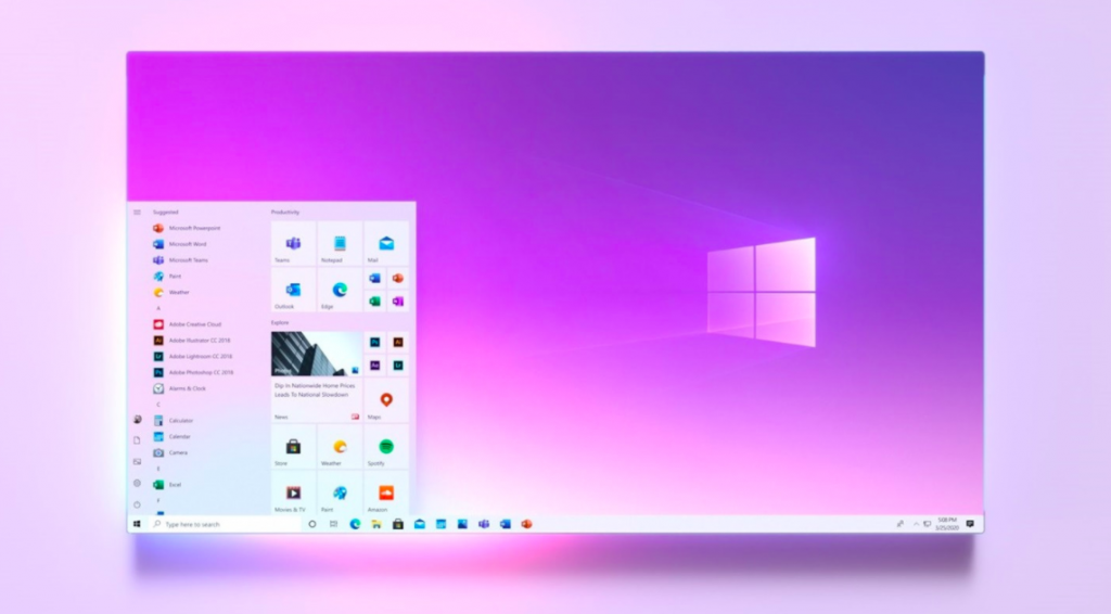
Microsoft-Windows-10-new-start-menu-looks-good-1024x566.png


1483630224_windows-10-neon-01.jpg


This seems to be move everyone is going now.

Well skeuomorphism is not coming back any time soon.
 
Last edited:

nachodorito

macrumors member
Jun 19, 2020
42
19
loonaverse
I like it! Catalina (UI-wise) felt like the iOS 13 of the Yosemite design, and having a new design to pair things up feels nice. Though its not really mature, it a nice change of pace! I kinda disagree with the "pro os" type of design because it feels too cluttered for my taste.
 

Brien

macrumors 68040
Aug 11, 2008
3,821
1,397
I wonder if all of the new stock apps are catalyst ports or if Apple is simply making them look the same.

If they are ports it does not bode well for the future of macOS.
 

nickdalzell1

macrumors 68030
Dec 8, 2019
2,787
1,670
Windows 10 looks like Windows XP on one of my laptops, and like Windows 7 on another, even using Hotmail on a 2010-era Mozilla Thunderbird. So flat or not, I can make it as skeuomorphic as I want. I also got an old PowerBook G4 on 10.2 Jaguar.

But from what I've seen, Windows has started to trend towards at least some Windows 7 design lately. Transparency/Aero glass has come back, as have some of the more skeuo icons (such as the one for the 'new' Edge browser that finally stops it from looking similar to the Internet Explorer icon).

Given Windows 8 was the very template that started the whole fiasco of flat design (despite it failing miserably for Microsoft, go figure!) One can only hope that 'fluent' design or 'neuomorphism' which Windows 10 appears to be doing will start the move back. I've been sick of flat since it was new in the 80s. Was glad to see it go in the late 1990s, sad to see it rehashed again in 2013.
 

derekamoss

macrumors 65816
Jul 18, 2002
1,491
1,143
Houston, TX
mountain-lion-screenshot.png


Well that is really big on skeuomorphism and is old fashion and both Microsoft and Apple has moved away from that long ago.

Even most Linux didtros have moved away from that.

Well may be in 5 or 10 years when the flat look gets old than skeuomorphism may start to make a come back. And may start to look like leopard or Lion Again.

But I as of now Microsoft and Apple will be moving more to flat look. And the same with most Linux distro well apart from may very small number.

It odd that the dock and icons did not get more of flat look than the UI that is really flat.
[automerge]1593113043[/automerge]


Mac OS was already flat and Apple just made UI even more flat.

There is even talk windows 10 will get more flat by next year.

Microsoft-Windows-10-new-start-menu-looks-good-1024x566.png


1483630224_windows-10-neon-01.jpg


This seems to be move everyone is going now.

Well skeuomorphism is not coming back any time soon.
I personally like this look that windows 10 is going towards. As for the Groove App Picture I love it and still use it for all my physical mp3's and if they didn't shut down their music subscription service I would still be using it for that instead of Spotify. I was actually a huge fan of Windows 8's UI but that was because I had a Touchscreen tablet to use it on instead of a desktop computer. Honestly, I wish they would go back to that because it is still IMO the best touch UI that there has been.
 
  • Like
Reactions: nachodorito

nickdalzell1

macrumors 68030
Dec 8, 2019
2,787
1,670
Windows 8 I was excited about since to me the start menu was inefficient since Windows 95 once you got tons of apps installed (start--programs--games--microsoft games--microsoft flight simulator--flight simulator x, that's a ton of steps! and heaven forbid you mouse outside the menu and it disappears and you have to start over again!) and given I had an Xbox 360 with a similar UX, it was more consistent. The Start Menu was something I never had to grow up with--my first Windows was Windows 3.1, so the 'start screen' harked back to my ol'e Program Manager and I loved that. My old workaround to the start menu clutter of steps was filling my desktop with a ton of icons for every game, program I had installed until you couldn't see the wallpaper behind the wall of icons. I despised the start menu. Was glad to see it go.

What killed Windows 8 though was how it was gesture driven, by default and especially forced on a tablet. One wrong move while scrolling would either switch between two open apps or minimize it. None of them felt natural or intuitive. Most I discovered by accident (such as that charms bar. my god!). Thankfully it could be disabled on a laptop.

On a tablet, especially one with no buttons, like a Toshiba one I still own, very different. No virtual buttons ala Android 4.1 at all. I fired it up recently to see if Kindle still worked for kicks, and the way you navigate it brought back my hatred of the gestures. To download a book, you have to actually tap, hold, and drag down. Naturally for me it would be a right click and 'download' or tap the icon itself to open the book and it would download and open. Don't even get me started on what act of congress it took to figure out how to get back to the library view or change font size, or screen tone.

I never liked being forced to use only gestures to navigate. I couldn't adjust to the ones on the iPhone X either. I like the home button especially the layout Samsung used to use, which has a recent apps and back capacitive key beside the home button. I still find touchID far more efficient and one step vs. having to make one nasty swipe mark on the screen then still wait a few seconds hoping it'd recognize me. I hate looking through fingerprints and being forced to use a button-less phone or device still irks me.

So while I loved the initial impression of Windows 8, I was not happy long-term. It was otherwise the only flat design I liked. Now, with Windows 10 on a few PCs I use, I got it looking more like Windows 7 or Vista or XP. I like skeuomorphism. One of my Android tablets I use to play podcasts I use an app called Cassie-o-player that brings back the cassette tape interface. I just loved that. It was fun to use and made me want to actually touch the screen far more than a gesture-driven interface. Aldiko in older versions brings back the wooden bookshelf view of old iBooks and works with ePub.
 

Apple Knowledge Navigator

macrumors 68040
Mar 28, 2010
3,676
12,835
I wonder if all of the new stock apps are catalyst ports or if Apple is simply making them look the same.

If they are ports it does not bode well for the future of macOS.

Unlikely. For instance, Music is still built on the iTunes code because of the number of features unique to the macOS version. There would be little advantage to 'Catalysing' the iOS version, only to add back all the macOS features.

But long-term, it would seem like a goal for Apple in order to simplify their software development. I mean, how many times have we complained over the years about the disparity between macOS and iOS features within apps?
 
  • Like
Reactions: nachodorito

daveedjackson

macrumors 6502
Aug 6, 2009
401
262
London
There some prett big design issues. In mail for example when selecting mailboxes and folders... no highlight or visual indication which box you’re in. Basic design principles.
 
  • Like
Reactions: idktbh

nusynergy

macrumors regular
Jul 3, 2008
203
20
Kent - UK
Hated it to begin with. I thought they have a winning formula with Catalina. But over the last couple of days as I've been using it I've become more familiar with it and don't mind it so much. Still not a big fan of the finders redesign, I'm sure that will grow on me too.
 

sunapple

macrumors 68030
Jul 16, 2013
2,834
5,413
The Netherlands
The couple of screens I've seen already make Catalina feel dated, so I'm pretty excited for it.

When iOS 7 was introduced, I thought I liked it, but then hated it. Felt so unfinished. Big Sur seems like the UI they tried back then, but now it's actually beautiful IMO.
 
  • Like
Reactions: ErikGrim

derekamoss

macrumors 65816
Jul 18, 2002
1,491
1,143
Houston, TX
Windows 8 I was excited about since to me the start menu was inefficient since Windows 95 once you got tons of apps installed (start--programs--games--microsoft games--microsoft flight simulator--flight simulator x, that's a ton of steps! and heaven forbid you mouse outside the menu and it disappears and you have to start over again!) and given I had an Xbox 360 with a similar UX, it was more consistent. The Start Menu was something I never had to grow up with--my first Windows was Windows 3.1, so the 'start screen' harked back to my ol'e Program Manager and I loved that. My old workaround to the start menu clutter of steps was filling my desktop with a ton of icons for every game, program I had installed until you couldn't see the wallpaper behind the wall of icons. I despised the start menu. Was glad to see it go.

What killed Windows 8 though was how it was gesture driven, by default and especially forced on a tablet. One wrong move while scrolling would either switch between two open apps or minimize it. None of them felt natural or intuitive. Most I discovered by accident (such as that charms bar. my god!). Thankfully it could be disabled on a laptop.

On a tablet, especially one with no buttons, like a Toshiba one I still own, very different. No virtual buttons ala Android 4.1 at all. I fired it up recently to see if Kindle still worked for kicks, and the way you navigate it brought back my hatred of the gestures. To download a book, you have to actually tap, hold, and drag down. Naturally for me it would be a right click and 'download' or tap the icon itself to open the book and it would download and open. Don't even get me started on what act of congress it took to figure out how to get back to the library view or change font size, or screen tone.

I never liked being forced to use only gestures to navigate. I couldn't adjust to the ones on the iPhone X either. I like the home button especially the layout Samsung used to use, which has a recent apps and back capacitive key beside the home button. I still find touchID far more efficient and one step vs. having to make one nasty swipe mark on the screen then still wait a few seconds hoping it'd recognize me. I hate looking through fingerprints and being forced to use a button-less phone or device still irks me.

So while I loved the initial impression of Windows 8, I was not happy long-term. It was otherwise the only flat design I liked. Now, with Windows 10 on a few PCs I use, I got it looking more like Windows 7 or Vista or XP. I like skeuomorphism. One of my Android tablets I use to play podcasts I use an app called Cassie-o-player that brings back the cassette tape interface. I just loved that. It was fun to use and made me want to actually touch the screen far more than a gesture-driven interface. Aldiko in older versions brings back the wooden bookshelf view of old iBooks and works with ePub.
See i'm the opposite, the gestures were one of the things I loved about windows 8. The left quick swipe to bring up all opened windows and the left long swipe bringing back the last used app was perfect. I really liked the charms bar as well. I even liked the idea of there not being a desktop/tablet mode and that the desktop it self was presented as an app to go into when you needed it and with windows 8.1 you could boot directly into the desktop if thats what you needed. I also really liked that they used horizontal scrolling instead of vertical because it just felt more natural to me since i use a tablet 99% of the time in landscape mode. I think iPad is still the only tablet where portrait mode is a thing?
 

R1t6yM

macrumors newbie
Jun 26, 2020
10
21
Absolutely horrible. Apple just has no taste anymore.
  • Border radius is too large, almost cutting into close button. Even more possibilities of content being cut off.
  • Titlebars, toolbars are too tall. What is computer? Even Gnome's toolbars are shorter.
  • It's not clear where you can drag on merged titlebar/toolbar now that buttons have no borders and title is part of toolbar.
  • Full height sidebars were ugly when they introduced them, nothing changed, window controls buttons not visibly being part of titlebar/toolbar just looks off.
  • White everywhere, are they copying windows 10 or android here?
  • Floating dock... Let's waste few more pixels on this desktop computer OS, oh wait, Apple doesn't know what's a computer anymore.
  • If you put control center in at least make it look mac like, parts of iOS UI being thrown in is alright now?
 

bluecoast

macrumors 68020
Nov 7, 2017
2,256
2,673
macOS Big Sur ≈ iOS 7

The translucency is too extreme and it’s too saturated imho.

I’ve often felt that Apple’s UI design was optimised to look great in the bright California sunlight. It can look garish and too bright for those of us in gloomier climes.

No doubt they will dial back some of this in the beta and over the next year. I hope.

It’s good to see macOS get a lot of attention though.

And it’s also good thing that it’s getting closer to iPadOS.

macOS has felt dated for some time now (look at the clock settings panel) with UI elements that are completely different from iPadOs

Also both platforms will benefit.

No one can say that the 3rd party macOS app market is in a good place right now. This will help.
 

RandomDSdevel

macrumors regular
Jul 23, 2009
153
76
Kokomo, IN
As noted elsewhere:
From my reply to the 'macOS 'Big Sur' Unveiled With Updated Design, New Features for Safari and Messages, and More' thread in 'News and Article Discussion' → 'MacRumors.com News Discussion:'
  • I sincerely hope there's an accessibility option to reduce the menu bar's transparency back to what it was before! (That is, on top of and separate from/in addition to the current option to disable menu transparency entirely.)
  • This…isn't how I imagined a redesigned Dock.
_________________________________________________________________________________________________

Additionally, I, too, would like a gray theme in addition to the existing light and dark themes, at least for toolbars. Otherwise, I'd miss macOS's classic gradient gray window chrome.
_________________________________________________________________________________________________

On top of that:
  • I mostly agree with your post, R1t6yM, though I think I could get used to Control Center; it works better with some of the new menu extra designs.
  • The new inset selection style just exacerbates the problem of having too much white space, making it worse. I have some distaste for it.
 

KALLT

macrumors 603
Sep 23, 2008
5,380
3,415
Titlebars, toolbars are too tall. What is computer? Even Gnome's toolbars are shorter.

I find even Gnome’s titlebars/toolbars too top-heavy; imbalanced. At one of the WWDC session videos Apple pointed out that users can “see” where something is draggable in the titlebar by hovering over it with the pointer. If it changes its colour, then it’s a button or input field (e.g. search bar) and cannot be dragged (fantastic logic, by the way).

Grey background for most applications was getting depressing, nice to see a bit more white and colour throughout the os.

Going from a mix of grey tones, white and translucency to just white, very light-grey tones and translucency does not exactly make the UI uplifting either. If anything, they could have at least introduced some of the tinting that dark mode has.
 
  • Like
Reactions: RandomDSdevel

Frankied22

macrumors 68000
Nov 24, 2010
1,787
594
When it was first unveiled and shown off in pictures and videos I loved it and thought it looked great but now that I am using it on my Mac I am not so sure. While it definitely looks fresh and more modern, it also suffers from massive wasted space and things like the huge title bars on all the windows is annoying after awhile of using it. Also, most of the icons look like garbage (not that I care, my dock is hidden 99% of the time). All the BIG SPACE in the windows looks silly after awhile, almost like they are preparing to add touch to macOS...
 

Takohashi

macrumors member
May 15, 2011
71
18
Most of all, I hate what the selection of items with margins looks like. It looks absolutely ugly and outdated 🤮 And also a frenzy with rounding ALL the corners 🤦🏻‍♂️
 
  • Like
Reactions: RandomDSdevel

Natya Sadella

Suspended
Jun 20, 2016
833
679
Some of the icons are ugly AF but overall, I really like the redesign. Looks more modern, catalina already looks outdated.

But I don't really understand why they didn't change the function-key UI. Like the volume slider or brightness slider. I hope they get a redesign too within the next beta releases
 

SuperMatt

Suspended
Mar 28, 2002
1,569
8,281
Here‘s a critique from a Mac software developer.

 
  • Like
Reactions: RandomDSdevel

nickdalzell1

macrumors 68030
Dec 8, 2019
2,787
1,670
Aren't rounded corners a Steve Jobs fetish or something? Also, Google must have caught on since there are rounded corners in the UI design of Android 9 and up as well.

Would be rather ironic given 2020 starts looking more like 2010 in UI design. That to me was the peak. before it got overboard with fake leather and felt, it was just the effects of buttons, icons, and overall gloss on title bars and such. That to me was peak skeuo. Wouldn't mind having it back myself.
 
Register on MacRumors! This sidebar will go away, and you'll see fewer ads.