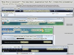
I've been using Vista for the past two days. I just had to share this. I've got a splitting headache.
This thing is by far the worst UI design I've had the misfortune of laying my eyes on. You can't even call it 'design'. Total chaos. It looks like someone decided to throw in everything into the UI, without any thought on simplicity, consistency, or putting things where you need them or would look for them.
Seems they figured that lots of sparkly, shiny stuff makes a good UI.
I don't even know how to describe it beyond 'sheer chaos'. Every window is freaking chock full of options, and shiny things, and little pull-down menus, almost every spot is clickable. It never ends. More and more and more options. No consistency, as if every window was designed by someone else with the goal of adding even more options. It really is that horrible.
I truly have a headache trying to wrap my head around this monstrosity.
Chaos.


