Become a MacRumors Supporter for $50/year with no ads, ability to filter front page stories, and private forums.

What would you like to see in watchOS 4?

  • A new App Screen

    Votes: 82 23.4%
  • New native health features

    Votes: 151 43.0%
  • Siri responding with speech

    Votes: 65 18.5%
  • A 3rd party Watch face store

    Votes: 235 67.0%
  • Other (specify in the comments)

    Votes: 30 8.5%

  • Total voters
    351

lordofthereef

macrumors G5
Nov 29, 2011
13,161
3,721
Boston, MA
I was very surprised when 3.0 didn't include thirdparty faces, even if Apple only allowed some developers to make them.
It really is strange, right? I feel like this being a piece of jewelry it is much more an extension of oneself than a phone is. Sure I can out a photo of virtually everything as my Watch face but that still limits me to one type of face and one way to view that information.

I can totally understand copyright restrictions but this doesn't seem to be an issue for the AppStore which is literally open to everyone.

I don't even imagine this would require a new Watch OS. Unless I'm mistaken, every Watch face is actually loaded first in the Watch app. This could be as simple as a small iOS update. Either way I would be all for it.
 

Type4O

macrumors 6502
Aug 23, 2011
346
121
Toronto, Canada
I We like watchOS 3. The AW2 is my first watch, so I have no prior experience.

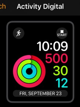
I use the Activity watch face and have a complication in the top right and often accidentally activate it.

IMG_2573.jpg

I like the Activity face but would like to be able to rearrange it so the time is in the top right as it is not selectable.

I'd also like three complications along the bottom instead of the wide one.
 

satchmo

macrumors 603
Aug 6, 2008
5,219
6,092
Canada
I never understood why the apps screen couldn't be a simple list. View by name or custom rearrangement.

Maybe not as cool or visually striking, but a heck of a lot more functional.

Yes, you may need to scroll a bit if you have lots of apps. But at least you can find it, instead of spending time hunting for it. You can still have a graphic icon beside the name.
 

aduteau

macrumors 6502a
Oct 14, 2007
553
46
I still don't get why my Apple Watch is mirror my iPhone with iMessage, or Notifications ... and if I Delete a iMessage conversation on my watch ... it still is showing on my phone (or vise versa).

Same thing with the Notification center on the Watch, If I clear a notification on my watch or phone ... both should sync together and get rid of them across all devices.

While at it ... throw in the Podcast app so i could sync my podcasts from the official Apple Podcast app.

I want more syncing between my watch and Phone for watch OS4
 

ARK

macrumors 6502a
Jul 20, 2008
537
96
Indianapolis, IN
I hate the way Messages are blue, Calendars are red, Timer is orange, Maps are blue, Workouts are green, Music is red, etc. It doesn't seem consistent at all which is unusual for Apple especially compared with iOS. I would like to see one overall theme across all apps. You choose what color you want to match the Watch face color you chose.
 

BlueMoon63

macrumors 68020
Mar 30, 2015
2,055
959
I hate the way Messages are blue, Calendars are red, Timer is orange, Maps are blue, Workouts are green, Music is red, etc. It doesn't seem consistent at all which is unusual for Apple especially compared with iOS. I would like to see one overall theme across all apps. You choose what color you want to match the Watch face color you chose.
This is something I agree with... also, the complications differ in size on some faces. For example, on the activity face, the battery complication is way too big. The alarm/timer is so tiny. Having them on the top left and right look odd and not good. There are others that are so big that they seem too large for the screen while others are tiny. Also, these are Apple apps.

I also agree with color choices but more disappointed at the complication sizes being all over the place. Some just look awfully large and out of place.
 

thinkpink1434

macrumors newbie
Feb 10, 2016
18
2
Orange County, CA
I like using smart watches for fitness especially tracking steps which is a surprise to me that none of the main screens have the option to show steps (unless you use an app).
Also automatic sleep tracking someone else mentioned would be a plus for me.
 

Type4O

macrumors 6502
Aug 23, 2011
346
121
Toronto, Canada
Also automatic sleep tracking someone else mentioned would be a plus for me.

I am very surprised sleep tracking is not built in. The apps I tried only use motion and heart rate (as they probably all do), from the watch, so why not have it as part of watchOS. Seems a no brainer.
 

infinitejest

macrumors 6502a
May 1, 2016
744
1,942
Siri responding with speech would be great actually. Not sure why they disabled this in the first place. Any ideas?
Not a big fan of the app screen either. I mean it looks really great but it's not really convenient to use.

Also, you could already easily change watch faces by using force touch, so I'd like to be able to switch between apps (in the dock) and not watch faces by swiping to the left or right. People use different apps more often than switching between watch faces anyway (I'd assume).

Other than that, I think they've done a great job with watchOS 3 and I'm really happy with it. New health functions would always be great, not sure if it's possible without updating the hardware though.
 

twinlight

macrumors 6502a
Sep 4, 2016
717
542
Siri talking back would waste battery and cpu usage and the speaker is way to weak but I think it could be used when using Bluetooth for some things.

To bad Siri is usually crap and most things never need a reply from her. Most things I tell her ends up wrong, misunderstood or ignored. But she's great for setting timers and starting an outdoor walk workout.

Sleep tracking must be added in watchOS 4.
 

ManicMarc

macrumors 6502
Jul 1, 2012
487
149
For watchOS 4 I'd like to see the following:

  • Offline Siri: the ability to add reminders, open apps, set timers etc. without having a network connection.
  • Smart complications: Show me the weather complication when it's raining, show me a timer complication when I've set a timer, show me a calendar appointment when I have a meeting soon, show me my battery when I'm less than 20%. There's only so much space on the watch-face - I'd like important information to surface without having to micro-manage complications.
  • The ability to download music directly to the watch without using the phone as an intermediary (fair enough if it only happens when plugged in).
  • A podcast player that works when the phone is not connected.
  • Better support for Wi-Fi networks that use captive portals that I've previously logged into (like the one at my gym).
  • Better timed breathe reminders - rather than every X hours, why doesn't it suggest I take a moment when my heart rate is raised, but I'm not working out?
  • Better stats and suggestions for overall fitness levels, for example, did I run the same distance, and get a better time? Was my heart rate lower? Should I be pushing myself a bit more? Would love it to make suggestions based on how hard I'm working.
Not bothered about sleep tracking, I know when I've had a good or bad night's sleep. ;)
 

honglong1976

macrumors 68000
Jul 12, 2008
1,675
1,135
UK
It needs sleep tracking and the ability to see steps on the watch face natively. I love my Apple Watch but I am using a Fitbit Blaze because i can see my heart rate, steps on the same watch face. Who cares about the metrics apple watch displays? I just want to see steps!
 

Badrottie

Suspended
May 8, 2011
4,317
336
Los Angeles
I can't think anything else WatchOS 3 looks so good. For hardware I think 16GB would be nice and tiny FaceTime camera would be nice for every deaf people to use. :)
 

Dhonk

macrumors 6502
Mar 2, 2015
349
265
I'd like to see the voice-text feature give you clickable options when it can't understand your words. I hate that I have to click "cancel" and try again or switch to my phone
 
  • Like
Reactions: FrisbeeK9

Type4O

macrumors 6502
Aug 23, 2011
346
121
Toronto, Canada
It needs sleep tracking and the ability to see steps on the watch face natively. I love my Apple Watch but I am using a Fitbit Blaze because i can see my heart rate, steps on the same watch face. Who cares about the metrics apple watch displays? I just want to see steps!

I for one care about the metrics it shows. They are important to my fitness plan. I know I get my steps per day because of my activity, so that's not important to me. I agree that you should be able to customise the activity metrics shown though.
 

Twimfy

macrumors 6502a
Sep 11, 2011
888
246
UK
The odd restrictions on the microphone and speaker have got to go. Apps being unable to use them when it would be useful for them to makes no sense.

Actually they can, as to why they don't is a mystery. I've just submitted an app update and the Watch App sends custom sounds through the watch speaker, the SDK allows Mic recording and playback too. Although the app is currently rejected for an unrelated issue, they seem to have no problems with me doing that and it'll be on the store in a day or two.

Notifications however, yes the sound is restricted on those which is a shame as it'd be great to have different sounds for different apps.
 

GIZBUG

macrumors 68020
Oct 28, 2006
2,459
1,625
Chicago, IL
Better Battery Life.
Faster response
Group Imessage/SMS notifications obeying the MUTE/DND feature is enabled on iPhone.
 

Restlesslegs

macrumors member
Sep 14, 2015
65
70
Have my watch for a few days only, use it for exercise and sleep tracking and would like to see a configurable control centre. I never swim so I'd like to replace the "waterdrop" icon with a "wake screen on wrist raise" toggle as I use that every night to switch it off and keep the screen dark...
 

Type4O

macrumors 6502
Aug 23, 2011
346
121
Toronto, Canada
Shake, or sharp flick of the wrist to dismiss notifications would be good. When working out (especially on the rowing machine), I don't want to have to keep stopping to dismiss notifications. I know the privacy setting that doesn't show the content only shows the icon then goes away, but there are times when that is not convenient either, which is why I have it show content. It's a catch 22.
 
Last edited:

BarracksSi

Suspended
Jul 14, 2015
3,902
2,664
Shake, or sharp flick of the wrist to dismiss notifications would be good. When working out (especially on the rowing machine), I don't want to have to keep stopping to dismiss notifications.

You don't even need to look at all your notifications. If one comes in and you don't turn your wrist right away, it won't light up the display; and if you wait a bit to see it (twenty seconds, maybe?), it'll just have the little indicator dot.

Or does it light up every time while you're on the rowing machine due to the hand position?
 
Register on MacRumors! This sidebar will go away, and you'll see fewer ads.