Got a tip for us?
Let us know
Become a MacRumors Supporter for $50/year with no ads, ability to filter front page stories, and private forums.
Weekly Photo Contest (January 1-7)
- Thread starter Phrasikleia
- Start date
- Sort by reaction score
You are using an out of date browser. It may not display this or other websites correctly.
You should upgrade or use an alternative browser.
You should upgrade or use an alternative browser.


Wedding Rings
Shallow DoF shot of wedding rings. Using AF-S DX Nikkor 17-55mm f/2.8G at an aperture of f/5.6

Shallow DoF shot of wedding rings. Using AF-S DX Nikkor 17-55mm f/2.8G at an aperture of f/5.6
It's near the end of the day on the 7th where I am (in Europe), but it's still midday in the US, so I'll keep the contest open for another 10-12 hours. There are a lot of great shots in this lot; I need to sleep on it before making any decisions!
ok one last entry
last minute entry?")
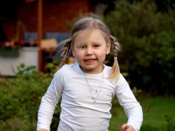
This is my daughter running towards me last autumn in the yard, just when I got my 70-200mm lens. This one was taken at 82mm. Personally it is one of my favorite shots of her because she really stands out from the image and takes the focus of the image naturally onto her.
notice the noise in the image is because of the compression.
last minute entry?
This is my daughter running towards me last autumn in the yard, just when I got my 70-200mm lens. This one was taken at 82mm. Personally it is one of my favorite shots of her because she really stands out from the image and takes the focus of the image naturally onto her.
notice the noise in the image is because of the compression.
Attachments


Forty-five submissions! Wow. This was a big week for the contest. My job was not easy, as there are so many great photos in this lot. I've decided to comment critically on each and every one. I hope my comments are constructive enough.
LittleCanonKid You definitely caught the right moment of the splash, which is hard to do. I think this photo might benefit from tighter cropping and more contrast.
NStocks A textbook example of good macro photography. Lighting, composition, and focus are all spot-on.
heron88 Good lighting and sharp focus, but having the deepest blacks appear only at the extreme corners robs this shot of visual interest.
serpent Cute photo, but the boy's expression seems a bit uncomfortable. I want either to see his eyes or see them completely closed, but the way they're rolled back looks contorted. Also, this shot looks as though it was taken in the shade; the lighting is very flat.
sud Nice color and focus, but the composition would be better if the subject weren't dead-center.
techie4life I'm wondering how you achieved the pointillist bokeh, which works very well with the geometry of the subject (i.e. round knots and repeating rope segments). I think I'd like to see a less centered composition.
bootedbear Another very centered subject. The fall colors against a blue sky have the potential to be very exciting, but the lighting is a bit flat, so the photo lacks vibrancy.
NeGRit0 This one might have worked better as a macro shot.
rouxeny A really whimsical photo that seems to illustrate the whole concept of "puppy dog eyes", with the focus on the eyes of a dog smiling over his empty bowl. I'd like to see more of the bowl and less of the ceiling, but that's being nitpicky.
Xander562 Nice texture in the coin, but it's dead center and lacks a meaningful setting.
wbe858 This one seems to have shallow DOF for its own sake. I'm left wanting a concept to go with the composition.
Nicholie A fairly disturbing subject; I'm hoping the noose is merely a prop for this photograph. That said, the focus, lighting, and composition all work well here.
Nadav An interesting chess set, but the focus falls on the backs of a couple of pieces, leaving the photo without a visual pay-off.
TJunkers The solar flare that will soon thaw the icy fruit: a rich concept for a photo. However, it's also a very challenging shot to get, and this one has some technical shortcomings. The flare is too strong, leaving a large blown-out hole in the image.
jbernie Some interesting geometry at work here, but the whole upper half of the "subect" is blown out and devoid of detail.
shady825 I like the silhouetting of the ears against the black background. The composition is otherwise unsuccessful, however. There is too much negative space with all the black, and the lioness's head is too centered. Also, the highlights on her fur are all blown out.
H2Ockey A good composition and good use of selective focus. The lighting has that "on-camera-flash" look about it, leaving the photo a bit dull.
MiniMan Nice texture and use of black-and-white. I'd like to get a better sense of a meaningful subject in its setting, though.
Soundie Another photo with some interesting geometry, made explicit by the use of black-and-white. However, both the lettering and the windows are in focus and are competing with each other, leaving the photo's composition unresolved.
md2427 The weathered post has some nice texture. The lighting is rather cool and flat.
nissan.gtp A good job of panning here. The blurred greenery looks great.
peabody This could have been a good composition if we at least had a hint of the face, but the total lack of detail is not working here. Nothing in the frame is well exposed.
doubleohseven Your subject has lots to offer with all of that color and interesting texture. However, nothing is in sharp focus here, and the lighting is very dull and flat.
Martin_C I remember seeing this one in the daily thread and liking it then. The triangular formation of bicycles gives the eye a nice path to travel around. It's a pity the closest figure isn't in sharp focus.
RedDragon870503 I like the angle you chose, but the photo is overexposed. Also, with several of the flowers in sharp focus, my eye gets restless. You would need some really strong leading lines to pull that off.
deanjohnson7 Lots of potential here. I'm left wanting a stronger "subject". The logo is really oblique, making me want to look beyond it, but everything back there is out of focus.
apearlman Just the right DOF here. I wonder how this photo would look cropped as a vertical, with the parrot falling near the intersection of the thirds.
cosmokanga2 The white canopy of the mushroom gives some nice contrast, but it's not quite in focus and is getting lost in so much background.
AlexH I remember seeing this one in the daily thread. I really liked it and may have even commented on it. The colors are terrific, and the repeating shapes give the photo a great sense of rhythm.
I'm a Mac Great contrast and good lighting. The composition leaves the left half too vacant; you might try cropping the photo.
orangeillini14 Nice detail in the fur. The background could be more interesting; perhaps a smaller aperture would have helped.
MaddMacs The snowflakes on the dark pine branches have great potential. I'm wanting to see more of what's at the right and less of the blurry background. Also, the lighting is very flat.
seattle A very successful macro shot. I love the detail in the bee's wings.
[bChappers][/b] It's impressive that you got this one using manual focus. Well done. I would probably crop it more tightly to remove the distracting second flower.
icanhasiphone? The lensbaby effect adds a sense of vertigo that works well with old house...as if it's haunted or something. My eye is searching for a place to rest, however.
beatzfreak An interesting composition. I would probably rotate the image into a vertical so that the logo would be right-side-up.
GT41 Despite the focus clearly being on the blossoms, the image seems too busy. I think this one would benefit from even shallower DOF so that the shapes in the background wouldn't compete with the subject.
sreedy I really like the texture and the faint repetition of the subject. The lighting is pretty flat; perhaps a fill flash would have helped?
dewailang There's lots to like about this shot; I just wish the focus weren't so centered in the frame.
thouts I really like the play of light on that one very yellow leaf. I wonder if you could have made that the subject by focusing on it more. The mass of leaves otherwise do not offer enough visual interest to be a strong subject.
lucarelli This would make a good advertisement for a jeweler, since the identities of the figures are completely obscured. I like the composition.
flosseR Cute picture. Good lighting and nice choice of aperture. Vertical compositions usually work best for portraits. I would love to see this one as a vertical that captures all of the figure and places her at one side. As it is, she bifurcates the image, and her one red fingernail at the frame's edge becomes a distraction.
Clic_Pix This one has too much contrast and not enough in the conceptual realm.
steeveage A beautiful baby! Nice composition. Perhaps a bit overexposed?
spinnerlys The lizard's skin has some terrific texture. Usually it's best to place the focus on a creature's eyes. Here it's on the hind legs and seems arbitrary.
Those are my impressions, for what they're worth. There are a lot of great photos here, and I could easily have chosen several of them as winners. Alas, there can only be one winning photo, so I will name rouxeny as this week's winner, since the selective focus in this photo really adds to its message. Congratulations, rouxeny, the next contest is yours.
Register on MacRumors! This sidebar will go away, and you'll see fewer ads.