Become a MacRumors Supporter for $50/year with no ads, ability to filter front page stories, and private forums.

katewes

macrumors 6502
Original poster
Jun 7, 2007
466
146
I'm one of those that finds the Apple Watch to be a visual monstrosity, i.e. Samsung-like.

A round Apple Watch such as this would have been superb:

http://www.theverge.com/2014/9/11/6134981/apple-watch-round-concept-photo-essay

But my greater fear is that in the future there never will be a round Apple Watch in future iterations. If the groundwork of the Watch OS is being laid now, can it be adapted later on for circular with all the infrastructure of apps being developed in tandem?

e.g. if, now, with millions of rectangular apps in the App Store, you can't simply change the iPhone screen to a circle. There's too many legacy apps out there. Once you start, you're stuck in that direction. It's like Microsoft being stuck with the Registry - it is so fundamental that it can't ever be changed.

For the increase in size, in the jump from iPhone 4S to 5, it was a simpler matter of lengthening the size of the screen, whereas, once the Watch OS is cast as being square/rectangular, those paradigms in apps are not going to translate to a circular screen.

I think we're stuck with the square Apple Watch for at least a decade or two, until Apple degenerates into a has-been, like the parade of once-great corporations, e.g. Blackberry, Sony. Most young people weren't around in the mid 1990's when Sony was so strong in innovation and quality that people would pay extra to get a Sony, hence, the marketing slogan "Because it's a Sony". In 20 years time, are we going to tell the young people there once was a market leader called Apple, who were so innovative that people would pay a premium for their products. Sony were like that 20 years ago.
 

Wishbrah

macrumors regular
Oct 20, 2013
235
8
This thread was interesting and provocative. May I bring you a cookie?

On a serious note, you are saying a square Watch is going to bring down Apple because you prefer round watches. I want whatever you are drinking.
 

C64

macrumors 65816
Sep 3, 2008
1,236
222
A few mockups say nothing about the consequences for the user interface. You're losing a lot of screen real estate without those square corners. That's why the Moto 360 is pretty big: if you can't use the corners, the whole circle needs to be bigger.

And if something comes along that's better than Apple, let them come. Good competition has never been a bad thing.
 

Piggie

macrumors G3
Feb 23, 2010
9,182
4,112
If I am honest here, and I always try to be.

When I first saw the Apple Watch and how they are heavily going into circles.
The whole UI really is circle based.

I will admit, I felt all the roundness did clash with the squareness of the device.

That image of the round icons on a round screen/watch does feel more comfortable on the eye, and seems to feel in harmony more.

I would like to see a round option in time and I'm sure many here would.

I hope it's something Apple may consider for the future.

----------


Again, that is easy to get AROUND!

It depends how you see the circle.

You can choose, as your examples try and show that a circle gives you less screen area.

Or you can look at it in a positive way and consider a circle gives you more screen area as you are ADDING the EXTRA curved areas onto the current square.
 

JayLenochiniMac

macrumors G5
Nov 7, 2007
12,819
2,390
New Sanfrakota
I'm one of those that finds the Apple Watch to be a visual monstrosity, i.e. Samsung-like.

It's hardly a visual monstrosity like the Moto 360.

Motorola-Moto-360.jpg


Compare to

J3rQJtx.jpg
 

Julien

macrumors G4
Jun 30, 2007
11,847
5,441
Atlanta

Making an good analogy of your point:cool: : Round is wasted space and limited display of info over a rectangle. Everyone would see this on an iPad and since a watch is a smaller screen then its even more of a problem.

Also watches were round because of the movement dictated the round face. Besides being a waste of user space it would be pure skeuomorphism to make it a round face. I want to see more info and NOT less in the same confined space.
 
Last edited:

Michael CM1

macrumors 603
Feb 4, 2008
5,682
277
I'm one of those that finds the Apple Watch to be a visual monstrosity, i.e. Samsung-like.

A round Apple Watch such as this would have been superb:

http://www.theverge.com/2014/9/11/6134981/apple-watch-round-concept-photo-essay

But my greater fear is that in the future there never will be a round Apple Watch in future iterations. If the groundwork of the Watch OS is being laid now, can it be adapted later on for circular with all the infrastructure of apps being developed in tandem?

e.g. if, now, with millions of rectangular apps in the App Store, you can't simply change the iPhone screen to a circle. There's too many legacy apps out there. Once you start, you're stuck in that direction. It's like Microsoft being stuck with the Registry - it is so fundamental that it can't ever be changed.

For the increase in size, in the jump from iPhone 4S to 5, it was a simpler matter of lengthening the size of the screen, whereas, once the Watch OS is cast as being square/rectangular, those paradigms in apps are not going to translate to a circular screen.

I think we're stuck with the square Apple Watch for at least a decade or two, until Apple degenerates into a has-been, like the parade of once-great corporations, e.g. Blackberry, Sony. Most young people weren't around in the mid 1990's when Sony was so strong in innovation and quality that people would pay extra to get a Sony, hence, the marketing slogan "Because it's a Sony". In 20 years time, are we going to tell the young people there once was a market leader called Apple, who were so innovative that people would pay a premium for their products. Sony were like that 20 years ago.

I had no idea Steve Ballmer would share his thoughts at MacRumors.
 

kdarling

macrumors P6
And as big as it is, it still cuts text off. :D

Big can do things small cannot :)

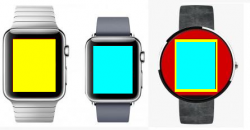
Playing devil's advoate, using the estimated screen sizes from Gizmag for the two Apple types, and overlaying them on the Moto 360:

apple-watch-vs-moto-360-screen.png

Looks like the Moto could display everything the Apple Watch can, and still have room around the circle to display most of a background watch dial, and other indicators... if they wanted to not use Google Wear's big fonts, that is.

(I think all round smartwatches should keep a border with abbreviated hands, so no matter what you're doing, the time is still shown.)
 

Julien

macrumors G4
Jun 30, 2007
11,847
5,441
Atlanta
Big can do things small cannot :)

Playing devil's advoate, using the estimated screen sizes from Gizmag for the two Apple types, and overlaying them on the Moto 360:

View attachment 491310

Looks like the Moto could display everything the Apple Watch can, and still have room around the circle to display most of a background watch dial, and other indicators... if they wanted to not use Google Wear's big fonts, that is.

(I think all round smartwatches should keep a border with abbreviated hands, so no matter what you're doing, the time is still shown.)
True, but not a fair comparison. Look at the size of the 360. It is significantly larger and a full 9mm (over ⅓") wider. The 360 looks like a hockey puck. Slim the 360 dimensions down to a comparable size and round loses. A circle is just a less efficient use of space of text/graphics.

Here are a couple of side by side pics.

ScreenShot2014-09-14at45237PM_zps20cac862.jpg


ScreenShot2014-09-14at45316PM_zps1b850bf5.jpg
 
Last edited:

mariotr87

macrumors regular
Aug 12, 2011
196
25
Why on earth would someone want to have a round Apple watch? You fit less on the screen, it makes it harder for developers to make apps, especially when the rest of the devices are not round, layouts of UI components would be weird...Not to mention the unnecessary added complexity to fit the internals in the device.

There are reasons for analog watches to be round, but those don't apply here. It's actually even more practical and pleasant to the eye to have something square shaped on the wrist. The Apple watch is just beautiful.
 

APlotdevice

macrumors 68040
Sep 3, 2011
3,145
3,861
Since it's software we may very will get a 100 rectangle 'analog' watch faces.;)

Oh I'm sure we will, but I just find it odd that Apple is marketing the watch with clock faces that aren't really optimal for it.
 

Julien

macrumors G4
Jun 30, 2007
11,847
5,441
Atlanta
Oh I'm sure we will, but I just find it odd that Apple is marketing the watch with clock faces that aren't really optimal for it.

Part of the reason maybe because with OLED black is 'free'. So a smaller round face will use less battery
 

kdarling

macrumors P6
Of course, another factor against round is that more and more young people these days cannot read an analog clock face.

A recent survey in the UK, for example, found that one in seven Britons cannot read analog clocks. I wouldn't be surprised if the number was even higher in the US.

I've personally met many people who cannot read analog clocks. They're totally reliant on digital clocks, and do not relate easily to the idea of a quarter hour.

We used to use analog clockfaces in our software, and had to dump them because it just confused some users. So sad, because I think clockfaces can instantly show time relationships that a number cannot.

On the other hand, going back to that survey, it turned out that many who cannot read a clockface still bought an analog clock just for the fashion. I'm flabbergasted at that.
 

Piggie

macrumors G3
Feb 23, 2010
9,182
4,112
Of course, another factor against round is that more and more young people these days cannot read an analog clock face.

A recent survey in the UK, for example, found that one in seven Britons cannot read analog clocks. I wouldn't be surprised if the number was even higher in the US.

I've personally met many people who cannot read analog clocks. They're totally reliant on digital clocks, and do not relate easily to the idea of a quarter hour.

We used to use analog clockfaces in our software, and had to dump them because it just confused some users. So sad, because I think clockfaces can instantly show time relationships that a number cannot.

On the other hand, going back to that survey, it turned out that many who cannot read a clockface still bought an analog clock just for the fashion. I'm flabbergasted at that.

Well we can either alter things so stupid lazy people can use them.
Or we can educate people to not be stupid and lazy.

I'd favor the latter myself.
 
Register on MacRumors! This sidebar will go away, and you'll see fewer ads.