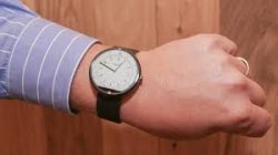
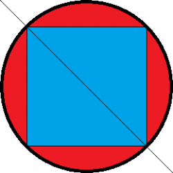
Playing devil's advoate, using the estimated screen sizes from Gizmag for the two Apple types, and overlaying them on the Moto 360:
View attachment 491310
Looks like the Moto could display everything the Apple Watch can, and still have room around the circle to display most of a background watch dial, and other indicators... if they wanted to not use Google Wear's big fonts, that is.
No wonder why they had to make the Moto 360 larger and it looks like a visual monstrosity on the wrist.


 customer, your taste in design has always aligned with Jobs taste (not sure how you determined this???