Forgive my ignorance, eyou..but wots your game plan here? Wot are you trying to achieve?
I'll try and break this down…
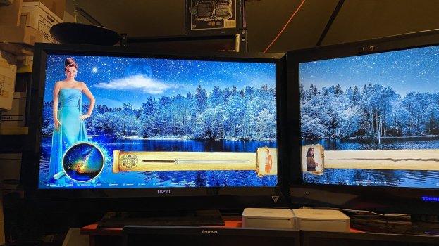
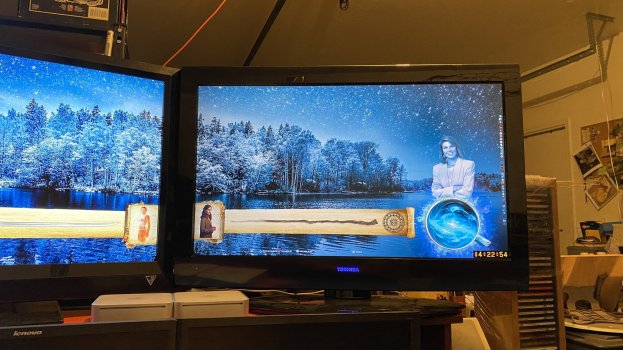
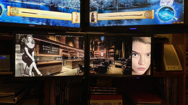
The game plan is to make me happy. These are personal desktops. This particular one is for my Late 2009 Mac Mini. I am simply using InDesign/Photoshop on my MacPro to create the backgrounds.
I am trying to achieve a background that inspires me for writing whenever I am at this computer. This Mac Mini is in the garage and I am surrounded by my fantasy gaming books and sci/fi fantasy novels. It's supposed to be more of a 'happy' environment for creation. I refer to this desktop/Mac as my 'Creativity Desktop'.
My MacPro has a different desktop because while I want to be inspired by it, the MP is where I do my more serious content/structure writing.
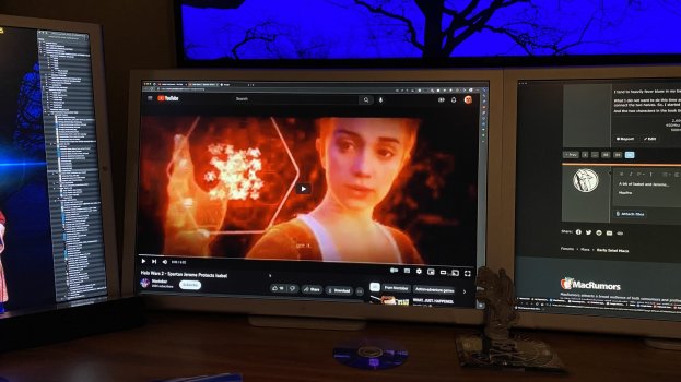
I have an Early 2009 Mac Mini that's sole purpose is to serve music and video content while I am writing. This Mini is also in the garage. I will be redoing it's desktop soon.
As someone who isn't up with the movie/tv world I have no idea who these characters are. No..I don't need an explanation of that, But I am interested in your methodology.
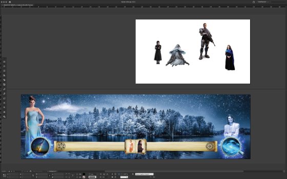
The characters in the top right panel - are they to be included in the main letterbox screen panel.? You're working with quite contrasting factors in your image sources, like light sources, cast shadows ..or lack there of, and clothing tones...which makes it tricky to get to look right.
Each person represents a strong influence on me. Either the person themselves or who they represent, or both. The uniting characteristic between all is that each is an example of what I believe is a strong woman. As I mentioned to
@TheShortTimer, my life has been influenced by strong women and weak men. So it's natural for me that my inspiration is drawn from strong women.
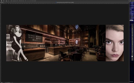
This is an InDesign document and the page size is exactly equal to 1920x1080 pixels, because that is the resolution of the two HDTVs I have attached to the Late 2009 Mac Mini I am using this desktop on. But with InDesign you cannot have a spread on page 1. So, I am using page 1 as a 'pasteboard'. Page 2 and 3 is a spread and it represents my left display (page 2) and my right display (page 3).
I'm not showing the guides so it looks like one contiguous picture. That's the point, because I don't want to try and match stuff up. So build it as 3840x1080 pixels and have InDesign slice it in half, page 2 for my left display and page 3 for my right display.
I am using InDesign because for this particular desktop it makes it easier.
I'm interested in the foreground object..it looks like a time slider with a book as the place indicator..but looking at this with an iPod mini, I may be reading it all wrong.
It's a scroll, with a book in the center. The book is meant to look like a 'picture book' with the two characters in it being 'pictures' in the book.
Graphic design factor: 'tell a story without the need of words.'
Yes, I get it. Graphic design is my day job. But, again, this stuff is solely for me and my personal enjoyment. I'm making mental shortcuts and leaps because I understand what I'm getting at. None of it's meant for anybody else.
Wot version of photoshop are you using.?
I haven't used it since PS2..and that was creating visuals of different management practices on the Mackenzie landscape, South Island, NZ (a tussock land) for the tourism industry. That was using various tree species instead of people so I hope your PS has improved for making 'cutouts' without a tell tale edge to objects???
On my MacPro I am using Photoshop CC21 and InDesign CC21. As for cutouts, I use whatever is easiest. The object selection tool by itself or in combination with the magnetic lasso and standard lasso. Once I have my selection I usually shrink it in a pixel, invert the selection and feather it by 2 pixels. Then I apply a layer mask (so I don't delete the background). The feathering usually covers for any errors in selection or my poor lasso skills.

