Got a tip for us?
Let us know
Become a MacRumors Supporter for $50/year with no ads, ability to filter front page stories, and private forums.
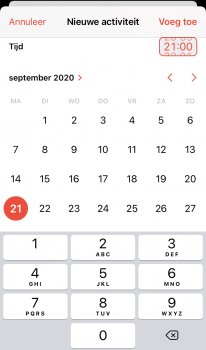
What is wrong with Calendar in IOS14 🤯
- Thread starter Igor2020
- Start date
-
- Tags
- calendar app ios14
- Sort by reaction score
You are using an out of date browser. It may not display this or other websites correctly.
You should upgrade or use an alternative browser.
You should upgrade or use an alternative browser.
I don’t use the stock app as I have found it lacking for a good while. Your picture is the first time I have seen the new Calendar. It reminds me of the current Fantastical that i use.
Interesting... I expect we'll get used to it soon (timed Reminders are now set the same way). I always hated the spinning wheel... 
I think the designers had an off day. Wtf happend in calendar with the new update???? The way to enter a new meeting how to set the time is super crazy difficult 🙈🤯 why did you guys do this?
You either slide it like you did before, or type it. Some people don't have great use of their hands, so typing is easier. Best of both worlds.
The time picker in general is terrible (also used in the alarm clock, etc.). The concept of typing in a time is, eh, ok, I can see how you might want that, but if you want to scroll the time the interface is almost unusable. The touch target is far too small and you can't see what you're doing when using it.
It took me WAAAY to long to figure out how to get the ending time set. You have to collapse the keypad to make it show up.
I hate it!
I hate it!
I hate it - it's so much more difficult than before...
Once you have touched either hours or minutes you can use the whole height of the screen as a ‘spinner’ so your finger can quickly be outside the target window.if you want to scroll the time the interface is almost unusable. The touch target is far too small and you can't see what you're doing when using it.
That fact that this needs to be explained instead of it working in an obvious way is proof that there's a problem here.Once you have touched either hours or minutes you can use the whole height of the screen as a ‘spinner’ so your finger can quickly be outside the target window.
At the same time there are all kinds of things that need and needed explanations to all kinds of people even since before iPhone came to exist (that's why manuals, tutorials, and all that exist), so that's sort of neither here nor there in that respect.That fact that this needs to be explained instead of it working in an obvious way is proof that there's a problem here.
So you can either try to manipulate the worlds smallest scroll wheel, use the whole height of the screen as a novel scroll UI never used anywhere else in iOS, or type in the time ... on a telephone keypad?
Yeah, totally intuitive. And where’s the ending time?
I wouldn’t have thought it possible, but the stock Calendar app just keeps getting worse.
Yeah, totally intuitive. And where’s the ending time?
I wouldn’t have thought it possible, but the stock Calendar app just keeps getting worse.
So you can either try to manipulate the worlds smallest scroll wheel, use the whole height of the screen as a novel scroll UI never used anywhere else in iOS, or type in the time ... on a telephone keypad?
Yeah, totally intuitive. And where’s the ending time?
I don’t see why typing in the time is unintuitive—the keypad comes up, and you type. I agree that adjusting the end time is unintuitive, however; you have to drag the big calendar “up” to get to the “Ends” box. It seems like the calendar should disappear after you choose the date.
I’m going to play around with other calendar apps to remind myself how they handle setting start/end times, as this does feel clunky to me.
EDIT: Ok, so in Google Calendar, the big calendar disappears after you choose the date... you then choose the time (this applies both to start and end time). In Android, the calendar comes up as a separate little window, that goes away after you choose the date and click “OK”; in the iOS version of the app, the calendar automatically collapses after you select a date, and a scroll wheel appears for choosing the time.
In the new iOS Calendar app, it is definitely awkward that the calendar (date selector) never disappears until you click “Add” to complete the process of creating the new event.
Last edited:
I don’t see why typing in the time is unintuitive—the keypad comes up, and you type. I agree that adjusting the end time is unintuitive, however; you have to drag the big calendar “up” to get to the “Ends” box. It seems like the calendar should disappear after you choose the date.
You can tap the Start line to close it after finishing. Same as pre-iOS 14
You can tap the Start line to close it after finishing. Same as pre-iOS 14
Hmm, thanks! You’re right. I already forget how it worked pre-iOS 14, but I don’t recall it being as confusing.
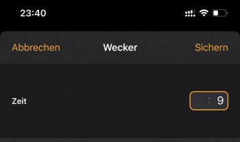
What i find irritating is how you need to type it in like backwards so if I want to set a time to 09:00 I have to type 9 but then it appears as 00:09 so I need to fill it with 0 from behind.
it’s like those ATMs I saw in Asia where I kept on almost withdrawing the wrong amount of money because you had to type in the amount so strangely as well
it’s like those ATMs I saw in Asia where I kept on almost withdrawing the wrong amount of money because you had to type in the amount so strangely as well
You can go back to the old date picker by tapping the name of the month btw. Well at least for months.I think the designers had an off day. Wtf happend in calendar with the new update???? The way to enter a new meeting how to set the time is super crazy difficult 🙈🤯 why did you guys do this?
You type “900”. How is that backwards?so if I want to set a time to 09:00...
You type “900”. How is that backwards?
what i mean is the indicator is confusing cuz it puts the 9 at the end (minutes) and then fills it up from the right by default (and if you don’t tap into it first) instead of going left (hour) to right (minutes) as taught since 1st grade
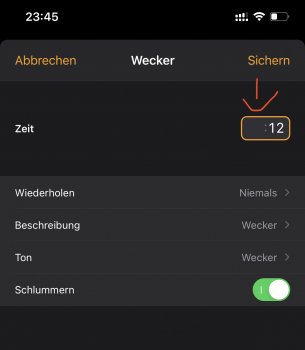
for instance if I type „12“ I would expect it to start at the left (hours) and not at the right (Screenshot)
like who writes minutes before hours unless that’s an American thing like your date being written after the month ...
ALSO if I do actually remember to tap into the „hour“ block first and type in e. g. „12“. Why doesn’t it automatically then jump to the minutes field? Instead it keeps changing the hours field all over. if for example I write 12 3 it should fill it with „12:3“ not replace the 12 with a 3. it seems all very anti intuitive and against all UX habits
Attachments
Last edited:
But with banking apps, it makes sense because .50 is a real amount of money. :50 isn’t a real time.Got it. Many banking apps do that too.
I’ve hated it since they debuted it in the betas, and I still hate it. I haven’t gotten used to it at all. The layout, in my opinion, is awful. I used to be able to set appts really quick and easy. Now ? PITA!
Register on MacRumors! This sidebar will go away, and you'll see fewer ads.


