Become a MacRumors Supporter for $50/year with no ads, ability to filter front page stories, and private forums.

76ShovelHead

macrumors 6502a
May 30, 2010
527
32
Florida
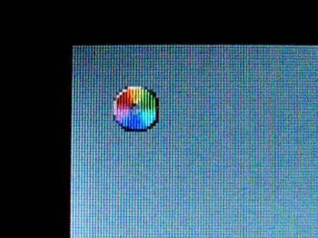
I didn't much care for the new direction Jony is taking the UI, especially with losing the 3D dock :( but I've been running El Capitan for a couple days now and the subtle gradients are a nice added touch and a step in the right direction. I also love the ability to hide the menubar, it adds some screen real estate and gives it a more custom look. Anyone notice the beachball has been flattened? lol almost reminds me of the color wheel in Puma/Cheetah.

Edit: Found the original pinwheel haha
 

Attachments

  • hqdefault.jpg
    hqdefault.jpg
    22.5 KB · Views: 191

Lions JEM

macrumors newbie
Mar 19, 2016
1
4
I honestly hate the appearance. I never actually updated to Yosemite, and went straight to El Capitan. I enjoyed the simplicity of Mavericks, and I liked that it wasn't all you could see when looking at the screen. The 3D features were excellent, and it didn't clutter up my screen. Here, everything is chunky, boxy, monotonous, and flat. It is unpleasant to look at, and it draws my eye away from what I'm trying to do. I don't like that you cannot choose for yourself what the layout and appearance of your own computer looks like. If I own this machine, I should be allowed to choose more than just the color gradient of a few buttons. This is extremely disappointing, and I cannot think of anything positive to say about this new appearance. If that steps on toes and hurts feelings, I'm sorry, but I just don't like this.
 

Jayson A

macrumors 68030
Sep 16, 2014
2,671
1,935
El Capitan has a lot of quirky visual glitches for me.

Expanding down a folder in list view that has another folder inside it already expanded causes some flashing. It looks really bad.

Most of the time, the quick look animation doesn't start from the beginning anymore. The zooming starts from about the middle of the normal zoom animation and if you close it and open it back up too quickly, it won't zoom out and when it does zoom back in, it just resumes zooming where it left off when you closed it.

The tabs view in the Finder is different from safari for some reason. Tabs have an extra dark line on the left and right sides of the window and it makes the window appear notched.

Opening a window in some apps will first show a black box the size of the window that's about to open, then the window will open.


Also, animations mess up my workflow a bit. If I make a new folder and immediately start naming it, the new folder animation interrupts the first character that I typed and the name comes out like "ew folder" instead of "new folder".
 

navaira

macrumors 68040
May 28, 2015
3,934
5,161
Amsterdam, Netherlands
Also, animations mess up my workflow a bit. If I make a new folder and immediately start naming it, the new folder animation interrupts the first character that I typed and the name comes out like "ew folder" instead of "new folder".
I end up having "untitled folder", "untitled folder 2", typing the name and discovering it has gone nowhere. :p Not an appearance problem, but it does irritate.
 

Sanlitun

macrumors 6502a
Sep 19, 2014
560
580
127.0.0.1
El Capitan has been a bit better with legibility for me, and I feel it's better than Yosemite just for that. Yosemite was a nightmare of blurry fonts and grey on white. El Capitan is still terrible, but it is not as headache inducing.

It would be nice to be able to disable all animations, drop shadows and font smoothing.
 
Last edited:

ZVH

macrumors 6502
Original poster
Apr 14, 2012
381
51
I honestly hate the appearance. I never actually updated to Yosemite, and went straight to El Capitan. I enjoyed the simplicity of Mavericks, and I liked that it wasn't all you could see when looking at the screen. The 3D features were excellent, and it didn't clutter up my screen. Here, everything is chunky, boxy, monotonous, and flat. It is unpleasant to look at, and it draws my eye away from what I'm trying to do. I don't like that you cannot choose for yourself what the layout and appearance of your own computer looks like. If I own this machine, I should be allowed to choose more than just the color gradient of a few buttons. This is extremely disappointing, and I cannot think of anything positive to say about this new appearance. If that steps on toes and hurts feelings, I'm sorry, but I just don't like this.

A lot of people feel that way, or at least a bigger percentage than would have been expected. I read somewhere that somewhere between 35% to 40% of the current users either haven't updated OS X or they regressed back to an earlier version to escape the "new" look of Yosemite or El Capitan, and that seems high to me. There was a thread on here some time ago named "Yosemite looks terrible" or something like that and it had over 300,000 views. Couple questionable looks with a buggy OS and you have a recipe for disaster.
 

deviant

macrumors 65816
Oct 27, 2007
1,187
275
A lot of people feel that way, or at least a bigger percentage than would have been expected. I read somewhere that somewhere between 35% to 40% of the current users either haven't updated OS X or they regressed back to an earlier version to escape the "new" look of Yosemite or El Capitan, and that seems high to me. There was a thread on here some time ago named "Yosemite looks terrible" or something like that and it had over 300,000 views. Couple questionable looks with a buggy OS and you have a recipe for disaster.
you can downgrade but what about new features. mavericks doesn't support a lot of things i love using now. especially if you have one of the latest iPhones/ipads. plus, the interface is nice. you get used to it. i tried mavericks the other day on the mac mini and it felt like using windows xp again lol
 
Register on MacRumors! This sidebar will go away, and you'll see fewer ads.